


 收藏
收藏


 天蓬老师
天蓬老师批改状态:合格
老师批语:不错

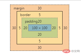
默认盒子大小计算公式: 内容区 + 内边距 + 边框。
盒子模型的排列位置由外边距(margin)决定,不影响盒子的大小。
宽度150px = 100px (width) + 40px(左、右内边距) + 10px(左、右边框)。
高度150px = 100px (height) + 40px(上、下内边距) + 10px(上、下边框)。
<style>.box {/* 内容区 */height: 100px;width: 100px;/* 设置背景颜色 */background-color: lightgreen;/* 背景颜色只显示内容区 */background-clip: content-box;/* 外边距30px */margin: 30px;/* 设置内边距20px 内边距是透明的*/padding: 20px;/* 设置边框 */border: 5px solid #000;/* 自定义盒子计算公式,盒子内容区包括边框和内边距 *//* box-sizing: border-box; */}</style><body><div class="box">box</div></body>
代码运行结果图: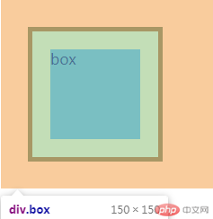
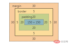
box-sizing: 用来自定义盒子计算公式,盒子内容区是否计算内边距和边框。box-sizing:content-box(默认):盒子大小只计算内容区,当box_sizing:border-box,此时,盒子的大小包括内边距和边框,但总大小始终等于盒子的大小,此时的内容区大小会被压缩。
真正内容区的宽度: 200px(width) - 40px(左、右内边距) - 10(左、右边框) = 150px
<style>.box {/* 内容区 */height: 200px;width: 200px;/* 设置背景颜色 */background-color: lightgreen;/* 外边距30px */margin: 30px;/* 设置内边距20px */padding: 20px;/* 设置边框 */border: 5px solid #000;/* 自定义盒子计算公式,此时盒子内容区包括边框和内边距 */box-sizing: border-box;}</style><body><div class="box">box</div></body>
代码运行结果图: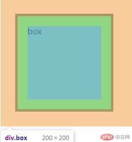
绝对定位:元素的位置相对于最近的已定位父元素,如果没有就相对于当前窗口进行定位(body/html),参照物是它的父级包含块;
相对定位:定位元素是相对于元素的当前位置进行定位,参照物是它的当前位置。相对定位通常作为绝对定位父级的定位元素。
<style>.box.one {/* 内容区 */width: 300px;height: 300px;/* 背景颜色 */background-color: lightblue;/* 相对定位relative通常作为父级定位属性使用 */position: relative;/* 避免子元素margin影响到父级 */overflow: hidden;}.box.two {/* 内容区 */width: 100px;height: 100px;/* margin-top: 50px; *//* margin-left: 30px; *//* 背景颜色 */background-color: lightcoral;/* 绝对元素:参考物就是他的父级包含块(就是他的所有上级元素中具有具体定位属性的元素) */position: absolute;top: 0;left: 50px;}.box.three {/* 内容区 */width: 100px;height: 100px;margin-top: 100px;background-color: lightgreen;/* box3相对原来的位置,向右移了100px 向下100px,到了如图位置 */position: relative;top: 100px;left: 100px;}</style><body><div class="box one"><div class="box two">box2-绝对</div><div class="box three">box3-相对</div></div></body>
代码运行结果图: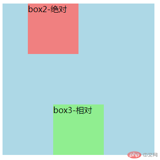
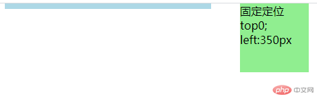
固定定位: 元素的位置始终将当前的窗口做为定位父级,始终显示在当前页面上
绝对定位:一定要有一个定位父级/包含块,如果没有就相对于当前窗口进行定位(body/html)
<style>.box.one {/* 内容区 */width: 300px;height: 200px;/* 背景颜色 */background-color: lightblue;/* 相对定位relative通常作为父级定位属性使用 */position: relative;/* 加一个margin让页面能够上下滚动 */margin-bottom: 1000px;}.box.two {/* 内容区 */width: 100px;height: 100px;/* margin-top: 50px; *//* margin-left: 30px; *//* 背景颜色 */background-color: lightcoral;/* 绝对元素:参考物就是他的父级包含块(就是他的所有上级元素中具有具体定位属性的元素) */position: absolute;top: 0;left: 50px;}.fix {width: 100px;height: 100px;background-color: lightgreen;position: fixed;top: 0;left: 350px;}</style><body><div class="box one"><div class="box two">绝对定位 top:0; left:50px</div></div><div class="fix three">固定定位 top0; left:350px</div></body>
代码运行结果图: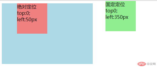
为什么垂直居中如此困难?因为页面的宽度有限,而高度是无限的,并且允许用户翻页,所以无法确定页面的高度,可以通过使用绝对定位实现垂直居中。
<style>.box {width: 200px;height: 200px;background-color: lightgray;/* 父级定位元素 */position: relative;}.box1 {width: 100px;height: 100px;background-color: lightcoral;/* 1.水平居中 *//* 子块的外边距让浏览器根据父级的宽度自动计算 *//* margin-left: auto; *//* margin-right: auto; *//* 2.垂直居中,使用绝对定位 */position: absolute;/* 定位起点 */top: 0;left: 0;/* 定位终点 */right: 0;bottom: 0;/* 使当前的元素定位的上下文充满整个父级容器 *//* 1.水平居中 *//* margin-left: auto; *//* margin-right: auto; *//* 2.垂直居中 */margin-top: auto;margin-bottom: auto;/* 简化 */margin: auto;}</style><body><div class="box"><div class="box1">居中</div></div></body>
代码运行结果图: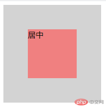
二列布局:第一列绝对定位的起始点top:0;left:0;,宽度:width:200px;第二列起始点top:0;right:0,宽度:width:800px,再给个内边距padding:10px。
注意:使用绝对定位,父级一定要有定位元素position:relative。
html布局如下:
<style>@import url(demo5.css);</style><body><!-- 页眉 --><div class="header"><div class="content"><ul><li><a href="">首页</a></li><li><a href="">新闻</a></li><li><a href="">视频</a></li><li><a href="">地图</a></li><li><a href="">贴吧</a></li><li><a href="">学术</a></li><li><a href="">更多</a></li></ul></div></div><!-- 主体 --><div class="container"><div class="left">左侧</div><div class="main">内容</div></div><!-- 页脚 --><div class="footer"><div class="content"><p>Copyright © 2017-2020 *******.com 版权所有</p></div></div></body>
css样式如下:
* {/* 初始化 */padding: 0;margin: 0;box-sizing: border-box;}/* a标签 */a {color: black;/* 开启浮动 */float: left;/* 去掉a标签的下划线 */text-decoration: none;padding: 0 20px;/* 设置行高与父级高度一样,达到居中效果 */line-height: 40px;}/* 鼠标覆盖a标签 */a:hover {background-color: lightcoral;/* color: white; */}li {/* 去掉li标签前面的样式 */list-style: none;}/* 页眉页脚 */.header,.footer {height: 40px;background-color: lightblue;}.content {width: 1000px;height: 40px;/* background-color: lightgreen; *//* 居中显示 */margin: auto;line-height: 40px;}/* 第一个content元素 */.content:last-of-type {/* 文本居中显示 */text-align: center;}/* 主体 */.container {width: 1000px;/* 最小宽度600 */min-height: 600px;background-color: lightgray;/* 上下边距10 左右边距自动 */margin: 10px auto;/* 设置父级定位,作为子元素的定位元素 */position: relative;}/* 左侧 */.container .left {width: 200px;height: 600px;background-color: yellow;/* 绝对定位 */position: absolute;/* 起始点 默认值*//* top: 0; *//* left: 0; */}/* 内容区 */.container .main {width: 800px;height: 600px;background-color: lightgreen;/* 加个边距 */padding: 10px;/* 背景裁切 *//* background-clip: content-box; *//* 绝对定位 */position: absolute;/* 起始点 *//* top: 0; */right: 0;}
代码运行结果图: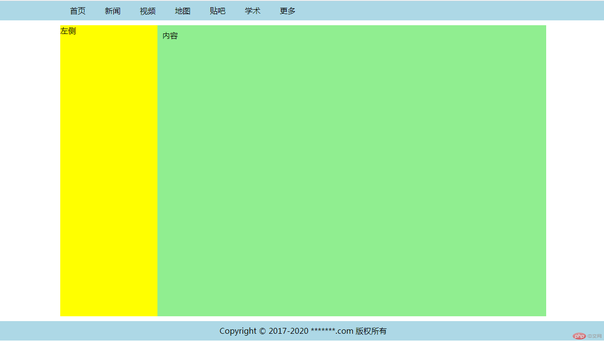
三列布局: 使用float这个属性实现三列布局
注意: 浮动布局,父级高度塌陷,需要使用overflow:hidden隐藏溢出,转成BFC块。
html代码如下:
<style>@import url(demo6.css);</style><body><!-- 页眉 --><div class="header"><div class="content"><ul><li><a href="">首页</a></li><li><a href="">新闻</a></li><li><a href="">视频</a></li><li><a href="">地图</a></li><li><a href="">贴吧</a></li><li><a href="">学术</a></li><li><a href="">更多</a></li></ul></div></div><!-- 主体 --><div class="container"><div class="left">左侧</div><div class="main">内容</div><div class="right">右侧</div></div><!-- 页脚 --><div class="footer"><div class="content"><p>Copyright © 2017-2020 *******.com 版权所有</p></div></div></body>
CSS样式表如下:
* {/* 初始化 */padding: 0;margin: 0;/* 自定义盒子计算公式 */box-sizing: border-box;}/* a标签 */a {color: black;/* 开启浮动 */float: left;/* 去掉a标签的下划线 */text-decoration: none;padding: 0 20px;/* 设置行高与父级高度一样,达到居中效果 */line-height: 40px;}/* 鼠标覆盖a标签 */a:hover {background-color: lightcoral;/* color: white; */}li {/* 去掉li标签前面的样式 */list-style: none;}/* 页眉页脚 */.header,.footer {height: 40px;background-color: lightblue;}.content {width: 1000px;height: 40px;/* background-color: lightgreen; *//* 居中显示 */margin: auto;line-height: 40px;}/* 第一个content元素 */.content:last-of-type {/* 文本居中显示 */text-align: center;}/* 主体 */.container {width: 1000px;/* 最小宽度600 *//* min-height: 600px; 浮动布局父元素高度失效 */background-color: lightgray;/* 上下边距10 左右边距自动 */margin: 10px auto;/* border: 5px solid #000; *//* 隐藏溢出内容 转成BFC块*/overflow: hidden;}/* 左右侧公共属性 */.container .left,.container .right {width: 200px;min-height: 600px;background-color: yellow;}/* 左侧 */.container .left {float: left;}/* 右侧 */.container .right {float: right;}/* 内容区 */.container .main {float: left;width: 600px;min-height: 600px;background-color: lightpink;}
代码运行结果图: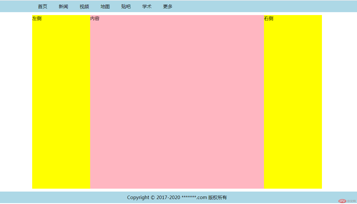
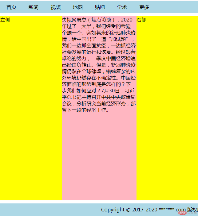
float:left)html 代码如下:
<link rel="stylesheet" href="demo7.css" /><body><!-- 页眉 --><div class="header"><div class="content"><ul><li><a href="">首页</a></li><li><a href="">新闻</a></li><li><a href="">视频</a></li><li><a href="">地图</a></li><li><a href="">贴吧</a></li><li><a href="">学术</a></li><li><a href="">更多</a></li></ul></div></div><!-- 主体 --><div class="container"><div class="main">央视网消息(焦点访谈):2020年过了一大半,我们经受的考验一个接一个。突如其来的新冠肺炎疫情,给中国出了一道“加试题”,我们一边抓全面抗疫,一边抓经济社会发展的运行和恢复。经过艰苦卓绝的努力,二季度中国经济增速已经由负转正。但是,新冠肺炎疫情仍然在全球肆虐,错综复杂的内外环境仍然存在不确定性。中国经济面临的形势到底是怎样的?下一步我们如何应对?7月30日,习近平总书记主持召开中共中央政治局会议,分析研究当前经济形势,部署下一段的经济工作。</div><div class="left">左侧</div><div class="right">右侧</div></div><!-- 页脚 --><div class="footer"><div class="content"><p>Copyright © 2017-2020 *******.com 版权所有</p></div></div></body>
CSS代码如下:
* {/* 初始化 */padding: 0;margin: 0;/* 自定义盒子计算公式 */box-sizing: border-box;}/* a标签 */a {color: black;/* 开启浮动 */float: left;/* 去掉a标签的下划线 */text-decoration: none;padding: 0 20px;/* 设置行高与父级高度一样,达到居中效果 */line-height: 40px;}/* 鼠标覆盖a标签 */a:hover {background-color: lightcoral;/* color: white; */}li {/* 去掉li标签前面的样式 */list-style: none;}/* 页眉页脚 */.header,.footer {height: 40px;background-color: lightblue;}.content {width: 1000px;height: 40px;/* background-color: lightgreen; *//* 居中显示 */margin: auto;line-height: 40px;}/* 第一个content元素 */.content:last-of-type {/* 文本居中显示 */text-align: center;}/* 主体 */.container {/* 加一个虚线 *//* border: 5px dotted #000; *//* 用overflow:hidden转成BFC块,使父级元素包住浮动的子元素 */overflow: hidden;/* 左右挤出200内边距给左右两侧 */padding: 10px 200px;}/* 主体下所有元素 */.container > * {/* 最小高度 */min-height: 600px;/* 所有元素浮动 */float: left;}/* 左右侧加一个200px的宽度,背景色 */.container .left,.container .right {width: 200px;background-color: yellow;}/* 主体内容区宽度必须自适应100% */.container .main {width: 100%;background-color: lightpink;}/* 将左侧元素放在内容区左侧 */.container .left {margin-left: -100%;/* 相对定位,往左200px */position: relative;right: 200px;}/* 将右侧元素放在内容区右侧 */.container .right {margin-left: -200px;/* 相对定位,往右200px */position: relative;left: 200px;}
代码运行结果图: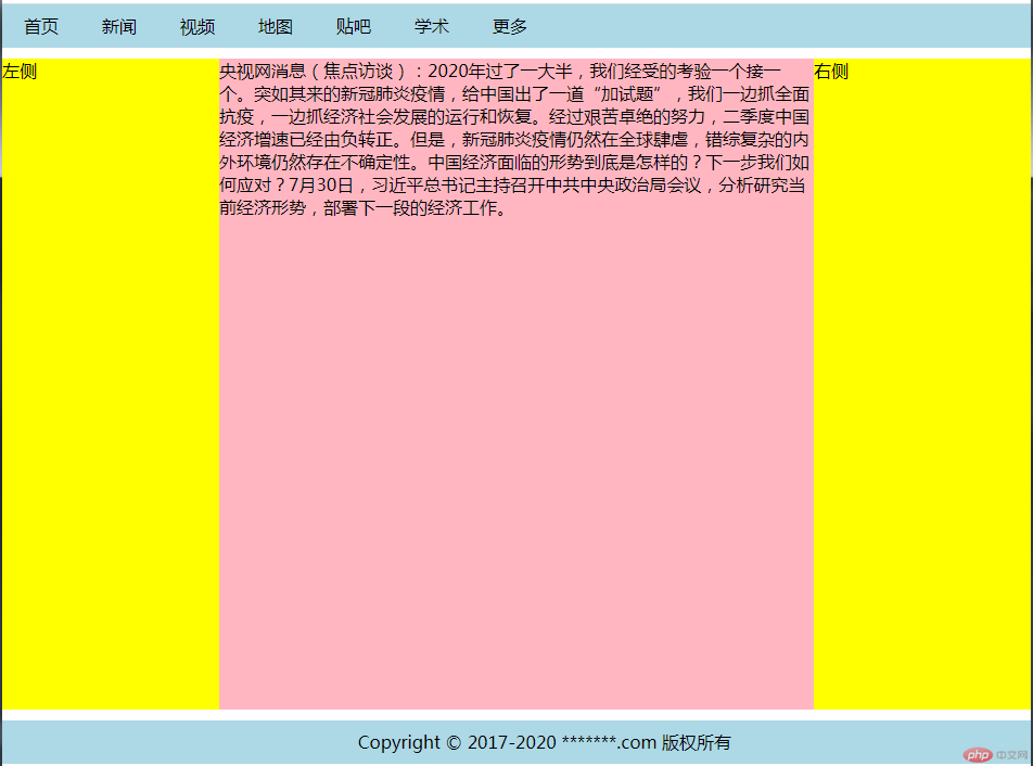

Copyright 2014-2025 https://www.php.cn/ All Rights Reserved | php.cn | 湘ICP备2023035733号


