


 收藏
收藏


 Guanhui
批改状态:合格
老师批语:写的不错!文章可以适当加点文字描述一下!
items部分
<div class="container"><div class="item">1</div><div class="item">2</div><div class="item">3</div><div class="item">4</div><div class="item">5</div><div class="item">6</div><div class="item">7</div><div class="item">8</div><div class="item">9</div></div>
css部分
.container {width: 300px;height: 300px;background-color: wheat;display: grid;grid-template-columns: repeat(3, 50px);grid-template-rows: repeat(3, 50px);/* 当容器在存在剩余空间的时候,才有意义 *//* place-content: 垂直方向对齐方式 水平方向对齐方式; *//* 剩余空间分配方案1: 在顶部和左侧进行分配,简单的理解为二边分配 *//* 垂直居中, 水平居左 */place-content: center start;/* 垂直居上, 水平居中 */place-content: start center;/* 垂直,水平全部居中 */place-content: center center;place-content: center;/* 剩余空间分配方案2: 在每个单元格之间进行分配 *//* 垂直方向二端对齐, 水平分散对齐 */place-content: space-between space-around;/* 垂直分散对齐, 水平平均对齐 */place-content: space-around space-evenly;}.container > .item {background-color: violet;}
css部分
.container {width: 300px;height: 300px;background-color: wheat;display: grid;/* 单元格中存在剩余空间时, 才有意义 */grid-template-columns: repeat(3, 1fr);grid-template-rows: repeat(3, 1fr);/* place-items: 垂直对齐方式 水平对齐方式; */place-items: stretch;/* 关键字 *//* place-items: auto;place-items: normal; *//* 垂直居中, 水平居左 */place-items: center start;/* 垂直, 水平都居中 */place-items: center center;place-items: center;place-items: center stretch;}.container > .item {background-color: violet;width: 50px;height: 50px;}
.container {width: 300px;height: 300px;background-color: wheat;display: grid;/* 网格区域,就是由一个或多个单元格组成的矩形空间 */grid-template-columns: repeat(3, 1fr);grid-template-rows: repeat(3, 1fr);/* 整体对齐 */place-items: center;}.container > .item {width: 50px;height: 50px;}.item:first-of-type {background-color: violet;/* grid-area: 1 / 1 / span 2 / span 2; */grid-area: span 2 / span 2;/* 具体覆盖全局 */place-self: center start; /*中,左*/}.item:last-of-type {background-color: lightblue;grid-area: 1 / 3 / span 3 / span 1;/* 简化 */grid-area: span 3;place-self: end center; /*下,中*/}
具体见图: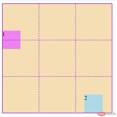
.container {width: 300px;height: 300px;background-color: wheat;display: grid;grid-template-columns: repeat(3, 1fr);grid-template-rows: repeat(3, 1fr);column-gap: 5px;row-gap: 5px;gap: 5px;/* 行10px, 列5px *//* gap: 行间距 列间距 */gap: 10px 5px;}.container > .item {background-color: violet;/* 在单元格的行与列之间添加5px的间距,下面这个方法都不如上面的gap *//* 方法1: margin *//* margin: 5px; *//* 方法2: padding *//* padding: 5px;background-clip: content-box; */}</style>

Copyright 2014-2025 https://www.php.cn/ All Rights Reserved | php.cn | 湘ICP备2023035733号


