


 收藏
收藏


 Guanhui
批改状态:合格
老师批语:可以把课程标题美化美化!

实战-模拟PHP中文网网页的一个内容
网页原内容如下:
自己做的内容如下: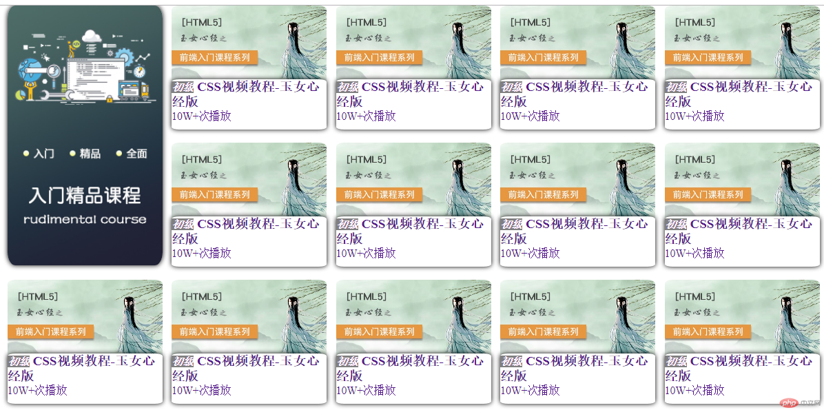
自己的代码:
html部分
<body><div class="container"><div class="items1"><img class="img" src="img/0.bmp" alt=""></div><div class="items"><img class="img" src="img/1.bmp" alt=""><div class="ele"><a href=""><div class="ele1"><h3 class="p1" ><i class="p2">初级</i>CSS视频教程-玉女心经版</h3><p class="p3"></p></div><div class="ele2"><p class="p4">10W+次播放</p></div></a></div></div></body>
css部分
* {margin: 0;padding: 0;box-sizing: border-box;font-size: 14px;}a,p {text-decoration: none;}.container {width: 1080px;height: 580px;display: grid;grid-template-columns: repeat(5, 200px);grid-template-rows: repeat(3, 165px);gap: 12px;margin: auto;}.items1 {grid-row: span 2;}.items1 > img {box-shadow: 0px 0px 10px #000;}.items {width: 200px;height: 180px;position: relative;border-radius: 5%; /*圆角情况*/}.ele > a {box-shadow: 0px 0px 10px #000;border-radius: 5%;position: absolute;top: 95px;width: 200px;height: 65px;background-color: white;}.ele > a:hover {height: 95px; /*点击后高度增加30px,对应的下面的顶部位置也向上移30px*/position: absolute;top: 65px; /*位置向上移动30px,起到一个向上扩展的效果*/display: flex;flex-direction: column;justify-content: space-between;transition-duration: 0.5s; /*整个过程延续0.5s,就有一种舒缓的感觉。至于鼠标离开后的反馈后面也可以考虑下*/}img {width: 200px;float: right;border-radius: 5%;}.p2 {background-color: grey;color: white;}h3 {font-size: 17px;}
.ele > a {box-shadow: 0px 0px 10px #000;border-radius: 5%;position: absolute;top: 95px;width: 200px;height: 65px;background-color: white;}.ele > a:hover {height: 95px; /*点击后高度增加30px,对应的下面的顶部位置也向上移30px*/position: absolute;top: 65px; /*位置向上移动30px,起到一个向上扩展的效果*/display: flex;flex-direction: column;justify-content: space-between;transition-duration: 0.5s; /*整个过程延续0.5s,就有一种舒缓的感觉。至于鼠标离开后的反馈后面也可以考虑下*/}
老司机的实现方式
.courses-list > .container > .course .desc {display: grid;place-content: space-between;min-height: 84px;/*这个地方是关键*/background-color: #fff;border-radius: 5%;padding: 10px;position: relative;top: -42px; /*这个地方是关键*/}.courses-list > .container > .course .desc:hover {min-height: 130px;/*这个地方是关键*/cursor: pointer;position: relative;top: -90px;/*这个地方是关键*/}
② 老司机内部部位的实现,
老司机的:
<div class="course"><a href=""><img src="lesson.jpg" alt="" /></a><div class="desc"><a href=""><span>初级</span>30分钟学会网站布局</a><span>6W+播放</span></div></div>
自己的:
<div class="items"><img class="img" src="img/1.bmp" alt=""><div class="ele"><a href=""><div class="ele1"><h3 class="p1" ><i class="p2">初级</i>CSS视频教程-玉女心经版</h3><p class="p3"></p> <!--这块本来是想着放增加的内容。这个内容的添加可以通过伪类的js来实现--></div><div class="ele2"><p class="p4">10W+次播放</p></div></a></div></div>

Copyright 2014-2025 https://www.php.cn/ All Rights Reserved | php.cn | 湘ICP备2023035733号


