


 收藏
收藏


 天蓬老师
天蓬老师批改状态:合格
老师批语:你的总结 ,使用表格会更好些

| 属性 | 描述 |
|---|---|
| display | 指定 HTML 元素盒子类型。 |
| flex-direction | 指定了弹性容器中子元素的排列方式 |
| justify-content | 设置弹性盒子元素在主轴(横轴)方向上的对齐方式。 |
| align-items | 设置弹性盒子元素在侧轴(纵轴)方向上的对齐方式。 |
| flex-wrap | 设置弹性盒子的子元素超出父容器时是否换行。 |
| align-content | 修改 flex-wrap 属性的行为,类似 align-items, 但不是设置子元素对齐,而是设置行对齐 |
| flex-flow | flex-direction 和 flex-wrap 的简写 |
| order | 设置弹性盒子的子元素排列顺序。 |
| align-self | 在弹性子元素上使用。覆盖容器的 align-items 属性。 |
| flex | 设置弹性盒子的子元素如何分配空间。 |
<!DOCTYPE html><html lang="en"><head><meta charset="UTF-8" /><meta name="viewport" content="width=device-width, initial-scale=1.0" /><title>FlexBox弹性盒布局快速预览</title><style>.container {width: 300px;/* 如果这个容器中的内容要使用flexBox布局, 第一步就是必须将这个容器转为弹性盒子 *//* 弹性容器 */display: flex;}.container > .item {/* 行内:全部在一排显示 *//* 块: 可以设置宽和高 */flex: auto;/* width: 60px; *//* height: 60px; */}</style></head><body><div class="container"><div class="item">1</div><span class="item">2</span><a class="item">3</a></div></body></html>
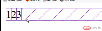
一旦将父元素转为弹性容器,内部的“子元素”就会自动成为: 弹性项目 , 不管这个项目标签之前是什么类型,统统转为“行内块”
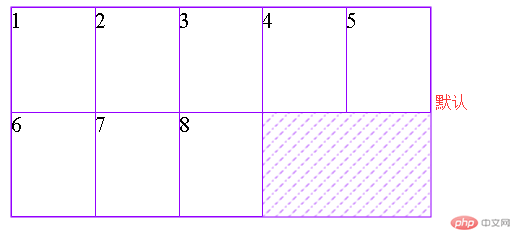
所有项目必须沿主轴排列,与主轴垂直的轴称为:交叉轴,侧轴,列轴,辅助轴。
演示代码
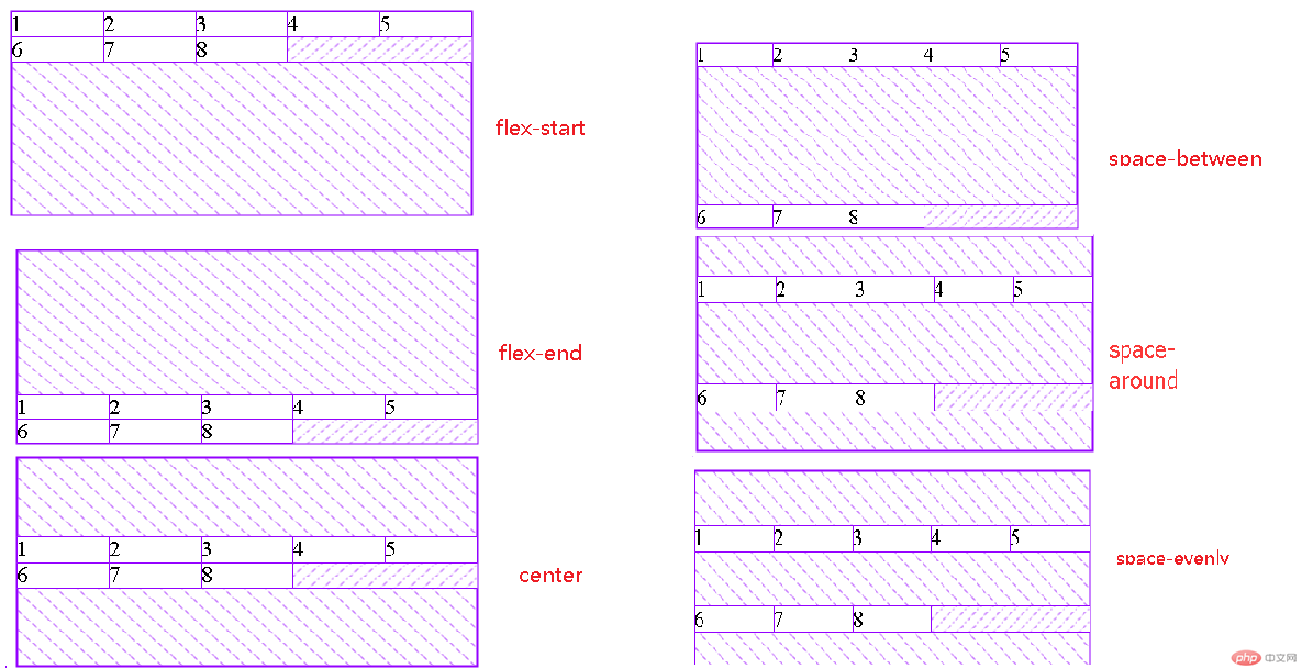
<style>.container {width: 300px;display: flex;/* 多行容器 */flex-wrap: wrap;height: 150px;/* align-content: 设置多行容器中的项目排列; *//* 1. 容器剩余空间在所有项目“二边”的如何分配 ,将全部项目视为一个整体*/align-content: stretch; //默认值元素被拉伸以适应容器。align-content: flex-start; //各行向弹性盒容器的起始位置堆叠。align-content: flex-end;//各行向弹性盒容器的结束位置堆叠。align-content: center;//各行向弹性盒容器的中间位置堆叠。/* 2. 容器剩余空间在所有项目“之间”的如何分配 ,将项目视为一个个独立的个体*/align-content: space-between;align-content: space-around;align-content: space-evenly;}.container > .item {width: 60px;}</style></head><body><div class="container"><div class="item">1</div><div class="item">2</div><div class="item">3</div><div class="item">4</div><div class="item">5</div><div class="item">6</div><div class="item">7</div><div class="item">8</div></div></body>
代码
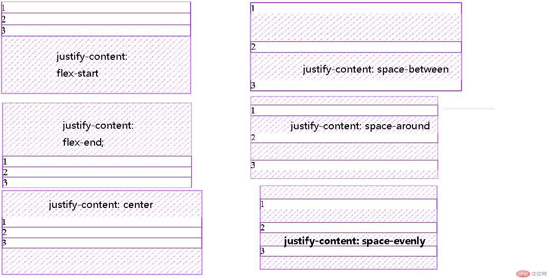
<style>.container {width: 300px;height: 150px;display: flex;/* 主轴方向:默认为行 */flex-direction: row;flex-direction: column;/* 项目二边分配 */justify-content: flex-start;justify-content: flex-end;justify-content: center;/* 项目之间分配 */justify-content: space-between;justify-content: space-around;justify-content: space-evenly;}</style></head><body><div class="container"><div class="item">1</div><div class="item">2</div><div class="item">3</div></div></body>
代码
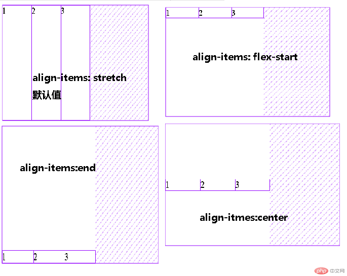
<style>.container {width: 300px;height: 200px;display: flex;/* 项目在交叉轴上默认是自动伸缩的 */align-items: stretch;align-items: flex-start;align-items: flex-end;align-items: center;}.container > .item {width: 60px;}</style>
代码
<style>/* 初始化 */* {padding: 0;margin: 0;box-sizing: border-box;}a {text-decoration: none;color: #ccc;}nav {height: 40px;background-color: #333;padding: 0 50px;/* 转为弹性盒布局 */display: flex;}nav a {height: inherit;line-height: 40px;padding: 0 15px;}nav a:hover {background-color: seagreen;color: white;}/* 登录/注册放在最右边 */nav a:last-of-type {margin-left: auto;}</style></head><body><header><nav><a href="">首页</a><a href="">教学视频</a><a href="">社区问答</a><a href="">资源下载</a><a href="">登录/注册</a></nav></header></body>
效果
代码
<style>.container {width: 300px;display: flex;flex-direction: column;}.container > .item {border: 1px solid #000;padding: 10px;display: flex;position: relative;}.container > .item > div {display: flex;}</style></head><body><div class="container"><div class="item">images-1.jpg<div><button onclick="up(this)">Up</button><button onclick="down(this)">Down</button></div></div><div class="item">images-2.jpg<div><button onclick="up(this)">Up</button><button onclick="down(this)">Down</button></div></div><div class="item">images-3.jpg<div><button onclick="up(this)">Up</button><button onclick="down(this)">Down</button></div></div></div><script>let up = (ele) => (ele.offsetParent.style.order -= 1);let down = (ele) => (ele.offsetParent.style.order += 1);</script></body>
效果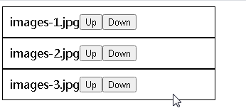
flex-wrap(定义如何换行)
nowrap(默认值,不换行)wrap(换行)wrap-reverse(换行,且颠倒行顺序,第一行在下方)
flex-flow(属性是 flex-direction 属性和 flex-wrap 属性的简写形式,默认值为row nowrap)
justify-content(设置或检索弹性盒子元素在主轴(横轴)方向上的对齐方式)
flex-start( 默认值、弹性盒子元素将向行起始位置对齐)
flex-end(弹性盒子元素将向行结束位置对齐)
center(弹性盒子元素将向行中间位置对齐。该行的子元素将相互对齐并在行中居中对齐)
space-between(弹性盒子元素会平均地分布在行里)
space-around(弹性盒子元素会平均地分布在行里,两端保留子元素与子元素之间间距大小的一半)

Copyright 2014-2025 https://www.php.cn/ All Rights Reserved | php.cn | 湘ICP备2023035733号


