


 收藏
收藏


 天蓬老师
天蓬老师批改状态:合格
老师批语:控制项目大小的几个属性,非常的有意思的, 好好研究
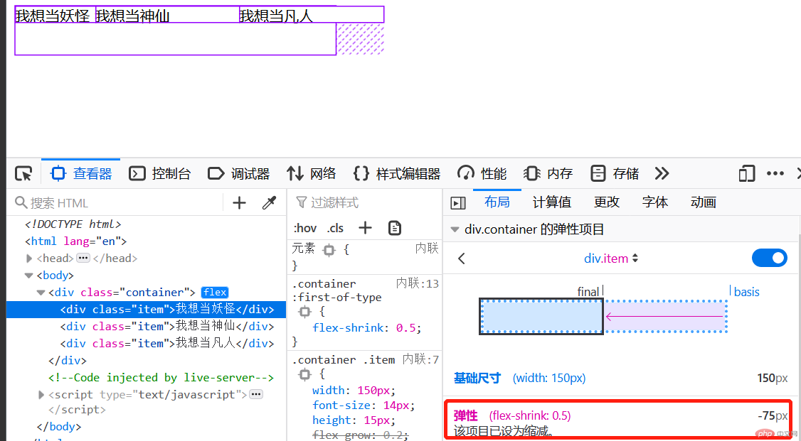
<div class="container"><div class="item">1</div><div class="item">2</div><div class="item">3</div></div>
自己尝试的小于的例子:
<style>.container {width: 300px;display: flex;}.container > .item {width: 60px;/* 默认为0,不放大 */flex-grow: 0;/* 3 * 60 = 180, 主轴空间的宽度300,剩余空间为300-180=120px *//* 120/3 = 40px,均分的话,每个人可以得到40。这个通过firefox中的元素查看可以看到对应的增长 */flex: 1;flex: auto;}.container > .item:first-of-type {flex-grow: 0.5;}.container > .item:nth-of-type(2) {flex-grow: 1;}.container > .item:last-of-type {flex-grow: 1;}/* 增长因子和: 0.5 + 1 + 1 = 2.5 *//* 120px / 2.5 = 48px *//* 第2个,第3个最终为: 108px(60+48*1) *//* 第1个最终是84px(60+48*0.5) */</style>
<style>.container {width: 300px;height: 45px;display: flex;}.container .item{width: 50px;font-size: 14px;/* flex-grow: 0.2; */}.container :first-of-type{flex-grow: 0.5;}.container :nth-last-child(2){flex-grow: 0.1;}.container :last-of-type{flex-grow: 0.1;}</style>
<style>.container {width: 300px;display: flex;}.container > .item {width: 60px;/* flex: 放大因子 收缩因子 基础尺寸 *//* 默认不放大,可收缩,尺寸使用原始大小 */flex: 0 1 auto;/* 可放大可收缩尺寸自动 */flex: 1 1 auto;/* 等价于 */flex: 1;flex: auto;/* 禁止放大和收缩,保持原样 */flex: 0 0 auto;flex: none;/* flex: 0; *//* 等价于 */flex: 0 0 0%;/* 常用的值: 0 , 1, auto */}</style>
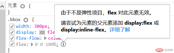
② 大小的优先次序。min-width > flex-basis > width
.container > .item {/* 原始大小,初始大小 */width: 60px;/* 基础尺寸优先级大于原始大小 */flex-basis: 80px;width: 60px;/* 最小宽度优先级又大于基础尺寸 *//* min-width: 90px; */
| id | 问题 |
|---|---|
| 1 | list中的last-of-type右侧浮动不发挥作用。 |
| 2 | list:hover时无法排除first-of-typle。 |
<!DOCTYPE html><html lang="en"><head><meta charset="UTF-8"><meta name="viewport" content="width=device-width, initial-scale=1.0"><title>Document</title></head><style>*{margin: 0;padding: 0;box-sizing: border-box;}body{margin: auto;}.header, .footer{background-color: #555555;color: aqua;height: 50px;display: flex;align-items: center;}.footer{flex-direction: column;justify-content: center;}li{list-style: none;float:left;margin: 0 10px;}/* 下面这个不发挥作用。貌似这种情况用not进行限制无效。.header ul li:hover :not(:first-of-type){background-color: brown;color: chartreuse;font-size: large;cursor: pointer;}但如果如果是a标签的时候却可以:header > a:hover:not(:first-of-type) {color: coral;}下面这个也是可以用的。.header ul li:nth-of-type(1){margin-right: 40px;}*/.header > ul > li:hover :not(:first-of-type) {background-color: brown;color: chartreuse;font-size: large;cursor: pointer;}/* li:hover{background-color: brown;color: chartreuse;font-size: large;cursor: pointer;} */.header ul li:first-of-type{margin-right: 40px;color: gold;}/* 测试下来发现1:貌似li无法进行右侧浮动。.header ul li:last-of-type{float: right;color:gold;} */.content{height: 450px;width: 800px;display: flex;margin: 5px auto;}.content >.item{width: 180px;border: 1px solid black;}.content >.item:nth-of-type(2){flex-grow: 1;margin: 0 10px;}.footer{margin: auto;}</style><body><div class="header"><ul><li class="meau">宏宇</li><li class="meau">凡界</li><li class="meau">妖界</li><li class="meau">凡界</li><li class="meau">造册</li><li class="meau">帮助</li></ul></div><div class="content"><div class="item">左宇</div><div class="item">中宙</div><div class="item">右宇</div></div><div class="footer"><div class="p">凡天下人事,人间妖,天上仙,均有其道</div><div class="p">混沌一开,万物显灵</div></div></body></html>
值得学习的几个点:
① 老司机对footer的简化处理:
footer {display: flex;flex-flow: column nowrap;text-align: center;}
② header直接用a来解决。而非div中用class的header。
<header><a href="">LOGO</a><a href="">首页</a><a href="">栏目1</a><a href="">栏目2</a><a href="">栏目3</a><a href="">登录</a></header>
移动端开发,先将浏览器展示端从pc切换到手机。
firefox元素检查右上角有一个切换按钮,点击下就可以。
(先看自己的后再看老司机的,发现有很多点值得学习,在后面有说明)
下面是最后截图: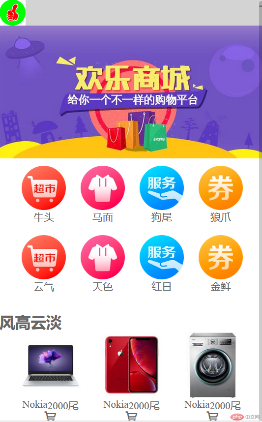
下面是代码:
<!DOCTYPE html><html lang="en"><head><meta charset="UTF-8"><meta name="viewport" content="width=device-width, initial-scale=1.0"><title>Document</title></head><style>* {margin: 0;padding: 0;box-sizing: border-box;}a {text-decoration: none;color: #666;}html {width: 100vw;height: 100vh;font-size: 14px;color: #666;}body {min-width: 360px;background-color: #fff;flex-flow: column nowrap;}.flex {display: flex;position: relative;}.h1 {height: 35px;background-color: lightgray;justify-content: space-between;}.logo > img {height: 35px;}.h2 {height: 180px;flex-direction: row;justify-content: center;}.h2 > img {height: 100%;}.h3 {width: 355px;height: 188px;flex-wrap: wrap;margin: 10px auto;justify-content: center;}.head {display: flex;flex-direction: column;align-items: center;}.h3 > div > img {width: 60px;margin: 0 10px;}.h3 > div > img,a:hover {cursor: pointer;color: lime;}footer {color: #666;background-color: #efefef;border-top: 1px solid #ccc;height: 55px;/* position: fixed; */bottom: 0;width: 100vw;display: flex;justify-content: space-evenly;}footer > a {display: flex;flex-direction: column;align-items: center; /*这个没想到用,结果字体不知道怎么去居中。纵轴的操作*/}body > footer a > span:first-of-type {/* 图标字体应该大一些 */font-size: 1.6rem;}/*---中间相对复杂的部分-----*/section{width: 358px;display: flex;flex-flow: row wrap;justify-content: center;}section> div > a > img {width: 90px;}section > .goodshow {width: 110px;display: flex;flex-flow: column nowrap;align-items: center;}section> div> a {display: flex;flex-flow: row nowrap;flex-grow: 1;justify-content: center;}.info {height: 16px;display: flex;flex-flow: row nowrap;justify-content: space-around;}</style><body><header class="flex h1"><div class="logo"><img src="static\images\logo.jpg" alt="" /></div><div class="meau">=</div></header><header class="flex h2"><img src="static\images\banner.jpg" alt="" /></header><header class="flex h3"><div class="head"><img src="static\images\link1.webp" alt="" /><a href="">牛头</a></div><div class="head"><img src="static\images\link2.webp" alt="" /><a href="">马面</a></div><div class="head"><img src="static\images\link3.webp" alt="" /><a href="">狗尾</a></div><div class="head"><img src="static\images\link4.webp" alt="" /><a href="">狼爪</a></div><div class="head"><img src="static\images\link1.webp" alt="" /><a href="">云气</a></div><div class="head"><img src="static\images\link2.webp" alt="" /><a href="">天色</a></div><div class="head"><img src="static\images\link3.webp" alt="" /><a href="">红日</a></div><div class="head"><img src="static\images\link4.webp" alt="" /><a href="">金鲜</a></div></header><!--这块是中间部分--><h2>风高云淡<span class="iconfont hot"></span></h2><section><div class="goodshow"><a href=""><img src="static\images\goods2.jpg" alt=""></a><div class="info"><p class="name">Nokia</p><p class="price">2000尾</p></div><div class="iconfont hot"></div></div><div class="goodshow"><a href=""><img src="static\images\goods1.jpg" alt=""></a><div class="info"><p class="name">Nokia</p><p class="price">2000尾</p></div><div class="iconfont hot"></div></div><div class="goodshow"><a href=""><img src="static\images\goods3.jpg" alt=""></a><div class="info"><p class="name">Nokia</p><p class="price">2000尾</p></div><div class="iconfont hot"></div></div><div class="goodshow"><a href=""><img src="static\images\goods2.jpg" alt=""></a><div class="info"><p class="name">Nokia</p><p class="price">2000尾</p></div><div class="iconfont hot"></div></div><div class="goodshow"><a href=""><img src="static\images\goods1.jpg" alt=""></a><div class="info"><p class="name">Nokia</p><p class="price">2000尾</p></div><div class="iconfont hot"></div></div></section><!----><footer><a href=""><span class="iconfont"></span><span>首页</span></a><a href=""><span class="iconfont"></span><span>凡品</span></a><a href=""><span class="iconfont"></span><span>妖品</span></a><a href=""><span class="iconfont"></span><span>仙品</span></a></footer></body></html>
| id | 详情 |
|---|---|
| 1 | 整体的潜在设置取消掉 |
| 2 | 整体的字体大小、颜色灰度 |
| 3 | 移动端大结构方面的column方向设置,nowrap |
* {margin: 0;padding: 0;box-sizing: border-box;}a {text-decoration: none;color: #666;}html {/* vw: 可视区宽度,100指100份 *//* vh:可视区的高度,100指100分 */width: 100vw;height: 100vh;font-size: 14px;color: #666;}body {min-width: 360px;background-color: #fff;display: flex;flex-flow: column nowrap;}
② header是这样处理的,用了字体图标,自己却忘了:
<header><a href="">LOGO</a><span class="iconfont"></span></header>
header的处理,通过jusity-content中的space-between来让两元素分别显示到两侧。
postion:fixed来确定一直显示,不随下滑而消失。
body > header {color: white;background-color: #333;height: 30px;width: 100vw;padding: 0 15px;position: fixed;display: flex;align-items: center;justify-content: space-between;}
③ 主体部分,每个div下面用两个a来实现。自己的没有第一个a,这样可能点了图片就没有效果。
<div><a href=""><img src="static/images/link1.webp" alt="" /></a><a href="">京东超市</a></div>
④ footer的做法(space-evenly来做平均分配;居中显示在横轴的时候用align-items)
body > footer {color: #666;background-color: #efefef;border-top: 1px solid #ccc;height: 55px;position: fixed;bottom: 0;width: 100vw;display: flex;justify-content: space-evenly;}body > footer a {margin-top: 10px;font-size: 0.8rem;display: flex;/* 垂直排列不换行 */flex-flow: column nowrap;/* 交叉轴项目居中显示 */align-items: center;}body > footer a > span:first-of-type {/* 图标字体应该大一些 */font-size: 1.6rem;}

Copyright 2014-2025 https://www.php.cn/ All Rights Reserved | php.cn | 湘ICP备2023035733号


