


 收藏
收藏


 天蓬老师
天蓬老师批改状态:合格
老师批语:记住了吗?
多行弹性盒(wrap后即为多行,align-content:stretch(先stretch之后很多命令跟上面一样))
交叉轴弹性盒排列(align-items,同样也先需要stretch之后再展开)
item的order顺序控制
看似很牛X,但貌似后面绝大多数功能也有可能被Grid代替掉。就当学html、css历史了。
再强调几点:
内容汇总:
<style>.container {width: 300px;height: 100px;/* 声明flexbox容器 */display: flex;/* 主轴方向: 行方向 */flex-direction: row;/* 主轴上的项目是否换行 */flex-wrap: nowrap;/* flex-flow: flex-direction flex-wrap; */flex-flow: row nowrap;/* 当主轴上存在剩余空间时,控制空间在项目上的分配方案 */justify-content: flex-start;/* 仅适用于多行容器,控制项目的对齐方式 */align-content: flex-start;/* 控制所有项目在交叉轴上的对齐方式 */align-items: stretch;}</style>
浮动法:中间的两列的处理。设置好上上级盒子的大小、margin、塌陷问题等。
.wrap {width: 1000px;border: 1px solid #000;overflow: hidden;margin: 10px auto;}
然后计算好中间盒子的大小、高度等。然后一个左浮动,一个右浮动即可。
aside {width: 200px;float: left;}main {width: 790px;float: right;}
定位法的注意事项及快捷处理:
继承。例如aside直接继承了上一级的左上对齐、main因为top对齐是默认值,因此直接删除。
aside {width: 200px;min-height: inherit;position: absolute;}main {width: 790px;min-height: inherit;position: absolute;right: 0;}
一个小技巧,初始化和默认值。:root是将整个html及所有元素都改成默认的属性设置。
* {padding: 0;margin: 0;box-sizing: border-box;}:root {font-size: 16px;color: #555;}
div {border: 1px solid #000;padding: 1rem;width: 60rem;margin: 30px auto;}
分列自然好,但不要用这个方法去建设网站中的栏目分块等。因为中间有很多不好操作,或者逻辑上较难走通的地方 - 见老师demo4.html。
div {column-count: 3;/* column-rule-style: solid;(中间加分割线)column-rule-width: 1px;column-rule-color: red; */column-rule: 1px solid red;}
类似下面这样一些盒子,通过display:flex后就会全部转为弹性盒。
<div class="container"><div class="item">1</div><span class="item">2</span><a class="item">3</a><a class="item">4</a><a class="item">5</a><a class="item">6</a></div>
<style>.container {width: 300px;/* 如果这个容器中的内容要使用flexBox布局, 第一步就是必须将这个容器转为弹性盒子 *//* 弹性容器 */display: flex;}.container > .item {/* 一旦将父元素转为弹性容器,内部的“子元素”就会自动成为: 弹性项目 *//* 不管这个项目标签之前是什么类型,统统转为“行内块” *//* 行内:全部在一排显示 *//* 块: 可以设置宽和高 *//* flex: auto; *//*自动情况下会将一行全部均分占满。自定义超过情况下总宽度情况下会被自动均分*//* 不够的情况下则会留下剩余空间 */flex: auto;/* width: 30px; *//* height: 100px; */}</style>
.container {flex-wrap: wrap;}
wrap后上一行,下一行都有可能出现剩余空间。
这个后面的参数挺多的,理解下即可。
justify-content: flex-start;justify-content: flex-end;justify-content: center;
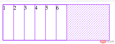
justify-content: space-between;分散对齐: 剩余空间在所有项目二侧平均分配(第五、六个)
justify-content: space-around;justify-content: space-evenly;
flex-direction: column;
<style>.container {width: 300px;height: 50px;display: flex;/* 默认值就不用写出来 *//* flex-direction: row;flex-wrap: nowrap; *//* flex-flow: row nowrap; */flex-flow: column wrap;}
多行情况下先align-content:stretch后,然后用的一些方法跟单行情况下有类似之处。
<style>.container {width: 300px;display: flex;/* 多行容器 */flex-wrap: wrap;height: 150px;/* align-content: 设置多行容器中的项目排列; *//* 1. 容器剩余空间在所有项目“二边”的如何分配 ,将全部项目视为一个整体*/align-content: stretch;align-content: flex-start;align-content: flex-end;align-content: center;/* 2. 容器剩余空间在所有项目“之间”的如何分配 ,将项目视为一个个独立的个体*/align-content: space-between;align-content: space-around;align-content: space-evenly;}.container > .item {width: 60px;}
重点:align-items。先stretch,然后设置其他属性,items在主轴外的另一轴上就可以居中,向上向下及其他方式显示了。
<div class="container"><div class="item">1</div><div class="item">2</div><div class="item">3</div></div>
<style>.container {width: 300px;height: 200px;display: flex;/* 项目在交叉轴上默认是自动伸缩的 */align-items: stretch;align-items: flex-start;align-items: flex-end;align-items: center;}.container > .item {width: 60px;}</style>
这个比较简单,其实就类似赋值。
不过要注意:是所有的默认都是0,而非从0开始向上排。
<style>.container {width: 300px;display: flex;}.container > .item {width: 60px;}.container > .item:first-of-type {/* order: 默认是0 */order: 3;}.container > .item:last-of-type {/* order: 默认是0 */order: 5;}.container > .item:nth-of-type(2) {/* order: 默认是0 */order: 50;}</style></head><body><div class="container"><div class="item">1</div><div class="item">2</div><div class="item">3</div></div></body>
用line-height和nav height的高度一样直接来实现按钮文本的上下对齐。
<body><header><nav><a href="">首页</a><a href="">教学视频</a><a href="">社区问答</a><a href="">资源下载</a><a href="">登录/注册</a></nav></header></body>```css<style>/* 初始化 */* {padding: 0;margin: 0;box-sizing: border-box;}a {text-decoration: none;color: #ccc;}nav {height: 40px;background-color: #333;padding: 0 50px;/* 转为弹性盒布局 */display: flex;}nav a {height: inherit;line-height: 40px;padding: 0 15px;}nav a:hover {background-color: seagreen;color: white;}/* 登录/注册放在最右边 */nav a:last-of-type {margin-left: auto;}</style>
例如相册、产品展示等可能都会用到。
先模拟三个图片。然后旁边加上up、down按钮。
<body><div class="container"><div class="item">images-1.jpg<div><button onclick="up(this)">Up</button><button onclick="down(this)">Down</button></div></div><div class="item">images-2.jpg<div><button onclick="up(this)">Up</button><button onclick="down(this)">Down</button></div></div><div class="item">images-3.jpg<div><button onclick="up(this)">Up</button><button onclick="down(this)">Down</button></div></div></div>
<style>.container {width: 300px;display: flex;flex-direction: column;}.container > .item {border: 1px solid #000;padding: 10px;display: flex;position: relative;}.container > .item > div {display: flex;}</style>
up、down两个button的定义。
<script>let up = (ele) => (ele.offsetParent.style.order -= 1);let down = (ele) => (ele.offsetParent.style.order += 1);</script>

Copyright 2014-2025 https://www.php.cn/ All Rights Reserved | php.cn | 湘ICP备2023035733号


