


 收藏
收藏


 天蓬老师
天蓬老师批改状态:合格
老师批语:其实, 你只要有一个完整项目的开发经验, 这些都不再问题了

我们利用flex弹性布局来快速完成一个PC端通用布局的解决方案,以后遇到类似布局可以直接仿照当前布局方案来做
代码:
<!DOCTYPE html><html lang="en"><head><meta charset="UTF-8" /><meta name="viewport" content="width=device-width, initial-scale=1.0" /><title>PC端布局的通用解决方案</title><style>/* 初始化 */* {margin: 0;padding: 0;box-sizing: border-box;}a {color: #666;text-decoration: none;}body {/* 设置最小宽度 */min-width: 680px;/* 将body转为flex弹性容器 */display: flex;/* 主轴垂直方向,不换行 因为body下的元素都需要垂直布局 */flex-flow: column nowrap;}header,footer {/* 添加页眉和页脚的公共样式 */height: 50px;border: 1px solid #000;}header {/* 将页眉转为flex 弹性容器*/display: flex;/* 所有项目在交叉轴方向上居中显示 因为页眉的导航栏需要居中显示*/align-items: center;}header > a {/* 给定每个header下的弹性项目 不增长 不收缩 基础宽度100px */flex: 0 1 100px;/* 文本居中 */text-align: center;}/* Logo */header > a:first-of-type {margin-right: 50px;}header > a:last-of-type {margin-left: auto;}/* 鼠标悬停时忽略logo */header > a:hover:not(:first-of-type) {color: coral;}.banner {width: 1020px;height: 180px;/* 转为弹性布局 */display: flex;margin: 10px auto;}.banner img {width: 100%;}.container {/* 主体这里为了显示方便给定最小高度为400px */min-height: 400px;margin: 10px auto;/* 转为弹性布局 */display: flex;/* 剩余空间给两端平均分配 达到主体居中效果 */justify-content: center;}.container > aside,.container > main {border: 1px solid #000;padding: 10px;}.container > aside {/* 给定两个侧边栏基础宽度为200px */flex: 0 0 200px;}.container > main {/* 主体基础宽度为600px */flex: 0 0 600px;margin: 0 10px;}footer {/* 将页脚转为弹性布局 */display: flex;/* 弹性项目主轴为垂直排列 */flex-flow: column nowrap;/* 文本居中显示 */text-align: center;}</style></head><body><!-- 页眉 --><header><a href="">LOGO</a><a href="">首页</a><a href="">栏目1</a><a href="">栏目2</a><a href="">栏目3</a><a href="">登录</a></header><!-- 轮播图 --><div class="banner"><img src="static/images/banner_pc.jpg" alt="" /></div><!-- 主体 --><div class="container"><!-- 左边栏 --><aside>左边栏</aside><!-- 主体内容区 --><main>主体内容区</main><!-- 右边栏 --><aside>右边栏</aside></div><!-- 页脚 --><footer><p>北京xx公司 ©版权所有 (2018-2022) | 备案号:<a href="">京ICP-18********</a></p><p>中国.北京市通州区金融街园中园999号 | 电话: 0551-888999**</p></footer></body></html>
效果: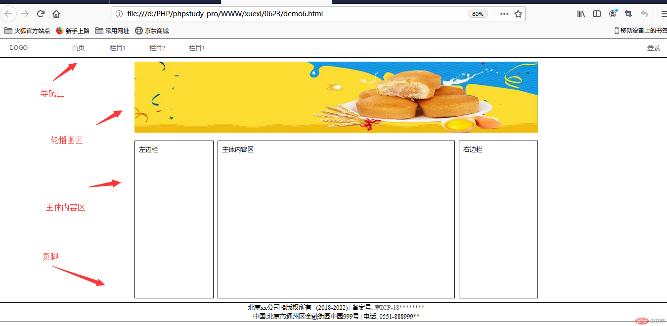
PC端的通用布局大体上就这样,可以仿照这个flex自己动手试试
注:图中为了演示效果把高度都调低了 实际开发科根据自身需求调节高度大小
接下来我们利用flex弹性布局来快速完成一个移动端通用布局的解决方案,以后遇到类似布局可以直接仿照当前布局方案来做
代码:
<!DOCTYPE html><html lang="en"><head><meta charset="UTF-8" /><meta name="viewport" content="width=device-width, initial-scale=1.0" /><!-- 加载字体图标 --><link rel="stylesheet" href="static/css/font-icon.css" /><title>移动端的解决方案</title><style>* {margin: 0;padding: 0;box-sizing: border-box;}a {text-decoration: none;color: #666;}html {/* vw: 可视区宽度,100指100份 *//* vh:可视区的高度,100指100分 */width: 100vw;height: 100vh;font-size: 14px;color: #666;}body {min-width: 360px;background-color: #fff;display: flex;flex-flow: column nowrap;}body > header {color: white;background-color: #333;height: 30px;display: flex;align-items: center;justify-content: space-between;position: fixed;width: 100vw;padding: 0 15px;}body > .slider {margin-top: 30px;height: 180px;}body > .slider > img {width: 100%;height: 100%;}/* 主导航区 */nav {height: 200px;margin-bottom: 10px;display: flex;/* 转为多行容器 */flex-flow: row wrap;align-content: space-around;}nav > div {width: 25vw;display: flex;flex-flow: column nowrap;align-items: center;}nav > div > a:first-of-type {text-align: center;}nav > div img {width: 50%;}/* 每个区域的标题样式 */.title {margin-top: 10px;font-size: 1.2rem;font-weight: normal;text-align: center;}/* 热销商品区 */.hot-goods {border-top: 1px solid #cdcdcd;margin-top: 10px;font-size: 0.8rem;display: flex;/* 水平多行容器 */flex-flow: row wrap;}.hot-goods img {width: 100%;}.hot-goods > .goods-img {/* 内边距并重置大小 */padding: 10px;box-sizing: border-box;/* 允许放大不允许缩小,否则项目不会换行,多行容器失效 */flex: 1 0 30vw;/* 再将每个商品描述转为flex */display: flex;/* 主轴垂直且不允许换行 */flex-flow: column nowrap;justify-content: center;}/* 商品描述的最后一个区域转flex,并设置项目在主轴上排列对齐方式 */.hot-goods > .goods-img > div {display: flex;/* 分散对齐 */justify-content: space-around;}/* 热销样式 */.hot {color: coral;}/* 商品列表区 */.list-goods {padding: 10px;border-top: 1px solid #cdcdcd;margin-top: 10px;font-size: 0.8rem;display: flex;/* 主轴水平 转为多行容器 */flex-flow: row wrap;/* 把底部占用的空间撑开 */margin-bottom: 55px;}/* 每个项目也转为flex */.list-goods > .goods-desc {/* 定义每个弹性项目的宽度 */width: 47vw;margin: 10px 0;/* 转为弹性布局 */display: flex;/* 弹性项目垂直排列 不换行 */flex-flow: column nowrap;}/* 列表中每个项目的样式,加些间距 */.list-goods > .goods-desc > a {padding: 10px;box-sizing: border-box;}.list-goods > .goods-desc > a:last-of-type:hover {color: lightseagreen;}/* 图片全部适应项目空间 */.list-goods img {width: 100%;}body > footer {color: #666;background-color: #efefef;border-top: 1px solid #ccc;height: 55px;position: fixed;bottom: 0;width: 100vw;display: flex;justify-content: space-evenly;}body > footer a {margin-top: 10px;font-size: 0.8rem;display: flex;/* 垂直排列不换行 */flex-flow: column nowrap;/* 交叉轴项目居中显示 */align-items: center;}body > footer a > span:first-of-type {/* 图标字体应该大一些 */font-size: 1.6rem;}</style></head><body><!-- 页眉 --><header><a href="">LOGO</a><span class="iconfont"></span></header><!-- 轮播图 --><div class="slider"><img src="static/images/banner.jpg" alt="" /></div><!-- 主导航区 --><nav><div><a href=""><img src="static/images/link1.webp" alt="" /></a><a href="">京东超市</a></div><div><a href=""><img src="static/images/link2.webp" alt="" /></a><a href="">服装百货</a></div><div><a href=""><img src="static/images/link3.webp" alt="" /></a><a href="">数码精品</a></div><div><a href=""><img src="static/images/link4.webp" alt="" /></a><a href="">优惠劵</a></div><div><a href=""><img src="static/images/link1.webp" alt="" /></a><a href="">超市精选</a></div><div><a href=""><img src="static/images/link2.webp" alt="" /></a><a href="">服装百货</a></div><div><a href=""><img src="static/images/link3.webp" alt="" /></a><a href="">数码精品</a></div><div><a href=""><img src="static/images/link4.webp" alt="" /></a><a href="">优惠劵</a></div></nav><!-- 热销商品 --><h2>热销商品<span class="iconfont hot" style="color: coral;"></span></h2><div class="hot-goods"><div class="goods-img"><a href=""><img src="static/images/goods1.jpg" alt="" /></a><p>Apple iPhone 11 128G</p><div><span>6299 元</span><span class="iconfont hot"></span></div></div><div class="goods-img"><a href=""><img src="static/images/goods1.jpg" alt="" /></a><p>Apple iPhone X 512G</p><div><span>8299 元</span><span class="iconfont hot"></span></div></div><div class="goods-img"><a href=""><img src="static/images/goods2.jpg" alt="" /></a><p>华为笔记本电脑</p><div><span>5699 元</span><span class="iconfont hot"></span></div></div><div class="goods-img"><a href=""><img src="static/images/goods2.jpg" alt="" /></a><p>小米笔记本电脑</p><div><span>3999 元</span><span class="iconfont hot"></span></div></div><div class="goods-img"><a href=""><img src="static/images/goods2.jpg" alt="" /></a><p>联想笔记本电脑</p><div><span>4399 元</span><span class="iconfont hot"></span></div></div></div><!-- 商品列表区 --><h2 class="title">商品列表<span class="iconfont hot" style="color: coral;"></span></h2><div class="list-goods"><div class="goods-desc"><a href=""><img src="static/images/goods4.jpg" alt="" /></a><a href="">[白条24期免息]Apple苹果iPhone 11 手机 128G 全网通, 免费领取500元话费,今天17:00下单,明晨12:00之前送达,7天无理由退货,官方提供售后,以上都是我瞎编的<spanclass="iconfont hot"style="vertical-align: middle;"></span></a></div><div class="goods-desc"><a href=""><img src="static/images/goods3.jpg" alt="" /></a><a href="">[白条24期免息]Apple洗衣机,专业清洗苹果手机,苹果电脑,iPad,洗好保证不能用, 免费领取500元保险费,今天17:00下单,明晨12:00之前送达,7天无理由退货,官方提供售后,以上都是我瞎编的<spanclass="iconfont hot"style="vertical-align: middle;"></span></a></div><div class="goods-desc"><a href=""><img src="static/images/goods5.png" alt="" /></a><a href="">[白条24期免息]Apple苹果iPhone 11 手机 128G 全网通, 免费领取500元话费,今天17:00下单,明晨12:00之前送达,7天无理由退货,官方提供售后,以上都是我瞎编的<spanclass="iconfont hot"style="vertical-align: middle;"></span></a></div><div class="goods-desc"><a href=""><img src="static/images/goods2.jpg" alt="" /></a><a href="">[白条24期免息]华为笔记本MateBook 14 全面屏轻薄性能笔记本电脑十代酷睿(i5 16G 512G MX250 触控屏 多屏协同)灰, 以上都是我瞎编的<spanclass="iconfont hot"style="vertical-align: middle;"></span></a></div></div><footer><a href=""><span class="iconfont hot"></span><span>首页</span></a><a href=""><span class="iconfont hot"></span><span>分类</span></a><a href=""><span class="iconfont hot"></span><span>购物车</span></a><a href=""><span class="iconfont hot"></span><span>未登录</span></a></footer></body></html>
效果图: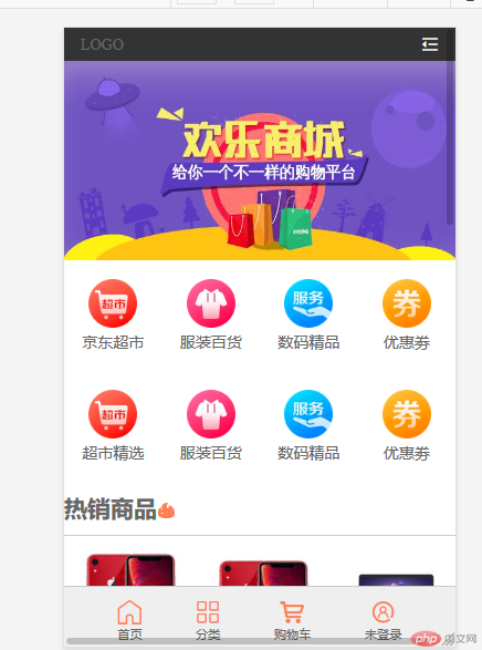
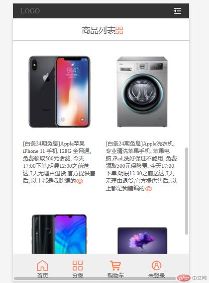
注:以上主要代码都在代码块重做了注释,请详细阅读代码,以上移动端布局示例都是采用flex弹性布局来做的。
1.请结合图中代码亲自动手试一下效果,用到的技术:阿里云字体图标的引用,flex弹性布局,css其他样式属性
2.以上两个示例只是大部分网站通用的格式,可根据自己的想法进行修改和重新布局

Copyright 2014-2025 https://www.php.cn/ All Rights Reserved | php.cn | 湘ICP备2023035733号


