


 收藏
收藏


 天蓬老师
天蓬老师批改状态:合格
老师批语:flexbox布局, 仔细想一下, 是不是超级简单呢

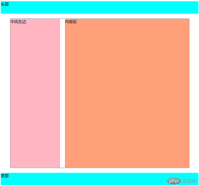
<!DOCTYPE html><html lang="zh-cn"><head><meta charset="UTF-8" /><meta name="viewport" content="width=device-width, initial-scale=1.0" /><title>小刚日志:浮动两列布局</title></head><style>header,footer {width: 100%;height: 50px;background-color: aqua;}.container {width: 720px;/* 浮动元素容器如果不设高度将会塌陷 */min-height: 600px;margin: 20px auto;border: 1px solid lightslategrey;/* 解决高度塌陷 */overflow: hidden;}/* 将中间左边浮动放到容器左边 */.container > aside {width: 200px;/* 高度继承 */min-height: inherit;background-color: lightpink;margin-right: 20px;float: left;}/* 将内容区浮动放到容器右边 */.container > main {width: 500px;height: 600px;background-color: lightsalmon;float: left;/* 也可以用float: right *//* float: right; */}</style><body><header>头部</header><div class="container"><aside>中间左边</aside><main>内容区</main></div><footer>底部</footer></body></html>
<!DOCTYPE html><html lang="zh-cn"><head><meta charset="UTF-8" /><meta name="viewport" content="width=device-width, initial-scale=1.0" /><title>小刚日志:定位两列布局</title></head><style>header,footer {width: 100%;height: 50px;background-color: aqua;}/* 将容器设置为相对定位,使子元素可以以容器为定位依据 */.container {width: 720px;min-height: 600px;margin: 20px auto;border: 1px solid lightslategrey;position: relative;}/* 将中间左边相对于容器的左上角顶点位置放到容器左边 */.container > aside {width: 200px;min-height: 600px;background-color: lightpink;margin-right: 20px;position: absolute;/* 为0的定位可以不写 *//* top: 0; *//* left: 0; */}/* 将内容区相对于容器右上角顶点位置放到容器右边 */.container > main {width: 500px;min-height: 600px;background-color: lightsalmon;position: absolute;/* top: 0; *//* right: 0; *//* 也可以用left将左侧区域宽度留出来 */left: 220px;}</style><body><header>头部</header><div class="container"><aside>中间左边</aside><main>内容区</main></div><footer>底部</footer></body></html>
两列布局运行效果
<!DOCTYPE html><html lang="zh-cn"><head><meta charset="UTF-8" /><meta name="viewport" content="width=device-width, initial-scale=1.0" /><title>小刚日志:内容排版布局</title></head><style>* {padding: 0;margin: 0;box-sizing: content-box;}/* 根元素html */:root {font-size: 16px;color: navy;}div {width: 40rem;padding: 1rem;margin: 50px auto;border: 2px solid lightslategrey;/* 分列显示 *//* 分4列 */column-count: 4;/* 每列宽度200px */column-width: 200px;/* 分割条,可以选择样式 */column-rule-style: groove;column-rule-color: maroon;/* 可以简写成与边框相似属性值 */column-rule: 2px solid mediumvioletred;}</style><body><div>今天下午,在北京市新型冠状病毒肺炎疫情防控工作第129场新闻发布会上,市疾控中心副主任庞星火通报了6月21日7例确诊患者的活动轨迹,以及补充通报了20日5例确诊患者的活动轨迹。北京日报(ID:Beijing_Daily)记者梳理发现,这12名确诊病例中,有多名患者主要活动轨迹既无新发地直接接触史,又非确诊病例密接者。据通报,6月21日海淀区田村路街道新增的病例5、病例6是一对夫妻,两人活动轨迹中均无新发地。病例5,女,47岁,河北人,住海淀区田村路街道玉海园一里,工作单位为天客隆超市永定路店。6月12日曾到过永定路70号院,15日,超市二层停业,患者居家无外出。17日,9时到永定路二街坊的库房清卖鸡蛋未进入社区,随后,到超市发三街坊便民店购买水果和蔬菜,18日、19日,患者自述无外出。20日,与丈夫到航天中心医院发热门诊咨询,21日确诊。病例6,男,48岁,河北人,住海淀区田村路街道玉海园一里,为病例5丈夫,曾于6日至11日到锦绣大地批发货物,14日,患者做核酸检测,15日取核酸检测结果,检测结果为阴性。之后返回家中,未再外出。16日患者开车去航天桥科技大厦物业餐厅送货物,17日至锦绣大地进货,18日至航天桥科技大厦物业餐厅送货、去西城区金融大厦地下一层物业餐厅,19日患者自述未外出。20日与妻子到航天中心医院发热门诊咨询,21日确诊。值得注意的是,永定路街道永定路70号院,此前曾出现过确诊病例。此外,补充通报的6月20日确诊5例病例中,病例4和病例5活动轨迹中也无新发地,但二人先后均到过凯德MALL大峡谷店。</div></body></html>
运行效果
<!DOCTYPE html><html lang="zh-cn"><head><meta charset="UTF-8" /><meta name="viewport" content="width=device-width, initial-scale=1.0" /><title>列排版布局(不适合布局)</title></head><style>header,footer {height: 50px;background-color: aqua;}div {width: 700px;min-height: 600px;margin: 10px auto;background-color: lightseagreen;/* 分列显示 */column-count: 3;/* 每列宽度200px *//* column-width: 200px; */}div > aside {/* 这种方式布局不能设置宽度 *//* width: 200px; */min-height: 600px;background-color: limegreen;}div > main {/* width: 500px; */min-height: 600px;background-color: lightcoral;/* 使内容区跨2列,需要设置高度*2 */column-span: 2;min-height: 1200px;}</style><body><header>头部</header><div class="container"><aside>中间左边</aside><main>内容区</main></div><footer>底部</footer></body></html>
运行效果

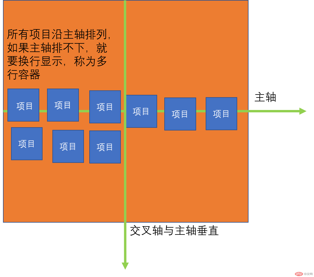
要使用弹性盒子布局,必须先将元素容器设置为弹性容器;
在CSS样式属性中设置:display: flex; ;
转为弹性盒子的元素,都是“行内块”;
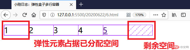
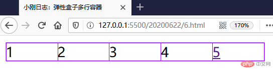
<!DOCTYPE html><html lang="zh-cn"><head><meta charset="UTF-8" /><meta name="viewport" content="width=device-width, initial-scale=1.0" /><title>小刚日志:弹性盒子单行容器</title></head><style>.container {width: 300px;/* 将容器转为弹性容器,内部子元素自动成为弹性项目 */display: flex;}.container > .item {/* 设置宽高后没有占满的位置是剩余空间,占据的地方是已分配空间 */width: 50px;height: 30px;/* 弹性容器内部元素都是“行内块” *//* 使弹性盒子内容占满容器 *//* flex: auto; *//* 如果项目宽高超过了容器宽高,会将项目收缩,将收缩的空间平分给项目 */width: 100px;/* 如果不想让项目自动收缩,就要使用多行容器,下个案例来说明 */}</style><body><div class="container"><div class="item">1</div><div class="item">2</div><div class="item">3</div><span class="item">4</span><a href="" class="item">5</a></div></body></html>
设置之后页面上的元素可以用 火狐浏览器 查看:
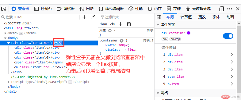
点击之后网页元素会显示结构:
<style>.container {width: 300px;/* 将容器转为弹性容器,内部子元素自动成为弹性项目 */display: flex;}.container > .item {/* 设置100px后总宽度500px大于父容器300px *//* 如果项目宽高超过了容器宽高,会将项目收缩,将收缩的空间平分给项目 */width: 100px;}</style><body><div class="container"><div class="item">1</div><div class="item">2</div><div class="item">3</div><span class="item">4</span><a href="" class="item">5</a></div></body>
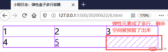
要让弹性容器中的元素不压缩,就需要在 .container 容器中加入:
flex-wrap: warp;
加入后显示效果:
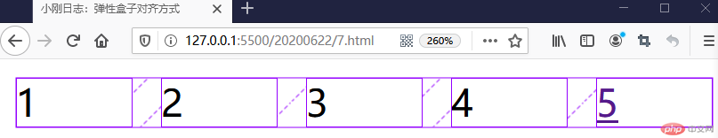
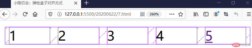
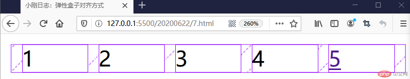
<style>.container {width: 300px;/* 将容器转为弹性容器,内部子元素自动成为弹性项目 */display: flex;/* 设置弹性盒子对齐方式 *//* 内容开始方向开始 */justify-content: flex-start;/* 右对齐 */justify-content: right;/* 内容结束方向开始 */justify-content: end;/* 居中 */justify-content: center;/* 容器剩余空间在项目之间分配,类似两端对齐 */justify-content: space-between;/* 容器剩余空间在项目前后两端分配,项目之间是两端项目前后剩余空间2倍,分散对齐 */justify-content: space-around;/* 容器剩余空间在所有项目之间平均分配,包括第一个项目前端和最后项目后端 */justify-content: space-evenly;}.container > .item {/* 设置宽高后没有占满的位置是剩余空间,占据的地方是已分配空间 */width: 50px;}</style><body><div class="container"><div class="item">1</div><div class="item">2</div><div class="item">3</div><span class="item">4</span><a href="" class="item">5</a></div></body>
justify-content: space-between;
justify-content: space-around;
justify-content: space-evenly;
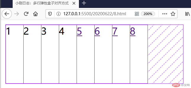
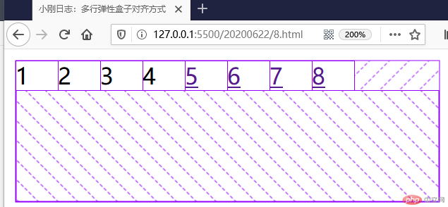
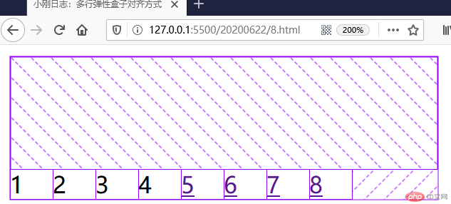
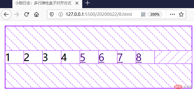
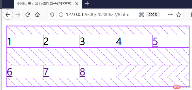
<style>.container {width: 300px;height: 100px;/* 将容器转为弹性容器,内部子元素自动成为弹性项目 */display: flex;/* 设置多行弹性盒子才能使多行对齐属性生效 */flex-wrap: wrap;/* 多行弹性盒子排列方式 *//* 默认值 */align-content: stretch;/* 属性值与单行对齐方式类似 */align-content: flex-start;align-content: flex-end;align-content: center;align-content: space-between;align-content: space-around;align-content: space-evenly;}.container > .item {/* 设置宽高后没有占满的位置是剩余空间,占据的地方是已分配空间 */width: 60px;}</style><body><div class="container"><div class="item">1</div><div class="item">2</div><div class="item">3</div><span class="item">4</span><a href="" class="item">5</a><a href="" class="item">6</a><a href="" class="item">7</a><a href="" class="item">8</a></div></body>
align-content: stretch;
align-content: flex-start;
align-content: flex-end;
align-content: center;
align-content: space-between;

align-content: space-around;
align-content: space-evenly;

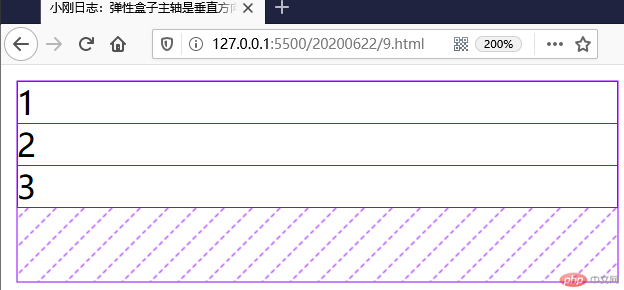
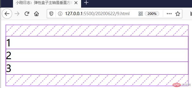
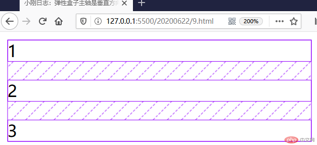
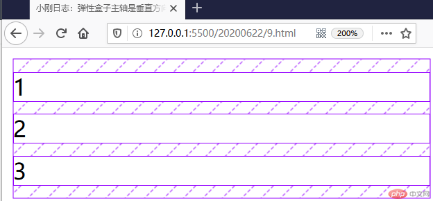
flex-direction: column;
<style>.container {width: 300px;height: 100px;/* 将容器转为弹性容器,内部子元素自动成为弹性项目 */display: flex;/* 默认是行方向 */flex-direction: row;/* 将主轴方向改为列方向 */flex-direction: column;/* 项目对齐方式 *//* 内容开始方向开始 */justify-content: flex-start;/* 右对齐 */justify-content: right;/* 内容结束方向开始 */justify-content: end;/* 居中 */justify-content: center;/* 容器剩余空间在项目之间分配,类似两端对齐 */justify-content: space-between;/* 容器剩余空间在项目前后两端分配,项目之间是两端项目前后剩余空间2倍,分散对齐 */justify-content: space-around;/* 容器剩余空间在所有项目之间平均分配,包括第一个项目前端和最后项目后端 */justify-content: space-evenly;}/* .container > .item {} */</style><body><div class="container"><div class="item">1</div><div class="item">2</div><div class="item">3</div></div></body>
justify-content: flex-start;
justify-content: end;

justify-content: center;
justify-content: space-between;
justify-content: space-around;

justify-content: space-evenly;
<style>.container {width: 300px;height: 200px;/* 将容器转为弹性容器,内部子元素自动成为弹性项目 */display: flex;/* 项目在交叉轴上是默认自动伸缩的 */align-items: stretch;align-items: flex-start;align-items: flex-end;align-items: center;}.container > .item {width: 60px;}</style><body><div class="container"><div class="item">1</div><div class="item">2</div><div class="item">3</div></div></body>
flex-flow: column nowrap
…
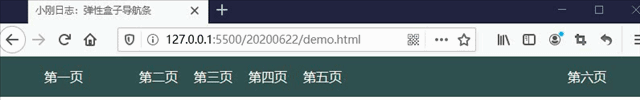
<!DOCTYPE html><html lang="en"><head><meta charset="UTF-8" /><meta name="viewport" content="width=device-width, initial-scale=1.0" /><title>小刚日志:弹性盒子导航条</title></head><style>/* 初始化元素,去掉边距 */* {padding: 0;margin: 0;box-sizing: border-box;}nav {height: 50px;padding: 0 50px;background-color: darkslategrey;/* 弹性容器 */display: flex;}nav > a {height: inherit;line-height: 50px;color: floralwhite;text-decoration: none;padding: 0 10px;}/* 第一个项目右边距 */nav > a:first-of-type {margin-right: 50px;}/* 将最后一个项目右对齐 */nav > a:last-of-type {margin-left: auto;}nav > a:hover {color: lightgreen;background-color: lightcoral;}</style><body><nav><a href="" class="item">第一页</a><a href="" class="item">第二页</a><a href="" class="item">第三页</a><a href="" class="item">第四页</a><a href="" class="item">第五页</a><a href="" class="item">第六页</a></nav></body></html>
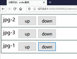
<!DOCTYPE html><html lang="zh-cn"><head><meta charset="UTF-8" /><meta name="viewport" content="width=device-width, initial-scale=1.0" /><title>小刚日志:order案例</title></head><style>.container {border: 1px solid darkslategrey;display: flex;flex-direction: column;}.container > .item {font-size: 26px;padding: 10px;border: 1px solid darkslategray;display: flex;/* 需要定位父级才能移动 */position: relative;}.container > .item > div {display: flex;}.container > .item > div > button {width: 100px;height: 50px;font-size: 1.5rem;margin-left: 10px;}</style><body><div class="container"><div class="item">jpg-1 <div><button onclick="up(this)">up</button><button onclick="down(this)">down</button></div></div><div class="item">jpg-2 <div><button onclick="up(this)">up</button><button onclick="down(this)">down</button></div></div><div class="item">jpg-3 <div><button onclick="up(this)">up</button><button onclick="down(this)">down</button></div></div></div></body><script>let up = (ele) => (ele.offsetParent.style.order -= 1);let down = (ele) => (ele.offsetParent.style.order += 1);</script></html>

Copyright 2014-2025 https://www.php.cn/ All Rights Reserved | php.cn | 湘ICP备2023035733号


