


 收藏
收藏


 天蓬老师
天蓬老师批改状态:合格
老师批语:在实战中去理解每一个属性, 以及每一个取值的作用

| NO | 属性 | 释义 | 属性值 |
|---|---|---|---|
| A | flex-direction | 定义主轴(项目排列)的方向 | 1.row(默认值)主轴水平方向起点在左边;2.row-reverse:主轴水平方向起点在右端。3.column:主轴垂直方向,起点在上沿,4.column-reverse:主轴垂直方向,起点在下沿 |
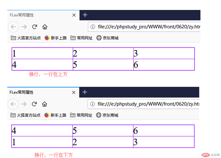
| B | flex-wrap | 规定一条轴线排不下如何换行 | 1.nowrap(默认)不换行;2.wrap:换行,第一行在上方;3.wrap-reverse:换行第一行在下方 |
| C | flex-flow | 是flex-direction属性和flex-wrap属性的简写形式,默认值为row/nowrap | |
| D | justify-content | 定义项目在主轴上的对齐方式 | 1.flex-start(默认值)左对齐;2.flex-end右对齐;3.center居中;4.space-between:两端对齐,项目之间的间隔相等。5.space-around:各个项目两侧的间隔相等。所以项目之间的间隔比项目与边框间隔大一倍;6.space-evenly:平均分配 |
| E | align-items | 定义flex子项在flex容器的当前行的侧轴(交叉轴)方向上的对齐方式 | 1.flex-start:交叉轴起点对齐;2.flex-end:交叉轴终点对齐;3.center:与交叉轴的中点对齐;4.baseline 项目的第一行文字的基线对齐;5.stretch(默认值) 如果项目未设置高或设为auto,将占满整个容器的高度 |
| F | align-content | 设置多行容器的项目排列(垂直) | 1.flex-start:2.fles-end;3.center;4.space-between 与交叉轴两端对齐,轴线之间的间隔平均分布;5.space-around 每根轴线两侧的间隔都相等,所以轴线之间的间隔比轴线与边框的间隔大一倍;6.stretch(默认值) 轴线占满整个交叉轴 |
<style>.container {width: 300px;/* 如果这个容器的内容要使用flexbox布局:首先必须将这个容器转为弹性盒子 */display: flex;/* 默认值 水平方向从左边显示 */flex-direction: row;/* 水平方向从右边开始显示 */flex-direction: row-reverse;/* 切换为主轴为垂直方向显示起来在上沿*/flex-direction: column;/* 下沿显示 */flex-direction: column-reverse;}</style></head><body><div class="container"><div class="item">1</div><div class="item">2</div><div class="item">3</div><div class="item">4</div><div class="item">5</div><div class="item">6</div></div></body>

.container {width: 300px;/* 如果这个容器的内容要使用flexbox布局:首先必须将这个容器转为弹性盒子 */display: flex;/* 定义换行 */flex-wrap: wrap;/* 第一行在下方 */flex-wrap: wrap-reverse;}.container > .item {width: 100px;}</style></head><body><div class="container"><div class="item">1</div><div class="item">2</div><div class="item">3</div><div class="item">4</div><div class="item">5</div><div class="item">6</div></div></body>
.container {width: 300px;display: flex;/* 主轴:从右开始水平排列,并换行且第一行在下方 */flex-flow: column-reverse wrap-reverse;}.container > .item {width: 100px;}</style></head><body><div class="container"><div class="item">1</div><div class="item">2</div><div class="item">3</div><div class="item">4</div><div class="item">5</div><div class="item">6</div></div></body></html>

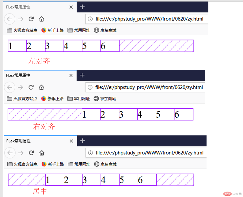
4.justify-content:定义项目在主轴上的对齐方式:本质就是剩余空间的分配{项目两边(全部项目看做整体)和项目之间(将项目视为一个个整体)}
项目两边(全部项目看做整体)
.container {width: 300px;/* 转为弹性盒子 */display: flex;/* 主轴水平从左侧 换行(此处不换行是因为 .item总宽度<父元素宽度)不用换行*/flex-flow: row wrap;/* 左对齐 */justify-content: flex-start;/* 右对齐 */justify-content: flex-end;/* 居中 */justify-content: center;}.container > .item {width: 30px;}</style></head><body><div class="container"><div class="item">1</div><div class="item">2</div><div class="item">3</div><div class="item">4</div><div class="item">5</div><div class="item">6</div></div></body>
项目之间(将项目视为一个个整体)
/* 两端对齐 */justify-content: space-between;/* 分散对齐 */justify-content: space-around;/* 平均分配 */justify-content: space-evenly;

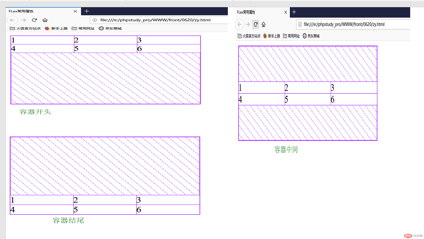
5.align-content:设置多行容器的项目排列(垂直)
.container {width: 300px;height: 150px;display: flex;flex-flow: row wrap;/* 默认占满整个空间 */align-content: stretch;/* 容器开始(左对齐) */align-content: flex-start;/* 容器结束 (右对齐)*/align-content: flex-end;/* 容器中间 (居中)*/align-content: center;/* 两端对齐 */align-content: space-between;/* 分散对齐 */align-content: space-around;/* 平均分配 */align-content: space-evenly;}.container > .item {width: 100px;}</style></head><body><div class="container"><div class="item">1</div><div class="item">2</div><div class="item">3</div><div class="item">4</div><div class="item">5</div><div class="item">6</div></div></body>

6.align-items:定义flex子项在flex容器的当前行的侧轴(交叉轴)方向上的对齐方式
.container {width: 300px;height: 80px;display: flex;/* 项目在交叉轴上默认是自动伸缩的父容器高度200,项目默认也是200*/align-items: stretch;/* 容器开头 注意这是在交叉轴*/align-items: flex-start;/* 容器结尾 注意这是在交叉轴*/align-items: flex-end;/* 容器中间 注意这是在交叉轴*/align-items: center;/* 元素位于容器的基线上注意这是在交叉轴 */align-items: baseline;}.container > .item {widows: 30px;}</style></head><body><div class="container"><div class="item">1</div><div class="item">2</div><div class="item">3</div><div class="item">4</div><div class="item">5</div><div class="item">6</div></div></body>

<!DOCTYPE html><html lang="en"><head><meta charset="UTF-8" /><meta name="viewport" content="width=device-width, initial-scale=1.0" /><title>导航条实战:FLEX</title><style>* {margin: 0;padding: 0;box-sizing: border-box;}a {text-decoration: none;color: #cccccc;}header nav {background-color: cadetblue;height: 40px;padding: 0 100px;display: flex;}nav a {/* 继承父级高度 */height: inherit;line-height: 40px;padding: 0 20px;}nav a:hover {color: coral;background-color: cornsilk;}nav a:last-of-type {margin-left: auto;}</style></head><body><header><nav><a href="">首页</a><a href="">视频教程</a><a href="">入门教程</a><a href="">视频问答</a><a href="">技术文章</a><a href="">PHP培训</a></nav></header></body></html>

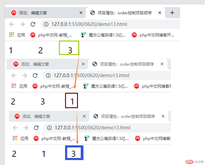
<style>.container {width: 300px;display: flex;}.container > .item {width: 60px;}.container > .item:first-of-type {/* order:默认为零,谁大谁往后挪 */order: 3;}.container > .item:last-of-type {order: 5;}</style></head><body><div class="container"><div class="item">1</div><div class="item">2</div><div class="item">3</div></div></body>

Copyright 2014-2025 https://www.php.cn/ All Rights Reserved | php.cn | 湘ICP备2023035733号


