


 收藏
收藏


 天蓬老师
天蓬老师批改状态:合格
老师批语:符号引入, 没有试试看吗?第三种引入方式,也很有意思,非常简单, 有空试试
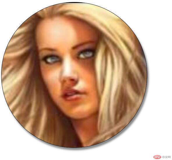
<!DOCTYPE html><html lang="en"><head><meta charset="UTF-8" /><meta name="viewport" content="width=device-width, initial-scale=1.0" /><title>背景</title><style>.box {width: 500px;height: 500px;border: 1px solid black;/* 背景色 */background-color: lightgoldenrodyellow;/* padding: 20px; *//* 控制背景的覆盖范围限制在内容区,裁切 */background-color: border-box;background-color: content-box;/* 渐变 *//* 从上到下 */background: linear-gradient(red, yellow);/* 45度 */background: linear-gradient(45deg, red, yellow);/* 从右到左 */background: linear-gradient(to right, red, yellow);/* 从左到右的;四色渐变 */background: linear-gradient(to left, red, yellow, white, yellow);/* 背景图片 */background-image: url(girl.jpg);/* 背景不重复 */background-repeat: no-repeat;/* 滚动条 *//* background-attachment: fixed; *//* 背景定位:位置 *//* background-position: 80px 70px; *//* 当使用关键字的时候,顺序没有关系。如:left 等,只写一个时,第二个默认为center *//* background-position: right center; *//* 使用百分比的时候只有一个参数的时候,第二个也默认50% *//* background-position: 50% 20%; *//* 把图像图像扩展至最大尺寸,以使宽度和高度完全适应内容区域。 */background-size: contain;/* 把背景图像扩展至足够大,以使背景图像完全覆盖背景区域。背景图像的某些部分也许无法显示在背景定位区域中。 */background-size: cover;/* 简写 */background: url(girl.jpg) cover;/* 加阴影 */box-shadow: 5px 8px 6px #888;/* 圆角 */border-radius: 250px;}</style></head><body><div class="box"></div></body></html>
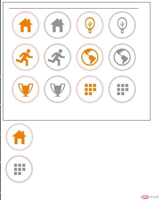
<!DOCTYPE html><html lang="en"><head><meta charset="UTF-8" /><meta name="viewport" content="width=device-width, initial-scale=1.0" /><title>背景实战:精灵图/雪碧图</title><style>.box1 {width: 500px;height: 400px;border: 1px solid #000;background-image: url("001.png");background-repeat: no-repeat;background-position: 20px 20px;}.box2 {/* 取灰色房子图标 宽和高需要设置为图标大小*/width: 110px;height: 110px;background-image: url("001.png");background-repeat: no-repeat;/* 设置x轴110px y轴为0 */background-position: -110px -1px;}.box2:hover {/* 取灰色房子图标 宽和高需要设置为图标大小*/width: 110px;height: 110px;background-image: url("001.png");background-repeat: no-repeat;/* 设置x轴110px y轴为0 */background-position: 0px -1px;}.box3 {/* 取橘黄色地球图标 宽和高需要设置为图标大小*/width: 110px;height: 110px;background-image: url("001.png");background-repeat: no-repeat;/* 设置x轴-220px y轴为-110 */background-position: -330px -220px;}.box3:hover {/* 取橘黄色地球图标 宽和高需要设置为图标大小*/width: 110px;height: 110px;background-image: url("001.png");background-repeat: no-repeat;/* 设置x轴-220px y轴为-110 */background-position: -220px -220px;}</style></head><body><div class="box1"></div><div class="box2"></div><div class="box3"></div></body></html>
<!DOCTYPE html><html lang="en"><head><meta charset="UTF-8" /><meta name="viewport" content="width=device-width, initial-scale=1.0" /><link rel="stylesheet" href="font/iconfont.css" /><title>阿里字体图标的使用方法1-font-class 引用</title><style>.ico {font-size: 80px;color: brown;}</style></head><body><span class="iconfont icon-taobao ico"></span></body></html>
deom4.html
<!DOCTYPE html><html lang="en"><head><meta charset="UTF-8" /><meta name="viewport" content="width=device-width, initial-scale=1.0" /><link rel="stylesheet" href="css.css" /><title>阿里字体图标的使用方法2-Unicode 引用</title><style>.ico {font-size: 50px;color: chartreuse;}</style></head><body><span class="iconfont ico"></span></body></html>
css.css
@font-face {font-family: "iconfont";src: url("font/iconfont.eot");src: url("font/iconfont.eot?#iefix") format("embedded-opentype"),url("font/iconfont.woff2") format("woff2"),url("font/iconfont.woff") format("woff"),url("font/iconfont.ttf") format("truetype"),url("font/iconfont.svg#iconfont") format("svg");}.iconfont {font-family: "iconfont" !important;font-size: 16px;font-style: normal;-webkit-font-smoothing: antialiased;-moz-osx-font-smoothing: grayscale;}

Copyright 2014-2025 https://www.php.cn/ All Rights Reserved | php.cn | 湘ICP备2023035733号


