


 收藏
收藏


 天蓬老师
天蓬老师批改状态:合格
老师批语:示意图做得不错

特点:
使用css中的float属性使html块元素脱离文档流,实现元素的左右位置改变,受父元素padding影响无法贴住边框。行内元素无法直接浮动。弊端:
html元素脱离文档流后对文档流中位置后面的元素造成一系列影响,谨慎使用。
<!DOCTYPE html><html lang="zh-cn"><head><meta charset="UTF-8" /><meta name="viewport" content="width=device-width, initial-scale=1.0" /><title>小刚的日志:元素浮动</title></head><style>.container1 {width: 150px;height: 150px;background-color: lightsteelblue;}.container2 {width: 150px;height: 150px;background-color: lightseagreen;float: left;}.container3 {width: 150px;height: 150px;background-color: lightcoral;}</style><body><div class="container1">盒子1</div><div class="container2">盒子2</div><div class="container3">盒子3</div></body></html>
.container2 未加入 float 属性与加入后的区别
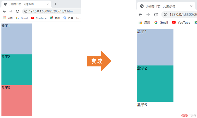
从上图可以看出盒子2脱离了文档流,并使后面还在文档流中的盒子3往前移动了位置,被盒子2覆盖。
如果不想使浮动元素后面的元素受到影响:
在受影响元素css样式中加入 clear: left; , clear: right;
可以简写成 clear: both;
<!DOCTYPE html><html lang="zh-cn"><head><meta charset="UTF-8" /><meta name="viewport" content="width=device-width, initial-scale=1.0" /><title>小刚的日志:元素浮动</title></head><style>.container {border: 2px dashed lightslategray;}.container1 {width: 150px;height: 150px;background-color: lightsteelblue;float: left;}.container2 {width: 150px;height: 150px;background-color: lightseagreen;float: left;}</style><body><div class="container"><div class="container1">盒子1</div><div class="container2">盒子2</div></div></body></html>
在给盒子1与盒子2加入浮动前后
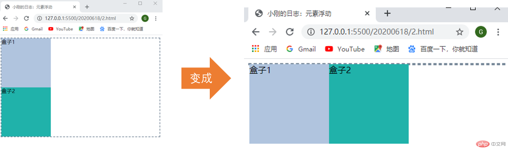
发现父元素div父元素边框变成了直线,说明父元素容器中已经不显示子元素了。
给父元素添加宽高;
让父元素浮动;
在浮动元素后面添加一个空元素,css属性设置 clear: both ;
由于新加了一个元素这种方式会影响页面dom结构;
在浮动元素后面添加一个伪元素,使用 ::before ::after ;
在父元素样式中加入 overflow: hidden; 或 overflow: auto; ,块级格式化上下文;
一般我们使用第5种方式。
前面的代码就变成了:
<!DOCTYPE html><html lang="zh-cn"><head><meta charset="UTF-8" /><meta name="viewport" content="width=device-width, initial-scale=1.0" /><title>小刚的日志:元素塌陷</title></head><style>.container {border: 2px dashed lightslategray;}.container1 {width: 150px;height: 150px;background-color: lightsteelblue;float: left;}.container2 {width: 150px;height: 150px;background-color: lightseagreen;float: left;}.container {overflow: hidden;overflow: auto;}</style><body><div class="container"><div class="container1">盒子1</div><div class="container2">盒子2</div></div></body></html>
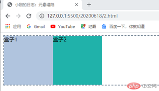
运行效果:
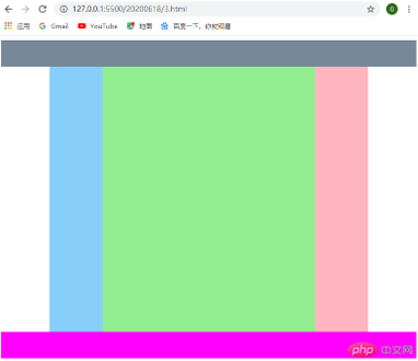
<!DOCTYPE html><html lang="zh-cn"><head><meta charset="UTF-8" /><meta name="viewport" content="width=device-width, initial-scale=1.0" /><title>小刚日志:绝对定位布局</title></head><style>.header {width: 100%;height: 50px;background-color: lightslategray;}.bodybox {width: 600px;height: 500px;margin: 0 auto;background-color: lightyellow;position: relative;}.bodybox > .bodyleft {width: 100px;height: 500px;background-color: lightskyblue;position: absolute;top: 0;left: 0;}.bodybox > .bodymain {width: 400px;height: 500px;background-color: lightgreen;position: absolute;top: 0;left: 100px;}.bodybox > .bodyright {width: 100px;height: 500px;background-color: lightpink;position: absolute;top: 0;right: 0;}.footer {width: 100%;height: 50px;background-color: magenta;}</style><body><div class="header"></div><div class="bodybox"><div class="bodyleft"></div><div class="bodymain"></div><div class="bodyright"></div></div><div class="footer"></div></body></html>
<!DOCTYPE html><html lang="zh-cn"><head><meta charset="UTF-8" /><meta name="viewport" content="width=device-width, initial-scale=1.0" /><title>小刚日志:浮动布局</title></head><style>.header {width: 100%;height: 50px;background-color: lightslategray;}.bodybox {width: 600px;margin: 0 auto;background-color: lightyellow;overflow: hidden;}.bodybox > .bodyleft {width: 100px;height: 500px;background-color: lightskyblue;float: left;}.bodybox > .bodymain {width: 400px;height: 500px;background-color: lightgreen;float: left;}.bodybox > .bodyright {width: 100px;height: 500px;background-color: lightpink;float: right;}.footer {width: 100%;height: 50px;background-color: magenta;}</style><body><div class="header"></div><div class="bodybox"><div class="bodyleft"></div><div class="bodymain"></div><div class="bodyright"></div></div><div class="footer"></div></body></html>
<!DOCTYPE html><html lang="zh-cn"><head><meta charset="UTF-8" /><meta name="viewport" content="width=device-width, initial-scale=1.0" /><title>小刚日志:圣杯布局</title></head><style>.header {min-width: 700px;height: 50px;background-color: lightslategray;}.bodybox {min-width: 300px;border: 2px dashed black;padding: 0 200px;overflow: hidden;}.bodybox > * {min-height: 500px;float: left;}.bodybox > .bodyleft {width: 200px;margin-left: -100%;background-color: limegreen;position: relative;top: 0;left: -200px;}.bodybox > .bodymain {width: 100%;background-color: gainsboro;}.bodybox > .bodyright {width: 200px;margin-right: -200px;background-color: lightseagreen;}.footer {min-width: 700px;height: 50px;background-color: magenta;}</style><body><div class="header">头部</div><div class="bodybox"><div class="bodymain">中间</div><div class="bodyleft">左边</div><div class="bodyright">右边</div></div><div class="footer">底部</div></body></html>
浮动改变元素位置使用 clear: both; 修复;
高度塌陷使用 over: hidden; 修复;
网页布局最好是以 display: grid; 布局实现;
浮动与定位不能同时使用在一个元素上。

Copyright 2014-2025 https://www.php.cn/ All Rights Reserved | php.cn | 湘ICP备2023035733号


