


 收藏
收藏


 WJ
WJ批改状态:合格
老师批语:写的非常不错,很认真仔细!继续加油!

<style>div{width:400px;height:400px;border:1px solid #000;padding:20px;}</style></head><body><div></div></body>

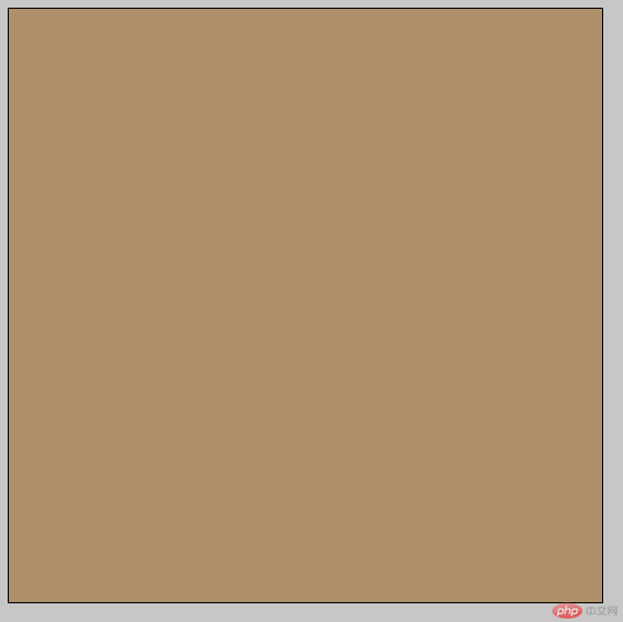
div{width:400px;height:400px;border:1px solid #000;padding:20px;background-color:burlywood;/* 设置背景颜色 */}
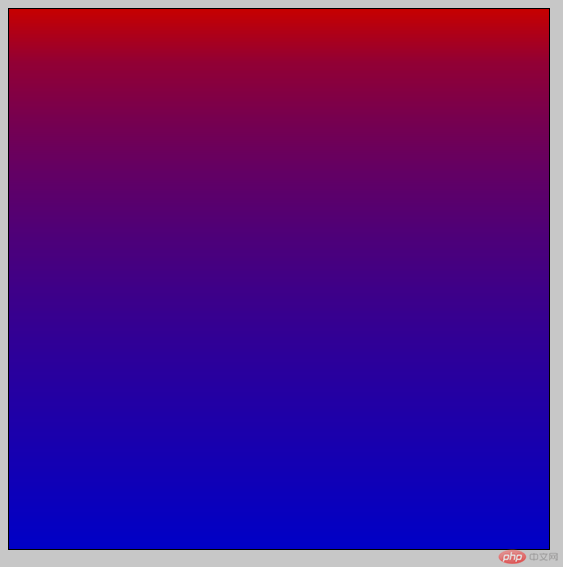
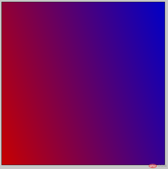
background: linear-gradient(red, 30%, blue); /* 基础线性渐变 *//*默认情况下,渐变会平滑地从一种颜色过渡到另一种颜色。你可以通过设置一个值来将渐变的中心点移动到指定位置*/
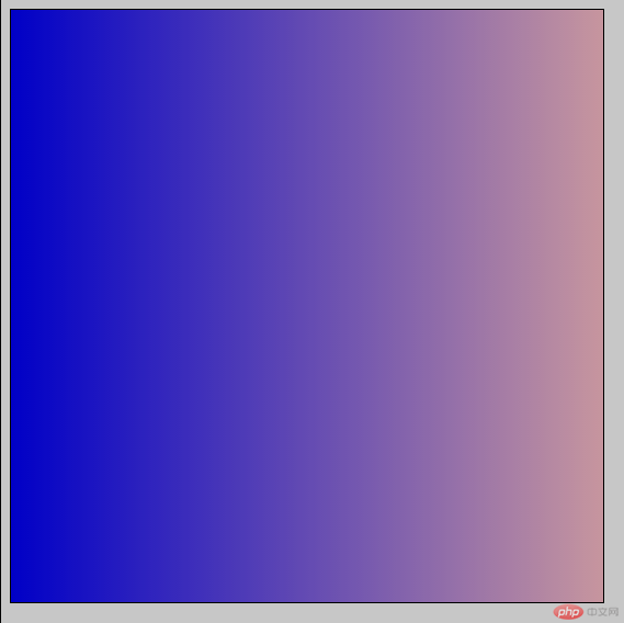
background: linear-gradient(to right, blue, pink); /* 向右渐变 *//*默认情况下,默认情况下,线性渐变的方向是从上到下, 你可以指定一个值来改变渐变的方向*/
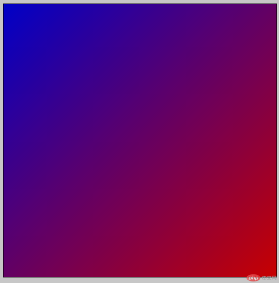
background: linear-gradient(to bottom right, blue, red); /* 向右下角渐变 *//*设置渐变方向为从一个对角到另一个对角。*/
background: linear-gradient(70deg, red, blue); /* 70°方向渐变 *//*如果想要更精确地控制渐变的方向,你可以给渐变设置一个具体的角度*//*在使用角度的时候, 0deg 代表渐变方向为从下到上, 90deg 代表渐变方向为从左到右,正角度都属于顺时针方向,负角度意味着逆时针方向。*/
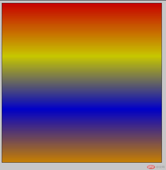
background: linear-gradient(red, yellow, blue, orange); /* 多颜色渐变 *//*默认情况下,所设置颜色会均匀分布在渐变路径中。*/
<style>div {width: 500px;height: 500px;padding: 20px;border: 1px solid #000; /* 设置边框 */background-image: url(laohu.jpg);/*设置背景图片*/}</style></head><body><div></div></body>
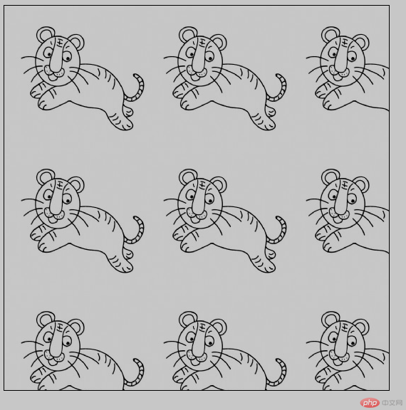
background-repeat: no-repeat;/*图片不重复显示*/
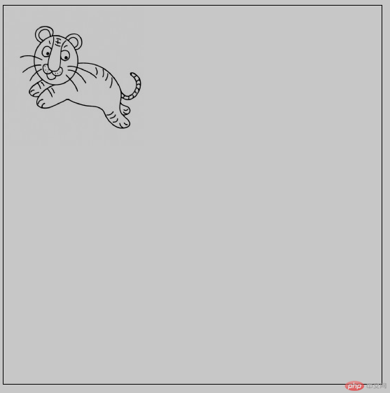
background-position: left center;/*向左居中显示*/
background-position: 50% 50%;/*居中显示*/
background-size: 100%;/*百分百大小显示*/
<style>div {width: 500px;height: 500px;padding: 20px;border: 1px solid #000; /* 设置边框 */box-shadow: 5px 10px 5px #888888;/*右阴影,下阴影 模糊 阴影颜色*/}</style></head><body><div></div></body>
box-shadow: 0px 0px 5px #888888;
border-radius: 50%;
减少http请求, 加快网页的加载速度, 提高用户体验减少图片的体积, 减少字节数解决设计师图片命名的烦恼更换风格方便
开发时需要测量, 比较繁琐维护的时候麻烦精灵图不能随意改变大小和位置宽屏高分辨率的屏幕下, 容易出现背景断裂
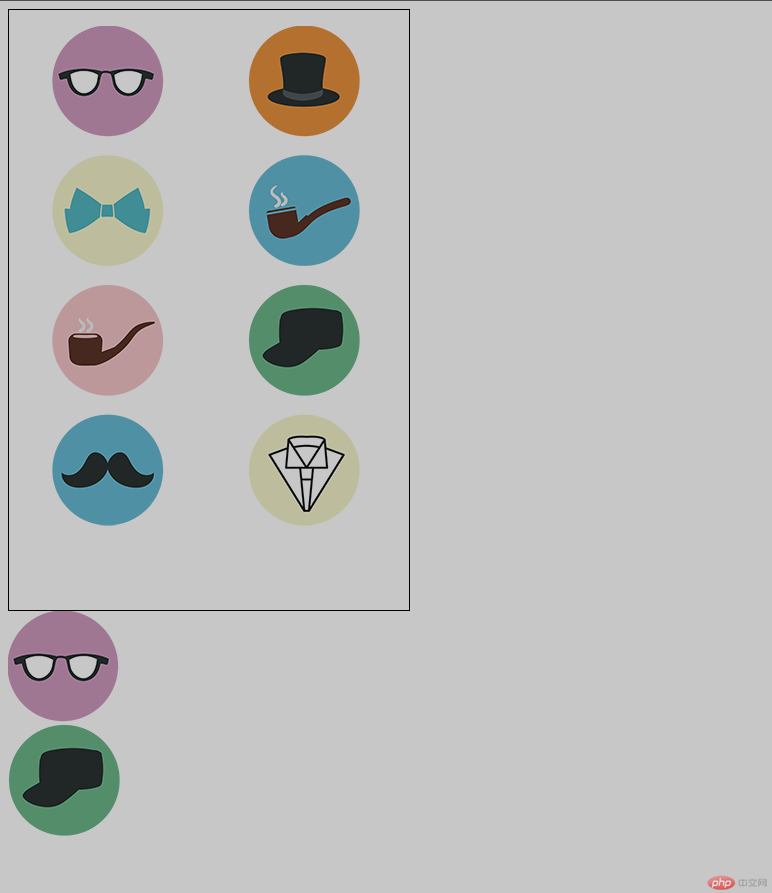
<style>.div1 {width: 400px;height: 600px;border: 1px solid #000;background: url(tb.png) no-repeat;background-position: -128 -44;}.div2 {width: 113px;height: 113px;background: url(tb.png) no-repeat;background-position: -44px -16px;}.div3 {width: 113px;height: 113px;background: url(tb.png) no-repeat;background-position: -239px -274px;}</style></head><body><div class="div1"></div><div class="div2"></div><div class="div3"></div></body>
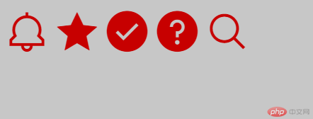
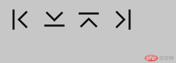
<link rel="stylesheet" href="font/iconfont.css" /><style>.zt1 {font-size: 66px;color: red;}</style></head><body><span class="iconfont notification icon-icon-test4 zt1"></span><span class="iconfont star_filled icon-icon-test19 zt1"></span><span class="iconfont check_filled icon-icon-test9 zt1"></span><span class="iconfont help_filled icon-icon-test14 zt1"></span><span class="iconfont search icon-icon-test2 zt1"></span></body>
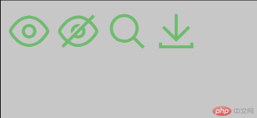
<style>@font-face {font-family: "iconfont";src: url("font/iconfont.eot");src: url("font/iconfont.eot?#iefix") format("embedded-opentype"),url("font/iconfont.woff2") format("woff2"),url("font/iconfont.woff") format("woff"),url("font/iconfont.ttf") format("truetype"),url("font/iconfont.svg#iconfont") format("svg");}.iconfont {font-family: "iconfont" !important;font-size: 66px;color: lightgreen;font-style: normal;-webkit-font-smoothing: antialiased;-moz-osx-font-smoothing: grayscale;}</style></head><body><span class="iconfont"></span><span class="iconfont"></span><span class="iconfont"></span><span class="iconfont"></span></body>
<script src="font/iconfont.js"></script><style>.icon {width: 66px;height: 66px;vertical-align: -0.15em;fill: currentColor;overflow: hidden;}</style></head><body><svg class="icon" aria-hidden="true"><use xlink:href="#icon-icon-test24"></use></svg><svg class="icon" aria-hidden="true"><use xlink:href="#icon-icon-test25"></use></svg><svg class="icon" aria-hidden="true"><use xlink:href="#icon-icon-test26"></use></svg><svg class="icon" aria-hidden="true"><use xlink:href="#icon-icon-test27"></use></svg></body>
background:red; 设置背景颜色background:linear-gradient(red,blue); 设置背景渐变background:linear-gradient(to left,red,blue); 向左渐变background:linear-gradient(to right,red,blue); 向右渐变background:linear-gradient(bottom to right,red,blue); 对角渐变background:linear-gradient(70deg,red,blue); 设置渐变角度background:linear-gradient(red,blue,yellow,pink); 多颜色渐变
background:url(图片路径); 设置背景图片background:url(图片路径) no-rapeat; 设置背景图片不重复显示background-size:100%; 设置背景图片大小为100%显示background-position:left center; 向左居中显示,center可以忽略background-position:right center; 向右居中显示,center可以忽略background-clip:border-box; 背景裁切到边框background-clip:content-box; 背景裁切到内容box-shadow: 0px 0px 5px #888888; 设置阴影border-radius:50%; 设置圆角
精灵图技术产生的目的:
很多大型网页在首次加载的时候都需要加载很多的小图片,而考虑到在同一时间,服务器拥堵的情况下,为了解决这一问题,采用了精灵图这一技术来缓解加载时间过长从而影响用户体验的这个问题。
精灵图技术的本质:
所谓精灵图就是把很多的小图片合并到一张较大的图片里,所以在首次加载页面的时候,就不用加载过多的小图片,只需要加载出来将小图片合并起来的那一张大图片也就是精灵图即可,这样在一定程度上减少了页面的加载速度,也一定程度上缓解了服务器的压力。
精灵图用到的插件:page ruler redux / ps
page ruler redux是一个可以测量任意网页元素并获得尺寸等信息的谷歌浏览器插件。首先要下载安装igg谷歌访问助手,并打开开发者模式在任意浏览器下载好后解压,直接拖拽到谷歌的扩展程序管理器接着打开谷歌商城,搜索page ruler redux并下载安装安装好后如下图
这里需要注意图片的打开方式要加上本地域名
font-class 引用
font-class 是 Unicode 使用方式的一种变种,主要是解决 Unicode 书写不直观,语意不明确的问题。与 Unicode 使用方式相比,具有如下特点:兼容性良好,支持 IE8+,及所有现代浏览器。相比于 Unicode 语意明确,书写更直观。可以很容易分辨这个 icon 是什么。因为使用 class 来定义图标,所以当要替换图标时,只需要修改 class 里面的 Unicode 引用。不过因为本质上还是使用的字体,所以多色图标还是不支持的。
Unicode 引用
Unicode 是字体在网页端最原始的应用方式,特点是:兼容性最好,支持 IE6+,及所有现代浏览器。支持按字体的方式去动态调整图标大小,颜色等等。但是因为是字体,所以不支持多色。只能使用平台里单色的图标,就算项目里有多色图标也会自动去色。
Symbol 引用
这是一种全新的使用方式,应该说这才是未来的主流,也是平台目前推荐的用法。相关介绍可以参考这篇文章 这种用法其实是做了一个 SVG 的集合,与另外两种相比具有如下特点:支持多色图标了,不再受单色限制。通过一些技巧,支持像字体那样,通过 font-size, color 来调整样式。兼容性较差,支持 IE9+,及现代浏览器。浏览器渲染 SVG 的性能一般,还不如 png。

Copyright 2014-2025 https://www.php.cn/ All Rights Reserved | php.cn | 湘ICP备2023035733号


