


 收藏
收藏


 WJ
WJ批改状态:合格
老师批语:写的很不错,格式工整,继续加油!
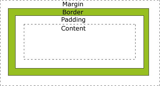
概述:所有 HTML 元素可以看作盒子,CSS 盒模型本质上是一个盒子,封装周围的 HTML 元素,它包括:边距,边框,填充,和实际内容。盒模型允许我们在其它元素和周围元素边框之间的空间放置元素。
下面的图片说明了盒子模型:
针对 padding,margin,border 的每一条边都可以单独设置属性
pading 和 margin 是背景透明的,所以只能设置宽度例如:
padding-top,padding-right,padding-bottom,padding-leftmargin-top,margin-right,margin-bottom,margin-left
border 比较特殊, 除了可以设置宽度, 还可以设置样式和颜色,所以有更多的属性例如:
border-top: 1px solid black
border-right: 1px solid green
border-bottom: 1px solid gray
border-left: 1px solid skyblue
具体示例代码:
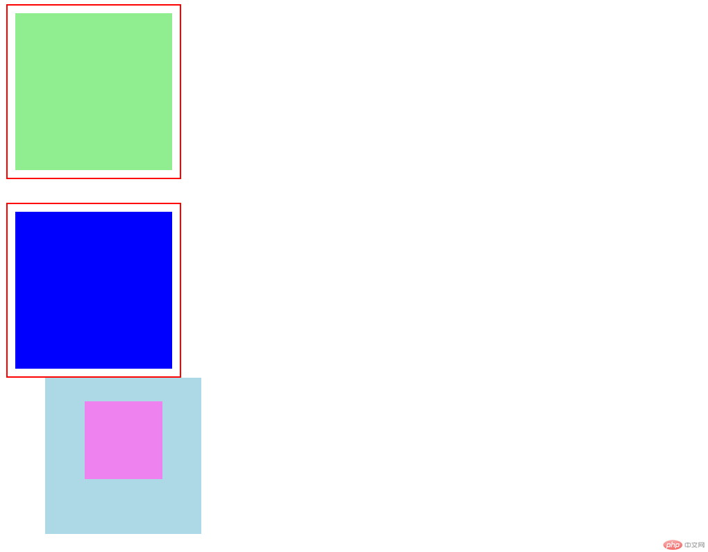
<!DOCTYPE html><html lang="en"><head><meta charset="UTF-8" /><meta name="viewport" content="width=device-width, initial-scale=1.0" /><title>盒/框模型基础</title><style>.box {/* 宽、高:内容区 */width: 200px;height: 200px;}.one {padding: 10px;border: 2px solid red;background-clip: content-box;background-color: lightgreen;/* margin: top right bottom left ; *//* margin: 0 0 20px 0; */margin-bottom: 20px;}.two {padding: 10px;border: 2px solid red;/* 规定背景的绘制区域,默认border-box */background-clip: content-box;background-color: blue;/* 当二个盒子在垂直方向上,外边距会产生折叠 */margin-top: 30px;}.box.parent {background-color: lightblue;/* 一旦一个元素被添加了position,且值非static,那么它就是定位元素 *//* 相对定位是相对自己做了偏移,这个元素在文档流中的位置不释放 */position: relative;left: 50px;}.son {width: 100px;height: 100px;background-color: violet;/* 绝对定位:相对于它的定位父级进行定位 */position: absolute;/* 固定定位:忽略你的定位父级,总是相对于<body>定位 *//* position: fixed; */left: 50px;top: 30px;}</style></head><body><!-- 块级元素默认垂直排列 --><div class="box one"></div><div class="box two"></div><div class="box parent"><div class="son"></div></div></body></html>
效果预览:
box-sizing 属性允许你以某种方式定义某些元素,以适应指定区域,说白了就是重新计算盒大小
| 属性值 | 说明 |
|---|---|
| content-box | 默认值,以内容区为准 |
| border-box | 指定宽度和高度(最小/最大属性)确定元素边框。也就是说,对元素指定宽度和高度包括了 padding 和 border 。通过从已设定的宽度和高度分别减去边框和内边距才能得到内容的宽度和高度。 |
| inherit | 指定 box-sizing 属性的值,应该从父元素继承 |
具体实例代码:
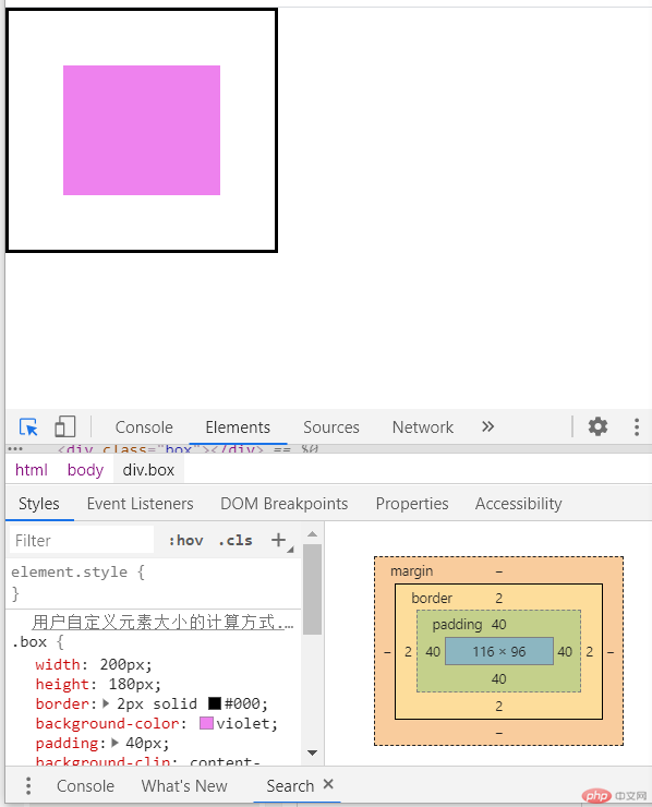
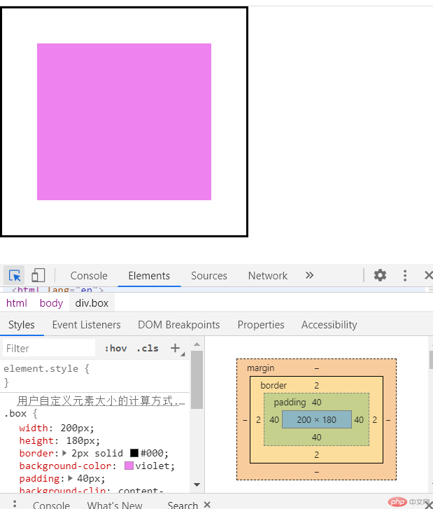
<!DOCTYPE html><html lang="en"><head><meta charset="UTF-8" /><meta name="viewport" content="width=device-width, initial-scale=1.0" /><title>用户自定义元素大小的计算方式</title><style>* {margin: 0;padding: 0;box-sizing: border-box;}.box {width: 200px;height: 180px;border: 2px solid #000;background-color: violet;padding: 40px;background-clip: content-box;/* box-sizing: 重新计算盒大小 *//* content-box: 默认值,以内容区为准 *//* box-sizing: content-box; */box-sizing: border-box;}</style></head><body><div class="box"></div><!-- width: content-width + padding-left/right + border-left/rightheight: 206 --></body></html>
当 box-sizing: border-box;效果预览:
当 box-sizing: content-box;效果预览:
综上可知:盒子实际 width= content-width + padding-left/right + border-left/right ;
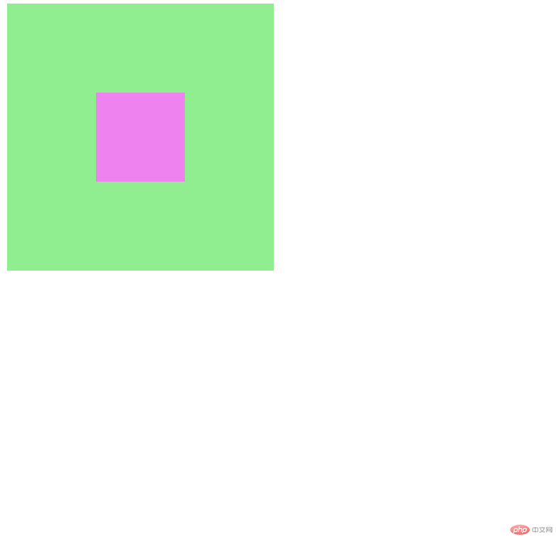
具体步骤看代码注释:
<!DOCTYPE html><html lang="en"><head><meta charset="UTF-8" /><meta name="viewport" content="width=device-width, initial-scale=1.0" /><title>margin:auto: 块元素元素的垂直居中</title><style>.container {width: 300px;height: 300px;background-color: lightgreen;/* 弹性布局 *//* display: flex;justify-content: center;align-items: center; *//* 转为定位元素 */position: relative;}.container .item {width: 100px;height: 100px;background-color: violet;/* 水平居中 *//* text-align: center; *//* 让浏览器自动计算左右外边距 *//* margin-left: auto;margin-right: auto; *//* 垂直居中,默认margin-top/bottom: 0 *//* margin-top: auto;margin-bottom: auto; *//* 通过绝对定位来实现垂直居中 */position: absolute;/* 让当前元素绝对定位的上下文充满整个父级容器 *//* 左上角开始 */top: 0;left: 0;/* 右下角结束 */right: 0;bottom: 0;/* 水平垂直居中 */margin: auto;}</style></head><body><div class="container"><div class="item"></div></div></body></html>
效果预览:

Copyright 2014-2025 https://www.php.cn/ All Rights Reserved | php.cn | 湘ICP备2023035733号


