


 收藏
收藏


批改状态:合格
老师批语:完成的不错
一、并分析内边距对盒中内容的影响,以及解决的三种方案
<!DOCTYPE html>
<html lang="en">
<head>
    <meta charset="UTF-8">
    <title>内边距对盒中内容的影响</title>
    <link rel="stylesheet" href="css/0705style1.css">
</head>
<body>
<!--方法一-->
<div class="box1">
    <img src="images/girl.jpg" alt="girl" >
</div>
<hr>
<!--方法二-->
<div class="father">
    <div class="box2">
        <img src="images/girl.jpg" alt="girl" >
    </div>
</div>
<hr>
<!--方法三-->

<div class="box3">
    <img src="images/girl.jpg" alt="girl" >
</div>

</body>
</html>
 /*方法一、先添加padding 后调整宽度 盒子会撑开*/
.box1{
    background-color: lightpink;
    border: 1px solid black;
    padding: 50px;
    width: 200px;

}
/*方法二 先设置父级盒子,利用盒子的宽度可继承的特征  盒子不会撑开*/
 .father{
     width: 300px;
 }
 .box2{
     background-color: lightpink;
     border: 1px solid black;
     padding: 50px;
 }
 /*方法三 padding是作用在边框上,不做在内容上,盒子不会撑开*/
 .box3{
     background-color: lightpink;
     border: 1px solid black;
     box-sizing: border-box;
     padding: 50px;
     width: 300px;
 }
总结:方法一、先添加padding 后调整宽度 盒子会撑开
方法二 先设置父级盒子,利用盒子的宽度可继承的特征 盒子不会撑开
方法三 padding是作用在边框上,不做在内容上,盒子不会撑开
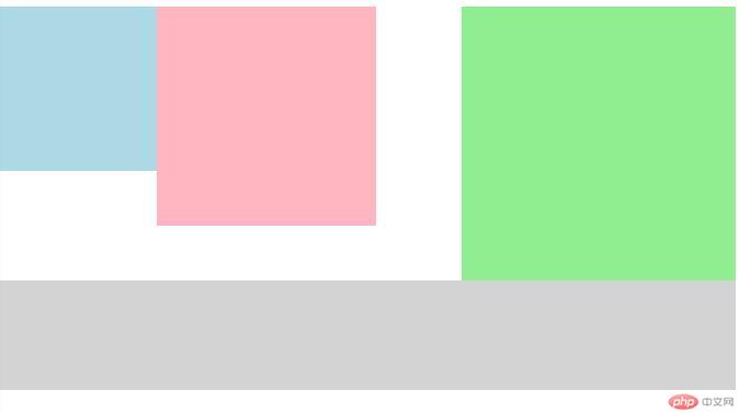
二、理解并写出外边距的三个特征: 同级塌陷,嵌套传递,自动挤压的案例;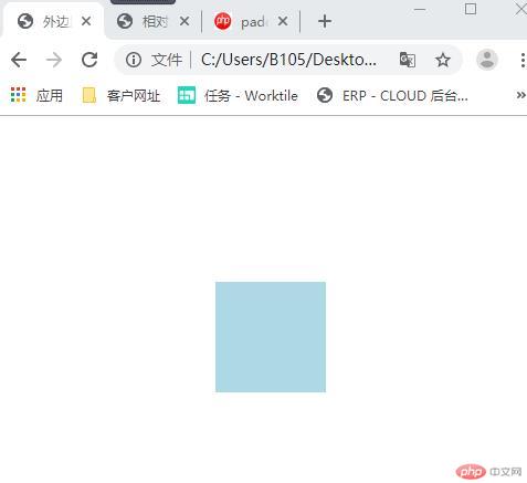
<!DOCTYPE html> <html lang="en"> <head> <meta charset="UTF-8"> <link rel="stylesheet" href="css/0705style2.css"> <title>外边距</title> </head> <body> <!--<!– 1、同级塌陷–>--> <!--<div class="box1"></div>--> <!--<div class="box2"></div>--> <!--2、嵌套传递--> <!--<div class="box3">--> <!-- <div class="box4"></div>--> <!--</div>--> <!--3、自动挤压--> <div class="box5"></div> </body> </html>
css代码
.box1{
    width:200px;
    height:200px;
    background-color: lightpink;
}
.box2{
    width:200px;
    height:200px;
    background-color:lightblue;
}
/*1、同级塌陷,相互重叠,以数值大的为准 左右叠加 上下重叠*/
.box1{
    margin-bottom: 100px;
}
.box2{
    margin-top: 30px;
}
/*2*嵌套传递/

.box3{
    width:200px;
    height:150px;
    background-color: lightpink;
    padding-top: 50px;

}
.box4 {
    width: 100px;
    height: 100px;
    background-color: lightblue;
    /*margin-top:50px;*/
/*}*/
.box5 {
    width: 100px;
    height: 100px;
    background-color: lightblue;
    /*自动挤压*/
    margin:150px auto;
}
三、 浮动的实现原理与清除的技巧
.box1{
    width: 150px;
    height: 150px;
    background-color: lightblue;
}
.box2{
    width: 200px;
    height: 200px;
    background-color: lightpink;
}
.box3{
    width: 250px;
    height: 250px;
    background-color: lightgreen;
}
.box1{
    /*浮动后,脱离文档流,进入浮动流*/
    float: left;
}
.box2{
    float: left;
}
.box3{
    float: right;
}
.box4{
    background-color: lightgray;
    width: 100%;
    height: 100px;
    /*清除浮动*/
    clear: both;
}
四、相对定位与绝对定位的区别与联系,并实例演示
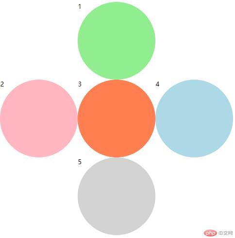
相对定位:相对于当前位置定位
.box1{
    width: 200px;
    height: 200px;
    background-color: lightgreen;
    border-radius: 50%;
    position: relative;
    left: 200px;
}
.box2{
    width: 200px;
    height: 200px;
    background-color: lightpink;
    border-radius: 50%;
}
.box3{
    width: 200px;
    height: 200px;
    background-color: coral;
    border-radius: 50%;
    position: relative;
    left: 200px;
    top: -200px;
}
.box4{
    width: 200px;
    height: 200px;
    background-color: lightblue;
    border-radius: 50%;
    position: relative;
    left:400px;
    top:-400px;
}
.box5{
    width: 200px;
    height: 200px;
    background-color: lightgray;
    border-radius: 50%;
    position: relative;
    left:200px;
    top:-400px;
}
绝对定位:相对于左上角0.0 来定位
.father{
    border: 1px solid black;
    width: 600px;
    height: 600px;
    position: absolute;

}

.box1{
    width: 200px;
    height: 200px;
    background-color: lightgreen;
    border-radius: 50%;
    position:absolute;
    left: 200px;
}
.box2{
    width: 200px;
    height: 200px;
    background-color: lightpink;
    border-radius: 50%;
    position:absolute;
    top: 200px;
}
.box3{
    width: 200px;
    height: 200px;
    background-color: coral;
    border-radius: 50%;
    position: absolute;
    left: 200px;
    top: 200px;
}
.box4{
    width: 200px;
    height: 200px;
    background-color: lightblue;
    border-radius: 50%;
    position: absolute;
    left:400px;
    top:200px;
}
.box5{
    width: 200px;
    height: 200px;
    background-color: lightgray;
    border-radius: 50%;
    position: absolute;
    left:200px;
    top:400px;
}
五、模拟php中文网登陆(遮罩+绝对定位)
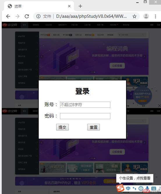
<!DOCTYPE html>
<html lang="en">
<head>
    <meta charset="UTF-8">
    <link rel="stylesheet" href="css/0705style6.css">
    <title>遮罩</title>
</head>
<body>
<div class="shade"></div>
<div class="box">
    <form  action="" method="get" name="register">
        <h2 style="text-align:center" >登录</h2>
        <p>
            <label for="usename" class="up">账号:</label>
            <input  type="text" id="usename" name="usename" placeholder="不超过8字符" maxlength="8">
        </p>
        <p>
            <label for="password" class="up">密码:</label>
            <input   type="password" id="password" name="password" >
        </p>
        <p>
            <input class="sub" type="submit" name="submit" value="提交">
            <input class="sub" type="reset" name="reset" value="重置">
        </p>
    </form>
</div>

</body>
</html>
css代码
body {
    background-image: url(../images/php.jpg);
    background-size: cover;
    background-repeat: repeat-y;
    margin:0;
}
.shade{
    position: absolute;
    left: 0;
    top: 0;
    height: 100%;
    width: 100%;
    background-color: black;
    opacity: 0.7;
}
.box{
    background-color: white;
    width: 300px;
    height: 200px;
    border: black 2px solid;
    position:fixed;
    left: 50%;
    top: 50%;
    margin-left:-150px;
    margin-top: -100px;

}
.sub {
    margin-left:60px ;
}

.up{
    margin-left: 20px;
}
固定定位广告的展示方式
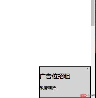
<!DOCTYPE html>
<html lang="en">
<head>
    <meta charset="UTF-8">
    <link rel="stylesheet" href="css/0705stlye7.css">
    <title>广告</title>
</head>
<body>
<div class="ad">
    <button onclick="this.parentNode.style.display = 'none'">X</button>

    <h2>广告位招租</h2>
    <p>敬请期待...</p>

</div>

</body>
</html>
css代码
.ad{
    width: 200px;
    height: 120px;
    border: 2px solid black;
    position: fixed;
    bottom: 0;
    right: 0;
    background-color: lightgray;
}
body{
    height: 1500px;
}
button {
    float: right;
    background: none;
    border: none;
}
button:hover{
    color: red;
    border-radius: 5%;
    font-size: 1.2em;
}
Copyright 2014-2025 https://www.php.cn/ All Rights Reserved | php.cn | 湘ICP备2023035733号


