一周的学习,做个综合使用看看效果,页面效果图如下:

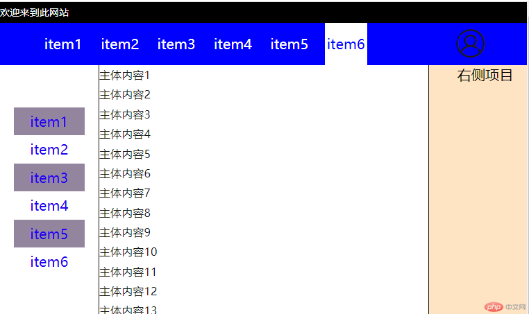

下面分项说明:
代码折叠显示如下:
注意点有以下:
.headbox {position: sticky;top: 0;}
.navtopdiv {background-color: blue;display: flex;flex-flow: row nowrap;place-content: space-between;}
.nav.top {margin-left: 3rem;width: 60vw;display: flex;flex-flow: row nowrap;place-content: place-evenly;text-align: center;}.nav.top .item {height: 3rem;flex: auto;line-height: 3rem;margin-left: 1rem;}.nav.top .item:first-child {margin-left: 0;}
中间部分采用container整体对flex定位,同时对左右两个项目做无弹性的设置,中间center做弹性设置.
.main.left {width: 5rem;flex: none;margin: 0px 1rem;}.main.center {flex: 1;}.main.right {width: 8rem;flex: none;}
最后对媒体查询做一些设置
@media (min-width: 375px) and (max-width: 500px) {html {font-size: 12px;}.keywords,.main.right {display: none;}}
@import url(http://at.alicdn.com/t/c/font_3957852_otlkw49btkr.css);.gerenzhongxindenglu {font-size: 2rem;color: rgb(32, 26, 26);}.gerenzhongxindenglu:hover {color: white;cursor: pointer;}

Copyright 2014-2025 https://www.php.cn/ All Rights Reserved | php.cn | 湘ICP备2023035733号


 收藏
收藏


