


 收藏
收藏


 PHPz
PHPz批改状态:合格
老师批语:完成的很好,没什么问题,继续加油

1、盒子2相对于大盒子box进行了绝对定位
2、盒子1的定位属性是static,默认文档流
<!DOCTYPE html><html lang="zh-cn"><head><meta charset="UTF-8"><meta http-equiv="X-UA-Compatible" content="IE=edge"><meta name="viewport" content="width=device-width, initial-scale=1.0"><title>Document</title><style>*{padding: 0;margin: 0;}.box {position: relative;width: 1000px;height: 500px;border: 5px solid green;}.box1 {width: 100px;height: 100px;background-color: aqua;text-align: center;line-height: 100px;}.box2 {text-align: center;line-height: 100px;top: 150px;right: 10px;position: absolute;width: 100px;height: 100px;background-color: coral;}</style></head><body><div class="box"><div class="box1">盒子1</div><div class="box2">盒子2</div></div></body></html>
上述代码结果图如下: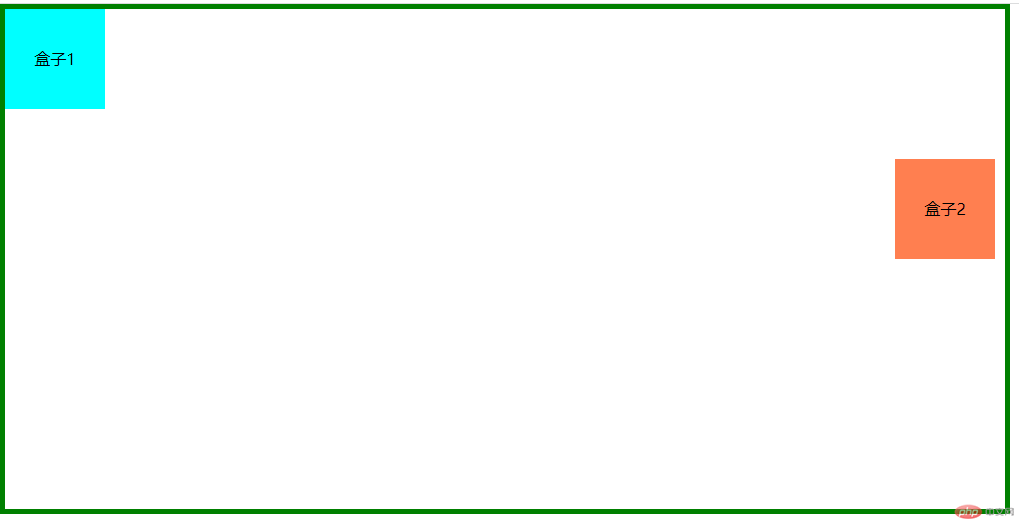
<!DOCTYPE html><html lang="zh-cn"><head><meta charset="UTF-8"><meta http-equiv="X-UA-Compatible" content="IE=edge"><meta name="viewport" content="width=device-width, initial-scale=1.0"><title>Document</title><link rel="stylesheet" href="//at.alicdn.com/t/c/font_3884917_h8g1mdk02fe.css"><style>*{padding: 0;margin: 0;}ul li {list-style: none;}body {min-height: 2000px;}.kefu {top: 200px;right: 10px;position: fixed;border: 2px solid pink;width: 200px;background-color: pink;}.kefu h2 {text-align: center;border-bottom: 3px solid #fff;}.kefu li{width: 100%;height: 50px;border-bottom: 1px solid #fff;text-align: center;line-height: 50px;}.kefu li:last-child {border: 0;}.kefu a {text-decoration: none;color: #fff;}.kefu i{font-size: 30px;vertical-align: middle;margin-right: 5px;}</style></head><body><div class="kefu"><h2>在线客服</h2><ul><li><a href="#"><i class="iconfont icon-QQ-circle-fill"></i>1111</a></li><li><a href="#"><i class="iconfont icon-QQ-circle-fill"></i>2222</a></li><li><a href="#"><i class="iconfont icon-QQ-circle-fill"></i>3333</a></li><li><a href="#"><i class="iconfont icon-QQ-circle-fill"></i>4444</a></li></ul></div></body></html>
固定定位效果图如下: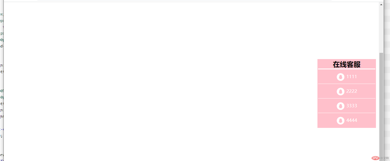
联系:两者都不会占据空间
区别:绝对定位会受父亲的情况影响,固定定位只针对视口,不会受父级的影响
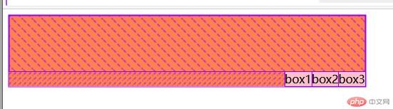
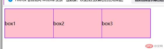
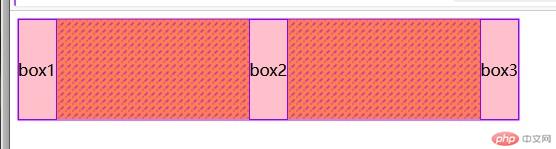
<!DOCTYPE html><html lang="zh-cn"><head><meta charset="UTF-8"><meta http-equiv="X-UA-Compatible" content="IE=edge"><meta name="viewport" content="width=device-width, initial-scale=1.0"><title>Document</title></head><body><div class="container"><div class="box">box1</div><div class="box">box2</div><div class="box">box3</div></div><style>.container {width: 500px;height: 100px;line-height: 100px;display: flex;background-color: coral;/* 主轴方向默认水平方向row *//* flex-direction: row;flex-wrap: nowrap; */flex-flow: row nowrap;/* 默认对其方式 沿着起始边布局,在主轴上的排列*/place-content: start;/* 沿着右边 *//* place-content: end; *//* 两端对齐 *//* place-content: space-between; *//* 分散 *//* place-content: space-around; *//* 平均 *//* place-content: space-evenly; *//* 在交叉轴上排列 默认*//* place-items: stretch; *//* 顶部对齐 *//* place-items: start; *//* 中间对齐 *//* place-items: center; */}.container .box {background-color: pink;/* height: 50px; *//* flex:属性,放大比例,是否允许收缩 占据主轴空间 */flex: 1 0 auto;}.container .box:first-child,.container .box:last-child{background-color: blue;flex: 1;}.container .box:first-child + *{flex: 3;place-self: start;}</style></body></html>
详细图如下:


Copyright 2014-2025 https://www.php.cn/ All Rights Reserved | php.cn | 湘ICP备2023035733号


