
本文给大家介绍的是如何使用python根据excel表格数据绘制不同的图表的方法,非常的详细,有相同需求的小伙伴可以参考下
本文介绍如果使用python汇总常用的图表,与Excel的点选操作相比,用python绘制图表显得比较比较繁琐,尤其提现在对原始数据的处理上。但两者在绘制图表过程中的思路大致相同,Excel中能完成的工作python大多也能做到。为了更清晰的说明使用python绘制图表的过程,我们在汇总图表的代码中进行注解,说明每一行代码的具体作用。并在文章的最后给出了自定义字体和图表配色的对应表。

准备工作
import numpy as np
import pandas as pd
#导入图表库以进行图表绘制
import matplotlib.pyplot as plt
loandata=pd.DataFrame(pd.read_excel('loan_data.xlsx'))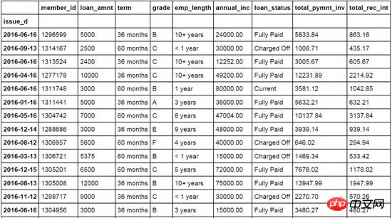
立即学习“Python免费学习笔记(深入)”;
折线图
#设置日期字段issue_d为loandata数据表索引字段
loandata = loandata.set_index('issue_d')
#按月对贷款金额loan_amnt求均值,以0填充空值
loan_plot=loandata['loan_amnt'].resample('M').fillna(0)
#图表字体为华文细黑,字号为15
plt.rc('font', family='STXihei', size=15)
#创建一个一维数组赋值给a
a=np.array([1,2,3,4,5,6,7,8,9,10,11,12])
#创建折线图,数据源为按月贷款均值,标记点,标记线样式,线条宽度,标记点颜色和透明度
plt.plot(loan_plot,'g^',loan_plot,'g-',color='#99CC01',linewidth=3,markeredgewidth=3,markeredgecolor='#99CC01',alpha=0.8)
#添加x轴标签
plt.xlabel('月份')
#添加y周标签
plt.ylabel('贷款金额')
#添加图表标题
plt.title('分月贷款金额分布')
#添加图表网格线,设置网格线颜色,线形,宽度和透明度
plt.grid( color='#95a5a6',linestyle='--', linewidth=1 ,axis='y',alpha=0.4)
#设置数据分类名称
plt.xticks(a, ('1月','2月','3月','4月','5月','6月','7月','8月','9月','10月','11月','12月') )
#输出图表
plt.show()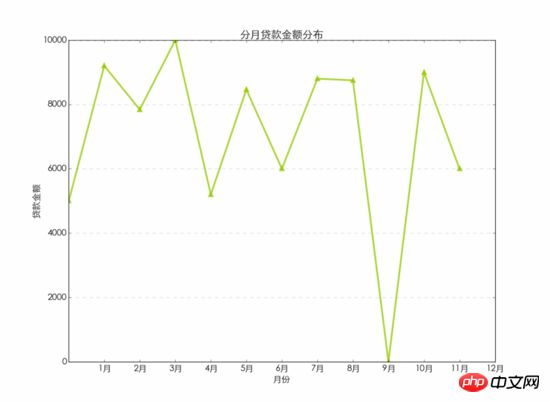
柱状图
#按用户等级grade字段对贷款金额进行求和汇总
loan_grade=loandata.groupby('grade')['loan_amnt'].agg(sum)
#图表字体为华文细黑,字号为15
plt.rc('font', family='STXihei', size=15)
#创建一个一维数组赋值给a
a=np.array([1,2,3,4,5,6])
#创建柱状图,数据源为按用户等级汇总的贷款金额,设置颜色,透明度和外边框颜色
plt.bar([1,2,3,4,5,6],loan_grade,color='#99CC01',alpha=0.8,align='center',edgecolor='white')
#设置x轴标签
plt.xlabel('用户等级')
#设置y周标签
plt.ylabel('贷款金额')
#设置图表标题
plt.title('不同用户等级的贷款金额分布')
#设置图例的文字和在图表中的位置
plt.legend(['贷款金额'], loc='upper right')
#设置背景网格线的颜色,样式,尺寸和透明度
plt.grid(color='#95a5a6',linestyle='--', linewidth=1,axis='y',alpha=0.4)
#设置数据分类名称
plt.xticks(a,('A级','B级','C级','D级','E级','F级'))
#显示图表
plt.show()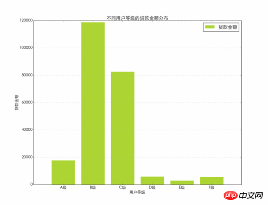
条形图
#图表字体为华文细黑,字号为15
plt.rc('font', family='STXihei', size=15)
#创建一个一维数组赋值给a
a=np.array([1,2,3,4,5,6])
#创建条形图,数据源为分等级贷款金额汇总,设置颜色,透明度和图表边框
plt.barh([1,2,3,4,5,6],loan_grade,color='#99CC01',alpha=0.8,align='center',edgecolor='white')
#添加x轴标题
plt.xlabel('贷款金额')
#添加y轴标题
plt.ylabel('用户等级')
#添加图表标题
plt.title('不同用户等级的贷款金额分布')
#添加图例,并设置在图表中的显示位置
plt.legend(['贷款金额'], loc='upper right')
#设置背景网格线的颜色,样式,尺寸和透明度
plt.grid(color='#95a5a6',linestyle='--', linewidth=1,axis='y',alpha=0.4)
#设置数据分类名称
plt.yticks(a,('A级','B级','C级','D级','E级','F级'))
#显示图表
plt.show()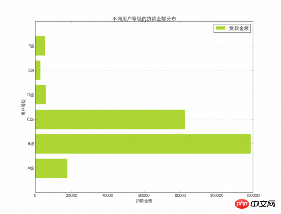
饼图
#图表字体为华文细黑,字号为15
plt.rc('font', family='STXihei', size=15)
#设置饼图中每个数据分类的颜色
colors = ["#99CC01","#FFFF01","#0000FE","#FE0000","#A6A6A6","#D9E021"]
#设置饼图中每个数据分类的名称
name=['A级', 'B级', 'C级', 'D级', 'E级','F级']
#创建饼图,设置分类标签,颜色和图表起始位置等
plt.pie(loan_grade,labels=name,colors=colors,explode=(0, 0, 0.15, 0, 0, 0),startangle=60,autopct='%1.1f%%')
#添加图表标题
plt.title('不同用户等级的贷款金额占比')
#添加图例,并设置显示位置
plt.legend(['A级','B级','C级','D级','E级','F级'], loc='upper left')
#显示图表
plt.show()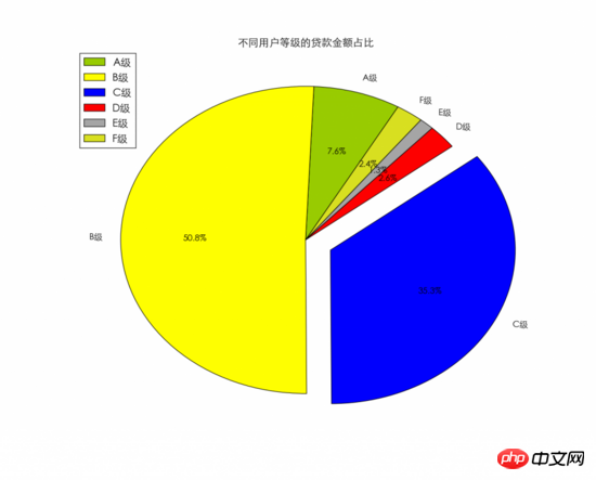
散点图
#按月汇总贷款金额,以0填充空值
loan_x=loandata['loan_amnt'].resample('M',how=sum).fillna(0)
#按月汇总利息金额,以0填充空值
loan_y=loandata['total_rec_int'].resample('M',how=sum).fillna(0)
#图表字体为华文细黑,字号为15
plt.rc('font', family='STXihei', size=15)
#创建散点图,贷款金额为x,利息金额为y,设置颜色,标记点样式和透明度等
plt.scatter(loan_x,loan_y,60,color='white',marker='o',edgecolors='#0D8ECF',linewidth=3,alpha=0.8)
#添加x轴标题
plt.xlabel('贷款金额')
#添加y轴标题
plt.ylabel('利息收入')
#添加图表标题
plt.title('贷款金额与利息收入')
#设置背景网格线的颜色,样式,尺寸和透明度
plt.grid(color='#95a5a6',linestyle='--', linewidth=1,axis='both',alpha=0.4)
#显示图表
plt.show()气泡图
#按月汇总贷款金额及利息
loan_x=loandata['loan_amnt'].resample('M',how=sum).fillna(0)
loan_y=loandata['total_rec_int'].resample('M',how=sum).fillna(0)
loan_z=loandata['total_rec_int'].resample('M',how=sum).fillna(0)
#图表字体为华文细黑,字号为15
plt.rc('font', family='STXihei', size=15)
#设置气泡图颜色
colors = ["#99CC01","#FFFF01","#0000FE","#FE0000","#A6A6A6","#D9E021",'#FFF16E','#0D8ECF','#FA4D3D','#D2D2D2','#FFDE45','#9b59b6']
#创建气泡图贷款金额为x,利息金额为y,同时设置利息金额为气泡大小,并设置颜色透明度等。
plt.scatter(loan_x,loan_y,s=loan_z,color=colors,alpha=0.6)
#添加x轴标题
plt.xlabel('贷款金额')
#添加y轴标题
plt.ylabel('利息收入')
#添加图表标题
plt.title('贷款金额与利息收入')
#设置背景网格线的颜色,样式,尺寸和透明度
plt.grid(color='#95a5a6',linestyle='--', linewidth=1,axis='both',alpha=0.4)
#显示图表
plt.show()箱线图
#图表字体为华文细黑,字号为15
plt.rc('font', family='STXihei', size=15)
#创建箱线图,数据源为贷款来源,设置横向显示
plt.boxplot(loandata['loan_amnt'],1,'rs',vert=False)
#添加x轴标题
plt.xlabel('贷款金额')
#添加图表标题
plt.title('贷款金额分布')
#设置背景网格线的颜色,样式,尺寸和透明度
plt.grid(color='#95a5a6',linestyle='--', linewidth=1,axis='both',alpha=0.4)
#显示图表
plt.show()
直方图
#图表字体为华文细黑,字号为15
plt.rc('font', family='STXihei', size=15)
#创建直方图,数据源为贷款金额,将数据分为8等份显示,设置颜色和显示方式,透明度等
plt.hist(loandata['loan_amnt'],8,normed=1, histtype='stepfilled',facecolor='#99CC01', rwidth=0.9,alpha=0.6,edgecolor='white')
#添加x轴标题
plt.xlabel('贷款金额')
#添加y轴标题
plt.ylabel('概率')
#添加图表标题
plt.title('贷款金额概率密度')
#设置背景网格线的颜色,样式,尺寸和透明度
plt.grid(color='#95a5a6',linestyle='--', linewidth=1,axis='y',alpha=0.4)
#显示图表
plt.show()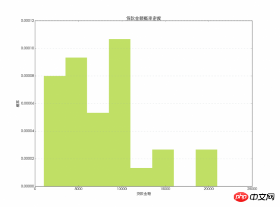
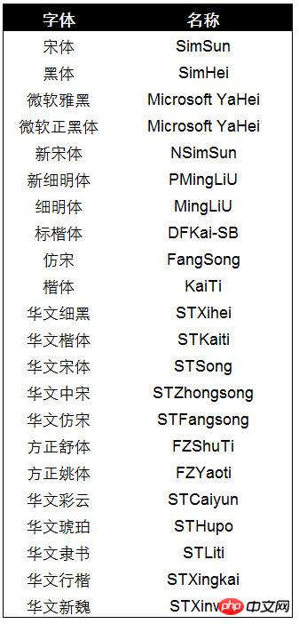
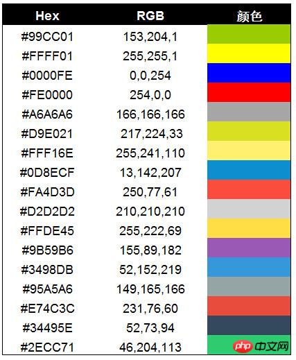
自定义字体及配色
图表中所使用的字体,可以使用下面的字体名称替换family=后面的内容以改变图表中所显示的字体。
图表中的颜色,可以直接使用颜色名称,也可以使用简称来设置图表中使用的颜色,本文中没有使用默认的颜色,而是使用了自定义颜色。
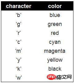
自定义颜色的色号,本文中使用的是Hex色号,下面给出了Hex和RGB的对应关系,以及相应的颜色。可以使用下面的Hex色号替换本文中图表的颜色。
相关推荐:
以上就是使用python绘制常用的图表的详细内容,更多请关注php中文网其它相关文章!

python怎么学习?python怎么入门?python在哪学?python怎么学才快?不用担心,这里为大家提供了python速学教程(入门到精通),有需要的小伙伴保存下载就能学习啦!

Copyright 2014-2025 https://www.php.cn/ All Rights Reserved | php.cn | 湘ICP备2023035733号


 456
456