

Border usage you don't know
Previous words:
Before reading this article, you may think that border just simply draws the border. After reading this article, I believe you will be the same as me. Say "Holy crap, it turns out that the border in CSS can be played like this." This article is mainly about sorting out some of my ideas after seeing others using pure CSS to draw triangles a long time ago. The article will introduce the effects of several small icons.
Use the border in CSS to draw an egg shape:
Yes, you read that right, here we are going to draw an egg-like effect.
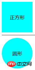
Idea: We first use p to draw a square, and then use the setting border-radius: 50%;, so that we can get a circular effect, the code is as follows:
html code:
css code:
.p {
width: 100px;
height: 100px;
line-height: 100px;
background-color: aqua;
text- align: center;
border-radius: 50%;
}
The result is as shown in the figure:
##Thinking: Analyze the egg-shaped structure, The egg is a bit oval, but it has a big head and a small head. Is there any way for us to change the previous circle into an ellipse?
Idea: We change the width or height of p to make them inconsistent and see if we can get the effect we want.
Implementation: We change width:50px; or height:50px; (only change one of them), then the effects we get are:
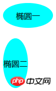
Thinking: We have got the elliptical effect, how can we achieve the effect of big head and small head next?
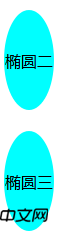
Idea 1: Let’s divide the ellipse and control the width to be inconsistent. (This method was unsuccessful)
Idea 2: We set the percentage of border-radius. When border-radius: 100%; the screenshot of the previous method is as follows:
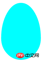
Try again to separate the value of the percentage of border-radius (do not abbreviate it, write it directly as 4), then the control percentage is inconsistent. Key code:
border-radius: 50% 50% 50% 50% / 62% 62% 38% 38%;
Screenshot of the effect obtained at this time:
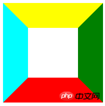
Use the border in CSS to draw a triangle:
I believe everyone knows that border-color controls the border color, but you may not have tried it this way. Take a look at the following code:
html:
css:
.p {
width: 100px;
height: 100px;
border: 50px solid transparent;
border-color: yellow green red aqua;
}
The result is:
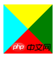
Thinking 1: What would happen if the p has no width and height?
Implementation results:
Thinking 2: The previous effect resulted in four triangles. Is there any way for us to separate the triangles from that p? Woolen cloth?
Idea: I haven’t come across anything about p separation so far (it probably doesn’t exist specifically), but let’s take a look at the CSS definition of “cascading style” and change our thinking. Is there any way we can Are the triangles we don't want overwritten?
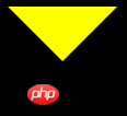
Specific method: Set the color on the side we need to our background color - white, so you can get the effect we want. The code is as follows (taking the triangle you want to have on top as an example):
border-color: yellow white white white;
Does this complete our triangle effect?
We can try changing the background color of the entire body to black to see what changes:

We found that the p still occupies such a large space, And setting the background color to white is not the most scientific
Thought 4: How can we set the unwanted color to disappear?
Idea: We set the color we don’t want to show as the background color of the parent container, border-color: yellow transparent transparenttransparent;
The results are as follows:
Thinking 3: How can we set p so that it does not take up so much space?
Idea: directly remove the width of the border on the opposite side of the desired triangle
Specific method: (This time, take the desired triangle as an example), the code is as follows:
p{
width:0px;
height: 0px;
border-bottom: 50px solid red;
border-left: 50px solid transparent;
border-right: 50px solid transparent;
}
The result is as shown in the figure:
Some thoughts on the extension of triangles:
Thinking 1: Our usual triangles include acute triangles, obtuse triangles, right-angled triangles, equilateral triangles, isosceles triangles, etc. Is there any way for us to get them directly? Is this the triangle effect we want?
Idea: When the base is parallel to the horizontal line, we directly control the aspect ratio to achieve the triangle effect we want; when it does not coincide with the horizontal line, it becomes more complicated, and we need to use the width Combining the high ratio with the transform attribute and rotate in CSS3 allows our triangle to show the effect we want (here is just an introduction to the idea, not a specific implementation. Among them If you have knowledge related to mathematics, you can use Baidu yourself).
Thinking 2: Can we use multiple triangles together to create more shapes?
(This can be possible. For example, we can use two triangles and a rectangle to form a parallelogram, or even use multiple ps to form a simple cabin effect...)
Supplement:
1. In the previous picture of our thinking one, we can see that the middle ones are actually trapezoids. Using the same method, we can get the effect of trapezoids (specific methods will not be introduced further).
2. By rotating, we can turn our square into a diamond shape
Production of polygons (taking hexagons as an example)
First we analyze the hexagon and see if we can decompose it into the simple graphics we mentioned before. Look at the picture below: 
Analysis: Taking the above example, we can see that a hexagon is composed of two triangles and a rectangle.
Thinking 1: Is there any way for us to put these three graphics together?
Idea: Use pseudo elements: after and :before, and then draw graphics in their respective areas.
The reference code is as follows:
# height: 55px; #hexagon:before { Content: "" "; ## Width: 0;
HEIGHT: 0; Position: absolute; using use with using use using through through ’ s ‐ ‐ ‐ ‐‐ and � to #hexagon
:after
{
Content: "" "";
Width: 0;
Height: 0;
Position: absolute;
Bottom: -25px; LEFT: 0; ’ ’ ’ ’ using use ’s ’ using using using through using using ‐ ‐ ‐ ‐ ‐ ‐ , lt;/style>
#(Of course the knowledge here introduces a situation, you can also try to have different sides of the triangle)
Production of a multi-pointed star (taking a six-pointed star as an example)
Analysis: Try to use the previous method to analyze the structure of a six-pointed star. We can understand that a six-pointed star is made up of two triangles overlapping together. OK, now it’s easy. Let’s look at the code directly:
UTF-8">
height: 0;
display
: block;
position: absolute;
border-left: 100px solid transparent;
border-right: 100px solid transparent; border-bottom: 200px solid #de34f7; margin: 10px auto; content: "";
/*contentInsert content* /
width: 0;
height: 0;
position: absolute;
border-left: 100px solid transparent;
border-right: 100px solid transparent;
border-top : 200px solid #de34f7;
margin: 60px 0 0 -100px;
}
The final effect is as shown in the figure:
Production of the five-pointed star (The actual operation is more difficult than the six-pointed star): We first draw a five-pointed star ourselves, then divide it into three, and then use the previous steps to implement it. Here I just list a method as a reference (there are several details in it The processing is a bit complicated), the analysis diagram is as follows:
##The reference code is as follows:
;
 ;
; ;
CSS small icon effect:
At this point, are you still not satisfied? Let me share the small CSS icon I made: Production of Dialog Box
Production of Dialog Box:
Analysis: The dialog box is composed of a triangle and a rounded corner
Implementation: The code is as follows:
dding
: 0px;
}
width: 300px;
Height: 100px;
Background:#088cb7;
Position: Relative ER- radius: 12px;
}
#comment_bubble:before {
content: ""; 0;
right: 100%; Top: 38px; Position: absolute;
border-top: 13px solid transparent;
Border-right: 26px solid #088cb7;
border-bottom: 13px solid transparent;
}
, and then place a triangle where needed.
:
Following words:
Although these effects don’t look so cool, I remember that I just started learning this I was so excited when I said it. At that time, more effects were made (but those before the computer system was changed a few days ago are gone), so the effects shown are only very simple ones. This is all I can recall now, I will add more later as I think of it. If you have any good results, please share them below.
-->
The above is the detailed content of Border usage you don't know. For more information, please follow other related articles on the PHP Chinese website!

Hot AI Tools

Undresser.AI Undress
AI-powered app for creating realistic nude photos

AI Clothes Remover
Online AI tool for removing clothes from photos.

Undress AI Tool
Undress images for free

Clothoff.io
AI clothes remover

Video Face Swap
Swap faces in any video effortlessly with our completely free AI face swap tool!

Hot Article
Hot Tools

Notepad++7.3.1
Easy-to-use and free code editor

SublimeText3 Chinese version
Chinese version, very easy to use

Zend Studio 13.0.1
Powerful PHP integrated development environment

Dreamweaver CS6
Visual web development tools

SublimeText3 Mac version
God-level code editing software (SublimeText3)
Hot Topics


 Is HTML easy to learn for beginners?
Apr 07, 2025 am 12:11 AM
Is HTML easy to learn for beginners?
Apr 07, 2025 am 12:11 AM
HTML is suitable for beginners because it is simple and easy to learn and can quickly see results. 1) The learning curve of HTML is smooth and easy to get started. 2) Just master the basic tags to start creating web pages. 3) High flexibility and can be used in combination with CSS and JavaScript. 4) Rich learning resources and modern tools support the learning process.
 The Roles of HTML, CSS, and JavaScript: Core Responsibilities
Apr 08, 2025 pm 07:05 PM
The Roles of HTML, CSS, and JavaScript: Core Responsibilities
Apr 08, 2025 pm 07:05 PM
HTML defines the web structure, CSS is responsible for style and layout, and JavaScript gives dynamic interaction. The three perform their duties in web development and jointly build a colorful website.
 Understanding HTML, CSS, and JavaScript: A Beginner's Guide
Apr 12, 2025 am 12:02 AM
Understanding HTML, CSS, and JavaScript: A Beginner's Guide
Apr 12, 2025 am 12:02 AM
WebdevelopmentreliesonHTML,CSS,andJavaScript:1)HTMLstructurescontent,2)CSSstylesit,and3)JavaScriptaddsinteractivity,formingthebasisofmodernwebexperiences.
 What is an example of a starting tag in HTML?
Apr 06, 2025 am 12:04 AM
What is an example of a starting tag in HTML?
Apr 06, 2025 am 12:04 AM
AnexampleofastartingtaginHTMLis,whichbeginsaparagraph.StartingtagsareessentialinHTMLastheyinitiateelements,definetheirtypes,andarecrucialforstructuringwebpagesandconstructingtheDOM.
 Gitee Pages static website deployment failed: How to troubleshoot and resolve single file 404 errors?
Apr 04, 2025 pm 11:54 PM
Gitee Pages static website deployment failed: How to troubleshoot and resolve single file 404 errors?
Apr 04, 2025 pm 11:54 PM
GiteePages static website deployment failed: 404 error troubleshooting and resolution when using Gitee...
 How to implement adaptive layout of Y-axis position in web annotation?
Apr 04, 2025 pm 11:30 PM
How to implement adaptive layout of Y-axis position in web annotation?
Apr 04, 2025 pm 11:30 PM
The Y-axis position adaptive algorithm for web annotation function This article will explore how to implement annotation functions similar to Word documents, especially how to deal with the interval between annotations...
 HTML, CSS, and JavaScript: Essential Tools for Web Developers
Apr 09, 2025 am 12:12 AM
HTML, CSS, and JavaScript: Essential Tools for Web Developers
Apr 09, 2025 am 12:12 AM
HTML, CSS and JavaScript are the three pillars of web development. 1. HTML defines the web page structure and uses tags such as, etc. 2. CSS controls the web page style, using selectors and attributes such as color, font-size, etc. 3. JavaScript realizes dynamic effects and interaction, through event monitoring and DOM operations.
 How to use CSS3 and JavaScript to achieve the effect of scattering and enlarging the surrounding pictures after clicking?
Apr 05, 2025 am 06:15 AM
How to use CSS3 and JavaScript to achieve the effect of scattering and enlarging the surrounding pictures after clicking?
Apr 05, 2025 am 06:15 AM
To achieve the effect of scattering and enlarging the surrounding images after clicking on the image, many web designs need to achieve an interactive effect: click on a certain image to make the surrounding...
