 Web Front-end
 CSS Tutorial
 CSS background color gradient case: detailed explanation of linear gradient and radial gradient effect examples
CSS background color gradient case: detailed explanation of linear gradient and radial gradient effect examples
Gradient is a smooth transition between two or more colors. Previously, images had to be used to achieve these effects. However, by using CSS3 gradients, you can reduce download events and bandwidth usage. Additionally, elements with gradients look better when zoomed in because the gradient is generated by the browser. Gradient is divided into two types: linear gradient and radial gradient. The following is the css background color gradient: Actual examples of linear gradient and radial gradient effects
1. Linear gradient (linear-gradient)
To achieve a linear gradient, you need to define at least two colors. These two colors are the colors you want to transition smoothly, that is: one color is the starting point and the other color is the ending point.
Syntax:
background: linear-gradient(colorA,colorB)
colorA is the starting point color, colorB is the end point color.
You can also define the direction of the gradient, whether it is a gradient from top to bottom, a gradient from left to right, or a gradient from the upper left corner to the lower right corner (the default is from top to bottom).
Syntax:
background: linear-gradient(direction,colroA,colorB)
direction represents the direction of the gradient, just write the starting point of the direction directly, for example : The gradient direction is from left to right, just write left; the gradient direction is from bottom to top, just write bottom; the gradient direction is from the upper left corner to the lower right corner, just write background: linear-gradient(left top,colorA, colorB).
css linear gradient case
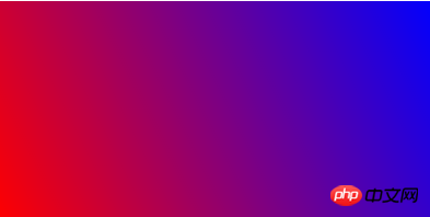
Example: from the lower left corner to the upper right corner, from red to blue gradient
Rendering:

Code:
<!DOCTYPE html>
<html>
 <head>
  <meta charset="utf-8" />
  <title></title>
  <style type="text/css">
   div{
    width: 400px;
    height: 200px;
    background: -webkit-linear-gradient(left bottom,red,blue);
    background: -o-linear-gradient(left bottom,red,blue);
    background: -moz-linear-gradient(left bottom,red,blue);
    background: linear-gradient(left bottom,red,blue);
   }
  </style>
 </head>
 <body>
  <div></div>
 </body>
</html>2. Radial-gradient
CSS3 radial gradient is a circular or oval gradient. Color no longer changes along a straight axis, but radiates in all directions from a starting point. It's more complex than a linear gradient.
You can define its center (the default gradient is center), shape (prototype or ellipse), size, etc.
Syntax: background: radial-gradient(position,shape,size,start-color,last-color)
position
left: Set the left side to be the abscissa value of the center of the radial gradient circle.
center: Set the abscissa value or ordinate of the center of the radial gradient circle in the middle.
right: Set the right side to be the abscissa value of the center of the radial gradient circle.
top: Set the top to the ordinate value of the center of the radial gradient circle.
bottom: Set the bottom to the vertical scale value of the center of the radial gradient circle.
shape
can be the value circle or ellipse. circle represents a circle and ellipse represents an ellipse. The default value is ellipse.
size
closest-side: Specify the radius length of the radial gradient from the center of the circle to the side closest to the center of the circle;
closest-corner: Specify the radial direction The radius length of the gradient is from the center of the circle to the corner closest to the center;
farthest-side: Specifies the radius length of the radial gradient from the center of the circle to the side farthest from the center;
farthest-corner: Specifies the radial gradient The radius length is from the center of the circle to the farthest corner from the center of the circle; default value
css radial gradient case
Example: start from 60%, 55% position Gradient, specify the radius length of the radial gradient from the center of the circle to the side closest to the center of the circle, and the gradient color from the inside to the outside is blue, green, yellow, black
Rendering:

Code:
<!DOCTYPE html>
<html>
 <head>
  <meta charset="utf-8" />
  <title></title>
  <style type="text/css">
   div{
    width: 400px;
    height: 200px;
    background: -webkit-radial-gradient(60% 55%, closest-side,blue,green,yellow,black);
     background: -o-radial-gradient(60% 55%, closest-side,blue,green,yellow,black);
    background: -moz-radial-gradient(60% 55%, closest-side,blue,green,yellow,black);
    background: radial-gradient(60% 55%, closest-side,blue,green,yellow,black);
   }
  </style>
 </head>
 <body>
  <div></div>
 </body>
</html> The above introduces the related usage of gradients, including meridional gradients and linear gradients. I hope it will be helpful to you!
The above is the detailed content of CSS background color gradient case: detailed explanation of linear gradient and radial gradient effect examples. For more information, please follow other related articles on the PHP Chinese website!

Hot AI Tools

Undresser.AI Undress
AI-powered app for creating realistic nude photos

AI Clothes Remover
Online AI tool for removing clothes from photos.

Undress AI Tool
Undress images for free

Clothoff.io
AI clothes remover

Video Face Swap
Swap faces in any video effortlessly with our completely free AI face swap tool!

Hot Article

Hot Tools

Notepad++7.3.1
Easy-to-use and free code editor

SublimeText3 Chinese version
Chinese version, very easy to use

Zend Studio 13.0.1
Powerful PHP integrated development environment

Dreamweaver CS6
Visual web development tools

SublimeText3 Mac version
God-level code editing software (SublimeText3)

Hot Topics
 Let's talk about how to cleverly use CSS to add color gradients to ordinary black QR codes!
Jul 14, 2022 am 10:34 AM
How to skillfully use CSS to build gradient color QR codes? The following article will introduce to you how to use CSS to add color gradients to ordinary black QR codes. I hope it will be helpful to you!
 Can css3 linear gradient achieve triangles?
Apr 25, 2022 pm 02:47 PM
CSS3 linear gradient can realize triangles; just create a 45-degree linear gradient and set the gradient color to two fixed colors, one is the color of the triangle and the other is transparent color. The syntax "linear-gradient(45deg, color value , color value 50%, transparent color 50%, transparent color 100%)".
 CSS drawing: how to achieve a simple gradient graphic effect
Nov 21, 2023 pm 04:51 PM
CSS Drawing: Implementing Simple Gradient Graphic Effects In web design, gradient graphic effects are a common visual element that can add an attractive look and experience to a website. In CSS, we can use gradient effects to easily achieve gradient effects on various graphics, including rectangles, circles, text, etc. This article will introduce how to use CSS to achieve a simple gradient graphic effect, and provide specific code examples. 1. Linear gradient Linear gradient refers to the effect of gradual change from one point to another point. In CSS we can use l
 Interpretation of CSS gradient background properties: linear-gradient and background-image
Oct 21, 2023 am 08:54 AM
Interpretation of CSS gradient background properties: Introduction to linear-gradient and background-image: In page development, the selection of background color is a very important link, and gradient background color can add richer visual effects to web pages. CSS provides two ways to implement gradient background properties: linear-gradient and background-image. This article will focus on explaining the use of these two methods and provide specific code examples.
 CSS radial gradient property optimization tips: radial-gradient and background-position
Oct 27, 2023 pm 05:09 PM
CSS radial gradient attribute optimization tips: radial-gradient and background-position Introduction: CSS radial gradient (radial-gradient) is an attribute used to create a circular gradient effect, and is often used to design the background of web pages, button styles, etc. When using radial gradients, combined with reasonable background-position settings, we can further optimize the effect and make the page more vivid and beautiful. This article will
 CSS gradient font properties: linear-gradient and font-stretch
Oct 21, 2023 am 09:18 AM
CSS gradient font properties: linear-gradient and font-stretch, specific code examples are required In modern web design, in order to attract users and enhance the visual effect of the page, gradient fonts have become a popular design trend. CSS provides some properties to achieve gradient font effects, including linear-gradient and font-stretch. This article will focus on the usage of these two properties and provide specific code examples to help readers better understand
 Can css radial gradient change the angle?
Aug 12, 2022 pm 05:03 PM
CSS radial gradient cannot change the angle. CSS radial gradient is implemented using the radial-gradient() function, with the syntax "background:radial-gradient(type size at position, start color, ..., end color);"; this function can set the gradient shape of the radial gradient (circle or ellipse), gradient size (nearest end, closest corner, farthest end, farthest corner, included or covered), gradient position and starting and ending colors of the gradient, but therefore the angle of the radial gradient cannot be set.
 How to use css to make words in text fields use different colors
Sep 02, 2022 pm 06:19 PM
Implementation steps: 1. Use linear-gradient() to add a gradient background effect to the text field, with the syntax "background-image: linear-gradient(...);"; 2. Use the background-clip attribute and color attribute to make the gradient background color Only display on the text in the text field, that is, let the text gradient have different colors, the syntax is "background-clip: text;color: transparent;".


