
 Web Front-end
CSS Tutorial
Let's talk about how to cleverly use CSS to add color gradients to ordinary black QR codes!
Web Front-end
CSS Tutorial
Let's talk about how to cleverly use CSS to add color gradients to ordinary black QR codes!
Let's talk about how to cleverly use CSS to add color gradients to ordinary black QR codes!

How to use CSS to build gradient color QR code? The following article will introduce to you how to use CSS to add color gradients to ordinary black QR codes. I hope it will be helpful to you!

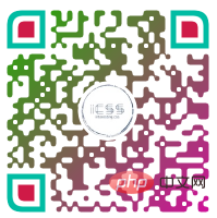
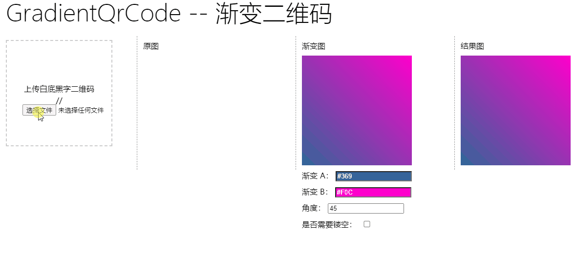
Today, there was a very interesting question in the group, asking me how to implement a colorful QR code with gradient, like this:
Very interesting question. We search qrcode on Baidu Google and can find many tools for making QR codes online. Some of them also have the function of making QR codes. The function of gradient QR code. But most of them are implemented in Canvas or other programming languages. [Recommended learning: css video tutorial]
If we already have an ordinary QR code with black text on a white background, and want to turn it into a gradient QR code ? How to do this?

This article will introduce, Use CSS to quickly turn an ordinary black QR code into any color gradient QR code we want .
Powerful blending modes
Have an original image and want to change its color. In CSS, we can quickly think of filter filter, or mixing mode mix-blend-mode.
Here, we need to use mixing mode mix-blend-mode. Blending modes are most commonly found in photoshop and are one of the most powerful features in PS. Currently, CSS already natively supports most blending modes.
The principle is actually very simple. We implement a gradient graphic. This graphic overlaps the QR code with black text on a white background through the mix-blend-mode: lighten in the mixing mode. Once together, the white areas in the QR code will remain unchanged, while the black areas in the QR code will appear as the color in the gradient pattern.
It sounds a bit convoluted. Through a schematic diagram, you can understand it at a glance. We only need two layers, the original QR code is one layer, and then superimpose the gradient pattern on top of it, and set mix -blend-mode: lighten can be:
<div class="g-container">
    <img src="qrcode.png">
</div>
.g-container {
    position: relative;
    width: 200px;
    height: 200px;

    &::before {
        content: "";
        position: absolute;
        top: 0;
        left: 0;
        bottom: 0;
        right: 0;
        background: linear-gradient(45deg, #673ab7, #ff5722);
        mix-blend-mode: lighten;
    }
}Here, we use the pseudo element of the parent element to save a label and use it as a gradient layer. For the actual overlapping effect, I made an animation:

In this way, we can use the blending mode to turn a black QR code image into a gradient color.
There is a hollow in the middle of the QR code
Of course, this is not over yet. Sometimes, there will be some patterns in the middle of our QR code, including a round or square picture.
If you use the above method, there will be some flaws:
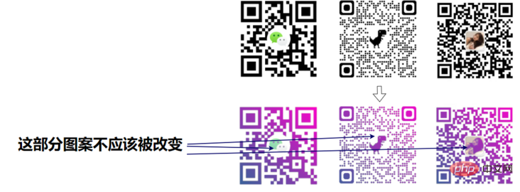
Then, we also need to hollow out the middle of the gradient pattern according to the style of the QR code!
Interestingly, there are two types of patterns in the middle of the QR code: circular and rectangular. For these two types of QR codes, what are the processing methods? Not quite the same yet.

A circle is hollowed out in the center of the gradient pattern
For a QR code with a circular pattern in the center, we only need to implement such a gradient and then superimpose it. :
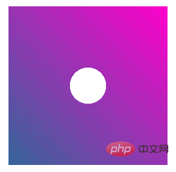
This is relatively simple. Since it is originally a linear gradient, a circle needs to be hollowed out in the middle. The best way is to use mask:
div {
    background: linear-gradient(45deg, rgb(51, 102, 153), rgb(255, 0, 204));
    mask: radial-gradient(rgba(0, 0, 0, 0), rgba(0, 0, 0, 0) 16%, rgb(0, 0, 0) 16%);
}A rectangle is hollowed out in the center of the gradient pattern
However, if there is a rectangle in the middle, it is not easy to handle. We need to implement such a graphic based on the gradient pattern:
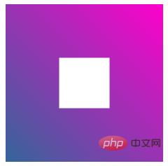
There are actually many methods. For example, we imagine the middle transparent part as the content part of a div, and the surrounding gradient color area is the border area.
Of course, I used clip-path here. Using it, it is also very convenient to realize a hollow rectangle:
div {
    background: linear-gradient(45deg, rgb(51, 102, 153), rgb(255, 0, 204));
    clip-path: polygon(0% 0%, 0% 100%, 34% 100%, 34% 34%, 66% 34%, 66% 66%, 34% 66%, 34% 100%, 100% 100%, 100% 0%);
}Making a QR code dyeing tool
Based on the above knowledge, we can simply build a gradient color QR code tool.
Here I simply implemented one:
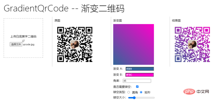
We quickly create a gradient color QR code by uploading a normal QR code, customizing the gradient color, selecting whether hollowing is required, the type and size of the hollowing out.
A brief demonstration:
A small tool that uses CSS as its core is now complete.
For the complete code, you can click here: CodePen - Make A Gradient QrCode
https://codepen.io/Chokcoco/pen/XWzPEXW
Finally
To summarize, this article introduces tips for using CSS blending mode to obtain gradient QR codes, and uses mask or clip-path hollow gradient Graphics, some related knowledge points. If you still have questions, I recommend you to read my following articles:
- Incredible mix-blend-mode
- Incredible blending mode background-blend-mode
- Two lines of CSS code to achieve arbitrary coloring technology for images
- Wonderful CSS MASK
- Smart use of CSS to achieve colorful triangle border animation
Okay, this article ends here, I hope it will be helpful to you :)
Original address: https://segmentfault.com/a/1190000041543121
Author: chokcoco
(Learning video sharing: Web Front End Introduction)
The above is the detailed content of Let's talk about how to cleverly use CSS to add color gradients to ordinary black QR codes!. For more information, please follow other related articles on the PHP Chinese website!

Hot AI Tools

Undresser.AI Undress
AI-powered app for creating realistic nude photos

AI Clothes Remover
Online AI tool for removing clothes from photos.

Undress AI Tool
Undress images for free

Clothoff.io
AI clothes remover

Video Face Swap
Swap faces in any video effortlessly with our completely free AI face swap tool!

Hot Article
Hot Tools

Notepad++7.3.1
Easy-to-use and free code editor

SublimeText3 Chinese version
Chinese version, very easy to use

Zend Studio 13.0.1
Powerful PHP integrated development environment

Dreamweaver CS6
Visual web development tools

SublimeText3 Mac version
God-level code editing software (SublimeText3)
Hot Topics


 How to use bootstrap in vue
Apr 07, 2025 pm 11:33 PM
How to use bootstrap in vue
Apr 07, 2025 pm 11:33 PM
Using Bootstrap in Vue.js is divided into five steps: Install Bootstrap. Import Bootstrap in main.js. Use the Bootstrap component directly in the template. Optional: Custom style. Optional: Use plug-ins.
 The Roles of HTML, CSS, and JavaScript: Core Responsibilities
Apr 08, 2025 pm 07:05 PM
The Roles of HTML, CSS, and JavaScript: Core Responsibilities
Apr 08, 2025 pm 07:05 PM
HTML defines the web structure, CSS is responsible for style and layout, and JavaScript gives dynamic interaction. The three perform their duties in web development and jointly build a colorful website.
 Understanding HTML, CSS, and JavaScript: A Beginner's Guide
Apr 12, 2025 am 12:02 AM
Understanding HTML, CSS, and JavaScript: A Beginner's Guide
Apr 12, 2025 am 12:02 AM
WebdevelopmentreliesonHTML,CSS,andJavaScript:1)HTMLstructurescontent,2)CSSstylesit,and3)JavaScriptaddsinteractivity,formingthebasisofmodernwebexperiences.
 How to write split lines on bootstrap
Apr 07, 2025 pm 03:12 PM
How to write split lines on bootstrap
Apr 07, 2025 pm 03:12 PM
There are two ways to create a Bootstrap split line: using the tag, which creates a horizontal split line. Use the CSS border property to create custom style split lines.
 How to set up the framework for bootstrap
Apr 07, 2025 pm 03:27 PM
How to set up the framework for bootstrap
Apr 07, 2025 pm 03:27 PM
To set up the Bootstrap framework, you need to follow these steps: 1. Reference the Bootstrap file via CDN; 2. Download and host the file on your own server; 3. Include the Bootstrap file in HTML; 4. Compile Sass/Less as needed; 5. Import a custom file (optional). Once setup is complete, you can use Bootstrap's grid systems, components, and styles to create responsive websites and applications.
 How to insert pictures on bootstrap
Apr 07, 2025 pm 03:30 PM
How to insert pictures on bootstrap
Apr 07, 2025 pm 03:30 PM
There are several ways to insert images in Bootstrap: insert images directly, using the HTML img tag. With the Bootstrap image component, you can provide responsive images and more styles. Set the image size, use the img-fluid class to make the image adaptable. Set the border, using the img-bordered class. Set the rounded corners and use the img-rounded class. Set the shadow, use the shadow class. Resize and position the image, using CSS style. Using the background image, use the background-image CSS property.
 How to use bootstrap button
Apr 07, 2025 pm 03:09 PM
How to use bootstrap button
Apr 07, 2025 pm 03:09 PM
How to use the Bootstrap button? Introduce Bootstrap CSS to create button elements and add Bootstrap button class to add button text
 How to resize bootstrap
Apr 07, 2025 pm 03:18 PM
How to resize bootstrap
Apr 07, 2025 pm 03:18 PM
To adjust the size of elements in Bootstrap, you can use the dimension class, which includes: adjusting width: .col-, .w-, .mw-adjust height: .h-, .min-h-, .max-h-
