
 Web Front-end
CSS Tutorial
Introduction to the four properties in the CSS box model (with code)
Web Front-end
CSS Tutorial
Introduction to the four properties in the CSS box model (with code)
Introduction to the four properties in the CSS box model (with code)

<p>1. Replacement elements and non-replacement elements
has replaceable content, we can also divide elements into replaced elements and non-replaced elements
1.1 Replacement elements Definition
<p>Elements that can be replaced by modifying the content presented by a certain attribute value are called "replacement elements". Common replacement elements are: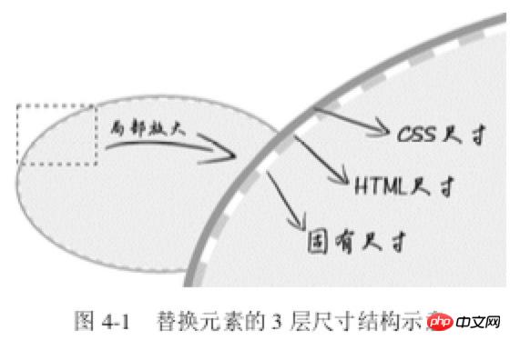 ,
,
1.2 Features of replacement elements
1.3 Size calculation rules for replaced elements
<p>The sizes of replaced elements are divided into 3 categories from the inside out: intrinsic size, HTML size and CSS size- <p>Inherent size refers to the original size of the replacement content; for example, when pictures, videos, and input exist as an independent file, they all have their own width and height;
- <p>HTML size, "HTML size" can only be changed through
HTMLnative properties. TheseHTMLnative properties include<img src="/static/imghw/default1.png" data-src="https://img.php.cn//upload/image/282/617/572/1533622417101890.jpg" class="lazy" alt="Introduction to the four properties in the CSS box model (with code)" >## Thewidthandheightproperties of #, thesizeproperty of, the - <p>CSS size specifically refers to the width
and The size set byheightormax-width/min-widthandmax-height/min-heightcorresponds to thecontent box# in the box size.
#Size calculation priority: CSS Size> HTML Size> Intrinsic Size<p> 2. Content attribute
Note that the
content<p> attribute can be used not only in ::before/::after, but also in elements, but there is some compatibility. sex.<img src="/static/imghw/default1.png" data-src="1.jpg" class="lazy" alt="美女沉思图" data-> <p><button>设置src属性显示图片</button></p>
var eleButton = document.querySelector('button'),
    eleImg = document.querySelector('img');if (eleButton && eleImg) {
    var initValueButton = eleButton.innerHTML;    // 图片地址
    var srcImage = eleImg.getAttribute('data-src');    // 移除该属性
    eleImg.removeAttribute('data-src');    // 按钮点击事件
    eleButton.addEventListener('click', function() {
        if (this.innerHTML == initValueButton) {
            this.innerHTML = '移除src属性';            // 图片显示
            eleImg.setAttribute('src', srcImage);        } else {
            this.innerHTML = initValueButton;            // src属性移除
            eleImg.removeAttribute('src');        }
});}CSS:
img {
    display: inline-block;    width: 256px; height: 192px;    /* 隐藏Firefox alt文字 */
    color: transparent;    position: relative;    overflow: hidden;}img:not([src]) {
    /* 隐藏Chrome alt文字以及银色边框 */
    visibility: hidden;}img::before {
    /* 淡蓝色占位背景 */
    content: "";    position: absolute; left: 0;    width: 100%; height: 100%;    background-color: #f0f3f9;    visibility: visible;}img::after {
    /* 黑色alt信息条 */
    content: attr(alt);    position: absolute;    left: 0; bottom: 0;    width: 100%;    line-height: 30px;    background-color: rgba(0,0,0,.5);    color: white;    font-size: 14px;    transform: translateY(100%);    /* 来点过渡动画效果 */
    transition: transform .2s;    visibility: visible;}img:hover::after {
transform: translateY(0);} Principle <p>: When the picture does not have src, ::before and
 ::after can take effect; when adding a src address to the picture, the picture changes from ordinary The element becomes a replacement element. ::before and ::after, which were originally supported, are all invalid at this time. img { content: url(1.jpg); }<img src="/static/imghw/default1.png" data-src="laugh.png" class="lazy" alt="Introduction to the four properties in the CSS box model (with code)" >
img:hover {
content: url(laugh-tear.png);
}<h1 id="CSS-nbsp-世界">《CSS 世界》</h1>
h1 {
width: 180px;
height: 36px;
background: url(logo.png); /* 隐藏文字 */
text-indent: -999px;
}正在加载中<dot>...</dot>
dot {
display: inline-block;
height: 1em;
line-height: 1;
text-align: left;
vertical-align: -.25em;
overflow: hidden;
}
dot::before {
display: block;
content: '...\A..\A.';
white-space: pre-wrap;
animation: dot 3s infinite step-start both;
}
@keyframes dot {
33% { transform: translateY(-2em); }
66% { transform: translateY(-1em); }
}<div class="reset">
<div class="counter">我是王小二 <div class="reset">
<div class="counter">我是王小二的大儿子</div>
<div class="counter">我是王小二的二儿子 <div class="reset">
<div class="counter">我是王小二的二儿子的大孙子</div>
<div class="counter">我是王小二的二儿子的二孙子</div>
<div class="counter">我是王小二的二儿子的小孙子</div>
</div>
</div>
<div class="counter">我是王小二的三儿子</div>
</div>
</div>
<div class="counter">我是王小三</div>
<div class="counter">我是王小四 <div class="reset">
<div class="counter">我是王小四的大儿子</div>
</div>
</div></div>- #padding affects both the horizontal and vertical directions of inline elements<p>
- padding width and height percentages are calculated based on the width of the parent element<p> Many, many front-end colleagues have such a wrong understanding: inline The padding of elements only affects the horizontal direction, not the vertical direction. This perception is inaccurate, inline elements Padding also affects layout in the vertical direction and affects visual performance. Just because inline elements have no visual width and visual height (clientHeight and clientWidth is always 0), vertical behavior is completely affected by line-height and vertical-align The impact is that the distance between the content of the previous line and the next line is not visually changed. Therefore, it gives us the feeling that vertical padding has no effect.
CSS:
.reset {
  padding-left: 20px;
  counter-reset: wangxiaoer;}.counter:before {
  content: counters(wangxiaoer, '-') '. ';
counter-increment: wangxiaoer;}a { padding: .25em 0; }<a href="">登录</a><a href="">注册</a>
a + a:before {
content: "";
font-size: 0;
padding: 10px 3px 1px;
margin-left: 6px;
border-left: 1px solid gray;
}/* 矩形 */
div { padding: 50%; }
/* 正方形 */
div { padding: 25% 50%; }margin features:
<p>- Unlike padding, margin can be negative;
- <p> Same as padding, the percentage of margin is also relative to the width of its parent element
- <p> 4.1 Application of negative margin value
(1) Increase the box size
<p>Only when the element is in the "full use of available space" state, the margin can change the element Visual size <p>/* 菜单 */
.icon-menu {
display: inline-block;
width: 140px; height: 10px;
padding: 35px 0;
/* 默认border-color:currentColor; */
border-top: 10px solid;
border-bottom: 10px solid;
/* 核心 */
background-color: currentColor;
background-clip: content-box;
}/* 无法改变尺寸 */
.father {
width: 300px;
margin: 0 -20px;
}
/* .son 尺寸变化 */
<div class="father">
<div class="son"></div>
</div>
.father { width: 300px; }
.son { margin: 0 -20px; }<p>(1) Margin merging of adjacent sibling elements . This is the most common and basic
.column-box {
    overflow: hidden;
}
.column-left,
.column-right {
    margin-bottom: -9999px;
    padding-bottom: 9999px;
}<p>第一行</p>
<p>第二行</p>
p { margin: 1em 0; }.father { overflow: hidden; }
.son { margin: 1em 0; }
<div class="father">
<div class="son"></div>
</div><p>元素高度仅仅是 1em,因为.son 这个空<p>元 素的 margin-top 和 margin-bottom 合并在一起了<p>如何阻止margin发生合并?<p>对于 margin-top 合并,可以进行如下操作(满足一个条件即可):- <p>父元素设置为块状格式化上下文元素;
- <p>父元素设置 border-top 值;
- <p>父元素设置 padding-top 值;
- <p>父元素和第一个子元素之间添加内联元素进行分隔。
- <p>父元素设置为块状格式化上下文元素;
- <p>父元素设置 border-bottom 值;
- <p>父元素设置 padding-bottom 值;
- <p>父元素和最后一个子元素之间添加内联元素进行分隔;
- <p>父元素设置 height、min-height 或 max-height。
4.3 margin:auto深入
<p>margin:auto 的填充规则如下(1)如果一侧定值,一侧 auto,则 auto 为剩余空间大小。
(2)如果两侧均是 auto,则平分剩余空间。<p>一侧auto应用
<div class="father">
    <div class="son"></div>
</div>

.father {
    width: 300px;
}
.son {
    width: 200px;
    margin-right: 80px;
    margin-left: auto;
}.father {
width: 300px; height: 150px;
background-color: #f0f3f9;
position:relative;
}
.son {
position: absolute;
top: 0; right: 0; bottom: 0; left: 0;
width: 200px; height: 100px;
background-color: #cd0000;
margin: auto;
}五、border属性
<p>几个特点:- <p>border属性值不支持百分比
- <p>border-style 默认值为none
- <p>border-color 默认值为currentColor
.add {
    color: #ccc;
    border: 2px dashed;
}
.add:before {
    border-top: 10px solid;
}
.add:after {
    border-left: 10px solid;
}
/* hover变色 */
.add:hover {
    color: #06C;
}/* box-sizing非border-box时 */
.icon-clear {
width: 16px;
height: 16px;
border: 11px solid transparent;
}div {
width: 0;
border: 10px solid;
border-color: #f30 transparent transparent;
} <p>通过改变width/height以及border-width在不同方位的尺寸,可以改变三角形的倾角方位和尺寸<p>应用4:border等高布局
.box {
    border-left: 150px solid #333;
    background-color: #f0f3f9;
}
.box > nav {
    width: 150px;
    margin-left: -150px;
    float: left;
}
.box > section {
    overflow: hidden;
}- <p>由于 border 不支持百分比宽度,因此,适合至少一栏是定宽的布局
- <p>等高布局的栏目有限制。基本上,border 等 高布局只能满足 2~3 栏的情况,除非正好是等比例的,那还可以使用 border-style:double 实现最多 7 栏布局
The above is the detailed content of Introduction to the four properties in the CSS box model (with code). For more information, please follow other related articles on the PHP Chinese website!

Hot AI Tools

Undresser.AI Undress
AI-powered app for creating realistic nude photos

AI Clothes Remover
Online AI tool for removing clothes from photos.

Undress AI Tool
Undress images for free

Clothoff.io
AI clothes remover

Video Face Swap
Swap faces in any video effortlessly with our completely free AI face swap tool!

Hot Article
Hot Tools

Notepad++7.3.1
Easy-to-use and free code editor

SublimeText3 Chinese version
Chinese version, very easy to use

Zend Studio 13.0.1
Powerful PHP integrated development environment

Dreamweaver CS6
Visual web development tools

SublimeText3 Mac version
God-level code editing software (SublimeText3)
Hot Topics


 How to use bootstrap in vue
Apr 07, 2025 pm 11:33 PM
How to use bootstrap in vue
Apr 07, 2025 pm 11:33 PM
Using Bootstrap in Vue.js is divided into five steps: Install Bootstrap. Import Bootstrap in main.js. Use the Bootstrap component directly in the template. Optional: Custom style. Optional: Use plug-ins.
 The Roles of HTML, CSS, and JavaScript: Core Responsibilities
Apr 08, 2025 pm 07:05 PM
The Roles of HTML, CSS, and JavaScript: Core Responsibilities
Apr 08, 2025 pm 07:05 PM
HTML defines the web structure, CSS is responsible for style and layout, and JavaScript gives dynamic interaction. The three perform their duties in web development and jointly build a colorful website.
 Understanding HTML, CSS, and JavaScript: A Beginner's Guide
Apr 12, 2025 am 12:02 AM
Understanding HTML, CSS, and JavaScript: A Beginner's Guide
Apr 12, 2025 am 12:02 AM
WebdevelopmentreliesonHTML,CSS,andJavaScript:1)HTMLstructurescontent,2)CSSstylesit,and3)JavaScriptaddsinteractivity,formingthebasisofmodernwebexperiences.
 How to write split lines on bootstrap
Apr 07, 2025 pm 03:12 PM
How to write split lines on bootstrap
Apr 07, 2025 pm 03:12 PM
There are two ways to create a Bootstrap split line: using the tag, which creates a horizontal split line. Use the CSS border property to create custom style split lines.
 How to set up the framework for bootstrap
Apr 07, 2025 pm 03:27 PM
How to set up the framework for bootstrap
Apr 07, 2025 pm 03:27 PM
To set up the Bootstrap framework, you need to follow these steps: 1. Reference the Bootstrap file via CDN; 2. Download and host the file on your own server; 3. Include the Bootstrap file in HTML; 4. Compile Sass/Less as needed; 5. Import a custom file (optional). Once setup is complete, you can use Bootstrap's grid systems, components, and styles to create responsive websites and applications.
 How to insert pictures on bootstrap
Apr 07, 2025 pm 03:30 PM
How to insert pictures on bootstrap
Apr 07, 2025 pm 03:30 PM
There are several ways to insert images in Bootstrap: insert images directly, using the HTML img tag. With the Bootstrap image component, you can provide responsive images and more styles. Set the image size, use the img-fluid class to make the image adaptable. Set the border, using the img-bordered class. Set the rounded corners and use the img-rounded class. Set the shadow, use the shadow class. Resize and position the image, using CSS style. Using the background image, use the background-image CSS property.
 How to use bootstrap button
Apr 07, 2025 pm 03:09 PM
How to use bootstrap button
Apr 07, 2025 pm 03:09 PM
How to use the Bootstrap button? Introduce Bootstrap CSS to create button elements and add Bootstrap button class to add button text
 How to resize bootstrap
Apr 07, 2025 pm 03:18 PM
How to resize bootstrap
Apr 07, 2025 pm 03:18 PM
To adjust the size of elements in Bootstrap, you can use the dimension class, which includes: adjusting width: .col-, .w-, .mw-adjust height: .h-, .min-h-, .max-h-
