

Use CSS3 to achieve image flip effect

This article mainly introduces the method of creating flip effect with CSS3. CSS3 creates 3D card flip effect, which is suitable for poker flip and other games. It has certain reference value. Interested friends can refer to it
The flip effect produced by CSS3 is that when the mouse is moved over the element, it feels like you can see the information behind the element. If you make Lianliankan, poker-type games that test your memory, or even write some words to your girlfriend, you can try it after putting them in the photo album made using this example, ha~
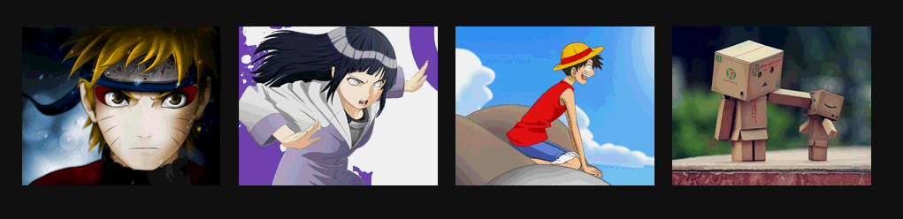
Rendering:
Some new css3 properties used in the example:
a. -webkit-perspective: 800px;
Perspective (perspective, perspective): Attribute defines the distance of the 3D element from the view, in pixels. This property allows you to change the 3D element's view of the 3D element. Determines whether what you see is a 2D transform or a 3D transform.
b, -webkit-transform-style: preserve-3d;
The transform-style attribute specifies how to render nested elements in 3D space. The default is flat, we use 3D effect, and then select 3D.
c, -webkit-backface-visibility: hidden; Whether to display the selected element after it is rotated to the back.
d、-webkit-transform: rotateY(0); The element rotates around the Y axis.
The above attributes will give you a perceptual understanding first. After reading the examples, you can then taste these attributes carefully, or use Baidu or Google Shenma.
Example:
Html:
<body>


<p id="content">
    <ul>
        <li>
            <a href="#" target="_blank">
                <p><img alt="" src="images/1.jpg"/></p>
                <p>
                    <h3>漩涡鸣人</h3>

                    <p>日本漫画家岸本齐史作品《火影忍者》中男主角。因为身上封印着邪恶的九尾妖狐,无父无母的他受尽了村人的冷眼与歧视,他下定决心要成为第六代火影,让所有人都认同他的存在。</p>
                </p>
            </a>
        </li>
        <li>
            <a href="#" target="_blank">
                <p>
                    <img alt="" src="images/2.jpg"/>
                </p>
                <p>
                    <h3>日向雏田</h3>

                    <p>
                        日本漫画家岸本齐史作品《火影忍者》中的3号女主角。木叶忍者村的女忍者,木叶名门日向一族宗家族长的长女。喜欢漩涡鸣人,原本是个性格柔弱的女孩,但是在鸣人的影响下逐渐变得坚强,并逐渐成长为一名优秀的忍者。</p>
                </p>
            </a>
        </li>
        <li>
            <a href="#" target="_blank">
                <p><img alt="" src="images/3.jpg"/></p>
                <p>
                    <h3>蒙奇·D·路飞</h3>

                    <p>蒙奇·D·路飞 是日本人气动漫 《海贼王》中的主人公。是日本人气动漫 《海贼王》中的主人公。草帽海贼团船长,梦想是找到传说中的宝藏 —— ONE PIECE,成为海贼王。</p>
                </p>
            </a>
        </li>
        <li>
            <a href="#" target="_blank">
                <p>
                    <img alt="" src="images/4.jpg"/>
                </p>
                <p>
                    <h3>盒子先生</h3>

                    <p>
                        Danbo是一只用废纸盒DIY出来的可爱玩偶,圆圆的眼睛和三角形的嘴巴,时刻露出无辜的表情,让人看到就心软,Danbo是个纯真善良的小家伙,在它单纯的幻想世界里,总是透露出最纯真可爱的动人气息。</p>
                </p>
            </a>
        </li>
    </ul>
</p>


</body>is quite simple:
ul is a set of pictures, and there is a in each li (because we I hope you can jump by clicking on the picture), a contains two p's, one is when it is displayed normally (that is, the picture is displayed), and the other is when the picture is rotated (that is, the introduction).
CSS:
 <link href="css/reset.css" rel="stylesheet" type="text/css">

    <style type="text/css">

        body
        {
            font-size: 14px;
            font-family: Microsoft YaHei, Tahoma, Geneva, sans-serif;
            background: #111;
        }

        #content ul
        {
            width: 960px;
            margin: 150px auto;
            padding: 60px 0;
        }

        #content ul li
        {
            margin-right: 20px;
            width: 225px;
            height: 180px;
            float: left;
        }

        #content ul li:last-child
        {
            margin-right: 0;
        }

        #content ul li a
        {
            position: relative;
            display: block;
            width: 100%;
            height: 100%;
            /*舞台(动画元素的父容器)perspective*/
            -webkit-perspective: 800px;
            -moz-perspective: 800px;

        }

        #content ul li a > p
        {
            position: absolute;
            left: 0;
            height: 0;
            width: 100%;
            height: 100%;
            color: #fff;
            /*动画元素transform-style*/
            -webkit-transform-style: preserve-3d;
            -webkit-transition: .8s ease-in-out ;
            /*动画元素背后设置为hidden*/
            -webkit-backface-visibility: hidden;
        }

        #content ul li a p:first-child
        {
            /*
            绕y轴旋转
            */
            -webkit-transform: rotateY(0);
            z-index: 2;
        }

        #content ul li a p:last-child
        {
            background: url("images/bg.jpg") no-repeat 0 0;
            -webkit-transform: rotateY(180deg);
            z-index: 1;
        }

        #content ul li a:hover p:first-child
        {
            -webkit-transform: rotateY(-180deg);
        }

        #content ul li a:hover p:last-child
        {
            -webkit-transform: rotateY(0);
        }

        #content ul li a p h3
        {
            margin: 0 auto 15px;
            padding: 15px 0;
            width: 200px;
            height: 16px;
            line-height: 16px;
            font-size: 14px;
            text-align: center;
            border-bottom: 1px #fff dashed;
        }

        #content ul li a p p
        {
            padding: 0 10px;
            font-size: 12px;
            text-indent: 2em;
            line-height: 18px;
        }


</style>Okay, in the above CSS you can find the CSS properties mentioned earlier in the article.
1. The most important thing is to understand rotateY, which rotates around the y-axis. Remember that I also used similar attributes transform: rotate(2520deg); in the exquisite case of HTML5 CSS3: realizing personalized slideshows in VCD packaging boxes. It's a 2D rotation.
rotateY literally rotates around the y-axis. Someone must ask where the y-axis is:
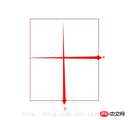
The default center point of the rotated element is the rotation center (you can pass transform-origin modification), the x and y axes are on the graph, and the z-axis is the arrow going out from the center (the arrow shooting towards your head from the screen).
In our example, the default image rotateY=0; the mouse pointer is rotateY=-180, a negative number means counterclockwise rotation around the y-axis, a positive number means clockwise rotation; the same applies to the other two axes;
The core of our example is that when the mouse points to: picture (p:first-child), it rotates 180 degrees counterclockwise around the y-axis from 0 degrees to -180 degrees; introduction (p:last-child) starts from 180 Rotate 180 degrees counterclockwise around the y-axis to reach 0 degrees. Creates the effect of two counterclockwise rotations together. Some people may ask why the default introduction is not 0 degrees. Note here that the introduction is in a frontal state after being rotated 180 degrees counterclockwise, so when the image is covered, it is equivalent to a 180-degree clockwise rotation from the normal state, because when the mouse points Need to return to normalcy.
Perspective, there is a trick for setting the stage (the parent element of the animation).
Transform-style’s 3D changes are of course 3D, there’s nothing much to say.
There are many more attributes related to the 3D effect of css3. If I have the opportunity, I will deliberately use unused ones in future examples~
The above is the entire content of this article. I hope it will be helpful to everyone's learning. Helpful, please pay attention to the PHP Chinese website for more related content!
Related recommendations:
How to use css to stretch and fill the background image to avoid repeated display
How to implement a canvas circular countdown Component
The above is the detailed content of Use CSS3 to achieve image flip effect. For more information, please follow other related articles on the PHP Chinese website!

Hot AI Tools

Undresser.AI Undress
AI-powered app for creating realistic nude photos

AI Clothes Remover
Online AI tool for removing clothes from photos.

Undress AI Tool
Undress images for free

Clothoff.io
AI clothes remover

Video Face Swap
Swap faces in any video effortlessly with our completely free AI face swap tool!

Hot Article
Hot Tools

Notepad++7.3.1
Easy-to-use and free code editor

SublimeText3 Chinese version
Chinese version, very easy to use

Zend Studio 13.0.1
Powerful PHP integrated development environment

Dreamweaver CS6
Visual web development tools

SublimeText3 Mac version
God-level code editing software (SublimeText3)
Hot Topics


 How to achieve wave effect with pure CSS3? (code example)
Jun 28, 2022 pm 01:39 PM
How to achieve wave effect with pure CSS3? (code example)
Jun 28, 2022 pm 01:39 PM
How to achieve wave effect with pure CSS3? This article will introduce to you how to use SVG and CSS animation to create wave effects. I hope it will be helpful to you!
 Use CSS skillfully to realize various strange-shaped buttons (with code)
Jul 19, 2022 am 11:28 AM
Use CSS skillfully to realize various strange-shaped buttons (with code)
Jul 19, 2022 am 11:28 AM
This article will show you how to use CSS to easily realize various weird-shaped buttons that appear frequently. I hope it will be helpful to you!
 How to hide elements in css without taking up space
Jun 01, 2022 pm 07:15 PM
How to hide elements in css without taking up space
Jun 01, 2022 pm 07:15 PM
Two methods: 1. Using the display attribute, just add the "display:none;" style to the element. 2. Use the position and top attributes to set the absolute positioning of the element to hide the element. Just add the "position:absolute;top:-9999px;" style to the element.
 How to flip the screen in Eye of Deep Space
Mar 22, 2024 pm 10:41 PM
How to flip the screen in Eye of Deep Space
Mar 22, 2024 pm 10:41 PM
Players can flip the screen when playing the game in Eye of Deep Space. Many users do not know how to flip the screen in Eye of Deep Space. Players need to turn on the option to support screen rotation in the control center and then return to the game. How to flip the screen of Deep Space Eye 1. Open the screen of your phone and slide up from the bottom of the screen with your finger. 2. Then you can open the control center. In the upper right corner of the control center is the switch to turn off screen rotation. 3. Click it to turn on screen rotation. At this time, you will find that the icon controlling rotation is highlighted in the control center. 4. When you open an application that supports screen rotation, it will rotate as the orientation of the phone changes.
 Methods and techniques on how to achieve image flipping effect through pure CSS
Oct 20, 2023 am 10:57 AM
Methods and techniques on how to achieve image flipping effect through pure CSS
Oct 20, 2023 am 10:57 AM
Methods and techniques on how to achieve image flipping effects through pure CSS Preface: In web development, we often need to add some animation effects to web pages to increase user experience. The flipping effect of pictures is one of the common effects. It is not only simple and convenient to realize the flipping of images through pure CSS, but also avoids the additional overhead caused by using other languages such as JavaScript. This article will introduce how to achieve the flip effect of images through pure CSS, and provide specific code examples. 1. Using CSS3 transfo
 How to implement lace borders in css3
Sep 16, 2022 pm 07:11 PM
How to implement lace borders in css3
Sep 16, 2022 pm 07:11 PM
In CSS, you can use the border-image attribute to achieve a lace border. The border-image attribute can use images to create borders, that is, add a background image to the border. You only need to specify the background image as a lace style; the syntax "border-image: url (image path) offsets the image border width inward. Whether outset is repeated;".
 HTML, CSS, and jQuery: Build a beautiful card flip effect
Oct 27, 2023 pm 01:43 PM
HTML, CSS, and jQuery: Build a beautiful card flip effect
Oct 27, 2023 pm 01:43 PM
HTML, CSS and jQuery: Build a beautiful card flip effect In web design, the application of special effects can increase the interactivity and visual effects of the page. The card flipping effect is a common special effect that can bring users a more vivid and interesting browsing experience. This article will introduce how to use HTML, CSS and jQuery to build a beautiful card flip effect, and provide specific code examples. First, we need to prepare the basic structure of HTML. We will use two div elements to represent the front of the card
 It turns out that text carousel and image carousel can also be realized using pure CSS!
Jun 10, 2022 pm 01:00 PM
It turns out that text carousel and image carousel can also be realized using pure CSS!
Jun 10, 2022 pm 01:00 PM
How to create text carousel and image carousel? The first thing everyone thinks of is whether to use js. In fact, text carousel and image carousel can also be realized using pure CSS. Let’s take a look at the implementation method. I hope it will be helpful to everyone!
