
 Web Front-end
CSS Tutorial
Detailed explanation of the example of implementing accordion effect using pure CSS
Web Front-end
CSS Tutorial
Detailed explanation of the example of implementing accordion effect using pure CSS
Detailed explanation of the example of implementing accordion effect using pure CSS

This article mainly introduces the relevant information about the sample code for realizing the accordion effect using pure CSS. The editor thinks it is quite good, so I will share it with you now and give it as a reference. Let’s follow the editor to take a look, I hope it can help everyone.
Yesterday I was working on a travel page project, and encountered such a requirement during the implementation of the front-end page. It is necessary to form a group of pictures into an accordion display effect. After thinking about it carefully, I decided to use ordinary HTML+CSS to achieve this requirement. I took advantage of my free time to sort it out a little today.
Implementation principle:
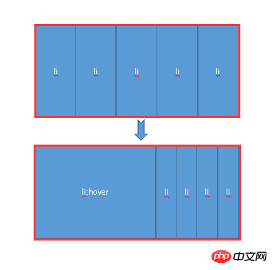
Mainly uses the hover attribute of CSS. When the mouse is not moved up, all li share the width of the entire container. When the mouse moves up, hover takes effect, allowing the li tag to return to the width of the original image, and other images share the remaining width. At the same time, the transition attribute is added to produce a gradient effect.
Next, let’s experience it personally through a small demo:
HTML code:
##
<body>
        <p class="contain">
            <ul>
                <li>
                    <a href="#">
                        <img src="img/1.jpg" />
                    </a>
                    <p class="title">
                        <a href="#">云南.大理</a>
                    </p>
                </li>
                <li>
                    <a href="#">
                        <img src="img/2.jpg" />
                    </a>
                    <p class="title">
                        <a href="#">广西.桂林</a>
                    </p>
                </li>
                <li>
                    <a href="#">
                        <img src="img/3.jpg" />
                    </a>
                    <p class="title">
                        <a href="#">福建.厦门</a>
                    </p>
                </li>
                <li>
                    <a href="#">
                        <img src="img/4.jpg" />
                    </a>
                    <p class="title">
                        <a href="#">浙江.千岛湖</a>
                    </p>
                </li>
                <li>
                    <a href="#">
                        <img src="img/5.jpg" />
                    </a>
                    <p class="title">
                        <a href="#">长江.三峡</a>
                    </p>
                </li>
            </ul>
        </p>
</body>
        .contain {
            width: 1050px;
            margin: 100px auto;
        }

        .contain li {
            float: left;
            list-style: none;
            width: 200px;
            height:284px;
            transition: all 2s;
            position: relative;
            overflow: hidden;
            border-left: 2px solid rgba(255, 255, 255, .8);
            box-shadow: 0px 0px 20px rgba(0, 0, 0, 0.8);
        }

        .contain ul:hover li {
            width: 80px;
        }

        .contain ul li:hover {
            width: 500px;
        }

        .contain li .title {
            position: absolute;
            width: 100%;
            height: 50px;
            background-color: rgba(0, 0, 0, .5);
            text-indent: 2em;
            line-height: 50px;
            bottom: 0px;
            left: 0
        }

        .contain a {
            color: #fff;
            text-decoration: none;
        }

1.hover selector
Explanation: The :hover selector is used to select the mouse pointer The element that floats above. The :hover selector can be used on all elements, not just links. Supplement: The :link selector sets the style of links pointing to pages that have not been visited, the :visited selector is used to set links to pages that have been visited, and the :active selector is used for active links. Extension: In the CSS definition, :hover must be located after :link and :visited (if present), so that the style can take effect.2.Transition attribute
Explanation: Transition is a shorthand attribute of CSS3, used to set four transition attributes:- transition-property: Specifies the name of the CSS property that sets the transition effect.
- transition-duration: Specifies how many seconds or milliseconds it takes to complete the transition effect.
- transition-timing-function: Specifies the speed curve of the speed effect.
- transition-delay: Defines when the transition effect starts.
jquery accordion focus animation
JQuery implements simple accordion effect example code
Using Bootstrap to implement accordion effect
The above is the detailed content of Detailed explanation of the example of implementing accordion effect using pure CSS. For more information, please follow other related articles on the PHP Chinese website!

Hot AI Tools

Undresser.AI Undress
AI-powered app for creating realistic nude photos

AI Clothes Remover
Online AI tool for removing clothes from photos.

Undress AI Tool
Undress images for free

Clothoff.io
AI clothes remover

Video Face Swap
Swap faces in any video effortlessly with our completely free AI face swap tool!

Hot Article
Hot Tools

Notepad++7.3.1
Easy-to-use and free code editor

SublimeText3 Chinese version
Chinese version, very easy to use

Zend Studio 13.0.1
Powerful PHP integrated development environment

Dreamweaver CS6
Visual web development tools

SublimeText3 Mac version
God-level code editing software (SublimeText3)
Hot Topics


 How to use bootstrap in vue
Apr 07, 2025 pm 11:33 PM
How to use bootstrap in vue
Apr 07, 2025 pm 11:33 PM
Using Bootstrap in Vue.js is divided into five steps: Install Bootstrap. Import Bootstrap in main.js. Use the Bootstrap component directly in the template. Optional: Custom style. Optional: Use plug-ins.
 The Roles of HTML, CSS, and JavaScript: Core Responsibilities
Apr 08, 2025 pm 07:05 PM
The Roles of HTML, CSS, and JavaScript: Core Responsibilities
Apr 08, 2025 pm 07:05 PM
HTML defines the web structure, CSS is responsible for style and layout, and JavaScript gives dynamic interaction. The three perform their duties in web development and jointly build a colorful website.
 How to write split lines on bootstrap
Apr 07, 2025 pm 03:12 PM
How to write split lines on bootstrap
Apr 07, 2025 pm 03:12 PM
There are two ways to create a Bootstrap split line: using the tag, which creates a horizontal split line. Use the CSS border property to create custom style split lines.
 Understanding HTML, CSS, and JavaScript: A Beginner's Guide
Apr 12, 2025 am 12:02 AM
Understanding HTML, CSS, and JavaScript: A Beginner's Guide
Apr 12, 2025 am 12:02 AM
WebdevelopmentreliesonHTML,CSS,andJavaScript:1)HTMLstructurescontent,2)CSSstylesit,and3)JavaScriptaddsinteractivity,formingthebasisofmodernwebexperiences.
 How to set up the framework for bootstrap
Apr 07, 2025 pm 03:27 PM
How to set up the framework for bootstrap
Apr 07, 2025 pm 03:27 PM
To set up the Bootstrap framework, you need to follow these steps: 1. Reference the Bootstrap file via CDN; 2. Download and host the file on your own server; 3. Include the Bootstrap file in HTML; 4. Compile Sass/Less as needed; 5. Import a custom file (optional). Once setup is complete, you can use Bootstrap's grid systems, components, and styles to create responsive websites and applications.
 How to insert pictures on bootstrap
Apr 07, 2025 pm 03:30 PM
How to insert pictures on bootstrap
Apr 07, 2025 pm 03:30 PM
There are several ways to insert images in Bootstrap: insert images directly, using the HTML img tag. With the Bootstrap image component, you can provide responsive images and more styles. Set the image size, use the img-fluid class to make the image adaptable. Set the border, using the img-bordered class. Set the rounded corners and use the img-rounded class. Set the shadow, use the shadow class. Resize and position the image, using CSS style. Using the background image, use the background-image CSS property.
 How to use bootstrap button
Apr 07, 2025 pm 03:09 PM
How to use bootstrap button
Apr 07, 2025 pm 03:09 PM
How to use the Bootstrap button? Introduce Bootstrap CSS to create button elements and add Bootstrap button class to add button text
 How to resize bootstrap
Apr 07, 2025 pm 03:18 PM
How to resize bootstrap
Apr 07, 2025 pm 03:18 PM
To adjust the size of elements in Bootstrap, you can use the dimension class, which includes: adjusting width: .col-, .w-, .mw-adjust height: .h-, .min-h-, .max-h-
