最新下载


24小时阅读排行榜
- 1 微博的浏览记录会同步吗_微博浏览记录同步规则说明
- 2 如何在Windows中配置JavaFX开发环境
- 3 如何通过css工具Sass实现循环生成类
- 4 python错误类型捕获的方法
- 5 PHP一键环境为什么不能发送邮件_邮件发送功能配置
- 6 彻底格式化硬盘并进行纯净Windows安装
- 7 Linux用户权限怎么管理_Linux用户权限管理的详细操作教程
- 8 PHPWebSocket怎么通信_PHP结合GatewayWorker实现WebSocket实时通信
- 9 抖音tiktok官方网址入口官方版 抖音tiktok官网首页快速直达
- 10 小强阅读app怎么删除书架上的书_小强阅读app已存书籍如何从书架删除详细方法
- 11 Linux SSH授权密钥与权限设置
- 12 阴阳师一起捉咪藏第三天攻略-阴阳师一起捉咪藏第三天在哪找
- 13 PHP代码怎么实现验证码生成_PHP验证码图片生成与验证步骤
- 14 css初级项目导航栏下拉效果优化
- 15 OFX代购大额汇款优势在哪里_OFX代购大额汇款优势解读
最新教程

-
- Node.js 教程
- 5844 2025-08-28
-
- CSS3 教程
- 856066 2025-08-27
-
- Rust 教程
- 9300 2025-08-27
-
- Vue 教程
- 11382 2025-08-22
-
- PostgreSQL 教程
- 8883 2025-08-21
-
- Git 教程
- 4704 2025-08-21
<head>
<meta charset="utf-8">
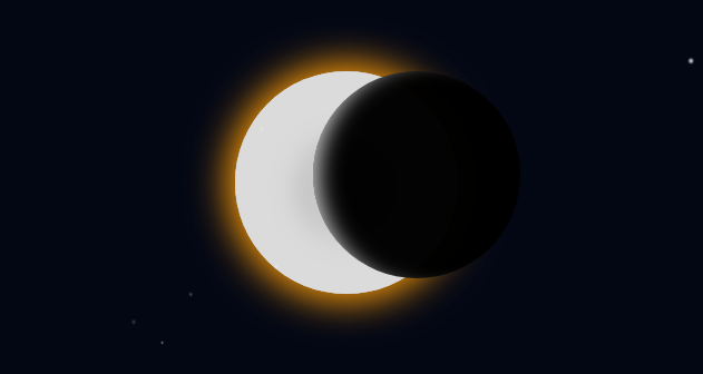
<title>逼真的CSS3日食动画特效</title>
<style>
html, body {
width: 100%;
overflow-x: hidden;
}
*, *:before, *:after {
box-sizing: border-box;
margin: 0;
padding: 0;
}
.universe {
width: 100vw;
height: 100vh;
background: #030613;
display: block;
position: relative;
-webkit-animation: skyDim 4s 8s linear forwards;
animation: skyDim 4s 8s linear forwards;
}
.universe:before {
content: "";
box-shadow: 10vw 1vh #fff, 14vw 29vh 2px #FFF, 23vw 34vh 1px #FFF, 1vw 99vh 1px #FFF, 20vw 80vh #FFF, 90vw 10vh 2px #fff, 55vw 9vh #FFF, 24vw 4vh 1px #FFF, 50vw 99vh 1px #FFF, 74vw 40vh 1px #FFF, 80vw 9vh 1px #FFF, 20vw 80vh #FFF, 85vw 78vh #fff;
width: 4px;
height: 4px;
position: absolute;
border-radius: 50%;
-webkit-animation: starsFloating 100s -200s linear both infinite;
animation: starsFloating 100s -200s linear both infinite;
}
.universe:after {
content: "";
box-shadow: 37vw 78vh #fff, 17vw 69vh #FFF, 68vw 4vh 1px #FFF, 98vw 9vh 1px #FFF, 45vw 67vh #FFF, 95vw 1vh 2px #fff, 35vw 75vh 2px #FFF, 44vw 47vh 1px #FFF, 54vw 5vh 1px #FFF, 22vw 29vh 1px #FFF, 39vw 71vh 1px #FFF, 11vw 11vh #FFF, 88vw 82vh #fff;
width: 2px;
height: 2px;
position: absolute;
border-radius: 50%;
-webkit-animation: starsFloating 100s 3s linear backwards infinite;
animation: starsFloating 100s 3s linear backwards infinite;
}
.sun {
height: 200px;
width: 200px;
border-radius: 50%;
background: #cfcfd4;
box-shadow: 0 0 60px gold, 0 0 100px #b9a018, inset 0 5px 35px 53px #dbdbdb, inset 48px 8px 34px 25px #c4c4c4;
left: calc(50% - 100px);
top: calc(50% - 100px);
position: absolute;
-webkit-animation: sunFreakOut 5s 7.1s linear forwards;
animation: sunFreakOut 5s 7.1s linear forwards;
}
.moon {
height: 50px;
width: 50px;
border-radius: 50%;
background: rgba(0, 0, 0, 0.99);
box-shadow: inset 5px 1px 10px -8px #d4d4d6;
-webkit-transition: 1s;
transition: 1s;
top: calc(40% - 100px);
position: absolute;
z-index: 5;
-webkit-animation: move 20s ease-in-out forwards;
animation: move 20s ease-in-out forwards;
}
@-webkit-keyframes move {
0% {
-webkit-transform: translateX(100vw);
transform: translateX(100vw);
}
40%, 60% {
top: calc(50% - 100px);
}
50%, 50.5% {
width: 200px;
height: 200px;
-webkit-transform: translateX(calc(50vw - 100px));
transform: translateX(calc(50vw - 100px));
box-shadow: inset 20px 1px 35px -15px #d4d4d6;
top: calc(50% - 100px);
}
60% {
box-shadow: inset -20px 1px 35px -15px #d4d4d6;
}
100% {
width: 50px;
height: 50px;
-webkit-transform: translateX(calc(-1vw - 60px));
transform: translateX(calc(-1vw - 60px));
top: calc(40% - 100px);
box-shadow: inset -5px 1px 10px -8px #d4d4d6;
}
}
@keyframes move {
0% {
-webkit-transform: translateX(100vw);
transform: translateX(100vw);
}
40%, 60% {
top: calc(50% - 100px);
}
50%, 50.5% {
width: 200px;
height: 200px;
-webkit-transform: translateX(calc(50vw - 100px));
transform: translateX(calc(50vw - 100px));
box-shadow: inset 20px 1px 35px -15px #d4d4d6;
top: calc(50% - 100px);
}
60% {
box-shadow: inset -20px 1px 35px -15px #d4d4d6;
}
100% {
width: 50px;
height: 50px;
-webkit-transform: translateX(calc(-1vw - 60px));
transform: translateX(calc(-1vw - 60px));
top: calc(40% - 100px);
box-shadow: inset -5px 1px 10px -8px #d4d4d6;
}
}
@-webkit-keyframes skyDim {
0%, 100% {
background: #030613;
}
50%, 70% {
background: black;
}
}
@keyframes skyDim {
0%, 100% {
background: #030613;
}
50%, 70% {
background: black;
}
}
@-webkit-keyframes sunFreakOut {
0%, 100% {
box-shadow: 0 0 60px gold, 0 0 100px #b9a018, inset 0 5px 35px 53px #dbdbdb, inset 48px 8px 34px 25px #c4c4c4;
}
50%, 70% {
box-shadow: 0 0 50px #e30000, 0 0 0px #b91818, inset 0 5px 35px 53px #dbdbdb, inset 48px 8px 34px 25px #c4c4c4;
}
}
@keyframes sunFreakOut {
0%, 100% {
box-shadow: 0 0 60px gold, 0 0 100px #b9a018, inset 0 5px 35px 53px #dbdbdb, inset 48px 8px 34px 25px #c4c4c4;
}
50%, 70% {
box-shadow: 0 0 50px #e30000, 0 0 0px #b91818, inset 0 5px 35px 53px #dbdbdb, inset 48px 8px 34px 25px #c4c4c4;
}
}
@-webkit-keyframes starsFloating {
0% {
opacity: 0;
}
10% {
opacity: 1;
}
100% {
-webkit-transform: translateY(-100vh);
transform: translateY(-100vh);
}
}
@keyframes starsFloating {
0% {
opacity: 0;
}
10% {
opacity: 1;
}
100% {
-webkit-transform: translateY(-100vh);
transform: translateY(-100vh);
}
}
</style>
</head>
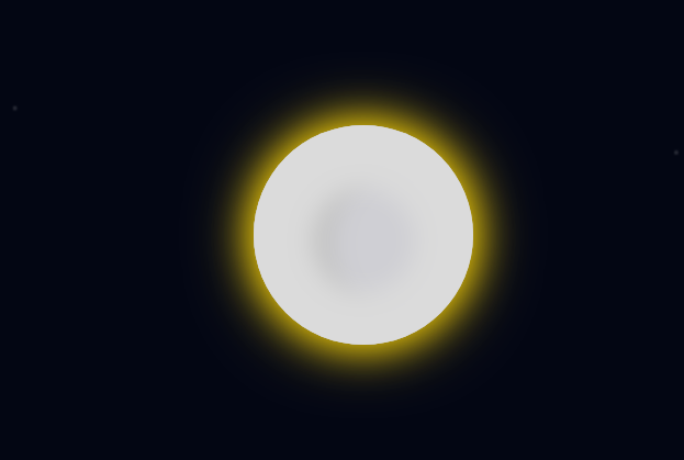
这是一款非常逼真的使用纯CSS3实现的一个天狗食月日食动画特效,当日全食时,还有背景星星闪烁动画特效,效果很漂亮


相关推荐


热门下载


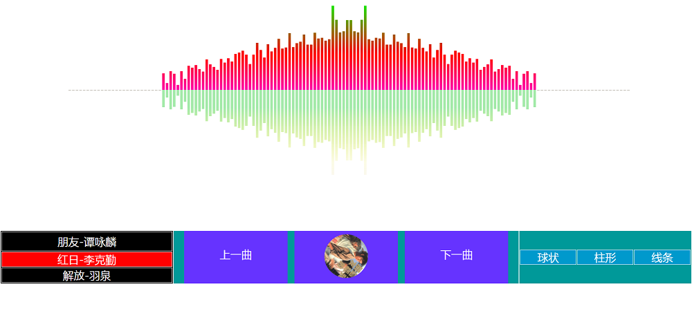
canvas音谱可视化mp3音乐播放器代码