

About how to use the JS component Bootstrap navigation bar

This article mainly introduces the use of the JS component Bootstrap navigation bar in detail. Interested friends can refer to it
The navigation bar is used as the navigation header in your application or website Responsive meta-component.
1. The default navigation bar
The navigation bar can be folded (and can be opened or closed) on mobile devices, and within the available viewport width When increasing, it changes to horizontal expansion mode
Customize the thresholds of collapsed mode and horizontal mode
Depending on the length of the content you place on the navigation bar, you may need to adjust it The threshold for the navigation bar to enter collapsed and horizontal modes. You can achieve your needs by changing the value of the @grid-float-breakpoint variable or adding your own media query CSS code.
Step one:
Add the nav-bar style class to the outermost container nav tag, indicating that it belongs to the navigation bar
<nav class="navbar navbar-default" role="navigation">
</nav>
Effect:

Step 2: Add header
<nav class="navbar navbar-default" role="navigation">
  <p class="navbar-header">
  <button type="button" class="navbar-toggle" data-toggle="collapse" data-target="#bs-example-navbar-collapse-1">
  <span class="sr-only">Toggle navigation</span>
  <span class="icon-bar"></span>
  <span class="icon-bar"></span>
  <span class="icon-bar"></span>
  </button>
  <a href="#" class="navbar-brand">品牌</a>
  </p>
 </nav>
There are three span icons nested in the button label. Then give the navbar-toggle style class and attribute collapse (collapse), and the target is data-target when clicked.
When the window is reduced to a certain extent, the effect on the right appears.

Step 3: Nested drop-down menu, form form, drop-down menu.
Code:
<h1 class="page-header">导航条</h1>
 <nav class="navbar navbar-default" role="navigation">
  <p class="navbar-header">
  <button type="button" class="navbar-toggle" data-toggle="collapse" data-target="#bs-example-navbar-collapse-1">
  <span class="sr-only">Toggle navigation</span>
  <span class="icon-bar"></span>
  <span class="icon-bar"></span>
  <span class="icon-bar"></span>
  </button>
  <a href="#" class="navbar-brand">品牌</a>
  </p>
  <p class="collapse navbar-collapse" id="bs-example-navbar-collapse-1">
  <!--嵌套下拉菜单-->
  <ul class="nav navbar-nav">
   <li class="active"><a href="#">Link</a></li>
   <li><a href="#">Link</a></li>
   <li><a href="#">Link</a></li>
   <li class="dropdown">
   <a href="#" class="dropdown-toggle" data-toggle="dropdown">
   下拉<b class="caret"></b>
   </a>
   <ul class="dropdown-menu">
    <li><a href="#">Action</a></li>
    <li><a href="#">Action</a></li>
    <li><a href="#">Action</a></li>
    <li><a href="#">Action</a></li>
   </ul>
   </li>
  </ul>

  <!--嵌套表单-->
  <form action="" class="navbar-form navbar-left" role="search">
   <p class="form-group">
   <input type="text" class="form-control" />
   </p>
   <button type="button" class="btn btn-default">Submit</button>

  </form>
  <!---->
  </p>
</nav>Preview:

Enhance the accessibility of the navigation bar Property
To enhance accessibility, be sure to add role="navigation" to each navigation bar.
2. Form
Placing the form within .navbar-form can present good vertical alignment and present a collapsed state in a narrower viewport. Use the alignment options to determine where it appears on the navigation bar.
A lot of code is shared through the use of mixins, .navbar-form and .form-inline.
Code
<form action="" class="navbar-form navbar-left" role="search">
   <p class="form-group">
   <input type="text" class="form-control" />
   </p>
   <button type="button" class="btn btn-default">Submit</button>

  </form>

Add a label label for the input box
If you do not have a label for the input box Screen readers will have problems adding label tags. For forms within the navigation bar, you can hide the label label through .sr-only class.
3. Button
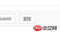
Code:
<button type="button" class="btn btn-default navbar-btn">登陆</button>
Preview:
4. Text
When wrapping text in .navbar-text, in order to have correct line spacing and color, the
tag is usually used.
Code snippet:
<p class="navbar-text">文本</p>
5. Non-navigation links
Maybe you want to add standard links in addition to standard navigation components, then use .navbar -link class allows links to have the correct default color and inverse color.
Code snippet:
<p class="navbar-text navbar-right">这个是<a href="#" class="navbar-link">链接</a></p>
6. Component alignment
Use the .navbar-left or .navbar-right tool class to align navigation links, forms, buttons or text. Both classes use CSS float styles in specific directions. For example, to align navigation links, place them in a separate
- that has a utility class applied to them.
These classes are mixin versions of .pull-left and .pull-right, but they are limited to media queries, which makes it easier to handle the navigation bar component on various screen sizes.
7. Fixed at the top
Add .navbar-fixed-top to fix the navigation bar at the top. The effect is gone.
Need to set padding for the body tag
This fixed navigation bar will cover other content on the page, unless you set padding above the
body { padding-top: 70px; } must be placed after the core file of Bootstrap CSS. (Covering problem)
8. Fixed at the bottom
Replace with .navbar-fixed-bottom.
Need to set internal (padding) for the body tag
This fixed navigation bar will cover other content on the page, unless you set padding at the bottom of
body { padding-bottom: 70px; }一定要在加载Bootstrap CSS的核心后使用它。
9、静止在顶部
通过添加.navbar-static-top即可创建一个与页面的导航条。它会随着页面向下滚动而消失。和.navbar-fixed-*类不同的是,你不用给body添加padding。
10、反色的导航条
通过添加.navbar-inverse类可以改变导航条的外观。
以上就是本文的全部内容,希望对大家的学习有所帮助,更多相关内容请关注PHP中文网!
相关推荐:
关于jQuery插件Validate实现自定义校验结果样式的代码
bootstrap时间控件daterangepicker的使用方法
The above is the detailed content of About how to use the JS component Bootstrap navigation bar. For more information, please follow other related articles on the PHP Chinese website!

Hot AI Tools

Undresser.AI Undress
AI-powered app for creating realistic nude photos

AI Clothes Remover
Online AI tool for removing clothes from photos.

Undress AI Tool
Undress images for free

Clothoff.io
AI clothes remover

Video Face Swap
Swap faces in any video effortlessly with our completely free AI face swap tool!

Hot Article
Hot Tools

Notepad++7.3.1
Easy-to-use and free code editor

SublimeText3 Chinese version
Chinese version, very easy to use

Zend Studio 13.0.1
Powerful PHP integrated development environment

Dreamweaver CS6
Visual web development tools

SublimeText3 Mac version
God-level code editing software (SublimeText3)
Hot Topics


 How to use bootstrap in vue
Apr 07, 2025 pm 11:33 PM
How to use bootstrap in vue
Apr 07, 2025 pm 11:33 PM
Using Bootstrap in Vue.js is divided into five steps: Install Bootstrap. Import Bootstrap in main.js. Use the Bootstrap component directly in the template. Optional: Custom style. Optional: Use plug-ins.
 How to get the bootstrap search bar
Apr 07, 2025 pm 03:33 PM
How to get the bootstrap search bar
Apr 07, 2025 pm 03:33 PM
How to use Bootstrap to get the value of the search bar: Determines the ID or name of the search bar. Use JavaScript to get DOM elements. Gets the value of the element. Perform the required actions.
 How to do vertical centering of bootstrap
Apr 07, 2025 pm 03:21 PM
How to do vertical centering of bootstrap
Apr 07, 2025 pm 03:21 PM
Use Bootstrap to implement vertical centering: flexbox method: Use the d-flex, justify-content-center, and align-items-center classes to place elements in the flexbox container. align-items-center class method: For browsers that do not support flexbox, use the align-items-center class, provided that the parent element has a defined height.
 How to set up the framework for bootstrap
Apr 07, 2025 pm 03:27 PM
How to set up the framework for bootstrap
Apr 07, 2025 pm 03:27 PM
To set up the Bootstrap framework, you need to follow these steps: 1. Reference the Bootstrap file via CDN; 2. Download and host the file on your own server; 3. Include the Bootstrap file in HTML; 4. Compile Sass/Less as needed; 5. Import a custom file (optional). Once setup is complete, you can use Bootstrap's grid systems, components, and styles to create responsive websites and applications.
 How to write split lines on bootstrap
Apr 07, 2025 pm 03:12 PM
How to write split lines on bootstrap
Apr 07, 2025 pm 03:12 PM
There are two ways to create a Bootstrap split line: using the tag, which creates a horizontal split line. Use the CSS border property to create custom style split lines.
 How to insert pictures on bootstrap
Apr 07, 2025 pm 03:30 PM
How to insert pictures on bootstrap
Apr 07, 2025 pm 03:30 PM
There are several ways to insert images in Bootstrap: insert images directly, using the HTML img tag. With the Bootstrap image component, you can provide responsive images and more styles. Set the image size, use the img-fluid class to make the image adaptable. Set the border, using the img-bordered class. Set the rounded corners and use the img-rounded class. Set the shadow, use the shadow class. Resize and position the image, using CSS style. Using the background image, use the background-image CSS property.
 How to use bootstrap button
Apr 07, 2025 pm 03:09 PM
How to use bootstrap button
Apr 07, 2025 pm 03:09 PM
How to use the Bootstrap button? Introduce Bootstrap CSS to create button elements and add Bootstrap button class to add button text
 How to resize bootstrap
Apr 07, 2025 pm 03:18 PM
How to resize bootstrap
Apr 07, 2025 pm 03:18 PM
To adjust the size of elements in Bootstrap, you can use the dimension class, which includes: adjusting width: .col-, .w-, .mw-adjust height: .h-, .min-h-, .max-h-
