
 Web Front-end
JS Tutorial
Issues related to text avoidance in front-end algorithms (detailed tutorial)
Web Front-end
JS Tutorial
Issues related to text avoidance in front-end algorithms (detailed tutorial)
Issues related to text avoidance in front-end algorithms (detailed tutorial)
This article mainly introduces you to the relevant information about text avoidance in the front-end algorithm. I believe many friends do not know this knowledge, but they will be amazed when they see the effect. The main use of inMap text to achieve this effect is The avoidance function is introduced in detail through sample code in this article. Friends who need it can refer to it. Let’s learn it together.
Preface
inMap is a big data visualization library based on canvas, focusing on the visual display of big data direction points, lines and surfaces. Currently supports scatter, fence, thermal, grid, aggregation and other methods; committed to making big data visualization simple and easy to use.
GitHub address: https://github.com/TalkingData/inmap (local download)
Document address: http://inmap.talkingdata.com/
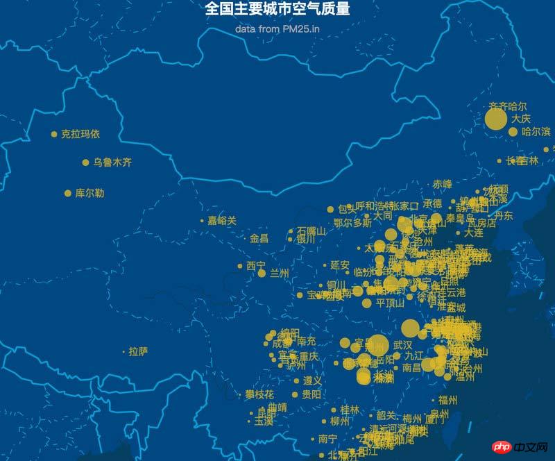
at In geographic information visualization, we often encounter the need to mark text on the map. The following shows the effect of a popular chart chart frame:
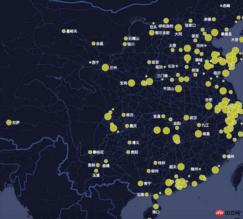
The text space to be displayed When it is not enough, it will cause overlapping text and confusing display, making the user experience very unfriendly.
How to solve this problem? We use text avoidance algorithm to solve this cheating problem.
The following shows the inMap text avoidance effect:
Text labeling algorithm is one of the most complex problems in GIS (belongs to NP complexity problem, so the optimal solution cannot usually be found, only the better solution).
inMap The avoidance algorithm uses the quartile model algorithm. Next, I will teach you step by step how to write the avoidance algorithm. An experienced driver will help you show off and help you fly.
Prepare data
inMap receives latitude and longitude data and needs to map it to the pixel coordinates of the canvas, which uses Mercator Conversion, Mercator's algorithm is very complicated. We will have a separate article to explain its principles in the future. After conversion, the data you get should look like this:
[
 {
 "name": "海门",//要显示的文字
 "lng": 121.15,
 "lat": 31.89,
 "count": 7,
 "pixel": { //像素坐标
  "x": 968,
  "y": 736
 }
 },
 {
 "name": "鄂尔多斯",
 "lng": 109.781327,
 "lat": 39.608266,
 "count": 5,
 "pixel": {
  "x": 659,
  "y": 478
 }
 },
...
]Okay, now that we have the converted pixel coordinate data (x, y), we can do the following.
Find the actual size of each text rectangle
measureText() is a built-in method of canvas, which returns the pixel unit of the font width:
let ctx = this.container.getContext('2d'); // canvas 上下文
let width= ctx.measureText(name).width;
We get the width of each text through measureText. Canvas does not have a direct method to obtain the text. So how do we get the height of the text?
We found through repeated testing that when the font of canvas is equal to the "13px Arial" font (other fonts cannot be guaranteed), the height of the text is about 1.1 times the fontSize.
So the code is as follows:
let fontSize = parseInt(ctx.font);
let height = fontSize * 1.1;
After the width and height of the text are obtained, we can create the coordinate system of the text rectangle.
Create a quartile model
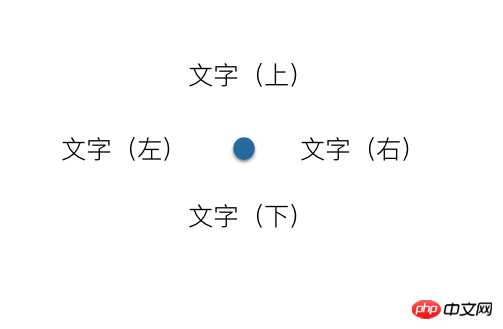
The so-called quartile model, each marker point has There are four places for text on the top, bottom, left and right. If you can't put it on the left side, try putting it on the right side. If it still doesn't work, try putting it on the bottom. And so on. The principle is that simple, haha.
Create a description of the coordinates of the virtual rectangle on the right:
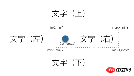
The description of the coordinates of the virtual rectangle on the right also includes dots to prevent text and Dots overlap.
There are some pitfalls when calculating the height of the virtual rectangle. The size of the dots is not fixed, but is dynamically configured according to the user. The diameter of the dots may be greater than the height of the text, so we set the height of the virtual rectangle to always be It's the largest one and requires some special handling.
The code is as follows:
_getLeftAnchor() {
  let x = this.center.x - this.radius - this.textReact.width,
    y = this.center.y - this.textReact.height / 2,
    diam = this.radius * 2,
    maxH = diam > this.textReact.height ? diam : this.textReact.height; //矩形的高度
  return {
    x,
    y,
    minX: x,
    maxX: this.center.x + this.radius,
    minY: this.center.y - maxH / 2,
    maxY: this.center.y + maxH / 2
  };
}And so on, describing the coordinates of the virtual rectangle below, left, and above.
Determine collision
Determine whether two rectangles cover and intersect. The intersection is determined based on the minX, maxX, minY, maxY of the rectangle. The principle is relatively simple. , the code is as follows:
/**
 * 判断分位是否相交
 * @param {*} target
 */
isAnchorMeet(target) {
  let react = this.getCurrentRect(),
    targetReact = target.getCurrentRect();
  if ((react.minX < targetReact.maxX) && (targetReact.minX < react.maxX) &&
    (react.minY < targetReact.maxY) && (targetReact.minY < react.maxY)) {
    return true;
  }
  return false;
}Create a virtual text collection object
let labels = pixels.map((val) => {
  let radius = val.pixel.radius + this.style.normal.borderWidth; //圆点半径
  return new Label(val.pixel.x, val.pixel.y, radius, fontSize, byteWidth, val.name);
});Recursively traverse the virtual text collection and determine whether it intersects with others. If there is an intersection Just move the current text position until they no longer intersect. When you can't find a suitable location, choose to hide the current text.
The code is as follows:
do {
  var meet = false; //本轮是否有相交
  for (let i = 0; i < labels.length; i++) {
    let temp = labels[i];
    for (let j = 0; j < labels.length; j++) {
      if (i != j && temp.show && temp.isAnchorMeet(labels[j])) {
        temp.next();
        meet = true;
        break;
      }
    }
  }
} while (meet);Painting text
labels.forEach(function (item) {
  if (item.show) { //是否显示
    let pixel = item.getCurrentRect();
    ctx.beginPath();
    ctx.fillText(item.text, pixel.x, pixel.y);
    ctx.fill();
  }
});The text avoidance algorithm has been introduced so far, the corresponding inMap file address It is https://github.com/TalkingData/inmap/blob/master/src/worker/helper/Label.js. I will continue to share useful information with you in the future.
The above is what I compiled for everyone. I hope it will be helpful to everyone in the future.
related articles:
How to fix the header and first column in Vue
How express multer implements the image upload function
Native JS How to implement a music player
How to set user permissions in VueJS
How to use YDUI’s ScrollTab component in WeChat applet
The above is the detailed content of Issues related to text avoidance in front-end algorithms (detailed tutorial). For more information, please follow other related articles on the PHP Chinese website!

Hot AI Tools

Undresser.AI Undress
AI-powered app for creating realistic nude photos

AI Clothes Remover
Online AI tool for removing clothes from photos.

Undress AI Tool
Undress images for free

Clothoff.io
AI clothes remover

Video Face Swap
Swap faces in any video effortlessly with our completely free AI face swap tool!

Hot Article
Hot Tools

Notepad++7.3.1
Easy-to-use and free code editor

SublimeText3 Chinese version
Chinese version, very easy to use

Zend Studio 13.0.1
Powerful PHP integrated development environment

Dreamweaver CS6
Visual web development tools

SublimeText3 Mac version
God-level code editing software (SublimeText3)
Hot Topics


 How to implement statistical charts of massive data under the Vue framework
Aug 25, 2023 pm 04:20 PM
How to implement statistical charts of massive data under the Vue framework
Aug 25, 2023 pm 04:20 PM
How to implement statistical charts of massive data under the Vue framework Introduction: In recent years, data analysis and visualization have played an increasingly important role in all walks of life. In front-end development, charts are one of the most common and intuitive ways of displaying data. The Vue framework is a progressive JavaScript framework for building user interfaces. It provides many powerful tools and libraries that can help us quickly build charts and display massive data. This article will introduce how to implement statistical charts of massive data under the Vue framework, and attach
 Some tips for developing data visualization applications using Vue.js and Python
Jul 31, 2023 pm 07:53 PM
Some tips for developing data visualization applications using Vue.js and Python
Jul 31, 2023 pm 07:53 PM
Some tips for developing data visualization applications using Vue.js and Python Introduction: With the advent of the big data era, data visualization has become an important solution. In the development of data visualization applications, the combination of Vue.js and Python can provide flexibility and powerful functions. This article will share some tips for developing data visualization applications using Vue.js and Python, and attach corresponding code examples. 1. Introduction to Vue.js Vue.js is a lightweight JavaScript
 How to use Layui to implement drag-and-drop data visualization dashboard function
Oct 26, 2023 am 11:27 AM
How to use Layui to implement drag-and-drop data visualization dashboard function
Oct 26, 2023 am 11:27 AM
How to use Layui to implement drag-and-drop data visualization dashboard function Introduction: Data visualization is increasingly used in modern life, and the development of dashboards is an important part of it. This article mainly introduces how to use the Layui framework to implement a drag-and-drop data visualization dashboard function, allowing users to flexibly customize their own data display modules. 1. Preparation to download the Layui framework. First, we need to download and configure the Layui framework. You can download it on Layui’s official website (https://www
 How to use C++ for efficient data visualization?
Aug 25, 2023 pm 08:57 PM
How to use C++ for efficient data visualization?
Aug 25, 2023 pm 08:57 PM
How to use C++ for efficient data visualization? Data visualization is to display abstract data through visual means such as charts and graphs, making it easier for people to understand and analyze the data. In the era of big data, data visualization has become an essential skill for workers in various industries. Although many commonly used data visualization tools are mainly developed based on scripting languages such as Python and R, C++, as a powerful programming language, has high operating efficiency and flexible memory management, which also plays an important role in data visualization. . This article will
 Graphviz Tutorial: Create Intuitive Data Visualizations
Apr 07, 2024 pm 10:00 PM
Graphviz Tutorial: Create Intuitive Data Visualizations
Apr 07, 2024 pm 10:00 PM
Graphviz is an open source toolkit that can be used to draw charts and graphs. It uses the DOT language to specify the chart structure. After installing Graphviz, you can use the DOT language to create charts, such as drawing knowledge graphs. After you generate your graph, you can use Graphviz's powerful features to visualize your data and improve its understandability.
 ECharts histogram (horizontal): how to display data ranking
Dec 17, 2023 pm 01:54 PM
ECharts histogram (horizontal): how to display data ranking
Dec 17, 2023 pm 01:54 PM
ECharts histogram (horizontal): How to display data rankings requires specific code examples. In data visualization, histogram is a commonly used chart type, which can visually display the size and relative relationship of data. ECharts is an excellent data visualization tool that provides developers with rich chart types and powerful configuration options. This article will introduce how to use the histogram (horizontal) in ECharts to display data rankings, and give specific code examples. First, we need to prepare a data containing ranking data
 Quick Start: Use Go language functions to implement simple data visualization functions
Aug 02, 2023 pm 04:25 PM
Quick Start: Use Go language functions to implement simple data visualization functions
Aug 02, 2023 pm 04:25 PM
Quick Start: Use Go language functions to implement simple data visualization functions. With the rapid growth and complexity of data, data visualization has become an important means of data analysis and data expression. In data visualization, we need to use appropriate tools and techniques to transform data into charts or graphs that are readable and understandable. As an efficient and easy-to-use programming language, Go language is also widely used in the field of data science. This article will introduce how to use Go language functions to implement simple data visualization functions. We will use Go
 Web project for data visualization using Node.js
Nov 08, 2023 pm 03:32 PM
Web project for data visualization using Node.js
Nov 08, 2023 pm 03:32 PM
Web projects that use Node.js to implement data visualization require specific code examples. With the advent of the big data era, data visualization has become a very important way of displaying data. By converting data into charts, graphs, maps and other forms, it can visually display the trends, correlations and distribution of data, helping people better understand and analyze the data. As an efficient and flexible server-side JavaScript environment, Node.js can well implement data visualization web projects. in the text,
