
 Web Front-end
JS Tutorial
Problems with px and rem conversion when adapting to different screens in vue2.0
Web Front-end
JS Tutorial
Problems with px and rem conversion when adapting to different screens in vue2.0
Problems with px and rem conversion when adapting to different screens in vue2.0
This article mainly introduces the detailed explanation of different screen adaptation and px to rem conversion issues of vue2.0. Now I share it with you and give you a reference.
Due to project needs, Vue development projects must convert the written parts in px to rem. If all are converted, this huge amount of calculations, even if it is the cssrem plug-in of sublime Text, is a huge workload. Therefore, there is no discussion on using the plug-in directly.
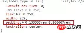
Step one: Because rem calculates the size based on updated elements, capturing the size of the current screen and assigning it to html is one of the steps
Step two: Use the px2rem plug-in , to capture all px of the current project and directly calculate the corresponding values.
In this way, when writing interfaces in the future, you can directly use px to build the interface without having to calculate it yourself!
1. Install the plug-in (I installed the Taobao image, so it is cnpm. If the Taobao image is not installed, just npm)
$ cnpm i postcss-px2rem --save
$ cnpm install px2rem-loader --save
2. Configure px2rem
build directory In vue-loader.conf.js, make the following modifications:
module.exports = {
loaders: utils.cssLoaders({
sourceMap: isProduction
? config.build.productionSourceMap
: config.dev.cssSourceMap,
extract: isProduction
}),
transformToRequire: {
video: 'src',
source: 'src',
img: 'src',
image: 'xlink:href'
},
postcss:[require('postcss-px2rem')({'remUnit':37.5,'baseDpr':2})]

 /*因为我是以750px(iphone6)宽度为基准,所以remUnit为37.5*/
}3. In the static directory, create a js folder and place flex.js:
(function(win, lib) {
var doc = win.document;
var docEl = doc.documentElement;
var metaEl = doc.querySelector('meta[name="viewport"]');
var flexibleEl = doc.querySelector('meta[name="flexible"]');
var dpr = 0;
var scale = 0;
var tid;
var flexible = lib.flexible || (lib.flexible = {});

if (metaEl) {
//console.warn('将根据已有的meta标签来设置缩放比例');
var match = metaEl.getAttribute('content').match(/initial\-scale=([\d\.]+)/);
if (match) {
scale = parseFloat(match[1]);
dpr = parseInt(1 / scale);
}
} else if (flexibleEl) {
var content = flexibleEl.getAttribute('content');
if (content) {
var initialDpr = content.match(/initial\-dpr=([\d\.]+)/);
var maximumDpr = content.match(/maximum\-dpr=([\d\.]+)/);
if (initialDpr) {
dpr = parseFloat(initialDpr[1]);
scale = parseFloat((1 / dpr).toFixed(2));
}
if (maximumDpr) {
dpr = parseFloat(maximumDpr[1]);
scale = parseFloat((1 / dpr).toFixed(2));
}
}
}

if (!dpr && !scale) {
var isAndroid = win.navigator.appVersion.match(/android/gi);
var isIPhone = win.navigator.appVersion.match(/iphone/gi);
var devicePixelRatio = win.devicePixelRatio;
if (isIPhone) {
// iOS下,对于2和3的屏,用2倍的方案,其余的用1倍方案
if (devicePixelRatio >= 3 && (!dpr || dpr >= 3)) {
dpr = 3;
} else if (devicePixelRatio >= 2 && (!dpr || dpr >= 2)){
dpr = 2;
} else {
dpr = 1;
}
} else {
// 其他设备下,仍旧使用1倍的方案
dpr = 1;
}
scale = 1 / dpr;
}

docEl.setAttribute('data-dpr', dpr);
if (!metaEl) {
metaEl = doc.createElement('meta');
metaEl.setAttribute('name', 'viewport');
metaEl.setAttribute('content', 'initial-scale=' + scale + ', maximum-scale=' + scale + ', minimum-scale=' + scale + ', user-scalable=no');
if (docEl.firstElementChild) {
docEl.firstElementChild.appendChild(metaEl);
} else {
var wrap = doc.createElement('p');
wrap.appendChild(metaEl);
doc.write(wrap.innerHTML);
}
}

function refreshRem(){
var width = docEl.getBoundingClientRect().width;
if (width / dpr > 540) {
width = 540 * dpr;
}
var rem = width / 10;
docEl.style.fontSize = rem + 'px';
flexible.rem = win.rem = rem;
}

win.addEventListener('resize', function() {
clearTimeout(tid);
tid = setTimeout(refreshRem, 300);
}, false);
win.addEventListener('pageshow', function(e) {
if (e.persisted) {
clearTimeout(tid);
tid = setTimeout(refreshRem, 300);
}
}, false);

if (doc.readyState === 'complete') {
doc.body.style.fontSize = 12 * dpr + 'px';
} else {
doc.addEventListener('DOMContentLoaded', function(e) {
doc.body.style.fontSize = 12 * dpr + 'px';
}, false);
}


refreshRem();

flexible.dpr = win.dpr = dpr;
flexible.refreshRem = refreshRem;
flexible.rem2px = function(d) {
var val = parseFloat(d) * this.rem;
if (typeof d === 'string' && d.match(/rem$/)) {
val += 'px';
}
return val;
}
flexible.px2rem = function(d) {
var val = parseFloat(d) / this.rem;
if (typeof d === 'string' && d.match(/px$/)) {
val += 'rem';
}
return val;
}

})(window, window['lib'] || (window['lib'] = {}));4. In index. html, add flex.js
<script type="text/javascript" src="static/js/flex.js"></script>
5, restart the project
and you’re done! !
Now you can see your px converted to rem in the browser!
The above is what I compiled for everyone. I hope it will be helpful to everyone in the future.
Related articles:
How to implement the dialog box in vue
What are the methods of using echarts3.0 adaptive in vue ?
How to solve the problem of sliding failure of dynamically loaded data in swiper?
The above is the detailed content of Problems with px and rem conversion when adapting to different screens in vue2.0. For more information, please follow other related articles on the PHP Chinese website!

Hot AI Tools

Undresser.AI Undress
AI-powered app for creating realistic nude photos

AI Clothes Remover
Online AI tool for removing clothes from photos.

Undress AI Tool
Undress images for free

Clothoff.io
AI clothes remover

Video Face Swap
Swap faces in any video effortlessly with our completely free AI face swap tool!

Hot Article
Hot Tools

Notepad++7.3.1
Easy-to-use and free code editor

SublimeText3 Chinese version
Chinese version, very easy to use

Zend Studio 13.0.1
Powerful PHP integrated development environment

Dreamweaver CS6
Visual web development tools

SublimeText3 Mac version
God-level code editing software (SublimeText3)
Hot Topics


 How to use bootstrap in vue
Apr 07, 2025 pm 11:33 PM
How to use bootstrap in vue
Apr 07, 2025 pm 11:33 PM
Using Bootstrap in Vue.js is divided into five steps: Install Bootstrap. Import Bootstrap in main.js. Use the Bootstrap component directly in the template. Optional: Custom style. Optional: Use plug-ins.
 How to add functions to buttons for vue
Apr 08, 2025 am 08:51 AM
How to add functions to buttons for vue
Apr 08, 2025 am 08:51 AM
You can add a function to the Vue button by binding the button in the HTML template to a method. Define the method and write function logic in the Vue instance.
 How to use watch in vue
Apr 07, 2025 pm 11:36 PM
How to use watch in vue
Apr 07, 2025 pm 11:36 PM
The watch option in Vue.js allows developers to listen for changes in specific data. When the data changes, watch triggers a callback function to perform update views or other tasks. Its configuration options include immediate, which specifies whether to execute a callback immediately, and deep, which specifies whether to recursively listen to changes to objects or arrays.
 What does vue multi-page development mean?
Apr 07, 2025 pm 11:57 PM
What does vue multi-page development mean?
Apr 07, 2025 pm 11:57 PM
Vue multi-page development is a way to build applications using the Vue.js framework, where the application is divided into separate pages: Code Maintenance: Splitting the application into multiple pages can make the code easier to manage and maintain. Modularity: Each page can be used as a separate module for easy reuse and replacement. Simple routing: Navigation between pages can be managed through simple routing configuration. SEO Optimization: Each page has its own URL, which helps SEO.
 How to reference js file with vue.js
Apr 07, 2025 pm 11:27 PM
How to reference js file with vue.js
Apr 07, 2025 pm 11:27 PM
There are three ways to refer to JS files in Vue.js: directly specify the path using the <script> tag;; dynamic import using the mounted() lifecycle hook; and importing through the Vuex state management library.
 How to return to previous page by vue
Apr 07, 2025 pm 11:30 PM
How to return to previous page by vue
Apr 07, 2025 pm 11:30 PM
Vue.js has four methods to return to the previous page: $router.go(-1)$router.back() uses <router-link to="/" component window.history.back(), and the method selection depends on the scene.
 How to use vue traversal
Apr 07, 2025 pm 11:48 PM
How to use vue traversal
Apr 07, 2025 pm 11:48 PM
There are three common methods for Vue.js to traverse arrays and objects: the v-for directive is used to traverse each element and render templates; the v-bind directive can be used with v-for to dynamically set attribute values for each element; and the .map method can convert array elements into new arrays.
 How to jump to the div of vue
Apr 08, 2025 am 09:18 AM
How to jump to the div of vue
Apr 08, 2025 am 09:18 AM
There are two ways to jump div elements in Vue: use Vue Router and add router-link component. Add the @click event listener and call this.$router.push() method to jump.
