

Echarts implements dynamic color changing histogram
This time I will bring you Echarts to implement dynamic color-changing histograms. What are the precautions for Echarts to implement dynamic color-changing histograms? The following is a practical case, let's take a look.
Rendering: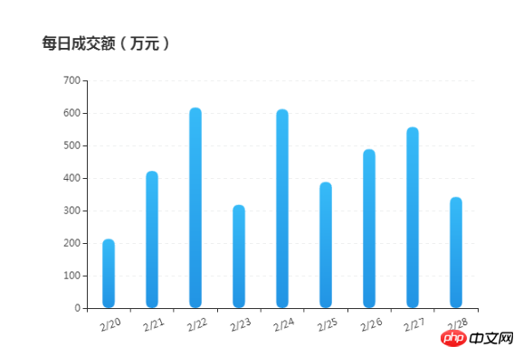
<!DOCTYPE html>
<html>
<head>
<metacharset="utf-8">
<title>ECharts柱状图</title>
</head>
<body>
<!-- 为ECharts准备一个具备大小(宽高)的Dom -->
<pid="container"style="width: 600px;height:400px; margin: 100px auto 20px;"></p>
<scripttypet="text/javascript"src="http://libs.baidu.com/jquery/1.9.1/jquery.min.js"></script>
<scripttype="text/javascript"src="http://echarts.baidu.com/gallery/vendors/echarts/echarts-all-3.js"></script>
<scripttype="text/javascript">
var dom = document.getElementById("container");
var myChart = echarts.init(dom);
option = null;
var xAxisData = [];
var data = [];
for (var i = 20; i <29; i++) {
xAxisData.push('2' +'/'+ i);
data.push(Math.round(Math.random() * 500) + 200);
}
// 初始 option
option = {
title: {
text: '每日成交额(万元)'
},
tooltip: {
trigger: 'axis',
borderColor: '#636F7F',
borderWidth : 1,
backgroundColor : 'rgba(99,111,127,1)',
textStyle:{
color : '#ffffff',
// fontWeight : 'bold',
fontSize : 14,
},
transitionDuration : 0.6,
formatter: '{b0}<br />{c0}(万元)',
axisPointer :{
type : 'line',
lineStyle : {
color : '#05F41E',
width : 1,
type : 'solid',
},
},
// axisPointer : { // 坐标轴指示器,坐标轴触发有效
// type : 'shadow', // 默认为直线,可选为:'line' | 'shadow'
// shadowStyle :{
// color : '#D6EAFA',
// opacity : 0.5,
// }
// },
},
calculable : true,
xAxis: {
data: xAxisData.map(function(x){
return x;
}),
axisLabel: {
textStyle: {
color: '#333',
align : 'center',
baseline : 'top'
},
rotate : 20,
margin : 15,
},
},
yAxis: {
// 横向标线 默认为TRUE
splitLine: {
show: true,
},
axisLabel: {
textStyle: {
color: '#333'
}
},
type : 'value',
boundaryGap : false,
// 分隔线线的类型
splitLine: {
show: true,
lineStyle :{
color : '#EFF0F0',
type : 'dashed',
}
}
},
series: {
type: 'bar',
data: data,
barWidth: 15,
itemStyle: {
normal: {
barBorderRadius: 20,
color: new echarts.graphic.LinearGradient(0, 0, 0, 1, [{
offset: 0,
color: '#37BBF8'
}, {
offset: 1,
color: '#2294E4'
}]),
// shadowColor: 'rgba(35,149,229,0.8)',
// shadowBlur: 20,
areaStyle: {type: 'default'}
}
}
},
};
if (option && typeof option === "object") {
myChart.setOption(option, true);
}
</script>
</body>
</html>jQuery operation background color gradient animation effect
jQuery plug-in FusionCharts draws pie chart
jQuery operation textarea input character limit
The above is the detailed content of Echarts implements dynamic color changing histogram. For more information, please follow other related articles on the PHP Chinese website!

Hot AI Tools

Undresser.AI Undress
AI-powered app for creating realistic nude photos

AI Clothes Remover
Online AI tool for removing clothes from photos.

Undress AI Tool
Undress images for free

Clothoff.io
AI clothes remover

Video Face Swap
Swap faces in any video effortlessly with our completely free AI face swap tool!

Hot Article
Hot Tools

Notepad++7.3.1
Easy-to-use and free code editor

SublimeText3 Chinese version
Chinese version, very easy to use

Zend Studio 13.0.1
Powerful PHP integrated development environment

Dreamweaver CS6
Visual web development tools

SublimeText3 Mac version
God-level code editing software (SublimeText3)
Hot Topics


 ECharts and Java interface: How to quickly implement statistical charts such as line charts, bar charts, pie charts, etc.
Dec 17, 2023 pm 10:37 PM
ECharts and Java interface: How to quickly implement statistical charts such as line charts, bar charts, pie charts, etc.
Dec 17, 2023 pm 10:37 PM
ECharts and Java interface: How to quickly implement statistical charts such as line charts, bar charts, and pie charts. Specific code examples are required. With the advent of the Internet era, data analysis has become more and more important. Statistical charts are a very intuitive and powerful display method. Charts can display data more clearly, allowing people to better understand the connotation and patterns of the data. In Java development, we can use ECharts and Java interfaces to quickly display various statistical charts. ECharts is a software developed by Baidu
 What is the keyboard shortcut for switching to black and white mode in win10?
Jan 10, 2024 pm 01:26 PM
What is the keyboard shortcut for switching to black and white mode in win10?
Jan 10, 2024 pm 01:26 PM
The win10 system launched by Microsoft has many new features compared to previous versions. For example, you can use the color filter, which is the color filter shortcut, to change the overall display of win10 to black and white. Some friends may not know how to set up this effect. So let me tell you now. Hope it helps you~ What is the solution to the shortcut key to change win10 to black and white? 1. You can use the shortcut ++ to turn on or off the color filter. 2. If you want to completely turn off the color filter, you can right-click the start logo on the taskbar. Select option 3 in the pop-up menu. Select option 4 in the opened interface. Select option 5 using the easy bar on the left side of the opened page. In the color filter interface on the right side of the opened page we will see a
 How to use php interface and ECharts to generate visual statistical charts
Dec 18, 2023 am 11:39 AM
How to use php interface and ECharts to generate visual statistical charts
Dec 18, 2023 am 11:39 AM
In today's context where data visualization is becoming more and more important, many developers hope to use various tools to quickly generate various charts and reports so that they can better display data and help decision-makers make quick judgments. In this context, using the Php interface and ECharts library can help many developers quickly generate visual statistical charts. This article will introduce in detail how to use the Php interface and ECharts library to generate visual statistical charts. In the specific implementation, we will use MySQL
 Steps to draw dashboard using ECharts and Python interface
Dec 18, 2023 am 08:40 AM
Steps to draw dashboard using ECharts and Python interface
Dec 18, 2023 am 08:40 AM
The steps to draw a dashboard using ECharts and Python interface require specific code examples. Summary: ECharts is an excellent data visualization tool that can easily perform data processing and graphics drawing through the Python interface. This article will introduce the specific steps to draw a dashboard using ECharts and Python interface, and provide sample code. Keywords: ECharts, Python interface, dashboard, data visualization Introduction Dashboard is a commonly used form of data visualization, which uses
 How to use map heat map to display city heat in ECharts
Dec 18, 2023 pm 04:00 PM
How to use map heat map to display city heat in ECharts
Dec 18, 2023 pm 04:00 PM
How to use a map heat map to display city heat in ECharts ECharts is a powerful visual chart library that provides various chart types for developers to use, including map heat maps. Map heat maps can be used to show the popularity of cities or regions, helping us quickly understand the popularity or density of different places. This article will introduce how to use the map heat map in ECharts to display city heat, and provide code examples for reference. First, we need a map file containing geographic information, EC
 How to use calendar charts to display time data in ECharts
Dec 18, 2023 am 08:52 AM
How to use calendar charts to display time data in ECharts
Dec 18, 2023 am 08:52 AM
How to use calendar charts to display time data in ECharts ECharts (Baidu’s open source JavaScript chart library) is a powerful and easy-to-use data visualization tool. It offers a variety of chart types, including line charts, bar charts, pie charts, and more. The calendar chart is a very distinctive and practical chart type in ECharts, which can be used to display time-related data. This article will introduce how to use calendar charts in ECharts and provide specific code examples. First, you need to use
 ECharts and golang technical guide: practical tips for creating various statistical charts
Dec 17, 2023 pm 09:56 PM
ECharts and golang technical guide: practical tips for creating various statistical charts
Dec 17, 2023 pm 09:56 PM
ECharts and golang technical guide: Practical tips for creating various statistical charts, specific code examples are required. Introduction: In the field of modern data visualization, statistical charts are an important tool for data analysis and visualization. ECharts is a powerful data visualization library, while golang is a fast, reliable and efficient programming language. This article will introduce you to how to use ECharts and golang to create various types of statistical charts, and provide code examples to help you master this skill. Preparation
 How to use histogram to display data in ECharts
Dec 18, 2023 pm 02:21 PM
How to use histogram to display data in ECharts
Dec 18, 2023 pm 02:21 PM
How to use histograms to display data in ECharts ECharts is a JavaScript-based data visualization library that is very popular and widely used in the field of data visualization. Among them, the histogram is the most common and commonly used chart type, which can be used to display the size, comparison and trend analysis of various numerical data. This article will introduce how to use ECharts to draw histograms and provide code examples. First, we need to introduce the ECharts library into the HTML file, which can be introduced in the following way
