

Detailed explanation of flex layout
This time I will bring you a detailed explanation of flex layout. What are the precautions of the detailed explanation of flex layout? The following is a practical case, let’s take a look.
Vertical centering is a common page layout method. For inline elements, you can set text-align:center;vertical-align:center to achieve,
Block-level elements can usually be achieved through the following settings
.parent{    position: relative;
}.child{    position: absolute;    top: 50%;    left: 50%;    transform: translate(-50%,-50%);
} However, for the simplicity and elegance of css, in addition to inline, inline-block, and block layout, the fourth layout method of css, flex, came into being
Only The following settings are required to easily center the element vertically
.parent{    display: flex;    justify-content: center;    align-items: center;
}Note: When set to flex layout, the float, clear and vertical-align attributes of the child elements will be invalid
flexBasic concepts
Elements that adopt flex layout are called flex containers. All child elements within an element are called flex items.
The container has two axes by default: the horizontal main axis (main axis) and the vertical cross axis (cross axis).
The starting position of the main axis (the intersection with the border) is called main start, and the ending position is called main end; the starting position of the cross axis is called cross start, and the ending position is called cross end.
Items are arranged along the main axis by default. The main axis space occupied by a single item is called main size, and the cross axis space occupied by a single item is called cross size.
Properties of flex container
flex-direction
flex-wrap
flex-flow
justify-content
align-items
align-content
flex-direction
The flex-direction property determines the direction of the main axis.
row (default value): The main axis is horizontal and the starting point is on the left
row-reverse: The main axis is horizontal and the starting point is on the right
column: The main axis is vertical , the starting point is on the upper edge
column-reverse: the main axis is vertical, the starting point is on the lower edge
flex-wrap
By default, the items are arranged on the main axis, The flex-wrap attribute defines how to wrap a line if the main axis line cannot fit.
nowrap (default value):, do not wrap
wrap: wrap, the first line is at the top
wrap-reverse: wrap, the first line is at the bottom
flex-flow
The flex-flow property is the abbreviation of the flex-direction property and the flex-wrap property.
The default value is row nowrap.
justify-content
The justify-content property defines the alignment of the item (from the element) on the main axis.
flex-start (default): left-aligned
flex-end: right-aligned
center: centered
space-between: aligned at both ends , the intervals between items are all equal.
space-around: Each item is equally spaced on both sides. Therefore, the space between items is twice as large as the space between items and the border.
align-items
The align-items property defines how items are aligned on the cross axis.
stretch (default value): If the item does not set a height or is set to auto, it will occupy the entire height of the container.
flex-start: Align the starting point of the cross axis.
flex-end: The end point alignment of the cross axis.
center: Align the midpoint of the cross axis.
baseline: The baseline alignment of the first line of text of the item.
align-content
The align-content property defines the alignment of multiple axes. This property has no effect if the project has only one axis.
stretch (default value): The axis occupies the entire cross axis.
flex-start: Align with the starting point of the cross axis.
flex-end: Aligned with the end point of the cross axis.
center: Aligned with the midpoint of the cross axis.
space-between: Align with both ends of the cross axis, and the intervals between the axes are evenly distributed.
space-around: Each axis is equally spaced on both sides. Therefore, the distance between the axes is twice as large as the distance between the axes and the frame.
flex item (self-element) attribute
order
flex-grow
flex-shrink
flex-basis
flex
align-self
order
order attribute defines the order in which items are arranged. The smaller the value, the higher the ranking. The default is 0.
flex-grow
The flex-grow attribute defines the enlargement ratio of the item. The default is 0, that is, if there is remaining space, it will not be enlarged.
If all items have a flex-grow property of 1, they will equally divide the remaining space.
If the flex-grow property of one item is 2 and the other items are 1, the former will occupy twice as much remaining space as the other items.
flex-shrink
The flex-shrink property defines the shrinkage ratio of the item. The default is 1, that is, if there is insufficient space, the item will shrink.
If the flex-shrink property of all items is 1, when there is insufficient space, they will all be reduced proportionally.
If the flex-shrink attribute of one item is 0 and the other items are 1, the former will not shrink when there is insufficient space.
Negative values are not valid for this attribute.
flex-basis
The flex-basis property defines the main size of the item before allocating excess space.
Based on this attribute, the browser calculates whether there is extra space on the main axis. Its default value is auto, which is the original size of the project.
It can be set to the same value as the width or height attribute (such as 350px), then the item will occupy a fixed space.
flex
The flex property is the abbreviation of flex-grow, flex-shrink and flex-basis. The default value is: 0 1 auto. The last two properties are optional.
This attribute has two shortcut values: auto (1 1 auto) and none (0 0 auto).
align-self
The align-self attribute allows a single item to be aligned differently from other items and can override the align-items attribute.
Default value: auto, which means inheriting the align-items attribute of the parent element. If there is no parent element, it is equivalent to stretch.
This attribute may take 6 values. Except for auto, the others are exactly the same as the align-items attribute.
I believe you have mastered the method after reading the case in this article. For more exciting information, please pay attention to other related articles on the php Chinese website!
Recommended reading:
Observer Pattern of Javascript
Strategy Pattern of Javascript
The above is the detailed content of Detailed explanation of flex layout. For more information, please follow other related articles on the PHP Chinese website!

Hot AI Tools

Undresser.AI Undress
AI-powered app for creating realistic nude photos

AI Clothes Remover
Online AI tool for removing clothes from photos.

Undress AI Tool
Undress images for free

Clothoff.io
AI clothes remover

Video Face Swap
Swap faces in any video effortlessly with our completely free AI face swap tool!

Hot Article
Hot Tools

Notepad++7.3.1
Easy-to-use and free code editor

SublimeText3 Chinese version
Chinese version, very easy to use

Zend Studio 13.0.1
Powerful PHP integrated development environment

Dreamweaver CS6
Visual web development tools

SublimeText3 Mac version
God-level code editing software (SublimeText3)
Hot Topics


 Detailed explanation of obtaining administrator rights in Win11
Mar 08, 2024 pm 03:06 PM
Detailed explanation of obtaining administrator rights in Win11
Mar 08, 2024 pm 03:06 PM
Windows operating system is one of the most popular operating systems in the world, and its new version Win11 has attracted much attention. In the Win11 system, obtaining administrator rights is an important operation. Administrator rights allow users to perform more operations and settings on the system. This article will introduce in detail how to obtain administrator permissions in Win11 system and how to effectively manage permissions. In the Win11 system, administrator rights are divided into two types: local administrator and domain administrator. A local administrator has full administrative rights to the local computer
 Detailed explanation of division operation in Oracle SQL
Mar 10, 2024 am 09:51 AM
Detailed explanation of division operation in Oracle SQL
Mar 10, 2024 am 09:51 AM
Detailed explanation of division operation in OracleSQL In OracleSQL, division operation is a common and important mathematical operation, used to calculate the result of dividing two numbers. Division is often used in database queries, so understanding the division operation and its usage in OracleSQL is one of the essential skills for database developers. This article will discuss the relevant knowledge of division operations in OracleSQL in detail and provide specific code examples for readers' reference. 1. Division operation in OracleSQL
 Guide to solving misalignment of WordPress web pages
Mar 05, 2024 pm 01:12 PM
Guide to solving misalignment of WordPress web pages
Mar 05, 2024 pm 01:12 PM
Guide to solving misaligned WordPress web pages In WordPress website development, sometimes we encounter web page elements that are misaligned. This may be due to screen sizes on different devices, browser compatibility, or improper CSS style settings. To solve this misalignment, we need to carefully analyze the problem, find possible causes, and debug and repair it step by step. This article will share some common WordPress web page misalignment problems and corresponding solutions, and provide specific code examples to help develop
 Detailed explanation of the role and usage of PHP modulo operator
Mar 19, 2024 pm 04:33 PM
Detailed explanation of the role and usage of PHP modulo operator
Mar 19, 2024 pm 04:33 PM
The modulo operator (%) in PHP is used to obtain the remainder of the division of two numbers. In this article, we will discuss the role and usage of the modulo operator in detail, and provide specific code examples to help readers better understand. 1. The role of the modulo operator In mathematics, when we divide an integer by another integer, we get a quotient and a remainder. For example, when we divide 10 by 3, the quotient is 3 and the remainder is 1. The modulo operator is used to obtain this remainder. 2. Usage of the modulo operator In PHP, use the % symbol to represent the modulus
 Detailed explanation of the linux system call system() function
Feb 22, 2024 pm 08:21 PM
Detailed explanation of the linux system call system() function
Feb 22, 2024 pm 08:21 PM
Detailed explanation of Linux system call system() function System call is a very important part of the Linux operating system. It provides a way to interact with the system kernel. Among them, the system() function is one of the commonly used system call functions. This article will introduce the use of the system() function in detail and provide corresponding code examples. Basic Concepts of System Calls System calls are a way for user programs to interact with the operating system kernel. User programs request the operating system by calling system call functions
 Detailed explanation of Linux curl command
Feb 21, 2024 pm 10:33 PM
Detailed explanation of Linux curl command
Feb 21, 2024 pm 10:33 PM
Detailed explanation of Linux's curl command Summary: curl is a powerful command line tool used for data communication with the server. This article will introduce the basic usage of the curl command and provide actual code examples to help readers better understand and apply the command. 1. What is curl? curl is a command line tool used to send and receive various network requests. It supports multiple protocols, such as HTTP, FTP, TELNET, etc., and provides rich functions, such as file upload, file download, data transmission, proxy
 Learn more about Promise.resolve()
Feb 18, 2024 pm 07:13 PM
Learn more about Promise.resolve()
Feb 18, 2024 pm 07:13 PM
Detailed explanation of Promise.resolve() requires specific code examples. Promise is a mechanism in JavaScript for handling asynchronous operations. In actual development, it is often necessary to handle some asynchronous tasks that need to be executed in sequence, and the Promise.resolve() method is used to return a Promise object that has been fulfilled. Promise.resolve() is a static method of the Promise class, which accepts a
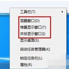 Introducing the window arrangement method in win7
Dec 26, 2023 pm 04:37 PM
Introducing the window arrangement method in win7
Dec 26, 2023 pm 04:37 PM
When we open multiple windows at the same time, win7 has the function of arranging multiple windows in different ways and then displaying them at the same time, which allows us to view the contents of each window more clearly. So how many window arrangements are there in win7? What do they look like? Let’s take a look with the editor. There are several ways to arrange Windows 7 windows: three, namely cascading windows, stacked display windows and side-by-side display windows. When we open multiple windows, we can right-click on an empty space on the taskbar. You can see three window arrangements. 1. Cascading windows: 2. Stacked display windows: 3. Display windows side by side:
