

HighCharts draws 2D pie chart effect example sharing with Legend

This article mainly introduces the jQuery plug-in HighCharts to draw a 2D pie chart with Legend. It analyzes the implementation techniques of jQuery using HighCharts to draw a pie chart with detailed display based on examples. It also comes with the demo source code for readers to download for reference. Friends in need can refer to it, I hope it can help everyone.
The example in this article describes the jQuery plug-in HighCharts to draw a 2D pie chart effect with Legend. Share it with everyone for your reference, the details are as follows:
1. Example code:
<!DOCTYPE html>
<html>
<head>
<meta charset="UTF-8">
<title>HighCharts 2D带有Legend的饼图</title>
<script type="text/javascript" src="js/jquery-1.7.2.min.js"></script>
<script type="text/javascript" src="js/highcharts.js"></script>
<script type="text/javascript">
$(function(){
// 构建饼图
$('#pieChart').highcharts({
chart: {
plotBackgroundColor: '#384778',
plotBorderWidth: '50px',
plotShadow: true
},
title: {
text: '(jb51.net)2013年4月日收入明细'
},
tooltip: {
pointFormat: '{series.name}: <b>{point.percentage:.1f}%</b>'
},
plotOptions: {
pie: {
allowPointSelect: true,
cursor: 'pointer',
dataLabels: {
enabled: true
},
showInLegend: true
}
},
series: [{
type: 'pie',
name: '日收入比率',
data: [
['20130401', 45.0],
['20130402', 26.8],
['20130403', 56.3],
['20130404', 74.1],
['20130405', 45.0],
['20130406', 26.8],
['20130407', 56.4],
['20130408', 84.1],
['20130409', 55.0],
['20130410', 56.8],
['20130411', 64.8],
['20130412', 63.2],
['20130413', 64.8],
['20130414', 63.2],
['20130415', 64.8],
['20130416', 45.2],
['20130417', 68.8],
['20130418', 63.2],
['20130419', 24.8],
['20130420', 53.2],
{
name: '20130421',
y: 27.8,
sliced: true,
selected: true
},
['20130422', 63.2],
['20130423', 64.8],
['20130424', 63.2],
['20130425', 64.8],
['20130426', 45.2],
['20130427', 68.8],
['20130428', 63.2],
['20130429', 24.8],
['20130430', 98.8]
]
}]
});
});
</script>
</head>
<body>
<p id="pieChart" style="width: 1250px; height: 500px; margin: 0 auto"></p>
</body>
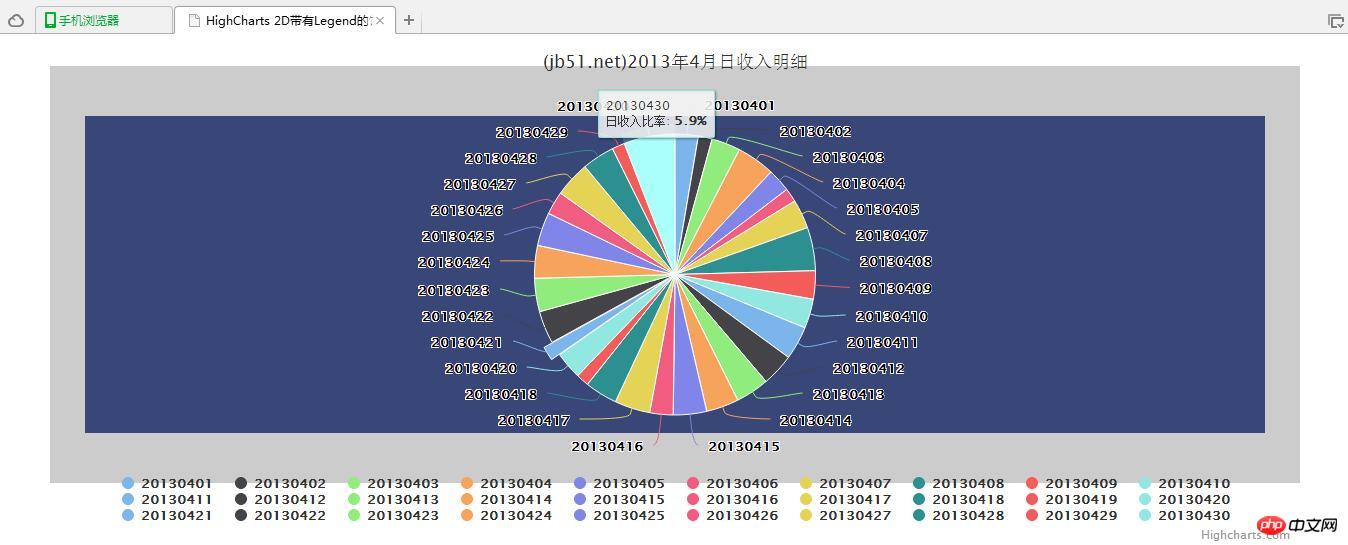
</html>2. Operation rendering:
Related recommendations:
jQuery plug-in HighCharts drawing 2D pie chart effect example sharing
Instance code of highcharts usage
PHP+mysql+Highcharts to implement pie chart_PHP tutorial
The above is the detailed content of HighCharts draws 2D pie chart effect example sharing with Legend. For more information, please follow other related articles on the PHP Chinese website!

Hot AI Tools

Undresser.AI Undress
AI-powered app for creating realistic nude photos

AI Clothes Remover
Online AI tool for removing clothes from photos.

Undress AI Tool
Undress images for free

Clothoff.io
AI clothes remover

Video Face Swap
Swap faces in any video effortlessly with our completely free AI face swap tool!

Hot Article
Hot Tools

Notepad++7.3.1
Easy-to-use and free code editor

SublimeText3 Chinese version
Chinese version, very easy to use

Zend Studio 13.0.1
Powerful PHP integrated development environment

Dreamweaver CS6
Visual web development tools

SublimeText3 Mac version
God-level code editing software (SublimeText3)
Hot Topics


 Implementation of pie chart and radar chart functions in Vue statistical charts
Aug 18, 2023 pm 12:28 PM
Implementation of pie chart and radar chart functions in Vue statistical charts
Aug 18, 2023 pm 12:28 PM
Implementation of the pie chart and radar chart functions of Vue statistical charts Introduction: With the development of the Internet, the demand for data analysis and chart display is becoming more and more urgent. As a popular JavaScript framework, Vue provides a wealth of data visualization plug-ins and components to facilitate developers to quickly implement various statistical charts. This article will introduce how to use Vue to implement the functions of pie charts and radar charts, and provide relevant code examples. Introducing statistical chart plug-ins In Vue development, we can use some excellent statistical chart plug-ins to help us implement
 How to use Sankey chart to display data in Highcharts
Dec 17, 2023 pm 04:41 PM
How to use Sankey chart to display data in Highcharts
Dec 17, 2023 pm 04:41 PM
How to use Sankey diagram to display data in Highcharts Sankey diagram (SankeyDiagram) is a chart type used to visualize complex processes such as flow, energy, and funds. It can clearly display the relationship and flow between various nodes, and can help us better understand and analyze data. In this article, we will introduce how to use Highcharts to create and customize a Sankey chart, with specific code examples. First, we need to load the Highcharts library and Sank
 How to use dynamic data in Highcharts to display real-time data
Dec 17, 2023 pm 06:57 PM
How to use dynamic data in Highcharts to display real-time data
Dec 17, 2023 pm 06:57 PM
How to use dynamic data in Highcharts to display real-time data. With the advent of the big data era, the display of real-time data has become more and more important. Highcharts, as a popular charting library, provides rich functions and customizability, allowing us to flexibly display real-time data. This article will introduce how to use dynamic data in Highcharts to display real-time data, and give specific code examples. First, we need to prepare a data source that can provide real-time data. In this article, I
 How to create a Gantt chart using Highcharts
Dec 17, 2023 pm 07:23 PM
How to create a Gantt chart using Highcharts
Dec 17, 2023 pm 07:23 PM
How to use Highcharts to create a Gantt chart requires specific code examples. Introduction: The Gantt chart is a chart form commonly used to display project progress and time management. It can visually display the start time, end time and progress of the task. Highcharts is a powerful JavaScript chart library that provides rich chart types and flexible configuration options. This article will introduce how to use Highcharts to create a Gantt chart and give specific code examples. 1. Highchart
 How to use stacked charts to display data in Highcharts
Dec 18, 2023 pm 05:56 PM
How to use stacked charts to display data in Highcharts
Dec 18, 2023 pm 05:56 PM
How to use stacked charts to display data in Highcharts Stacked charts are a common way of visualizing data, which can display the sum of multiple data series at the same time and display the contribution of each data series in the form of a bar chart. Highcharts is a powerful JavaScript library that provides a rich variety of charts and flexible configuration options to meet various data visualization needs. In this article, we will introduce how to use Highcharts to create a stacked chart and provide
 How to add and customize data labels in Microsoft Excel charts?
May 07, 2023 pm 04:22 PM
How to add and customize data labels in Microsoft Excel charts?
May 07, 2023 pm 04:22 PM
Microsoft Excel has many features that still amaze people. People learn something new every day. Today, we will learn how to add and customize data labels in Excel charts. Excel charts contain large amounts of data, and it can be challenging to understand them at a glance. Using data labels is a great way to point out important information. Data labels can be used as part of a column or bar chart. It can even be used as callouts when you create a pie chart. Adding Data Labels To show how to add data labels, we will use a pie chart as an example. While most people use legends to display content in pie charts, data labels are much more efficient. To add data labels, create a pie chart. Open it and click Show Chart Design
 How to create a pie chart using ECharts and Python interface
Dec 17, 2023 am 10:23 AM
How to create a pie chart using ECharts and Python interface
Dec 17, 2023 am 10:23 AM
How to create a pie chart using ECharts and Python interface ECharts is an open source data visualization library that provides rich chart types and flexible configuration options, allowing developers to easily create various charts, including pie charts. Python provides powerful data processing and visualization tools. Combined with the Python interface of ECharts, we can use the Python language to generate pie charts and display them on the Web page. Next, I will introduce how to use ECha
 Making Interactive Charts: Creating Pie Charts and Dashboard Charts with Plotly.js, Part 5
Sep 03, 2023 pm 03:33 PM
Making Interactive Charts: Creating Pie Charts and Dashboard Charts with Plotly.js, Part 5
Sep 03, 2023 pm 03:33 PM
If you've been following this series since the beginning, you may have noticed that Plotly.js uses the same scatter type to create line and bubble charts. The only difference is that we have to set mode to lines when creating a line chart and markers to mode when creating a bubble chart. Likewise, Plotly.js allows you to create pie charts, donut charts, and gauge charts by using the same value for the type property and changing the values of other properties based on the chart you want to create. Creating a Pie Chart in Plotly.js You can create a pie chart in Plotly.js by setting the type attribute to pie. There are other attributes such as opacity, visible
