How WebGL operates json and echarts charts
This time I will show you how to operate json and echarts charts with WebGL. What are the precautions for using WebGL to operate json and echarts charts? The following is a practical case, let's take a look.
Suddenly I had an idea. If I could put some different knowledge points on the same interface and put them in a box, then if I want to see something, it can be displayed directly, and The box must be able to be opened. I used HT to realize my idea, with more than 100 lines of code. I think it is awesome that such a small amount of code can achieve this effect. Let’s take a look at the renderings first:
 var box = new ht.CSGBox();
 dataModel.add(box);
ht.Default.xhrLoad('displays/demo/pump.json', function(text){
    const json = ht.Default.parse(text);
    pumpDM.deserialize(json);
    var currentRotation = 0;
    var lastTime = new Date().getTime();
    setInterval(function(){
        var time = new Date().getTime();
        var deltaTime = time - lastTime;
        currentRotation += deltaTime * Math.PI / 180 * 0.3;
        lastTime = time;
        pumpDM.getDataByTag('fan1').setRotation(currentRotation);
        pumpDM.getDataByTag('fan2').setRotation(currentRotation);
        box.iv();
        // g3d.iv();这边也可以刷新g3d,但是局部刷新更省
        pumpGV.validateImpl();
    }, 10);
}, 10); pumpGV.getWidth = function() { return 600;}
pumpGV.getHeight = function(){ return 600;}
pumpGV.getCanvas().dynamic = true;//设置这个是为了让canvas能动态显示 ht.Default.setImage('echart', charts(option));
ht.Default.setImage('pump', pumpGV.getCanvas());picture.
There is one thing that needs to be improved. We can see that there is a circle of jagged edges around the line segments, graphics, and text on the box, because when we set the font, we set translucency at the same time. The "blend" style will be turned off. At this time, we cannot control the style. Generally, when there is transparency, we need to set "all.transparent" to true. We can set the transparent of the surface that needs to be displayed. : true is enough. Take a look at the completed renderings: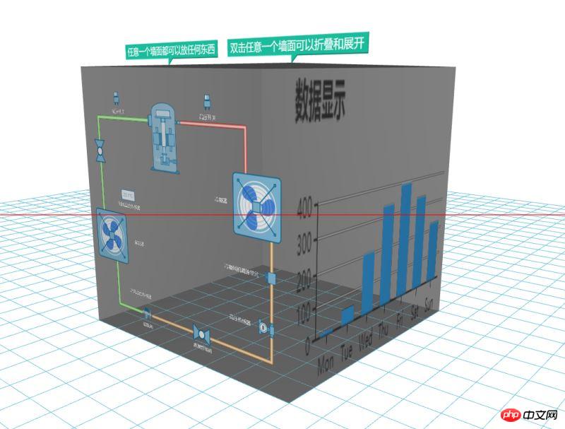
I believe you have mastered the method after reading the case in this article. Please come for more exciting information. Pay attention to other related articles on php Chinese website! Recommended reading:
html5 How to achieve the animation effect of pictures turning in circles
How to automatically play background music in H5 videos
The above is the detailed content of How WebGL operates json and echarts charts. For more information, please follow other related articles on the PHP Chinese website!

Hot AI Tools

Undresser.AI Undress
AI-powered app for creating realistic nude photos

AI Clothes Remover
Online AI tool for removing clothes from photos.

Undress AI Tool
Undress images for free

Clothoff.io
AI clothes remover

Video Face Swap
Swap faces in any video effortlessly with our completely free AI face swap tool!

Hot Article

Hot Tools

Notepad++7.3.1
Easy-to-use and free code editor

SublimeText3 Chinese version
Chinese version, very easy to use

Zend Studio 13.0.1
Powerful PHP integrated development environment

Dreamweaver CS6
Visual web development tools

SublimeText3 Mac version
God-level code editing software (SublimeText3)

Hot Topics
 How to use php interface and ECharts to generate visual statistical charts
Dec 18, 2023 am 11:39 AM
In today's context where data visualization is becoming more and more important, many developers hope to use various tools to quickly generate various charts and reports so that they can better display data and help decision-makers make quick judgments. In this context, using the Php interface and ECharts library can help many developers quickly generate visual statistical charts. This article will introduce in detail how to use the Php interface and ECharts library to generate visual statistical charts. In the specific implementation, we will use MySQL
 Steps to draw dashboard using ECharts and Python interface
Dec 18, 2023 am 08:40 AM
The steps to draw a dashboard using ECharts and Python interface require specific code examples. Summary: ECharts is an excellent data visualization tool that can easily perform data processing and graphics drawing through the Python interface. This article will introduce the specific steps to draw a dashboard using ECharts and Python interface, and provide sample code. Keywords: ECharts, Python interface, dashboard, data visualization Introduction Dashboard is a commonly used form of data visualization, which uses
 How to use map heat map to display city heat in ECharts
Dec 18, 2023 pm 04:00 PM
How to use a map heat map to display city heat in ECharts ECharts is a powerful visual chart library that provides various chart types for developers to use, including map heat maps. Map heat maps can be used to show the popularity of cities or regions, helping us quickly understand the popularity or density of different places. This article will introduce how to use the map heat map in ECharts to display city heat, and provide code examples for reference. First, we need a map file containing geographic information, EC
 How to use calendar charts to display time data in ECharts
Dec 18, 2023 am 08:52 AM
How to use calendar charts to display time data in ECharts ECharts (Baidu’s open source JavaScript chart library) is a powerful and easy-to-use data visualization tool. It offers a variety of chart types, including line charts, bar charts, pie charts, and more. The calendar chart is a very distinctive and practical chart type in ECharts, which can be used to display time-related data. This article will introduce how to use calendar charts in ECharts and provide specific code examples. First, you need to use
 Simple JavaScript Tutorial: How to Get HTTP Status Code
Jan 05, 2024 pm 06:08 PM
JavaScript tutorial: How to get HTTP status code, specific code examples are required. Preface: In web development, data interaction with the server is often involved. When communicating with the server, we often need to obtain the returned HTTP status code to determine whether the operation is successful, and perform corresponding processing based on different status codes. This article will teach you how to use JavaScript to obtain HTTP status codes and provide some practical code examples. Using XMLHttpRequest
 How to use histogram to display data in ECharts
Dec 18, 2023 pm 02:21 PM
How to use histograms to display data in ECharts ECharts is a JavaScript-based data visualization library that is very popular and widely used in the field of data visualization. Among them, the histogram is the most common and commonly used chart type, which can be used to display the size, comparison and trend analysis of various numerical data. This article will introduce how to use ECharts to draw histograms and provide code examples. First, we need to introduce the ECharts library into the HTML file, which can be introduced in the following way
 Does ECharts depend on jQuery? In-depth analysis
Feb 27, 2024 am 08:39 AM
Does ECharts need to rely on jQuery? Detailed interpretation requires specific code examples. ECharts is an excellent data visualization library that provides a rich range of chart types and interactive functions and is widely used in web development. When using ECharts, many people will have a question: Does ECharts need to rely on jQuery? This article will explain this in detail and give specific code examples. First, to be clear, ECharts itself does not rely on jQuery;
 How to use ECharts and php interface to generate statistical charts
Dec 18, 2023 pm 01:47 PM
How to use ECharts and PHP interfaces to generate statistical charts Introduction: In modern web application development, data visualization is a very important link, which can help us display and analyze data intuitively. ECharts is a powerful open source JavaScript chart library. It provides a variety of chart types and rich interactive functions, and can easily generate various statistical charts. This article will introduce how to use ECharts and PHP interfaces to generate statistical charts, and give specific code examples. 1. Overview of ECha


