

What is the difference between responsive and adaptive
Let me first give you a taste of the difference between responsiveness and adaptiveness. Please zoom in and out to try.
Adaptive experience http://m.ctrip.com/html5/
Responsive experience http://www.php.cn/
I have compiled several adaptive and responsive articles, excerpted and modified them, please enjoy:
In the beginning, web designers Fixed-width pages will be designed. In the beginning, there were not many types of computer monitor resolutions because there were few computers at that time. Even if there were changes, they would still be 800, 850, 870, 880. For example, Open Source China's web page is customized with a fixed width of 998. As for why it is 998,
Later, with the increasing number of monitors and the popularity of notebooks, problems occurred with pages using this method. So a new layout method, width-adaptive layout, emerged. The adaptive layout we usually talk about mostly refers to the width-adaptive layout.
Under this layout, two schools have emerged:
Percent width layout
Flow layout
The subject is talking about the first school, using percentages for width and text. em, now many people are starting to use rem, which is the so-called high-definition solution. The second group of layouts is represented by iGoogle (has been discontinued).
There was no word responsive layout at the beginning, but slowly a word appeared - progressive enhancement. The appearance of new words always appears together with the old words. Just like before 3G appeared, no one called their mobile phone 2G, so the terms 3G and 2G appeared together (technically, of course, 2G technology appeared first). In the same way, after the emergence of progressive enhancement, another term "graceful degradation" also appeared. You can check the meaning of
words by yourself on wiki and Google. I will only give an example here, gmail and qqmail.
The width of both of them is 100%, and they are both adaptive. However:
qqmail is the perfect embodiment of css hack. You can almost see the same mailbox using any browser. Tencent's front-end engineers use various css hack technologies to display the mailbox page for the purpose of unification user experience.
And gmail uses progressive enhancement. The more powerful your browser is, the better the effect you see and the better the user experience.
Later, Google, as everyone is familiar with it, released android, and the Internet war moved from PC to mobile phones. There is also the release of the HTML5 standard.
Although the screen of mobile phones has become smaller, it provides richer functions. Do you remember when you used Nokia to access QQ? We visited 3g.qq.com. At that time, I was using a ZTE mobile phone to access wap.qq.com. In later smartphones, I accessed m.qq.com.
Some people can’t help but ask, “Do I really need to design a web page for each mobile phone?”, “Do I really need to design different web pages for mobile phones and computers?” Of course, there are many solutions, you can take a look at css zen garden ("Css Secret Garden" is still a very good book.
The final solution winner is responsive layout.
An important reason why responsive layout is well-known is that Twitter open sourced bootstrap. Google No. Completed from pioneer to martyr.
Let’s take a more intuitive look at the difference between responsiveness and adaptiveness:
First of all, the two methods of solving problems are different.
Adaptive is to solve how to present the same web page on devices of different sizes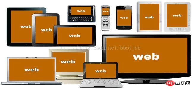
But no matter what, their main content and layout have not changed . 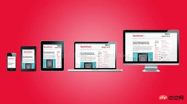
.

If the screen width is between 600 pixels and 1300 pixels, the 6 pictures are divided into two rows. 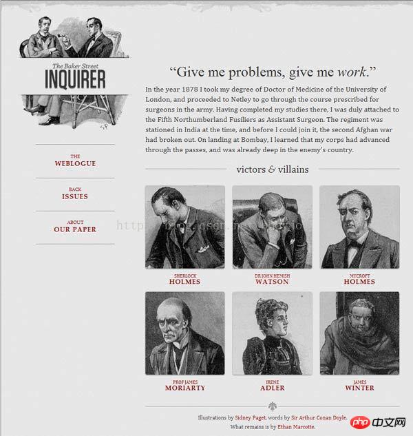
If the screen width is between 400 pixels and 600 pixels, the navigation bar moves to the head of the web page.
If the screen width is below 400 pixels, the 6 pictures will be divided into three rows.

mediaqueri.es There are more examples like this above.
Having said a lot, in fact, everyone may be more concerned about how to implement it. Let’s talk about the implementation method:
1. Allow the web page width to automatically adjust
How does “adaptive web design” work? It's not that difficult.
First, add a line of viewport meta tags at the head of the web page code.
print?
<meta name=“viewport” content=“width=device-width, initial-scale=1” />
<meta name="viewport" content="width=device-width, initial-scale=1" />
viewport is the default width and height of the web page. The above line of code means that the width of the web page is equal to the screen width by default (width=device-width), and the original scaling ratio (initial-scale=1) is 1.0 , that is, the initial size of the web page occupies 100% of the screen area.
All major browsers support this setting, including IE9. For those older browsers (mainly IE6, 7, 8), you need to use css3-mediaqueries.js.
print?
<!–[if lt IE 9]>
    <script src=“http://css3-mediaqueries-js.googlecode.com/svn/trunk/css3-mediaqueries.js”></script>
  <![endif]–>
<!--[if lt IE 9]>
    <script src="http://css3-mediaqueries-js.googlecode.com/svn/trunk/css3-mediaqueries.js"></script>
  <![endif]-->
2. Use absolute width as little as possible
Since the web page will adjust the layout according to the screen width, you cannot use the layout of absolute width, nor can you use elements with absolute width. This one is very important.
Specifically, CSS code cannot specify the pixel width:
print?
width:xxx px;
width:xxx px;
Replace it by specifying the percentage width: At the same time, you can also calculate the width with the cal of css
width: xx%;
width: xx%;
or
print?
width:auto;
width:auto;
3. Relative size fonts
The font cannot use absolute size (px), but can only use relative size (em) or high-definition solution (rem), rem is not limited to font size , the previous width width can also be used, instead of percentage.
print?
body {
    font: normal 100% Helvetica, Arial, sans-serif;
  }
body {
    font: normal 100% Helvetica, Arial, sans-serif;
}The above code specifies that the font size is 100% of the default size of the page, which is 16 pixels.
print?
h1 {
    font-size: 1.5em;
  }
h1 {
    font-size: 1.5em;
}Then, the size of h1 is 1.5 times the default size, which is 24 pixels (24/16=1.5).
print?
small {
  font-size: 0.875em;
}
  small {
    font-size: 0.875em;
}The size of the small element is 0.875 times the default size, which is 14 pixels (14/16=0.875).
4. Fluid grid
The meaning of "fluid grid" is that the position of each block is floating and not fixed. For more information, check out the article on fluid layouts.
print?
.main {
    float: right;
    width: 70%;
  }
  .leftBar {
    float: left;
    width: 25%;
  }
.main {
    float: right;
    width: 70%;
  }
  .leftBar {
    float: left;
    width: 25%;
}The advantage of float is that if the width is too small to fit two elements, the following element will automatically scroll to the bottom of the previous element and will not overflow (overflow) in the horizontal direction, avoiding the horizontal scroll bar. 's appearance.
In addition, you must be very careful when using absolute positioning (position: absolute).
5. Choose to load CSS
The core of "adaptive web design" is the Media Query module introduced by CSS3.
What it means is to automatically detect the screen width and then load the corresponding CSS file.
print?
<link rel=“stylesheet” type=“text/css”
    media=“screen and (max-device-width: 400px)”
    href=“tinyScreen.css” />
<link rel="stylesheet" type="text/css"
    media="screen and (max-device-width: 400px)"
    href="tinyScreen.css" />
The above code means that if the screen width is less than 400 pixels (max-device-width: 400px), load the tinyScreen.css file.
print?
<link rel=“stylesheet” type=“text/css”
    media=“screen and (min-width: 400px) and (max-device-width: 600px)”
    href=“smallScreen.css” />
<link rel="stylesheet" type="text/css"
    media="screen and (min-width: 400px) and (max-device-width: 600px)"
    href="smallScreen.css" />
If the screen width is between 400 pixels and 600 pixels, load the smallScreen.css file.
In addition to loading CSS files with html tags, you can also load them in existing CSS files.
print?
@import  url(“tinyScreen.css”) screen and (max-device-width: 400px);
@import url("tinyScreen.css") screen and (max-device-width: 400px);6. CSS @media rules
In the same CSS file, you can also choose to apply different CSS rules according to different screen resolutions.
print?
@media  screen and (max-device-width: 400px) {
    .column {
      float: none;
      width:auto;
    }
    #sidebar {
      display:none;
    }
  }
@media  screen and (max-device-width: 400px) {
    .column {
      float: none;
      width:auto;
    }
    #sidebar {
      display:none;
    }
}The above code means that if the screen width is less than 400 pixels, the column block will cancel floating (float:none), the width will be automatically adjusted (width:auto), and the sidebar block will not be displayed (display:none).
7. Adaptive image (fluid image)
In addition to layout and text, "adaptive web design" must also implement automatic scaling of images.
This only requires one line of CSS code:
print?
img { max-width: 100%;}
img { max-width: 100%;}This line of code is also valid for most videos embedded in web pages, so it can be written as:
print?
img, object { max-width: 100%;}
img, object { max-width: 100%;}Older versions of IE do not support max -width, so I had to write:
print?
img { width: 100%; }
img { width: 100%; }In addition, when scaling images on the Windows platform, image distortion may occur. At this time, you can try to use IE's proprietary command:
print?
img { -ms-interpolation-mode: bicubic; }
img { -ms-interpolation-mode: bicubic; }or Ethan Marcotte's imgSizer.js.
print?
addLoadEvent(function() {
    var imgs = document.getElementById(“content”).getElementsByTagName(“img”);
    imgSizer.collate(imgs);
  });
addLoadEvent(function() {
    var imgs = document.getElementById("content").getElementsByTagName("img");
    imgSizer.collate(imgs);
});However, if possible, it is best to load images of different resolutions according to different screen sizes. There are many ways to do this, both on the server side and on the client side.
The above is the detailed content of What is the difference between responsive and adaptive. For more information, please follow other related articles on the PHP Chinese website!

Hot AI Tools

Undresser.AI Undress
AI-powered app for creating realistic nude photos

AI Clothes Remover
Online AI tool for removing clothes from photos.

Undress AI Tool
Undress images for free

Clothoff.io
AI clothes remover

Video Face Swap
Swap faces in any video effortlessly with our completely free AI face swap tool!

Hot Article
Hot Tools

Notepad++7.3.1
Easy-to-use and free code editor

SublimeText3 Chinese version
Chinese version, very easy to use

Zend Studio 13.0.1
Powerful PHP integrated development environment

Dreamweaver CS6
Visual web development tools

SublimeText3 Mac version
God-level code editing software (SublimeText3)
Hot Topics


 What are the basic requirements for c language functions
Apr 03, 2025 pm 10:06 PM
What are the basic requirements for c language functions
Apr 03, 2025 pm 10:06 PM
C language functions are the basis for code modularization and program building. They consist of declarations (function headers) and definitions (function bodies). C language uses values to pass parameters by default, but external variables can also be modified using address pass. Functions can have or have no return value, and the return value type must be consistent with the declaration. Function naming should be clear and easy to understand, using camel or underscore nomenclature. Follow the single responsibility principle and keep the function simplicity to improve maintainability and readability.
 How to set password protection for export PDF on PS
Apr 06, 2025 pm 04:45 PM
How to set password protection for export PDF on PS
Apr 06, 2025 pm 04:45 PM
Export password-protected PDF in Photoshop: Open the image file. Click "File"> "Export"> "Export as PDF". Set the "Security" option and enter the same password twice. Click "Export" to generate a PDF file.
 The difference between H5 and mini-programs and APPs
Apr 06, 2025 am 10:42 AM
The difference between H5 and mini-programs and APPs
Apr 06, 2025 am 10:42 AM
H5. The main difference between mini programs and APP is: technical architecture: H5 is based on web technology, and mini programs and APP are independent applications. Experience and functions: H5 is light and easy to use, with limited functions; mini programs are lightweight and have good interactiveness; APPs are powerful and have smooth experience. Compatibility: H5 is cross-platform compatible, applets and APPs are restricted by the platform. Development cost: H5 has low development cost, medium mini programs, and highest APP. Applicable scenarios: H5 is suitable for information display, applets are suitable for lightweight applications, and APPs are suitable for complex functions.
 Concept of c language function
Apr 03, 2025 pm 10:09 PM
Concept of c language function
Apr 03, 2025 pm 10:09 PM
C language functions are reusable code blocks. They receive input, perform operations, and return results, which modularly improves reusability and reduces complexity. The internal mechanism of the function includes parameter passing, function execution, and return values. The entire process involves optimization such as function inline. A good function is written following the principle of single responsibility, small number of parameters, naming specifications, and error handling. Pointers combined with functions can achieve more powerful functions, such as modifying external variable values. Function pointers pass functions as parameters or store addresses, and are used to implement dynamic calls to functions. Understanding function features and techniques is the key to writing efficient, maintainable, and easy to understand C programs.
 Why do you need to call Vue.use(VueRouter) in the index.js file under the router folder?
Apr 05, 2025 pm 01:03 PM
Why do you need to call Vue.use(VueRouter) in the index.js file under the router folder?
Apr 05, 2025 pm 01:03 PM
The necessity of registering VueRouter in the index.js file under the router folder When developing Vue applications, you often encounter problems with routing configuration. Special...
 What are the differences and connections between c and c#?
Apr 03, 2025 pm 10:36 PM
What are the differences and connections between c and c#?
Apr 03, 2025 pm 10:36 PM
Although C and C# have similarities, they are completely different: C is a process-oriented, manual memory management, and platform-dependent language used for system programming; C# is an object-oriented, garbage collection, and platform-independent language used for desktop, web application and game development.
 How to use XPath to search from a specified DOM node in JavaScript?
Apr 04, 2025 pm 11:15 PM
How to use XPath to search from a specified DOM node in JavaScript?
Apr 04, 2025 pm 11:15 PM
Detailed explanation of XPath search method under DOM nodes In JavaScript, we often need to find specific nodes from the DOM tree based on XPath expressions. If you need to...
 What are the different ways of promoting H5 and mini programs?
Apr 06, 2025 am 11:03 AM
What are the different ways of promoting H5 and mini programs?
Apr 06, 2025 am 11:03 AM
There are differences in the promotion methods of H5 and mini programs: platform dependence: H5 depends on the browser, and mini programs rely on specific platforms (such as WeChat). User experience: The H5 experience is poor, and the mini program provides a smooth experience similar to native applications. Communication method: H5 is spread through links, and mini programs are shared or searched through the platform. H5 promotion methods: social sharing, email marketing, QR code, SEO, paid advertising. Mini program promotion methods: platform promotion, social sharing, offline promotion, ASO, cooperation with other platforms.
