
 Web Front-end
H5 Tutorial
HTML5 practice-detailed explanation of how to use css3 to enrich image styles (2)
Web Front-end
H5 Tutorial
HTML5 practice-detailed explanation of how to use css3 to enrich image styles (2)
HTML5 practice-detailed explanation of how to use css3 to enrich image styles (2)

In the previous tutorial "HTML5 Practice - css3 Image Style", I introduced how to add background-image packaging to the image, using box-shadow and border-radius to create the image Set up a variety of styles, interested friends can read back. But recently I encountered a problem when designing the PhotoTouch theme. The background-image size cannot be adjusted, which is not ideal for responsive design. Today we will try to solve the problem.
Problem
Most browsers do not render the border-radius and embedded box-shadow effects of images perfectly. This means that you cannot create effects such as embossing, highlights, and compression for images.
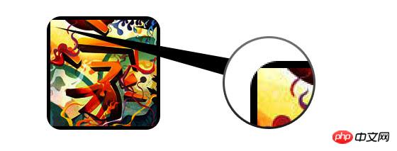
to the packaging of the image. Attribute , solves the above problem.
 ##
##
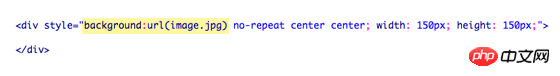
The problem with using background-image is that it cannot achieve dynamic scaling of the image size. Therefore, this method is not so suitable for responsive designs that require image scaling.
New solution
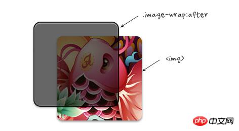
The new solution is somewhat similar to the previous one. We add the CSS3 effect to the image mask layer: after pseudo-class. The advantage of this is that the image remains intact. properties and shrinkability.
jqueryStatements to achieve dynamic effects
jquery will query all the pictures under #demo and then make them dynamic Add span packaging. <script type="text/javascript" src="http://ajax.googleapis.com/ajax/libs/jquery/1.5/jquery.min.js"></script>
<script type="text/javascript">$(document).ready(function(){
$('#demo img').each(function() {
var imgClass = $(this).attr('class');
$(this).wrap('<span class="image-wrap ' + imgClass + '" style="width: auto; height: auto;"/>');
$(this).removeAttr('class');
});
});</script>
The above code will output the following result:
<span class="image-wrap " style="width: auto; height: auto;">
<img src="image.jpg"></span>css skills
The css technique is very simple. The mask effect is used on .image-wrap:after, and border-radius is used on both the image and .image-wrap:after to achieve the style effect.
##  css
css
.image-wrap {
position: relative;
display: inline-block;
max-width: 100%;
vertical-align: bottom;
}.image-wrap:after {
content: ' ';
width: 100%;
height: 100%;
position: absolute;
top: -1px;
left: -1px;
border: solid 1px #1b1b1b;
-wekbit-box-shadow: inset 0 0 1px rgba(255,255,255,.4), inset 0 1px 0 rgba(255,255,255,.4), 0 1px 2px rgba(0,0,0,.3);
-moz-box-shadow: inset 0 0 1px rgba(255,255,255,.4), inset 0 1px 0 rgba(255,255,255,.4), 0 1px 2px rgba(0,0,0,.3);
box-shadow: inset 0 0 1px rgba(255,255,255,.4), inset 0 1px 0 rgba(255,255,255,.4), 0 1px 2px rgba(0,0,0,.3);
-webkit-border-radius: 7px;
-moz-border-radius: 7px;
border-radius: 7px;
}.image-wrap img {
vertical-align: bottom;
-webkit-box-shadow: 0 1px 2px rgba(0,0,0,.4);
-moz-box-shadow: 0 1px 2px rgba(0,0,0,.4);
box-shadow: 0 1px 2px rgba(0,0,0,.4);
-webkit-border-radius: 6px;
-moz-border-radius: 6px;
border-radius: 6px;
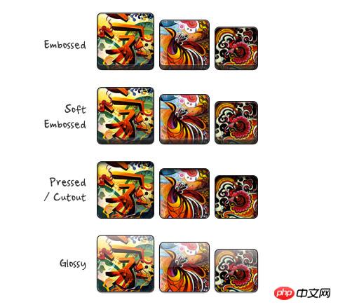
}Copy after login Picture style Many different effects, such as: relief, cutout, compression and highlights, etc., can be achieved by using multiple inline box-shadows properties. Of course, you can also use :before to achieve other layout effects, such as highlights. You can view the demo source code to learn more details. Afterwards, you can resize your browser window to see if the image size has changed.
.image-wrap {
position: relative;
display: inline-block;
max-width: 100%;
vertical-align: bottom;
}.image-wrap:after {
content: ' ';
width: 100%;
height: 100%;
position: absolute;
top: -1px;
left: -1px;
border: solid 1px #1b1b1b;
-wekbit-box-shadow: inset 0 0 1px rgba(255,255,255,.4), inset 0 1px 0 rgba(255,255,255,.4), 0 1px 2px rgba(0,0,0,.3);
-moz-box-shadow: inset 0 0 1px rgba(255,255,255,.4), inset 0 1px 0 rgba(255,255,255,.4), 0 1px 2px rgba(0,0,0,.3);
box-shadow: inset 0 0 1px rgba(255,255,255,.4), inset 0 1px 0 rgba(255,255,255,.4), 0 1px 2px rgba(0,0,0,.3);
-webkit-border-radius: 7px;
-moz-border-radius: 7px;
border-radius: 7px;
}.image-wrap img {
vertical-align: bottom;
-webkit-box-shadow: 0 1px 2px rgba(0,0,0,.4);
-moz-box-shadow: 0 1px 2px rgba(0,0,0,.4);
box-shadow: 0 1px 2px rgba(0,0,0,.4);
-webkit-border-radius: 6px;
-moz-border-radius: 6px;
border-radius: 6px;
} 
The above is the detailed content of HTML5 practice-detailed explanation of how to use css3 to enrich image styles (2). For more information, please follow other related articles on the PHP Chinese website!

Hot AI Tools

Undresser.AI Undress
AI-powered app for creating realistic nude photos

AI Clothes Remover
Online AI tool for removing clothes from photos.

Undress AI Tool
Undress images for free

Clothoff.io
AI clothes remover

Video Face Swap
Swap faces in any video effortlessly with our completely free AI face swap tool!

Hot Article
Hot Tools

Notepad++7.3.1
Easy-to-use and free code editor

SublimeText3 Chinese version
Chinese version, very easy to use

Zend Studio 13.0.1
Powerful PHP integrated development environment

Dreamweaver CS6
Visual web development tools

SublimeText3 Mac version
God-level code editing software (SublimeText3)
Hot Topics


 Table Border in HTML
Sep 04, 2024 pm 04:49 PM
Table Border in HTML
Sep 04, 2024 pm 04:49 PM
Guide to Table Border in HTML. Here we discuss multiple ways for defining table-border with examples of the Table Border in HTML.
 Nested Table in HTML
Sep 04, 2024 pm 04:49 PM
Nested Table in HTML
Sep 04, 2024 pm 04:49 PM
This is a guide to Nested Table in HTML. Here we discuss how to create a table within the table along with the respective examples.
 HTML margin-left
Sep 04, 2024 pm 04:48 PM
HTML margin-left
Sep 04, 2024 pm 04:48 PM
Guide to HTML margin-left. Here we discuss a brief overview on HTML margin-left and its Examples along with its Code Implementation.
 HTML Table Layout
Sep 04, 2024 pm 04:54 PM
HTML Table Layout
Sep 04, 2024 pm 04:54 PM
Guide to HTML Table Layout. Here we discuss the Values of HTML Table Layout along with the examples and outputs n detail.
 HTML Input Placeholder
Sep 04, 2024 pm 04:54 PM
HTML Input Placeholder
Sep 04, 2024 pm 04:54 PM
Guide to HTML Input Placeholder. Here we discuss the Examples of HTML Input Placeholder along with the codes and outputs.
 HTML Ordered List
Sep 04, 2024 pm 04:43 PM
HTML Ordered List
Sep 04, 2024 pm 04:43 PM
Guide to the HTML Ordered List. Here we also discuss introduction of HTML Ordered list and types along with their example respectively
 Moving Text in HTML
Sep 04, 2024 pm 04:45 PM
Moving Text in HTML
Sep 04, 2024 pm 04:45 PM
Guide to Moving Text in HTML. Here we discuss an introduction, how marquee tag work with syntax and examples to implement.
 HTML onclick Button
Sep 04, 2024 pm 04:49 PM
HTML onclick Button
Sep 04, 2024 pm 04:49 PM
Guide to HTML onclick Button. Here we discuss their introduction, working, examples and onclick Event in various events respectively.
