

How to make charts and data analysis charts in PPT

In the era of data analysis, it is crucial to produce high-quality data analysis charts in PPT. This article will comprehensively explain how to make chart data analysis charts in PPT, covering many aspects such as data preparation, chart selection, design and beautification, and adding dynamic effects. By following the steps in this article, readers will master the skills to create clear, beautiful, and engaging PPT chart data analysis diagrams, improving the effectiveness of presentations and reports.

1. Introduction
In the modern business and information age, data analysis has become the basis for decision-making and problem-solving. Important tool. As PPT is the main carrier of presentations and reports, it is particularly important to produce high-quality data analysis charts. An excellent PPT data analysis chart can not only visually display data, but also effectively convey information and opinions, improving the persuasiveness and influence of the report. This article will elaborate on how to make chart data analysis charts in PPT, including data preparation, chart selection, design beautification, and dynamic effect addition, to help readers improve their PPT chart production skills.
2. Data preparation
Clear the purpose of analysis: Before making PPT charts, you must first clarify the purpose of data analysis in order to choose the appropriate chart type and presentation method.
Collect and organize data: According to the purpose of analysis, collect relevant data and organize it to ensure the accuracy and completeness of the data.
Data preprocessing: Clean, transform and format the collected data to make it suitable for display in charts.
3. Choose the appropriate chart type
According to the type of data and the purpose of display, choosing the appropriate chart type is key. Common chart types include bar charts, line charts, pie charts, scatter charts, etc.
Bar chart: suitable for comparing the size relationship of different categories of data, such as sales comparison, etc.
Line chart: Suitable for displaying the changing trend of data, such as time series data, etc.
Pie chart: suitable for displaying the components of data, such as market share, etc.
Scatter plot: suitable for showing the relationship between two variables, such as correlation analysis, etc.
4. Make charts
Insert charts: In PPT, click the "Insert" tab, select the "Chart" function, and then select the desired chart type.
Edit data: In the inserted chart, there will be an Excel table associated with it for editing data. Fill in the prepared data into the form, and PPT will automatically generate charts based on the data.
Adjust chart style: As needed, you can adjust the color, font, line style, etc. of the chart to make it clearer and easier to read.
Add labels and annotations: Add horizontal and vertical axis labels, data labels, legends, etc. to the chart so that the audience can better understand the data.
5. Design and beautification
Layout design: Reasonably lay out charts and text descriptions to make the overall layout concise and clear, and highlight key points.
Color matching: Choose a color matching that suits the theme to enhance the visual effect and appeal of the chart.
Font selection: Use clear and easy-to-read fonts to ensure your audience can easily read and understand.
6. Add dynamic effects
In order to improve the attractiveness and expressiveness of PPT, you can add dynamic effects to charts. For example, you can use animation effects to show the dynamic change process of data, or use switching effects to show the switching process between different charts.
7. Notes
Concise and clear: avoid piling too much information and elements in the chart, keep it concise and clear, and highlight the key points.
Accurate data: Make sure the data in the chart is accurate to avoid misleading the audience or creating ambiguity.
Match the content: The type and style of the diagram should match the content of the presentation to promote overall consistency and coordination.
8. Summary
Creating high-quality PPT chart data analysis charts requires comprehensive consideration of data preparation, chart selection, design beautification, and addition of dynamic effects. Through the introduction of this article, I believe readers have a clearer understanding of how to create chart data analysis charts in PPT. In practical applications, it can be flexibly adjusted and optimized according to specific needs and scenarios to produce better PPT chart data analysis charts.
9. Advanced techniques
In addition to the above basic steps, there are also some advanced techniques that can help improve the quality and expressiveness of PPT chart data analysis charts.
Use Pivot Tables: In Excel, you can use Pivot Tables to quickly summarize and analyze data, and then import the results into PPT to generate charts. This can greatly improve the efficiency of data processing and chart production.
Use professional chart plug-ins: The chart types and functions provided by PPT itself may be limited, and its functions can be expanded by installing professional chart plug-ins. These plug-ins usually provide a more diverse chart type and more advanced design options to meet more complex data analysis needs.
Combine with other elements: In addition to the chart itself, you can also combine other elements such as text, pictures, shapes, etc. to enrich the content and presentation of PPT. For example, you can use text boxes to add explanations and descriptions of a diagram, or use pictures and shapes to enhance visual impact and appeal.
10. Conclusion
PPT chart data analysis chart is a powerful information display and transmission tool. Through careful production and optimization, it can effectively improve the presentation effect and report quality. I hope that the introduction and techniques in this article can help readers better master the skills of making PPT charts and bring more convenience and gains to work and study.
The above is the detailed content of How to make charts and data analysis charts in PPT. For more information, please follow other related articles on the PHP Chinese website!

Hot AI Tools

Undresser.AI Undress
AI-powered app for creating realistic nude photos

AI Clothes Remover
Online AI tool for removing clothes from photos.

Undress AI Tool
Undress images for free

Clothoff.io
AI clothes remover

Video Face Swap
Swap faces in any video effortlessly with our completely free AI face swap tool!

Hot Article
Hot Tools

Notepad++7.3.1
Easy-to-use and free code editor

SublimeText3 Chinese version
Chinese version, very easy to use

Zend Studio 13.0.1
Powerful PHP integrated development environment

Dreamweaver CS6
Visual web development tools

SublimeText3 Mac version
God-level code editing software (SublimeText3)
Hot Topics


 Steps to adjust the format of pictures inserted in PPT tables
Mar 26, 2024 pm 04:16 PM
Steps to adjust the format of pictures inserted in PPT tables
Mar 26, 2024 pm 04:16 PM
1. Create a new PPT file and name it [PPT Tips] as an example. 2. Double-click [PPT Tips] to open the PPT file. 3. Insert a table with two rows and two columns as an example. 4. Double-click on the border of the table, and the [Design] option will appear on the upper toolbar. 5. Click the [Shading] option and click [Picture]. 6. Click [Picture] to pop up the fill options dialog box with the picture as the background. 7. Find the tray you want to insert in the directory and click OK to insert the picture. 8. Right-click on the table box to bring up the settings dialog box. 9. Click [Format Cells] and check [Tile images as shading]. 10. Set [Center], [Mirror] and other functions you need, and click OK. Note: The default is for pictures to be filled in the table
 Introduction to the method of making a human icon in PPT
Mar 26, 2024 pm 04:21 PM
Introduction to the method of making a human icon in PPT
Mar 26, 2024 pm 04:21 PM
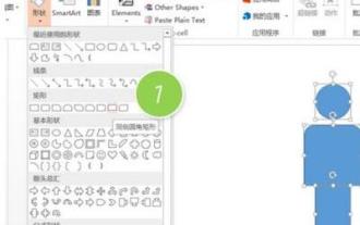
1. Create a new PPT page, insert a circle, a rounded rectangle on the same side (1 in the picture below) and a rectangle in the graphic, and then combine it to create a human-shaped graphic effect. Note that the circle (head) and rectangle (legs) are the same width, with the rounded rectangle slightly wider on the same side. Pay attention to the proportions between the human figures. 2. Next, select all three shapes, remove their outlines, change the color to gray, and use the shape [join] function (2 in the figure below) to turn the three shapes into a humanoid shape. 3. After zooming out, you can use the fast copy method of Ctrl+D for efficient copying. 4. Color the villain part. If there is no technical content in coloring them all, just change the color of the villain to green. 2. Color the human icon 1. Copy a little person separately. Then insert a [
 How to remove the date that appears automatically when printing from PPT handouts
Mar 26, 2024 pm 08:16 PM
How to remove the date that appears automatically when printing from PPT handouts
Mar 26, 2024 pm 08:16 PM
1. Let me first talk about the method I used at the beginning, maybe everyone is using it too. First, open [View]——]Remarks Template[. 2. A place where you can actually see the date after opening it. 3. Select it first and delete it. 4. After deleting, click [Close Master View]. 5. Open the print preview again and find that the date is still there. 6. In fact, this date was not deleted here. It should be in the [Handout Master]. Look at the picture below. 7. Delete the date after you find it. 8. Now when you open the preview and take a look, the date is no longer there. Note: In fact, this method is also very easy to remember, because the printed handouts are handouts, so you should look for the [Handout Master].
 How to insert excel icons into PPT slides
Mar 26, 2024 pm 05:40 PM
How to insert excel icons into PPT slides
Mar 26, 2024 pm 05:40 PM
1. Open the PPT and turn the page to the page where you need to insert the excel icon. Click the Insert tab. 2. Click [Object]. 3. The following dialog box will pop up. 4. Click [Create from file] and click [Browse]. 5. Select the excel table to be inserted. 6. Click OK and the following page will pop up. 7. Check [Show as icon]. 8. Click OK.
 Detailed steps to create text with chalk font effect in PPT
Mar 26, 2024 pm 04:50 PM
Detailed steps to create text with chalk font effect in PPT
Mar 26, 2024 pm 04:50 PM
1. If you want to get a good-looking effect, you can match the PPT with the corresponding [blackboard] background image. 2. First create the materials for [Chalk Lettering]. Draw a shape in [Insert]-[Shape], any shape can be used, fill it with black. 3. Copy the drawn shape and paste it as a [picture]. 4. Delete the drawn shape and set the [Artistic Effect] of the pasted picture to [Line Drawing]. 5. In [Artistic Effect]-[Artistic Effect Options], reduce [Transparency] and increase the value of [Pencil Size]. 6. [Picture Tools]-[Color]-[Set Transparent Color] Set the transparent color to black. 7. In】Set picture format【-】Picture color【Recolor picture】【. 8. In the ppt page, insert a [text box] and enter text. 9. Complex
 Introduction to the method of inserting heptagons into PPT slides
Mar 26, 2024 pm 07:46 PM
Introduction to the method of inserting heptagons into PPT slides
Mar 26, 2024 pm 07:46 PM
1. Open the PPT slide document, and in the [Outline, Slide] column on the left side of the PPT, click to select the slide where you want to insert the basic [shape]. 2. After selecting, select the [Insert] menu in the function menu bar above the PPT and click. 3. After clicking the [Insert] menu, the [Insert] submenu bar pops up below the function menu bar. Select the [Shape] menu in the [Insert] submenu bar. 4. Click the [Shape] menu to pop up the preset shape type selection page. 5. In the shape type selection page, select the [Heptagon] shape and click. 6. After clicking, move the mouse to the slide editing interface, press the mouse to draw, and release the mouse after the drawing is completed. Complete the insertion of the [heptagon] shape.
 Detailed method of inserting formula effect flow chart into PPT
Mar 26, 2024 pm 04:36 PM
Detailed method of inserting formula effect flow chart into PPT
Mar 26, 2024 pm 04:36 PM
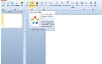
1. Open PPT, click the [Insert] tab, and click the [smartArt] button in the [Illustrations] group. 2. Click [Process] in the [Select smartArt graphics] dialog box that opens. 3. Select the [Formula] flow chart in the [Process] pane that opens. 4. Click [OK], and the [Formula] flow chart will be inserted into the slide pane. 5. Click [Text] in the [Type text here] column, or click [Text] on the graphic to enter content. 6. Select the shape in the graphic, click the [Design] tab of [smartArt Tools], and click the [Add Shape] button in the [Create Graphics] group to add a shape. 7. The shapes in the graphics can also be selected and deleted. Of course, you can also delete them in smar as needed.
 How to deal with blanks when playing PPT slides
Mar 26, 2024 pm 07:51 PM
How to deal with blanks when playing PPT slides
Mar 26, 2024 pm 07:51 PM
1. Open the PPT file you created and select the second slide. 2. On the second slide, select one of the pictures, and then select [Animation] to add any animation effect. 3. In the start column of the animation bar, change [While Standalone] to [After Previous Animation], and you will see that the picture animation label [1] will change to [0]. Do the same for subsequent slides, and you can see the effect by playing the slide at the end.
