

Tips for achieving gradient border effect using CSS properties


Techniques for achieving gradient border effects using CSS properties require specific code examples
In web design, the border is an important element that can bring richness to the page. visual effects. And if you can achieve a gradient effect on the border, it will further increase the appeal of the page. This article will introduce some techniques for using CSS properties to achieve gradient border effects, and provide specific code examples.
- Use the "border-image" attribute to achieve the gradient border
<style>
    .gradient-border {
        border-width: 10px;
        -moz-border-image: linear-gradient(to right, #f00 0%, #00f 100%);
        -webkit-border-image: -webkit-linear-gradient(left, #f00 0%, #00f 100%);
        border-image: linear-gradient(to right, #f00 0%, #00f 100%);
        border-image-slice: 1;
    }
</style>

<div class="gradient-border">这是一个渐变边框</div>In the above code, we use the "border-image" attribute to achieve the gradient border effect. Among them, "-moz-border-image" and "-webkit-border-image" are respectively targeted at Firefox and WebKit core browsers, while "border-image" is a general CSS3 property. Use the "linear-gradient" function to create a linear gradient effect, where "to right" means a gradient from left to right. We can also achieve different effects by modifying color values and gradient methods.
- Use "background-image" and "linear-gradient" properties to implement gradient borders
<style>
    .gradient-border {
        border: 10px solid;
        border-image: linear-gradient(to right, #f00 0%, #00f 100%);
        border-image-slice: 1;
        background-clip: content-box;
        padding: 20px;
    }
</style>

<div class="gradient-border">这是一个渐变边框</div>In the above example, we used the "border-image" property, But set the "background-clip" property to "content-box". In this way, the background will not extend into the border area, while achieving the effect of a gradient border. At the same time, by adjusting the value of "border-image-slice", we can control the size of the border.
- Use the "outline" attribute to achieve the gradient border
<style>
    .gradient-border {
        padding: 20px;
        outline: 10px solid transparent;
        outline-offset: -10px;
        background-image: linear-gradient(to right, #f00 0%, #00f 100%);
    }
</style>

<div class="gradient-border">这是一个渐变边框</div>In the above example, we use the "outline" attribute to achieve the gradient border effect. By setting the "outline-width" and "outline-offset" properties we can adjust the size and position of the border. At the same time, set the background image to a gradient effect to achieve the effect of a gradient border.
Summary
This article introduces three techniques for using CSS properties to achieve a gradient border effect, and provides specific code examples. Using these tips, we can easily add visual flair to our web design and make it more engaging. You can choose the appropriate method to implement the gradient border according to your actual needs, and you can also obtain different effects by adjusting the color, gradient method, etc. I hope these tips will be helpful to your web design work!
The above is the detailed content of Tips for achieving gradient border effect using CSS properties. For more information, please follow other related articles on the PHP Chinese website!

Hot AI Tools

Undresser.AI Undress
AI-powered app for creating realistic nude photos

AI Clothes Remover
Online AI tool for removing clothes from photos.

Undress AI Tool
Undress images for free

Clothoff.io
AI clothes remover

Video Face Swap
Swap faces in any video effortlessly with our completely free AI face swap tool!

Hot Article
Hot Tools

Notepad++7.3.1
Easy-to-use and free code editor

SublimeText3 Chinese version
Chinese version, very easy to use

Zend Studio 13.0.1
Powerful PHP integrated development environment

Dreamweaver CS6
Visual web development tools

SublimeText3 Mac version
God-level code editing software (SublimeText3)
Hot Topics


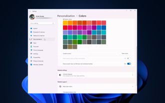 How to adjust window border settings on Windows 11: Change color and size
Sep 22, 2023 am 11:37 AM
How to adjust window border settings on Windows 11: Change color and size
Sep 22, 2023 am 11:37 AM
Windows 11 brings fresh and elegant design to the forefront; the modern interface allows you to personalize and change the finest details, such as window borders. In this guide, we'll discuss step-by-step instructions to help you create an environment that reflects your style in the Windows operating system. How to change window border settings? Press + to open the Settings app. WindowsI go to Personalization and click Color Settings. Color Change Window Borders Settings Window 11" Width="643" Height="500" > Find the Show accent color on title bar and window borders option, and toggle the switch next to it. To display accent colors on the Start menu and taskbar To display the theme color on the Start menu and taskbar, turn on Show theme on the Start menu and taskbar
 What does groove mean in css
Apr 28, 2024 pm 04:12 PM
What does groove mean in css
Apr 28, 2024 pm 04:12 PM
In CSS, groove represents a border style that creates a groove-like effect. The specific application is as follows: Use the CSS property border-style: groove; the groove-shaped border has a concave inner edge, a raised outer edge and a shadow effect.
 Detailed example of how to solve the problem of CSS gradient aliasing!
Nov 25, 2022 pm 04:43 PM
Detailed example of how to solve the problem of CSS gradient aliasing!
Nov 25, 2022 pm 04:43 PM
This article will introduce to you how to solve the aliasing problem caused by using gradient graphics. The so-called CSS gradient aliasing disappearing technique can be done once you know it. Let's take a look at how to achieve it~ I hope it will be helpful to everyone. !
 How to make custom borders in Microsoft Word
Nov 18, 2023 pm 11:17 PM
How to make custom borders in Microsoft Word
Nov 18, 2023 pm 11:17 PM
Want to make the front page of your school project look exciting? Nothing makes it stand out from other submissions like a nice, elegant border on the homepage of your workbook. However, the standard single-line borders in Microsoft Word have become very obvious and boring. Therefore, we show you the steps to create and use custom borders in Microsoft Word documents. How to Make Custom Borders in Microsoft Word Creating custom borders is very easy. However, you will need a boundary. Step 1 – Download Custom Borders There are tons of free borders on the internet. We have downloaded a border like this. Step 1 – Search the Internet for custom borders. Alternatively, you can go to clipping
 Angular components and their display properties: understanding non-block default values
Mar 15, 2024 pm 04:51 PM
Angular components and their display properties: understanding non-block default values
Mar 15, 2024 pm 04:51 PM
The default display behavior for components in the Angular framework is not for block-level elements. This design choice promotes encapsulation of component styles and encourages developers to consciously define how each component is displayed. By explicitly setting the CSS property display, the display of Angular components can be fully controlled to achieve the desired layout and responsiveness.
 Create dynamic background effects: flexible use of CSS properties
Nov 18, 2023 pm 03:56 PM
Create dynamic background effects: flexible use of CSS properties
Nov 18, 2023 pm 03:56 PM
Create dynamic background effects: The flexible use of CSS attributes in web design, background effects are a very important part, it can add a vivid atmosphere to the website and improve user experience. As a key language for web page style design, CSS gives full play to flexibility and diversity, and provides a wealth of attributes and techniques to create various dynamic background effects. This article will use specific code examples to introduce the flexible use of some common CSS properties to achieve wonderful dynamic background effects. 1. Gradient background Gradient background can add charm to the web page, making it
 Popular science on how to set excel borders
Mar 20, 2024 am 10:30 AM
Popular science on how to set excel borders
Mar 20, 2024 am 10:30 AM
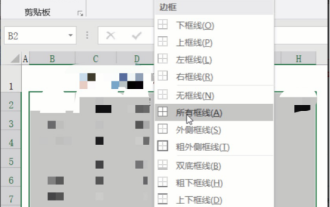
It is not uncommon for Excel to appear in our daily work and life. Whether it is the production of employee information, salary tables, or student enrollment information and transcripts, Excel is a relatively easy-to-use tool. When printing Excel, you need to set borders to meet printing requirements. In this article, the editor will introduce you to several ways to set Excel borders. Method 1. Use the function tab button. This should be a method often used by everyone. It is convenient and fast. The specific operation: select the cell area B2:H10 where you need to add a border, click the [Start] tab - [Border] drop-down on the right Button-[All Frames] to complete adding frames. Method 2. Select the cell area B2:H10 where you want to add a border.
 How to achieve transparency gradient effect using CSS properties
Nov 18, 2023 pm 05:28 PM
How to achieve transparency gradient effect using CSS properties
Nov 18, 2023 pm 05:28 PM
The method of implementing the transparency gradient effect using CSS properties requires specific code examples. In web design, the transparency gradient effect can add a soft and beautiful transition effect to the page. Through the setting of CSS properties, we can easily achieve the transition effect on transparency of different elements. Today we will introduce some common methods and specific code examples. Use the opacity attribute. The Opacity attribute can set the transparency of an element. The value ranges from 0 to 1. 0 means completely transparent and 1 means completely opaque. we can pass
