
 Web Front-end
CSS Tutorial
CSS Animation Tutorial: Teach you step by step how to implement rotation and zoom effects
Web Front-end
CSS Tutorial
CSS Animation Tutorial: Teach you step by step how to implement rotation and zoom effects
CSS Animation Tutorial: Teach you step by step how to implement rotation and zoom effects

CSS Animation Tutorial: Teach you step-by-step to achieve rotation and scaling effects
CSS animation is one of the important technologies to achieve interactive effects on web pages. This tutorial will teach you step by step how to use CSS to achieve rotation and scaling effects. Before studying this tutorial, please make sure you have a certain understanding of CSS basics.
- Preparation
Before you start, you need an editor to write code, such as Sublime Text, Visual Studio Code, etc. When writing code, you can create an HTML file and introduce CSS styles into it.
- Create HTML structure
First, we need to create an HTML structure. In this example we will create a simple circle.
<!DOCTYPE html>
<html>
<head>
  <link rel="stylesheet" type="text/css" href="style.css">
</head>
<body>
  <div class="circle"></div>
</body>
</html>
In the above code, we introduced a CSS file named style.css and created a div element with class circle in the body.
- Writing CSS styles
Next, we will write CSS styles in the style.css file. First, we need to set the width and height of the .circle element and set its shape to a circle.
.circle {
  width: 200px;
  height: 200px;
  background-color: #ff0000;
  border-radius: 50%;
}In the above code, we set the width and height of the .circle element to 200px and set its corners to 50%, thus forming a circle.
- Add animation effects
Next, we will add animation effects to the .circle element. This animation will include two parts: rotation and scaling.
First, we will add the rotation animation. In the .style.css file, add the following code:
@keyframes rotate {
  0% {
    transform: rotate(0deg);
  }
  100% {
    transform: rotate(360deg);
  }
}

.circle {
  /* 省略之前的代码 */
  animation: rotate 4s infinite;
}In the above code, we have defined an animation named rotate using the @keyframes keyword. This animation starts from the initial state of 0%, rotating the .circle element 0 degrees, to the end state of 100%, rotating the .circle element 360 degrees. We then apply this animation to the .circle element using the animation attribute and set the duration of the animation to 4 seconds, repeating infinite times.
Next, we will add the zoom animation. In the .style.css file, add the following code:
@keyframes scale {
  0% {
    transform: scale(1);
  }
  50% {
    transform: scale(1.5);
  }
  100% {
    transform: scale(1);
  }
}

.circle {
  /* 省略之前的代码 */
  animation: rotate 4s infinite, scale 2s infinite;
}In the above code, we defined an animation named scale using the @keyframes keyword. This animation starts from an initial state of 0%, keeping the .circle element at its original size, to an intermediate state of 50%, enlarging the .circle element 1.5 times, to an end state of 100%, returning the .circle element to its original size. We then apply this animation to the .circle element using the animation attribute and set the duration of the animation to 2 seconds, repeating infinite times.
- Effect display
Now, you can save and run this HTML file, and then view the effect in the browser. You will see a rotating and zooming circle. You can modify CSS styles and animation properties according to your needs to achieve different rotation and scaling effects.
Summary
CSS animation can help us achieve various interactive effects in web pages. In this tutorial, we teach you step by step how to use CSS to achieve rotation and scaling effects. By studying this tutorial, I hope you can master basic CSS animation technology and apply it in actual projects. If you want to learn more about CSS animation techniques and methods, please continue to study in depth. Good luck writing amazing CSS animations!
The above is the detailed content of CSS Animation Tutorial: Teach you step by step how to implement rotation and zoom effects. For more information, please follow other related articles on the PHP Chinese website!

Hot AI Tools

Undresser.AI Undress
AI-powered app for creating realistic nude photos

AI Clothes Remover
Online AI tool for removing clothes from photos.

Undress AI Tool
Undress images for free

Clothoff.io
AI clothes remover

Video Face Swap
Swap faces in any video effortlessly with our completely free AI face swap tool!

Hot Article
Hot Tools

Notepad++7.3.1
Easy-to-use and free code editor

SublimeText3 Chinese version
Chinese version, very easy to use

Zend Studio 13.0.1
Powerful PHP integrated development environment

Dreamweaver CS6
Visual web development tools

SublimeText3 Mac version
God-level code editing software (SublimeText3)
Hot Topics


 Display scaling guide on Windows 11
Sep 19, 2023 pm 06:45 PM
Display scaling guide on Windows 11
Sep 19, 2023 pm 06:45 PM
We all have different preferences when it comes to display scaling on Windows 11. Some people like big icons, some like small icons. However, we all agree that having the right scaling is important. Poor font scaling or over-scaling of images can be a real productivity killer when working, so you need to know how to customize it to get the most out of your system's capabilities. Advantages of Custom Zoom: This is a useful feature for people who have difficulty reading text on the screen. It helps you see more on the screen at one time. You can create custom extension profiles that apply only to certain monitors and applications. Can help improve the performance of low-end hardware. It gives you more control over what's on your screen. How to use Windows 11
 CSS Animation Guide: Teach you step-by-step how to create lightning effects
Oct 20, 2023 pm 03:55 PM
CSS Animation Guide: Teach you step-by-step how to create lightning effects
Oct 20, 2023 pm 03:55 PM
CSS Animation Guide: Teach you step by step how to create lightning effects Introduction: CSS animation is an indispensable part of modern web design. It can bring vivid effects and interactivity to web pages and enhance user experience. In this guide, we’ll take a closer look at how to use CSS to create a lightning effect, along with specific code examples. 1. Create an HTML structure: First, we need to create an HTML structure to accommodate our lightning effects. We can use a <div> element to wrap the lightning effect and provide
 Safari zoom issue on iPhone: Here's the fix
Apr 20, 2024 am 08:08 AM
Safari zoom issue on iPhone: Here's the fix
Apr 20, 2024 am 08:08 AM
If you don't have control over the zoom level in Safari, getting things done can be tricky. So if Safari looks zoomed out, that might be a problem for you. Here are a few ways you can fix this minor zoom issue in Safari. 1. Cursor magnification: Select "Display" > "Cursor magnification" in the Safari menu bar. This will make the cursor more visible on the screen, making it easier to control. 2. Move the mouse: This may sound simple, but sometimes just moving the mouse to another location on the screen may automatically return it to normal size. 3. Use Keyboard Shortcuts Fix 1 – Reset Zoom Level You can control the zoom level directly from the Safari browser. Step 1 – When you are in Safari
 How to zoom pages side by side in word
Mar 19, 2024 pm 07:19 PM
How to zoom pages side by side in word
Mar 19, 2024 pm 07:19 PM
When we use word documents to edit files, sometimes there are many pages. We want to display them side by side and check the overall effect. However, because we don’t know how to operate, we often need to scroll for a long time to view page by page. I don’t know if you have ever encountered a similar situation. In fact, we can easily solve it at this time as long as we learn how to set the word zoom pages side by side. Below, let’s take a look and learn together. First, we create and open a new page in the Word document, and then enter some simple content to make it easier to distinguish. 2. For example, if we want to realize word zoom and side-by-side display, we need to find [View] in the menu bar, and then select [Multiple Pages] in the view tool options, as shown in the figure below: 3. Find [Multiple Pages] and click,
 CSS Animation Tutorial: Teach you step-by-step to achieve page turning effects
Oct 24, 2023 am 09:30 AM
CSS Animation Tutorial: Teach you step-by-step to achieve page turning effects
Oct 24, 2023 am 09:30 AM
CSS Animation Tutorial: Teach you step-by-step to implement page turning effects, specific code examples are required CSS animation is an essential part of modern website design. It can add vividness to web pages, attract users' attention, and improve user experience. One of the common CSS animation effects is the page turning effect. In this tutorial, I'll take you step by step to achieve this eye-catching effect and provide specific code examples. First, we need to create a basic HTML structure. The code is as follows: <!DOCTYPE
 Word document editing tips: Make two pages of content into one
Mar 25, 2024 pm 06:06 PM
Word document editing tips: Make two pages of content into one
Mar 25, 2024 pm 06:06 PM
In Microsoft Word documents, you often encounter the situation of merging two pages of content into one page, especially when you need to save paper or when you need to print a double-sided document. Several common methods to achieve this goal will be introduced below. Method 1: Adjust the page margins. First open the Word document and find the "Page Layout" option in the menu bar. After clicking, the page layout settings menu will pop up. Here you can adjust the page margins, including the top, bottom, left, and right margins. Generally speaking, making the top and bottom margins smaller will allow the content to fit within one page. you can taste
 CSS Animation Tutorial: Teach you step-by-step to achieve the special effect of flowing water
Oct 21, 2023 am 08:52 AM
CSS Animation Tutorial: Teach you step-by-step to achieve the special effect of flowing water
Oct 21, 2023 am 08:52 AM
CSS Animation Tutorial: Teach you step-by-step to implement the special effect of flowing water. Specific code examples are required. Foreword: CSS animation is a commonly used technology in web design. It makes web pages more lively and interesting and attracts users' attention. In this tutorial, we will learn how to use CSS to achieve a flowing water effect and provide specific code examples. let's start! Step One: HTML Structure First, we need to create a basic HTML structure. Add a <di to the <body> tag of the document
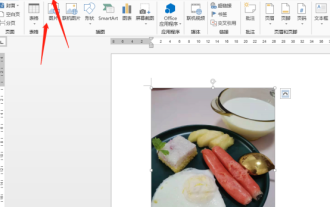 How to rotate Word pictures
Mar 19, 2024 pm 06:16 PM
How to rotate Word pictures
Mar 19, 2024 pm 06:16 PM
When we use Word office software for document processing, we often need to insert some pictures and other materials into the document. However, in order to achieve beautiful layout, we also need to perform some special layout on the pictures, among which rotation processing is the most basic. Typesetting processing, however, for some newcomers to the workplace who have just come into contact with Word office software, they may not be able to process pictures in Word documents. Below, we will share how to rotate pictures in Word. We hope it will be helpful and inspiring to you. 1. First, we open a Word document, and then click the Insert-Picture button on the menu bar to insert a random picture on the computer to facilitate our operation and demonstration. 2. If we want to rotate the image, then we need to
