

RWD: WordPress can do more than just design


As web developers, almost every client we work with wants their website to have a mobile version of their website. As screen sizes and resolutions vary more and more, it will be impossible or at least impractical to design a website for every device and screen resolution out there.
In this post, we’ll start at a basic level by first defining what responsive web design is, why it’s important, and some brief considerations that must be taken into consideration when brainstorming a responsive WordPress website.
What is responsive web design?
Wikipedia defines RWD as:
The web design approach aims to create websites that provide the best viewing experience on a variety of devices, from mobile phones to desktop computer monitors, and are easy to read and navigate with minimal resizing, panning and scrolling.
Responsive web design involves the application of CSS media queries and a combination of flexible grids and layouts. I’m sure you’ve heard of CSS frameworks like Bootstrap, Foundation, etc. They all use media queries for mixed layouts to render pages based on screen size, platform, and orientation.
For example, when using Bootstrap, you can make your project responsive by simply inserting the following lines of code on the tag
<meta name="viewport" content="width=device-width, initial-scale=1.0">
<link href="assets/css/bootstrap-responsive.css" rel="stylesheet">
In Bootstrap, media queries allow customizing CSS based on a variety of criteria (ratio, width, display type), but generally focus on min-width and max-width to
- Resize title and text to better fit the device
- Stack elements instead of floating when necessary
- Modify the width of the grid
Please note an entire hands-on series dedicated to teaching how to build responsive web designs using this specific framework
Why is RWD important?
In our discussion so far, we have established that an important feature of a responsive website is the website's ability to adapt to any screen size or orientation when a user views it. Beyond that, there are other important reasons why you should switch to a responsive website
Mobile device usage increases
Nowadays, quite a few people have access to mobile phones. This means that many of them access the internet through their phones. Statistics show that almost 20% of Google searches today come from mobile phones - which should tell you how important it is for users to be able to easily access and interact with your website.
With mobile internet usage surpassing desktop usage statistics, we need to ensure that users can identify our website no matter what device they are using without feeling like they are accessing a different or restricted version of the main website.
Significantly increase conversion rate
Conversion rate is one of the most commonly used terms among e-commerce websites and refers to how well you convert regular web visitors into paying customers. In the classic case of e-commerce solutions, think about how many people shop on their mobile phones.
If the average web user is forced to use the desktop version of your website for a simple checkout, then they will most likely choose to purchase the same product using another method. With a well-designed responsive website, users shouldn’t notice any difference other than using a smaller screen when conducting transactions on your website.
Improve search engine ranking
Search engines like Google openly promote responsive web design for many reasons:
- It is much easier to crawl a responsive website, index it and organize the website content in a simpler way. This is because responsive websites use just one URL across all platforms, rather than having different versions of the same website on different URLs.
- User experience can be easily assessed by looking at your website’s bounce rate. A website with a low bounce rate means users will stay on the site for a while, resulting in higher search rankings.
Cost-effectiveness
Running multiple websites for the same content can be expensive, requiring you to double the resources to maintain both sites. Having a responsive website is much easier because you will be able to invest all your resources and time into meeting the true expectations of your users.
Notes on Responsive WordPress Websites
There are many factors that must be considered before coming up with responsive web design in WordPress. In fact, WordPress is now used to build blogs, websites, and even apps, all of which may require a responsive implementation.
In the next article, we will look at implementation strategies on how to achieve this in WordPress development. Specifically, we will introduce
- performance
- Context
- Gradually enhance
Understanding these three key factors requires an in-depth analysis to show why responsive design is more than just design, and exactly what role WordPress plays in it.
Summary
In this article, we briefly introduce the concept of responsive web design, defining what it is, why it is important, and why we should consider it in future projects.
Please feel free to leave any questions or comments below!
The above is the detailed content of RWD: WordPress can do more than just design. For more information, please follow other related articles on the PHP Chinese website!

Hot AI Tools

Undresser.AI Undress
AI-powered app for creating realistic nude photos

AI Clothes Remover
Online AI tool for removing clothes from photos.

Undress AI Tool
Undress images for free

Clothoff.io
AI clothes remover

Video Face Swap
Swap faces in any video effortlessly with our completely free AI face swap tool!

Hot Article
Hot Tools

Notepad++7.3.1
Easy-to-use and free code editor

SublimeText3 Chinese version
Chinese version, very easy to use

Zend Studio 13.0.1
Powerful PHP integrated development environment

Dreamweaver CS6
Visual web development tools

SublimeText3 Mac version
God-level code editing software (SublimeText3)
Hot Topics
 1658
1658
 14
1415
52
1309
25
1257
29
1231
24
14
1415
52
1309
25
1257
29
1231
24

 How to adjust the wordpress article list
Apr 20, 2025 am 10:48 AM
How to adjust the wordpress article list
Apr 20, 2025 am 10:48 AM
There are four ways to adjust the WordPress article list: use theme options, use plugins (such as Post Types Order, WP Post List, Boxy Stuff), use code (add settings in the functions.php file), or modify the WordPress database directly.
 How To Begin A WordPress Blog: A Step-By-Step Guide For Beginners
Apr 17, 2025 am 08:25 AM
How To Begin A WordPress Blog: A Step-By-Step Guide For Beginners
Apr 17, 2025 am 08:25 AM
Blogs are the ideal platform for people to express their opinions, opinions and opinions online. Many newbies are eager to build their own website but are hesitant to worry about technical barriers or cost issues. However, as the platform continues to evolve to meet the capabilities and needs of beginners, it is now starting to become easier than ever. This article will guide you step by step how to build a WordPress blog, from theme selection to using plugins to improve security and performance, helping you create your own website easily. Choose a blog topic and direction Before purchasing a domain name or registering a host, it is best to identify the topics you plan to cover. Personal websites can revolve around travel, cooking, product reviews, music or any hobby that sparks your interests. Focusing on areas you are truly interested in can encourage continuous writing
 How to get logged in user information in WordPress for personalized results
Apr 19, 2025 pm 11:57 PM
How to get logged in user information in WordPress for personalized results
Apr 19, 2025 pm 11:57 PM
Recently, we showed you how to create a personalized experience for users by allowing users to save their favorite posts in a personalized library. You can take personalized results to another level by using their names in some places (i.e., welcome screens). Fortunately, WordPress makes it very easy to get information about logged in users. In this article, we will show you how to retrieve information related to the currently logged in user. We will use the get_currentuserinfo(); function. This can be used anywhere in the theme (header, footer, sidebar, page template, etc.). In order for it to work, the user must be logged in. So we need to use
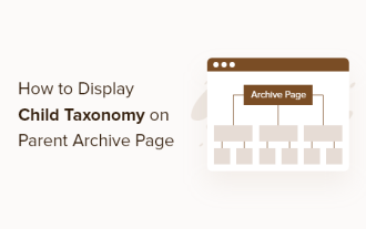 How to display child categories on archive page of parent categories
Apr 19, 2025 pm 11:54 PM
How to display child categories on archive page of parent categories
Apr 19, 2025 pm 11:54 PM
Do you want to know how to display child categories on the parent category archive page? When you customize a classification archive page, you may need to do this to make it more useful to your visitors. In this article, we will show you how to easily display child categories on the parent category archive page. Why do subcategories appear on parent category archive page? By displaying all child categories on the parent category archive page, you can make them less generic and more useful to visitors. For example, if you run a WordPress blog about books and have a taxonomy called "Theme", you can add sub-taxonomy such as "novel", "non-fiction" so that your readers can
 How to sort posts by post expiration date in WordPress
Apr 19, 2025 pm 11:48 PM
How to sort posts by post expiration date in WordPress
Apr 19, 2025 pm 11:48 PM
In the past, we have shared how to use the PostExpirator plugin to expire posts in WordPress. Well, when creating the activity list website, we found this plugin to be very useful. We can easily delete expired activity lists. Secondly, thanks to this plugin, it is also very easy to sort posts by post expiration date. In this article, we will show you how to sort posts by post expiration date in WordPress. Updated code to reflect changes in the plugin to change the custom field name. Thanks Tajim for letting us know in the comments. In our specific project, we use events as custom post types. Now
 How to Automate WordPress and Social Media with IFTTT (and more)
Apr 18, 2025 am 11:27 AM
How to Automate WordPress and Social Media with IFTTT (and more)
Apr 18, 2025 am 11:27 AM
Are you looking for ways to automate your WordPress website and social media accounts? With automation, you will be able to automatically share your WordPress blog posts or updates on Facebook, Twitter, LinkedIn, Instagram and more. In this article, we will show you how to easily automate WordPress and social media using IFTTT, Zapier, and Uncanny Automator. Why Automate WordPress and Social Media? Automate your WordPre
 How to display query count and page loading time in WordPress
Apr 19, 2025 pm 11:51 PM
How to display query count and page loading time in WordPress
Apr 19, 2025 pm 11:51 PM
One of our users asked other websites how to display the number of queries and page loading time in the footer. You often see this in the footer of your website, and it may display something like: "64 queries in 1.248 seconds". In this article, we will show you how to display the number of queries and page loading time in WordPress. Just paste the following code anywhere you like in the theme file (e.g. footer.php). queriesin
 How to build a website for wordpress host
Apr 20, 2025 am 11:12 AM
How to build a website for wordpress host
Apr 20, 2025 am 11:12 AM
To build a website using WordPress hosting, you need to: select a reliable hosting provider. Buy a domain name. Set up a WordPress hosting account. Select a topic. Add pages and articles. Install the plug-in. Customize your website. Publish your website.
