

Create a responsive design sliding side navigation menu


In this tutorial, you will create an expandable side navigation menu using JavaScript and CSS. The final product is shown below:
1. Create tag
First, let’s add some markup to the side menu:
<div id="sideNavigation" class="sidenav">
<a href="#" class="close-btn">×</a>
<a href="#">About</a>
<a href="#">Features</a>
<a href="#">Contact Us</a>
</div>
<nav class="topnav">
<a href="#" class="ham-icon">
<svg width="30" height="30" id="icoOpen">
<path d="M0,5 30,5" stroke="#000" stroke-width="5"/>
<path d="M0,14 30,14" stroke="#000" stroke-width="5"/>
<path d="M0,23 30,23" stroke="#000" stroke-width="5"/>
</svg>
</a>
</nav>
<section id="main">
<h1 id="This-Side-Navigation-Menu-Looks-Good">This Side Navigation Menu Looks Good!</h1>
<p>Lorem ipsum dolor sit amet, consectetur adipiscing elit, sed do eiusmod tempor incididunt ut labore et dolore magna aliqua. Ut enim ad minim veniam, quis nostrud exercitation ullamco laboris nisi ut aliquip ex ea commodo consequat. Duis aute irure dolor in reprehenderit in voluptate velit esse cillum dolore eu fugiat nulla pariatur. Excepteur sint occaecat cupidatat non proident, sunt in culpa qui officia deserunt mollit anim id est laborum.</p>
</section>
Here you can see that we have created a side menu div using class sidenav. Next, we added the actual top bar navigation via the <nav> tags, and we used SVG for the side menu icon.
Remember to put all the content of your website into a div id="main" container so that it slides to the right.
2.Writing JavaScript code
Next, let's add JavaScript that will use the ham-icon class to listen for click events on the hamburger icon, as well as the close button that appears after the side navigation menu slides onto the screen.
document.querySelector("a.ham-icon").addEventListener("click", function(event){
  document.getElementById("sideNavigation").style.width = "250px";
  document.getElementById("main").style.marginLeft = "250px";
});

document.querySelector("a.close-btn").addEventListener("click", function(event){
  document.getElementById("sideNavigation").style.width = "0";
  document.getElementById("main").style.marginLeft = "0";
});
Clicking on the hamburger icon should reveal the side navigation. To do this, we set the width of the navigation to 250px while adding a left margin of 250px to the main site content.
Clicking the close button should hide the side navigation. To do this, we change the width of the navigation back to 0, while also setting the left margin of the main site content to 0.
3. Using CSS styles
Finally, we need to use some CSS to style the side menu and links on the page. CSS will place all web page elements exactly where we want them. We will also apply some simple animation with the help of transition properties. Let's look at CSS one part at a time.
.sidenav {
  height: 100%;
  width: 0;
  position: fixed;
  z-index: 1;
  top: 0;
  left: 0;
  background-color: #111;
  overflow-x: hidden;
  padding-top: 4rem;
  transition: 0.4s cubic-bezier(0.18, 0.89, 0.32, 1.28);
  font-family: "Bebas Neue";
}

.sidenav a {
  padding: 0.5rem 1rem;
  text-decoration: none;
  color: #bdbdbd;
  display: block;
  transition: 0.4s;
  white-space: nowrap;
  font-size: 2rem;
}

.sidenav a:hover {
  color: white;
  background: #9e9e9e;
}
We set the side navigation's height to 100% and its initial width to 0 to make it hide. However, the content of the side navigation will remain hidden only if the value of the overflow-x attribute is set to hidden.
The transition property ensures that changes in side navigation width don't happen suddenly, and the easing feature makes it a bit elastic.
For links within the side navigation, we set the value of the white-space attribute to nowrap so that the menu text does not overflow multiple lines.
.sidenav .close-btn {
  position: absolute;
  top: -1rem;
  right: 1rem;
  font-size: 5rem;
}

.sidenav .close-btn:hover {
  background: initial;
  transform: scale(1.2);
}
The CSS styling above separates our close button from the other links in the side navigation. We applied absolute positioning to the close button and prevented its background from turning light gray on hover. It also increases in size by 20% when the user hovers over it.
The following CSS will now ensure that the main content position moves in sync with the navigation menu by using the same transition duration and the same easing function. Setting the value of the overflow-x property to hidden ensures that horizontal scroll bars do not appear as content moves.
#main {
  transition: margin-left 0.4s cubic-bezier(0.18, 0.89, 0.32, 1.28);
  padding: 20px;
  width: 100%;
}

body {
 overflow-x: hidden;
}
We can also add a little rotational movement to the hamburger icon with the help of the following CSS. It rotates the hamburger icon 180 degrees in 0.5 seconds.
a svg {
  transition: all 0.5s ease;
}
a svg:hover {
  transform: rotate(180deg);
}
Finally, let’s make the navigation menu responsive by adjusting the spacing and size of the links using the following CSS. It ensures that the menu does not stretch out of scope on screens with less vertical space.
@media screen and (max-height: 480px) {
  .sidenav {
    padding-top: 3rem;
  }
  .sidenav a {
    font-size: 1.5rem;
  }
}
At this point your navigation menu should look similar to the following CodePen demo.
4. Remove slideshow
To make the menu appear without slide animation, simply change the CSS property transition, as shown in the abbreviated form below:
.sidenav {
    transition: 0s;
}

#main {
    transition: margin-left 0s;
}
This will make the changes appear immediately since there is no delay specified in transition. The default value we use is 0.5s.
in conclusion
Creating a side menu only requires a few lines of code and does not require the use of many resources. Make your code responsive to different device screen resolutions by modifying your CSS by adding media queries for your specific cases.
To take it a step further, you may want to use a CSS framework like Bootstrap or Bulma to style your menu.
This article has been updated with a contribution from Monty Shokeen. Monty is a full-stack developer who also enjoys writing tutorials and learning new JavaScript libraries.
The above is the detailed content of Create a responsive design sliding side navigation menu. For more information, please follow other related articles on the PHP Chinese website!

Hot AI Tools

Undresser.AI Undress
AI-powered app for creating realistic nude photos

AI Clothes Remover
Online AI tool for removing clothes from photos.

Undress AI Tool
Undress images for free

Clothoff.io
AI clothes remover

Video Face Swap
Swap faces in any video effortlessly with our completely free AI face swap tool!

Hot Article
Hot Tools

Notepad++7.3.1
Easy-to-use and free code editor

SublimeText3 Chinese version
Chinese version, very easy to use

Zend Studio 13.0.1
Powerful PHP integrated development environment

Dreamweaver CS6
Visual web development tools

SublimeText3 Mac version
God-level code editing software (SublimeText3)
Hot Topics
 1673
1673
 14
1428
52
1333
25
1278
29
1257
24
14
1428
52
1333
25
1278
29
1257
24

 How to get logged in user information in WordPress for personalized results
Apr 19, 2025 pm 11:57 PM
How to get logged in user information in WordPress for personalized results
Apr 19, 2025 pm 11:57 PM
Recently, we showed you how to create a personalized experience for users by allowing users to save their favorite posts in a personalized library. You can take personalized results to another level by using their names in some places (i.e., welcome screens). Fortunately, WordPress makes it very easy to get information about logged in users. In this article, we will show you how to retrieve information related to the currently logged in user. We will use the get_currentuserinfo(); function. This can be used anywhere in the theme (header, footer, sidebar, page template, etc.). In order for it to work, the user must be logged in. So we need to use
 How to adjust the wordpress article list
Apr 20, 2025 am 10:48 AM
How to adjust the wordpress article list
Apr 20, 2025 am 10:48 AM
There are four ways to adjust the WordPress article list: use theme options, use plugins (such as Post Types Order, WP Post List, Boxy Stuff), use code (add settings in the functions.php file), or modify the WordPress database directly.
 How To Begin A WordPress Blog: A Step-By-Step Guide For Beginners
Apr 17, 2025 am 08:25 AM
How To Begin A WordPress Blog: A Step-By-Step Guide For Beginners
Apr 17, 2025 am 08:25 AM
Blogs are the ideal platform for people to express their opinions, opinions and opinions online. Many newbies are eager to build their own website but are hesitant to worry about technical barriers or cost issues. However, as the platform continues to evolve to meet the capabilities and needs of beginners, it is now starting to become easier than ever. This article will guide you step by step how to build a WordPress blog, from theme selection to using plugins to improve security and performance, helping you create your own website easily. Choose a blog topic and direction Before purchasing a domain name or registering a host, it is best to identify the topics you plan to cover. Personal websites can revolve around travel, cooking, product reviews, music or any hobby that sparks your interests. Focusing on areas you are truly interested in can encourage continuous writing
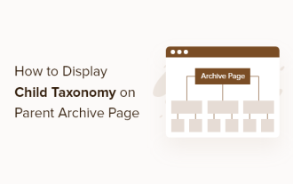 How to display child categories on archive page of parent categories
Apr 19, 2025 pm 11:54 PM
How to display child categories on archive page of parent categories
Apr 19, 2025 pm 11:54 PM
Do you want to know how to display child categories on the parent category archive page? When you customize a classification archive page, you may need to do this to make it more useful to your visitors. In this article, we will show you how to easily display child categories on the parent category archive page. Why do subcategories appear on parent category archive page? By displaying all child categories on the parent category archive page, you can make them less generic and more useful to visitors. For example, if you run a WordPress blog about books and have a taxonomy called "Theme", you can add sub-taxonomy such as "novel", "non-fiction" so that your readers can
 How to sort posts by post expiration date in WordPress
Apr 19, 2025 pm 11:48 PM
How to sort posts by post expiration date in WordPress
Apr 19, 2025 pm 11:48 PM
In the past, we have shared how to use the PostExpirator plugin to expire posts in WordPress. Well, when creating the activity list website, we found this plugin to be very useful. We can easily delete expired activity lists. Secondly, thanks to this plugin, it is also very easy to sort posts by post expiration date. In this article, we will show you how to sort posts by post expiration date in WordPress. Updated code to reflect changes in the plugin to change the custom field name. Thanks Tajim for letting us know in the comments. In our specific project, we use events as custom post types. Now
 How to build a website for wordpress host
Apr 20, 2025 am 11:12 AM
How to build a website for wordpress host
Apr 20, 2025 am 11:12 AM
To build a website using WordPress hosting, you need to: select a reliable hosting provider. Buy a domain name. Set up a WordPress hosting account. Select a topic. Add pages and articles. Install the plug-in. Customize your website. Publish your website.
 How to Automate WordPress and Social Media with IFTTT (and more)
Apr 18, 2025 am 11:27 AM
How to Automate WordPress and Social Media with IFTTT (and more)
Apr 18, 2025 am 11:27 AM
Are you looking for ways to automate your WordPress website and social media accounts? With automation, you will be able to automatically share your WordPress blog posts or updates on Facebook, Twitter, LinkedIn, Instagram and more. In this article, we will show you how to easily automate WordPress and social media using IFTTT, Zapier, and Uncanny Automator. Why Automate WordPress and Social Media? Automate your WordPre
 How to import the source code of wordpress
Apr 20, 2025 am 11:24 AM
How to import the source code of wordpress
Apr 20, 2025 am 11:24 AM
Importing WordPress source code requires the following steps: Create a sub-theme for theme modification. Import the source code and overwrite the files in the sub-topic. Activate the sub-theme to make it effective. Test the changes to make sure everything works.
