

How to add echarts pie chart to react project

How to add echarts pie chart to react project: 1. Install "echarts" through "npm install echarts --save" command; 2. Use import to introduce "echarts/lib/echarts"; 3. Through "componentDidMount" () {...}" to add echarts pie chart.

The operating environment of this tutorial: Windows 10 system, react18.0.0 version, Dell G3 computer.
How to add echarts pie chart to react project?
#Using echarts pie chart in React project
1. Installationnpm install echarts --save
import echarts from 'echarts/lib/echarts';
import  'echarts/lib/chart/pie';  //饼状图
import  'echarts/lib/component/tooltip';
import  'echarts/lib/component/title';
import  'echarts/lib/component/legend'
import  'echarts/lib/component/markPoint'
componentDidMount() {
//环形图百分比
var huan_val = document.getElementsByClassName("huan")[0];
var chart = echarts.init(huan_val);
let option = {
color: ["#f8e367", "#99dfff", "#58c0f0", "#5ea6ff", "#ff9e48", "#bcbcbc"],
series: [{
name: "驾驶分析",
type: "pie",
radius: ['60%', '80%'],
avoidLabelOverlap: false,
label: {
normal: {
show: false,
position: 'center'
},
emphasis: {
show: true,
textStyle: {
fontSize: '30',
fontWeight: 'bold'
}
}
},
labelLine: {
normal: {
show: false
}
},
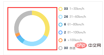
data: [{
value: 33,
name: '慢速'
}, {
value: 26,
name: '低速'
}, {
value: 6,
name: '中速'
}, {
value: 2,
name: '高速'
}, {
value: 3,
name: '超速'
}, {
value: 30,
name: '怠速'
}]
}]
};
chart.setOption(option);
}render(){
return(
<div className="huan"></div>
)}
react video tutorial"
The above is the detailed content of How to add echarts pie chart to react project. For more information, please follow other related articles on the PHP Chinese website!

Hot AI Tools

Undresser.AI Undress
AI-powered app for creating realistic nude photos

AI Clothes Remover
Online AI tool for removing clothes from photos.

Undress AI Tool
Undress images for free

Clothoff.io
AI clothes remover

Video Face Swap
Swap faces in any video effortlessly with our completely free AI face swap tool!

Hot Article
Hot Tools

Notepad++7.3.1
Easy-to-use and free code editor

SublimeText3 Chinese version
Chinese version, very easy to use

Zend Studio 13.0.1
Powerful PHP integrated development environment

Dreamweaver CS6
Visual web development tools

SublimeText3 Mac version
God-level code editing software (SublimeText3)
Hot Topics


 PHP, Vue and React: How to choose the most suitable front-end framework?
Mar 15, 2024 pm 05:48 PM
PHP, Vue and React: How to choose the most suitable front-end framework?
Mar 15, 2024 pm 05:48 PM
PHP, Vue and React: How to choose the most suitable front-end framework? With the continuous development of Internet technology, front-end frameworks play a vital role in Web development. PHP, Vue and React are three representative front-end frameworks, each with its own unique characteristics and advantages. When choosing which front-end framework to use, developers need to make an informed decision based on project needs, team skills, and personal preferences. This article will compare the characteristics and uses of the three front-end frameworks PHP, Vue and React.
 How to use map heat map to display city heat in ECharts
Dec 18, 2023 pm 04:00 PM
How to use map heat map to display city heat in ECharts
Dec 18, 2023 pm 04:00 PM
How to use a map heat map to display city heat in ECharts ECharts is a powerful visual chart library that provides various chart types for developers to use, including map heat maps. Map heat maps can be used to show the popularity of cities or regions, helping us quickly understand the popularity or density of different places. This article will introduce how to use the map heat map in ECharts to display city heat, and provide code examples for reference. First, we need a map file containing geographic information, EC
 Integration of Java framework and front-end React framework
Jun 01, 2024 pm 03:16 PM
Integration of Java framework and front-end React framework
Jun 01, 2024 pm 03:16 PM
Integration of Java framework and React framework: Steps: Set up the back-end Java framework. Create project structure. Configure build tools. Create React applications. Write REST API endpoints. Configure the communication mechanism. Practical case (SpringBoot+React): Java code: Define RESTfulAPI controller. React code: Get and display the data returned by the API.
 How to use histogram to display data in ECharts
Dec 18, 2023 pm 02:21 PM
How to use histogram to display data in ECharts
Dec 18, 2023 pm 02:21 PM
How to use histograms to display data in ECharts ECharts is a JavaScript-based data visualization library that is very popular and widely used in the field of data visualization. Among them, the histogram is the most common and commonly used chart type, which can be used to display the size, comparison and trend analysis of various numerical data. This article will introduce how to use ECharts to draw histograms and provide code examples. First, we need to introduce the ECharts library into the HTML file, which can be introduced in the following way
 Does ECharts depend on jQuery? In-depth analysis
Feb 27, 2024 am 08:39 AM
Does ECharts depend on jQuery? In-depth analysis
Feb 27, 2024 am 08:39 AM
Does ECharts need to rely on jQuery? Detailed interpretation requires specific code examples. ECharts is an excellent data visualization library that provides a rich range of chart types and interactive functions and is widely used in web development. When using ECharts, many people will have a question: Does ECharts need to rely on jQuery? This article will explain this in detail and give specific code examples. First, to be clear, ECharts itself does not rely on jQuery;
 ECharts polar scatter plot: how to display data distribution
Dec 18, 2023 pm 03:40 PM
ECharts polar scatter plot: how to display data distribution
Dec 18, 2023 pm 03:40 PM
ECharts polar scatter plot: How to display data distribution requires specific code examples Introduction: Data visualization is an important part of data analysis and presentation, and polar scatter plot, as a common data visualization method, can effectively display data The distribution helps us better understand the data. This article will use the ECharts library to implement polar coordinate scatter plots, and introduce how to display data distribution through specific code examples. 1. Introduction to ECharts ECharts is an open source data resource from Baidu.
 Vue.js vs. React: Project-Specific Considerations
Apr 09, 2025 am 12:01 AM
Vue.js vs. React: Project-Specific Considerations
Apr 09, 2025 am 12:01 AM
Vue.js is suitable for small and medium-sized projects and fast iterations, while React is suitable for large and complex applications. 1) Vue.js is easy to use and is suitable for situations where the team is insufficient or the project scale is small. 2) React has a richer ecosystem and is suitable for projects with high performance and complex functional needs.
 ECharts multi-axis chart: how to display multi-dimensional data
Dec 18, 2023 pm 06:39 PM
ECharts multi-axis chart: how to display multi-dimensional data
Dec 18, 2023 pm 06:39 PM
ECharts multi-axis chart: How to display multi-dimensional data, specific code examples are needed Introduction: With the advent of the big data era, we need to better display complex multi-dimensional data. As a powerful visualization library, ECharts provides a variety of chart types, among which multi-axis charts are one of the important tools for displaying multi-dimensional data. This article will introduce what a multi-axis chart is and how to use ECharts to display multi-dimensional data, and provide corresponding code examples. 1. What is a multi-axis chart? A multi-axis chart is a chart that can be displayed on the same chart.
