

CSS Tips Sharing: Pure CSS to Implement Table Responsive Layout

如何利用纯CSS实现表格响应式布局?下面本篇文章就来给大家分享超 Nice 的表格响应式布局小技巧,希望对大家有所帮助!

今天,遇到了一个很有意思的问题,一名群友问我,仅仅使用 CSS,能否实现这样一种响应式的布局效果:
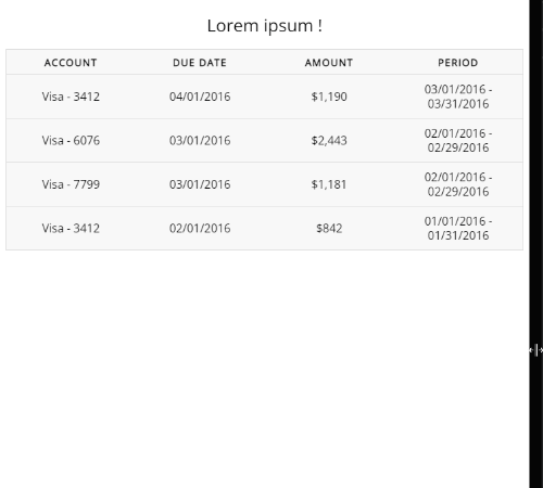
简单解析一下效果:
在屏幕视口较为宽时,表现为一个整体 Table 的样式
而当屏幕视口宽度较小时,原 Table 的每一行数据单独拆分为一个 Table 进行展示
很有意思的一个响应式布局,让信息在小屏幕下得到了一种不错的展示。
那么,仅仅使用 CSS 的话,能否实现这样一个布局呢?答案是可以的。【推荐学习:css视频教程】
首先,肯定会用到媒体查询,这个不难看出。另外,我们观察下拆分后的每一组数据:
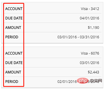
都会存在一组原本整体一个 Table 时的表头信息,主要的难点就是在这里,我们如何在拆分成一个一个的子 Table 展示时,同时展示这些表头信息?
基本结构的实现
首先,我们先实现常规宽屏下的 HTML 及对应的 CSS。
比较简单,这里没有什么特殊之处,使用 <table> 标签或者使用 div、ul 等标签进行模拟一个表格都可以。
<table>
  <caption>Lorem ipsum !</caption>
  <thead>
    <tr>
      <th>Account</th>
      <th>Due Date</th>
      <th>Amount</th>
      <th">Period</th>
    </tr>
  </thead>
  <tbody>
    <tr>
      <td data-label="Account">Visa - 3412</td>
      <td data-label="Due Date">04/01/2016</td>
      <td data-label="Amount">$1,190</td>
      <td data-label="Period">03/01/2016 - 03/31/2016</td>
    </tr>
    // ... 重复多组
  </tbody>
</table>
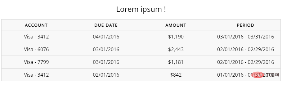
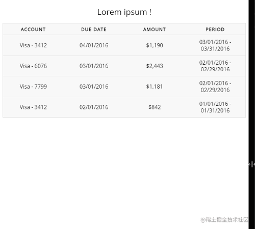
得到这样一个简单的 Table:
使用媒体查询将单个 Table 拆分成多个
下一步也很简单,设定合适的阈值(视实际业务情况而定),使用媒体查询将单个 Table 拆分成多个子 Table。
@media screen and (max-width: 600px) {
  table {
    border: 0;
  }
  table thead {
    display: none;
  }
  table tr {
    display: block;
    margin-bottom: 10px;
  }
  table td {
    border-bottom: 1px solid #ddd;
    display: block;
  }
}这里做的事情也非常简单:
利用媒体查询,设定屏幕宽度小于
600px的样式去掉原本表格的
<thead>表头,直接隐藏即可将原本的一行
<tr>,设置为display: block, 并且设置一个下边距,使之每一个分开将原本的一行内的
<td>,设置为display: block,这样,它们就会竖向排列,使每一个<tr>形成新的一个子 table
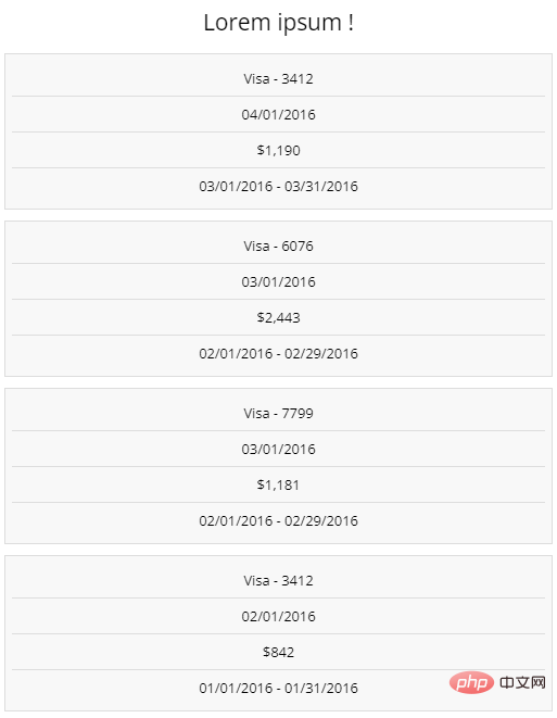
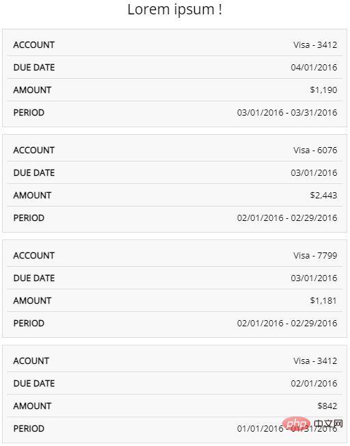
好,这样,再屏幕宽度小于 600px 时,我们就得到了这样一个 Table:
借助伪元素及其特性,实现表头信息展示
下面一步,也就是最为关键的一步,我们如何在子 table 的每一行,也就是 <td> 内,再展示原本的表头信息呢?
这里其实也非常简单,只是简单的运用了伪元素,极其可以读取 HTML 标签属性的小特性实现。
我们只需要简单改造一下代码,给每个 <td> 的 HTML,带上与之对应的表头列描述信息:
<table>
  // 上方信息保持一致
  <tbody>
    <tr>
      <td data-label="Account">Visa - 3412</td>
      <td data-label="Due Date">04/01/2016</td>
      <td data-label="Amount">$1,190</td>
      <td data-label="Period">03/01/2016 - 03/31/2016</td>
    </tr>
    <tr>
      <td scope="row" data-label="Account">Visa - 6076</td>
      <td data-label="Due Date">03/01/2016</td>
      <td data-label="Amount">$2,443</td>
      <td data-label="Period">02/01/2016 - 02/29/2016</td>
    </tr>
    // ... 每个 tr 进行同样的处理
  </tbody>
</table>
接着,借助 td 的伪元素,实现表头信息的展示即可:
@media screen and (max-width: 600px) {
  // ... 保持一致
  table td {
    position: relative;
    display: block;
    text-align: right;
  }
  table td::before {
    position: absolute;
    left: 10px;
    right: 0;
    content: attr(data-label);
  }
}这里,我们核心的知识点就是利用了元素的伪元素可以在 content 属性里,读取其 HTML 元素内的属性内容,并进行展示的知识点。
假设一个 HTML 标签定义为:
<div data-msg="ABC">那么该 div 对应的伪类如果设置了
content: attr(data-msg),就可以读取到 data-msg 的值,相当于content:"ABC"
这样,我们在小屏幕下,就得到了这样一种效果:
完整的效果,即如题图所示:
For the complete DEMO, you can click here: CodePen Demo -- Simple Responsive Table in CSS
Original address: https://www .cnblogs.com/coco1s/p/16422777.html
Author: ChokCoco
(Learning video sharing: web front-end)
The above is the detailed content of CSS Tips Sharing: Pure CSS to Implement Table Responsive Layout. For more information, please follow other related articles on the PHP Chinese website!

Hot AI Tools

Undresser.AI Undress
AI-powered app for creating realistic nude photos

AI Clothes Remover
Online AI tool for removing clothes from photos.

Undress AI Tool
Undress images for free

Clothoff.io
AI clothes remover

Video Face Swap
Swap faces in any video effortlessly with our completely free AI face swap tool!

Hot Article
Hot Tools

Notepad++7.3.1
Easy-to-use and free code editor

SublimeText3 Chinese version
Chinese version, very easy to use

Zend Studio 13.0.1
Powerful PHP integrated development environment

Dreamweaver CS6
Visual web development tools

SublimeText3 Mac version
God-level code editing software (SublimeText3)
Hot Topics


 How to use bootstrap in vue
Apr 07, 2025 pm 11:33 PM
How to use bootstrap in vue
Apr 07, 2025 pm 11:33 PM
Using Bootstrap in Vue.js is divided into five steps: Install Bootstrap. Import Bootstrap in main.js. Use the Bootstrap component directly in the template. Optional: Custom style. Optional: Use plug-ins.
 The Roles of HTML, CSS, and JavaScript: Core Responsibilities
Apr 08, 2025 pm 07:05 PM
The Roles of HTML, CSS, and JavaScript: Core Responsibilities
Apr 08, 2025 pm 07:05 PM
HTML defines the web structure, CSS is responsible for style and layout, and JavaScript gives dynamic interaction. The three perform their duties in web development and jointly build a colorful website.
 How to write split lines on bootstrap
Apr 07, 2025 pm 03:12 PM
How to write split lines on bootstrap
Apr 07, 2025 pm 03:12 PM
There are two ways to create a Bootstrap split line: using the tag, which creates a horizontal split line. Use the CSS border property to create custom style split lines.
 Understanding HTML, CSS, and JavaScript: A Beginner's Guide
Apr 12, 2025 am 12:02 AM
Understanding HTML, CSS, and JavaScript: A Beginner's Guide
Apr 12, 2025 am 12:02 AM
WebdevelopmentreliesonHTML,CSS,andJavaScript:1)HTMLstructurescontent,2)CSSstylesit,and3)JavaScriptaddsinteractivity,formingthebasisofmodernwebexperiences.
 How to set up the framework for bootstrap
Apr 07, 2025 pm 03:27 PM
How to set up the framework for bootstrap
Apr 07, 2025 pm 03:27 PM
To set up the Bootstrap framework, you need to follow these steps: 1. Reference the Bootstrap file via CDN; 2. Download and host the file on your own server; 3. Include the Bootstrap file in HTML; 4. Compile Sass/Less as needed; 5. Import a custom file (optional). Once setup is complete, you can use Bootstrap's grid systems, components, and styles to create responsive websites and applications.
 How to insert pictures on bootstrap
Apr 07, 2025 pm 03:30 PM
How to insert pictures on bootstrap
Apr 07, 2025 pm 03:30 PM
There are several ways to insert images in Bootstrap: insert images directly, using the HTML img tag. With the Bootstrap image component, you can provide responsive images and more styles. Set the image size, use the img-fluid class to make the image adaptable. Set the border, using the img-bordered class. Set the rounded corners and use the img-rounded class. Set the shadow, use the shadow class. Resize and position the image, using CSS style. Using the background image, use the background-image CSS property.
 How to use bootstrap button
Apr 07, 2025 pm 03:09 PM
How to use bootstrap button
Apr 07, 2025 pm 03:09 PM
How to use the Bootstrap button? Introduce Bootstrap CSS to create button elements and add Bootstrap button class to add button text
 How to resize bootstrap
Apr 07, 2025 pm 03:18 PM
How to resize bootstrap
Apr 07, 2025 pm 03:18 PM
To adjust the size of elements in Bootstrap, you can use the dimension class, which includes: adjusting width: .col-, .w-, .mw-adjust height: .h-, .min-h-, .max-h-
