 Web Front-end
 CSS Tutorial
 Learn about the new attribute object-view-box in CSS3 in one article
Learn about the new attribute object-view-box in CSS3 in one article
This article will take you to have an in-depth understanding of the new feature object-view-box attribute in CSS3, and talk about the role and use of the new attribute. I hope it will be helpful to everyone!

While developing, I always wished there was a native CSS way to crop an image and position it in any direction I needed. This can be achieved by using an additional HTML element and different CSS properties, explained later.
In this article, I will lead you to understand the new CSS property object-view-box proposed by Jake Archibald at the beginning of this year. It allows us to crop or resize the replaced HTML element, like a or <video></video>. [Recommended learning: css video tutorial]
Question
In the example below, we have an image that needs to be cropped. Note that we only want a specific part of the image.
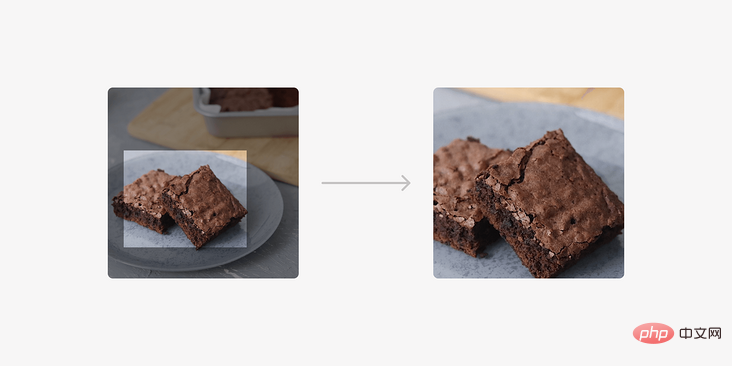
Currently, we can solve this problem in one of the following ways.
- Use
<img src="/static/imghw/default1.png" data-src="img/brownies.jpg" class="lazy" alt="Learn about the new attribute object-view-box in CSS3 in one article" >and wrap it in an extra element - Use the image as
background-imageand modify Position and size
Wrapped in an extra element
This is a common way to solve this problem, the steps are as follows:
- Wrap the image in another element (in our case
<figure></figure>). - Added
position: relativeandoverflow: hidden - Added
position: absoluteto the image, and changed the positioning and The size values were adjusted to achieve this result.
<figure>
    <img src="/static/imghw/default1.png"  data-src="img/brownies.jpg"  class="lazy"   alt="">
</figure>figure {
position: relative;
width: 300px;
aspect-ratio: 1;
overflow: hidden;
border-radius: 15px;
}
img {
position: absolute;
left: -23%;
top: 0;
right: 0;
bottom: 0;
width: 180%;
height: 100%;
object-fit: cover;
}Put image as background
In this solution we use a <div> to set the image as background and then we change the position and size value.
<div class="brownies"></div>
.brownies {
  width: 300px;
  aspect-ratio: 3 / 2;
  background-image: url("brownies.jpg");
  background-size: 700px auto;
  background-position: 77% 68%;
  background-repeat: no-repeat;
}That's fine, but what if we want to apply the above to <img src="/static/imghw/default1.png" data-src="img/brownies.jpg" class="lazy" alt="Learn about the new attribute object-view-box in CSS3 in one article" >? Well, that's what object-view-box does.
Introducing Object-View-Box
Attribute object-view-box May be supported in Chrome 104. Now available in Chrome canary.
According to CSS specification (https://drafts.csswg.org/css-images-4/#the-object-view-box)
object-view-box# The ## attribute specifies a "view box" on an element, similar to the . In the demonstration of this article, I will focus on the usage of inset().
object-view-box, we can use inset to draw a rectangle from four sides (top, right, bottom, left), and then apply object-fit: cover to avoid deformation.
<img src="/static/imghw/default1.png" data-src="img/brownies.jpg" class="lazy" alt="">
img {
    aspect-ratio: 1;
    width: 300px;
    object-view-box: inset(25% 20% 15% 0%);
}Intrinsic dimensions of the image
The intrinsic size is the default image width and height. The image size I'm working with is1194 × 1194 px.
img {
    aspect-ratio: 1;
    width: 300px;
}300×300px.
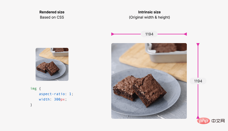
inset()values.
Using inset
inset()The values will be based on the width and height of the original image, resulting in a cropped image. It will help us draw an embedded rectangle and control the four edges, similar to handling margin or padding.
inset The value defines an inset rectangle. We can control the four edges, just like we did with margin or padding. In the example below, the card has an inset of 20px on all edges.
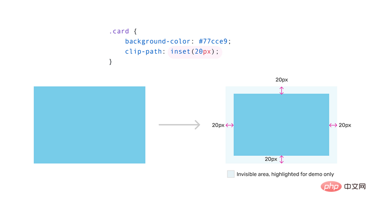
object-view-box:
img {
    aspect-ratio: 1;
    width: 300px;
    object-view-box: inset(25% 20% 15% 0%);
}25%, 20%, 15% and 0% represent the top, right, bottom and left sides respectively.
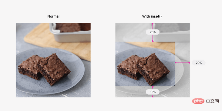
修复图像失真
如果图像的尺寸是正方形的,那么裁剪后的结果将是变形的。
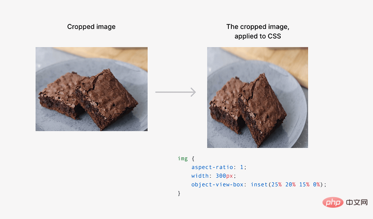
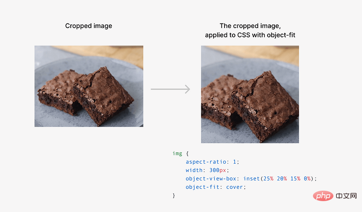
这可以使用 object-fit 属性来解决。
img {
    aspect-ratio: 1;
    width: 300px;
    object-view-box: inset(25% 20% 15% 0%);
    object-fit: cover;
}
放大或缩小
我们可以使用 inset 来放大或缩小图像。根据我的测试,过渡或动画不能与object-view-box工作。
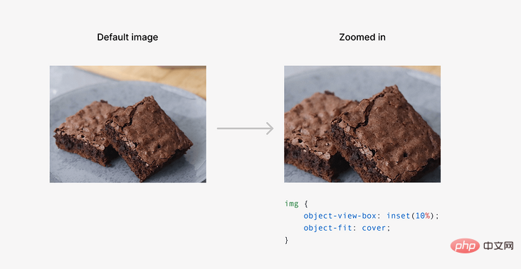
我们也可以用一个负的 inset 值来缩小。
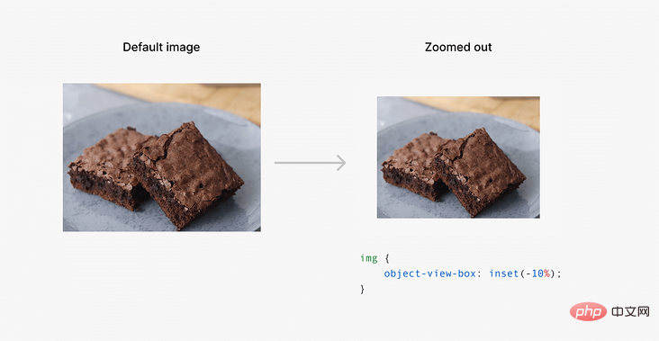
想象一下,这对于能够缩放图像是多么有用,而不需要用一个额外的元素来包装它。
事例
地址:https://codepen.io/shadeed/pen/yLvXJRd
期待这个新的属于尽快来了!
作者:ishadeed
来源:ishadeed
原文:https://ishadeed.com/article/css-object-view-box/
(学习视频分享:web前端)
The above is the detailed content of Learn about the new attribute object-view-box in CSS3 in one article. For more information, please follow other related articles on the PHP Chinese website!

Hot AI Tools

Undresser.AI Undress
AI-powered app for creating realistic nude photos

AI Clothes Remover
Online AI tool for removing clothes from photos.

Undress AI Tool
Undress images for free

Clothoff.io
AI clothes remover

Video Face Swap
Swap faces in any video effortlessly with our completely free AI face swap tool!

Hot Article

Hot Tools

Notepad++7.3.1
Easy-to-use and free code editor

SublimeText3 Chinese version
Chinese version, very easy to use

Zend Studio 13.0.1
Powerful PHP integrated development environment

Dreamweaver CS6
Visual web development tools

SublimeText3 Mac version
God-level code editing software (SublimeText3)

Hot Topics
 How to use bootstrap in vue
Apr 07, 2025 pm 11:33 PM
Using Bootstrap in Vue.js is divided into five steps: Install Bootstrap. Import Bootstrap in main.js. Use the Bootstrap component directly in the template. Optional: Custom style. Optional: Use plug-ins.
 The Roles of HTML, CSS, and JavaScript: Core Responsibilities
Apr 08, 2025 pm 07:05 PM
HTML defines the web structure, CSS is responsible for style and layout, and JavaScript gives dynamic interaction. The three perform their duties in web development and jointly build a colorful website.
 Understanding HTML, CSS, and JavaScript: A Beginner's Guide
Apr 12, 2025 am 12:02 AM
WebdevelopmentreliesonHTML,CSS,andJavaScript:1)HTMLstructurescontent,2)CSSstylesit,and3)JavaScriptaddsinteractivity,formingthebasisofmodernwebexperiences.
 How to set up the framework for bootstrap
Apr 07, 2025 pm 03:27 PM
To set up the Bootstrap framework, you need to follow these steps: 1. Reference the Bootstrap file via CDN; 2. Download and host the file on your own server; 3. Include the Bootstrap file in HTML; 4. Compile Sass/Less as needed; 5. Import a custom file (optional). Once setup is complete, you can use Bootstrap's grid systems, components, and styles to create responsive websites and applications.
 How to write split lines on bootstrap
Apr 07, 2025 pm 03:12 PM
There are two ways to create a Bootstrap split line: using the tag, which creates a horizontal split line. Use the CSS border property to create custom style split lines.
 How to insert pictures on bootstrap
Apr 07, 2025 pm 03:30 PM
There are several ways to insert images in Bootstrap: insert images directly, using the HTML img tag. With the Bootstrap image component, you can provide responsive images and more styles. Set the image size, use the img-fluid class to make the image adaptable. Set the border, using the img-bordered class. Set the rounded corners and use the img-rounded class. Set the shadow, use the shadow class. Resize and position the image, using CSS style. Using the background image, use the background-image CSS property.
 How to use bootstrap button
Apr 07, 2025 pm 03:09 PM
How to use the Bootstrap button? Introduce Bootstrap CSS to create button elements and add Bootstrap button class to add button text
 How to resize bootstrap
Apr 07, 2025 pm 03:18 PM
To adjust the size of elements in Bootstrap, you can use the dimension class, which includes: adjusting width: .col-, .w-, .mw-adjust height: .h-, .min-h-, .max-h-


