

How to set border rounded corners in css

In CSS, you can use the border-radius attribute to set the border rounded corners. The function of this attribute is to add a rounded corner effect to the border. You only need to add "border-radius: rounded corner radius value;" to the element. Style, you can set the rounded corners of four borders at the same time.

The operating environment of this tutorial: Windows 7 system, CSS3&&HTML5 version, Dell G3 computer.
The most common and simplest way to set border rounded corners in css is to use the border-radius attribute.
CSS border-radius property defines the radius of the corner of the element. Through the CSS border-radius property, the "rounded corner" style of any element can be achieved.
Syntax:
border-radius: none | length{1,4} [/ length{1,4}Each value can be in the form of a numerical value or a percentage.
length/length The first length represents the radius in the horizontal direction, and the second represents the radius in the vertical direction.
If it is a value, then the four values of top-left, top-right, bottom-right, and bottom-left are equal.
If there are two values, then top-left and bottom-right are equal and are the first value, and top-right and bottom-left are equal and are the second value. 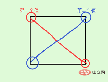
If there are three values, then the first value is to set top-left, and the second value is top-right and bottom-left and they will be equal, and the third value is to set bottom-right. 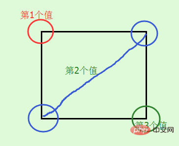
If there are four values, then the first value is to set top-left, and the second value is to set top-right, the third value is to set bottom-right, and the fourth value is to set bottom- left 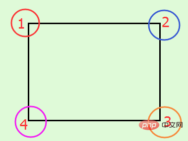
In addition to the above abbreviations, you can also write the four corners separately like border, as follows:
border-top-left-radius: //左上角
border-top-right-radius: //右上角
border-bottom-right-radius: //右下角
border-bottom-left-radius: //左下角
are the horizontal directions respectively and the vertical radius. When the second value is omitted, the horizontal and vertical radii are equal.
border-radius only supports the border-radius standard syntax format in the following versions of browsers: Firefox4.0, Safari5.0, Google Chrome 10.0, Opera 10.5, and IE9. For older browsers, border-radius needs to be based on Different browser kernels add different prefixes. For example, the Mozilla kernel needs to add "-moz", and the Webkit kernel needs to add "-webkit", etc. However, IE and Opera do not have private formats, so in order to maximize browser compatibility , we need to set it as follows:
-webkit-border-radius: 10px 20px 30px;
-moz-border-radius: 10px 20px 30px;
border-radius: 10px 20px 30px;
Please write the standard form after the browser private form.
Give a few examples to see the effect:
<!DOCTYPE html>
<html>
<head>
<meta charset="UTF-8">
<meta name="Keywords" content="关键词一,关键词二">
<meta name="Description" content="网站描述内容">
<meta name="Author" content="刘艳">
<title></title>
<style>
img {
border-radius: 30px;
margin: 100px;
}
</style>
</head>
<body>
<img  src="/static/imghw/default1.png"  data-src="../images/photo.jpg"  class="lazy"      style="max-width:90%" alt="How to set border rounded corners in css" >
</body>
</html>Effect:
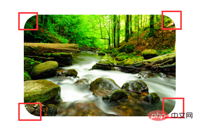
The radius of the four corners is 30px;
Look at a standard circle and ellipse again:
<!DOCTYPE html>
<html>
<head>
<meta charset="UTF-8">
<meta name="Keywords" content="关键词一,关键词二">
<meta name="Description" content="网站描述内容">
<meta name="Author" content="刘艳">
<title></title>
<style>
p {
display: inline-block;
border: 10px solid red;
}

.circle {
width: 50px;
height: 50px;
-webkit-border-radius: 50%;
-moz-border-radius: 50%;
border-radius: 50%;
}

.elipse {
width: 50px;
height: 100px;
-webkit-border-radius: 50%;
-moz-border-radius: 50%;
border-radius: 50%;
}
</style>
</head>
<body>
<p></p>
<p></p>
</body>
</html>Effect: 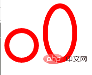
The difference between the first and second p mainly lies in whether it is a square or a rectangle. The circle is in When carouseling, it can be used instead of the circle picture.
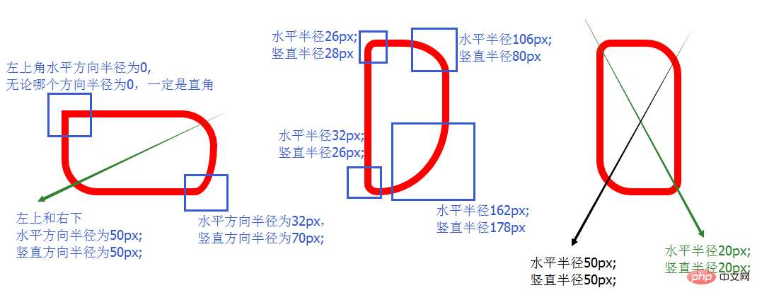
The above are examples of equal radii in the horizontal and vertical directions. Here are two examples of different radii in the horizontal and vertical directions:
<!DOCTYPE html>
<html>
<head>
<meta charset="UTF-8">
<meta name="Keywords" content="关键词一,关键词二">
<meta name="Description" content="网站描述内容">
<meta name="Author" content="刘艳">
<title></title>
<style>
p {
display: inline-block;
border: 10px solid red;
margin: 100px;
}

.p1 {
width: 200px;
height: 100px;
border-radius: 0px 50px 32px/28px 50px 70px;
}

.p2 {
width: 100px;
height: 200px;
border-radius: 26px 106px 162px 32px/28px 80px 178px 26px;
}

.p3 {
width: 100px;
height: 200px;
border-radius: 20px 50px/ 20px 50px;
}
</style>
</head>
<body>
<p></p>
<p></p>
<p></p>
</body>
</html>The effect is as follows:
(Learning video sharing: css video tutorial)
The above is the detailed content of How to set border rounded corners in css. For more information, please follow other related articles on the PHP Chinese website!

Hot AI Tools

Undresser.AI Undress
AI-powered app for creating realistic nude photos

AI Clothes Remover
Online AI tool for removing clothes from photos.

Undress AI Tool
Undress images for free

Clothoff.io
AI clothes remover

Video Face Swap
Swap faces in any video effortlessly with our completely free AI face swap tool!

Hot Article
Hot Tools

Notepad++7.3.1
Easy-to-use and free code editor

SublimeText3 Chinese version
Chinese version, very easy to use

Zend Studio 13.0.1
Powerful PHP integrated development environment

Dreamweaver CS6
Visual web development tools

SublimeText3 Mac version
God-level code editing software (SublimeText3)
Hot Topics


 How to use bootstrap in vue
Apr 07, 2025 pm 11:33 PM
How to use bootstrap in vue
Apr 07, 2025 pm 11:33 PM
Using Bootstrap in Vue.js is divided into five steps: Install Bootstrap. Import Bootstrap in main.js. Use the Bootstrap component directly in the template. Optional: Custom style. Optional: Use plug-ins.
 The Roles of HTML, CSS, and JavaScript: Core Responsibilities
Apr 08, 2025 pm 07:05 PM
The Roles of HTML, CSS, and JavaScript: Core Responsibilities
Apr 08, 2025 pm 07:05 PM
HTML defines the web structure, CSS is responsible for style and layout, and JavaScript gives dynamic interaction. The three perform their duties in web development and jointly build a colorful website.
 How to write split lines on bootstrap
Apr 07, 2025 pm 03:12 PM
How to write split lines on bootstrap
Apr 07, 2025 pm 03:12 PM
There are two ways to create a Bootstrap split line: using the tag, which creates a horizontal split line. Use the CSS border property to create custom style split lines.
 Understanding HTML, CSS, and JavaScript: A Beginner's Guide
Apr 12, 2025 am 12:02 AM
Understanding HTML, CSS, and JavaScript: A Beginner's Guide
Apr 12, 2025 am 12:02 AM
WebdevelopmentreliesonHTML,CSS,andJavaScript:1)HTMLstructurescontent,2)CSSstylesit,and3)JavaScriptaddsinteractivity,formingthebasisofmodernwebexperiences.
 How to set up the framework for bootstrap
Apr 07, 2025 pm 03:27 PM
How to set up the framework for bootstrap
Apr 07, 2025 pm 03:27 PM
To set up the Bootstrap framework, you need to follow these steps: 1. Reference the Bootstrap file via CDN; 2. Download and host the file on your own server; 3. Include the Bootstrap file in HTML; 4. Compile Sass/Less as needed; 5. Import a custom file (optional). Once setup is complete, you can use Bootstrap's grid systems, components, and styles to create responsive websites and applications.
 How to insert pictures on bootstrap
Apr 07, 2025 pm 03:30 PM
How to insert pictures on bootstrap
Apr 07, 2025 pm 03:30 PM
There are several ways to insert images in Bootstrap: insert images directly, using the HTML img tag. With the Bootstrap image component, you can provide responsive images and more styles. Set the image size, use the img-fluid class to make the image adaptable. Set the border, using the img-bordered class. Set the rounded corners and use the img-rounded class. Set the shadow, use the shadow class. Resize and position the image, using CSS style. Using the background image, use the background-image CSS property.
 How to use bootstrap button
Apr 07, 2025 pm 03:09 PM
How to use bootstrap button
Apr 07, 2025 pm 03:09 PM
How to use the Bootstrap button? Introduce Bootstrap CSS to create button elements and add Bootstrap button class to add button text
 How to resize bootstrap
Apr 07, 2025 pm 03:18 PM
How to resize bootstrap
Apr 07, 2025 pm 03:18 PM
To adjust the size of elements in Bootstrap, you can use the dimension class, which includes: adjusting width: .col-, .w-, .mw-adjust height: .h-, .min-h-, .max-h-
