 Web Front-end
 JS Tutorial
 Elementary article: How to make a cool black analog clock using html, css and js (with code)
Elementary article: How to make a cool black analog clock using html, css and js (with code)
In the previous article "Teach you how to use HTML/CSS and Three.js's fire-breathing dragon game (code sharing)", I introduced to you how to use HTML/CSS and Three.js Create a fire-breathing dragon mini game with Three.js. The following article will introduce to you how to use JS to make a cool black theme analog clock. Let’s see how to do it together.

Simple analog clock using HTML, CSS and JavaScript
Hope you like this design. I've shared the full tutorial on how I made this design below. Hope the tutorial below can help you.
To do this, first, you have to create an HTML and CSS file.
Step 1: Create the basic structure of the clock
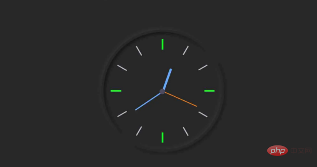
This HTML code is basically the basic structure of the analog clock. I used some CSS code to design the background and shape of this watch. As you can see in the image above, it takes the form of a neomorphic design. Here, I used CSS code to implement the Neumorphism design.
As you can see in the demo above, I used a border around this watch to make a code border: 7px solid #282828. I use box-shadow to make it clearer. border-radius 50% makes this watch round. I also used a height and width of 30 rem. If you want to make this watch bigger, you can increase its size.
HTML
<div class="clock">

</div>CSS
 html {
  background: #282828;
  text-align: center;
  font-size: 10px;
}

body {
  margin: 0;
  font-size: 2rem;
  display: flex;
  flex: 1;
  min-height: 100vh;
  align-items: center;
}

.clock {
  width: 30rem;
  height: 30rem;
  border: 7px solid #282828;
  box-shadow: -4px -4px 10px rgba(67,67,67,0.5),
                inset 4px 4px 10px rgba(0,0,0,0.5),
                inset -4px -4px 10px rgba(67,67,67,0.5),
                4px 4px 10px rgba(0,0,0,0.3);
  border-radius: 50%;
  margin: 50px auto;
  position: relative;
  padding: 2rem;

}Demo effect

Step 2: Mark 1 to 12 on the clock
HTML
<div class="outer-clock-face">
	<div class="marking marking-one"></div>
	<div class="marking marking-two"></div>
	<div class="marking marking-three"></div>
	<div class="marking marking-four"></div>
</div>
CSS
.outer-clock-face {
  position: relative;
  width: 100%;
  height: 100%;
  border-radius: 100%;
  background: #282828;


  overflow: hidden;
}

.outer-clock-face::after {
  -webkit-transform: rotate(90deg);
  -moz-transform: rotate(90deg);
  transform: rotate(90deg)
}

.outer-clock-face::before,
.outer-clock-face::after,
.outer-clock-face .marking{
  content: '';
  position: absolute;
  width: 5px;
  height: 100%;
  background: #1df52f;
  z-index: 0;
  left: 49%;
}Demo effect
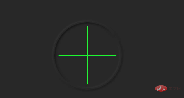
CSS
.outer-clock-face .marking {
  background: #bdbdcb;
  width: 3px;
}

.outer-clock-face .marking.marking-one {
  transform: rotate(30deg)
}

.outer-clock-face .marking.marking-two {
  transform: rotate(60deg)
}

.outer-clock-face .marking.marking-three {
  transform: rotate(120deg)
}

.outer-clock-face .marking.marking-four {
  transform: rotate(150deg)
}Demo effect
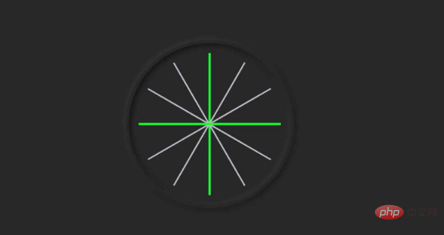
I use the following The HTML and CSS code makes a circle. As a result, the middle of the long line is covered, and it has the full 1 to 12 mark size.
HTML:
<div class="inner-clock-face">

</div>CSS
.inner-clock-face {
  position: absolute;
  top: 10%;
  left: 10%;
  width: 80%;
  height: 80%;
  background: #282828;
  -webkit-border-radius: 100%;
  -moz-border-radius: 100%;
  border-radius: 100%;
  z-index: 1;
}

.inner-clock-face::before {
  content: '';
  position: absolute;
  top: 50%;
  border-radius: 18px;
  margin-left: -9px;
  margin-top: -6px;
  left: 50%;
  width: 16px;
  height: 16px;
  background: #4d4b63;
  z-index: 11;
}Demo effect
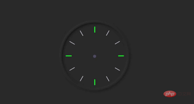
Step 3: Make three hands to indicate the time
In this cell, I used three hands, which were made using the HTML and CSS code below.
HTML
<div class="hand hour-hand"></div>
<div class="hand min-hand"></div>
<div class="hand second-hand"></div>
CSS
.hand {
  width: 50%;
  right: 50%;
  height: 6px;
  background: #61afff;
  position: absolute;
  top: 50%;
  border-radius: 6px;
  transform-origin: 100%;
  transform: rotate(90deg);
  transition-timing-function: cubic-bezier(0.1, 2.7, 0.58, 1);
}

.hand.hour-hand {
  width: 30%;
  z-index: 3;
}

.hand.min-hand {
  height: 3px;
  z-index: 10;
  width: 40%;
}

.hand.second-hand {
  background: #ee791a;
  width: 45%;
  height: 2px;
}Demo effect
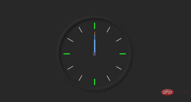
Step 4: Use JavaScript code to activate the clock
We designed the entire watch above, but this watch is not functional yet. This means that the hands of this watch have no function and do not display accurate time. For this we need to use JavaScript code.
Using the JavaScript below, I've given instructions on how to rotate these hands. If you know basic JavaScript, you will definitely understand it.
I've fully explained how this JavaScript code works below.
JavaScript
const secondHand = document.querySelector('.second-hand');
const minsHand = document.querySelector('.min-hand');
const hourHand = document.querySelector('.hour-hand');
JavaScript
function setDate() {
  const now = new Date();

  const seconds = now.getSeconds();   // second hand rotation
  const secondsDegrees = ((seconds / 60) * 360) + 90;
  secondHand.style.transform = `rotate(${secondsDegrees}deg)`;

  const mins = now.getMinutes();    // minutes hand rotation
  const minsDegrees = ((mins / 60) * 360) + ((seconds/60)*6) + 90;
  minsHand.style.transform = `rotate(${minsDegrees}deg)`;

  const hour = now.getHours();     // Hours hand rotation
  const hourDegrees = ((hour / 12) * 360) + ((mins/60)*30) + 90;
  hourHand.style.transform = `rotate(${hourDegrees}deg)`;
}Detailed explanation of JavaScript code
About the second hand
JavaScript
const seconds = now.getSeconds();   // second hand rotation
const secondsDegrees = ((seconds / 60) * 360) + 90;
secondHand.style.transform = `rotate(${secondsDegrees}deg)`;I have stored how the second hand rotates in secondsDegrees, then I use rotate (${secondsDegrees} deg) to rotate the second hand 1 minute equals 60 seconds so I divide by 60 one full circle of a circle is 360 degrees so I multiply by 360
about the minute hand
JavaScript
const mins = now.getMinutes();    // minutes hand rotation
const minsDegrees = ((mins / 60) * 360) + ((seconds/60)*6) + 90;
minsHand.style.transform = `rotate(${minsDegrees}deg)`;i In minsDegrees is stored how to turn the minute hand then I used (${minsDegrees]deg) to turn the minute hand 1 hour equals 60 minutes so I divided by 60 and added the Second hand position. Because the minute hand is in the correct position depending on the seconds.
JavaScript
setInterval(setDate, 1000);

setDate();
Recommended learning: HTML/CSS video tutorial, JS video tutorial
The above is the detailed content of Elementary article: How to make a cool black analog clock using html, css and js (with code). For more information, please follow other related articles on the PHP Chinese website!

Hot AI Tools

Undresser.AI Undress
AI-powered app for creating realistic nude photos

AI Clothes Remover
Online AI tool for removing clothes from photos.

Undress AI Tool
Undress images for free

Clothoff.io
AI clothes remover

Video Face Swap
Swap faces in any video effortlessly with our completely free AI face swap tool!

Hot Article

Hot Tools

Notepad++7.3.1
Easy-to-use and free code editor

SublimeText3 Chinese version
Chinese version, very easy to use

Zend Studio 13.0.1
Powerful PHP integrated development environment

Dreamweaver CS6
Visual web development tools

SublimeText3 Mac version
God-level code editing software (SublimeText3)

Hot Topics
 How to use bootstrap in vue
Apr 07, 2025 pm 11:33 PM
Using Bootstrap in Vue.js is divided into five steps: Install Bootstrap. Import Bootstrap in main.js. Use the Bootstrap component directly in the template. Optional: Custom style. Optional: Use plug-ins.
 The Roles of HTML, CSS, and JavaScript: Core Responsibilities
Apr 08, 2025 pm 07:05 PM
HTML defines the web structure, CSS is responsible for style and layout, and JavaScript gives dynamic interaction. The three perform their duties in web development and jointly build a colorful website.
 React's Role in HTML: Enhancing User Experience
Apr 09, 2025 am 12:11 AM
React combines JSX and HTML to improve user experience. 1) JSX embeds HTML to make development more intuitive. 2) The virtual DOM mechanism optimizes performance and reduces DOM operations. 3) Component-based management UI to improve maintainability. 4) State management and event processing enhance interactivity.
 How to write split lines on bootstrap
Apr 07, 2025 pm 03:12 PM
There are two ways to create a Bootstrap split line: using the tag, which creates a horizontal split line. Use the CSS border property to create custom style split lines.
 Understanding HTML, CSS, and JavaScript: A Beginner's Guide
Apr 12, 2025 am 12:02 AM
WebdevelopmentreliesonHTML,CSS,andJavaScript:1)HTMLstructurescontent,2)CSSstylesit,and3)JavaScriptaddsinteractivity,formingthebasisofmodernwebexperiences.
 How to set up the framework for bootstrap
Apr 07, 2025 pm 03:27 PM
To set up the Bootstrap framework, you need to follow these steps: 1. Reference the Bootstrap file via CDN; 2. Download and host the file on your own server; 3. Include the Bootstrap file in HTML; 4. Compile Sass/Less as needed; 5. Import a custom file (optional). Once setup is complete, you can use Bootstrap's grid systems, components, and styles to create responsive websites and applications.
 How to insert pictures on bootstrap
Apr 07, 2025 pm 03:30 PM
There are several ways to insert images in Bootstrap: insert images directly, using the HTML img tag. With the Bootstrap image component, you can provide responsive images and more styles. Set the image size, use the img-fluid class to make the image adaptable. Set the border, using the img-bordered class. Set the rounded corners and use the img-rounded class. Set the shadow, use the shadow class. Resize and position the image, using CSS style. Using the background image, use the background-image CSS property.
 How to use bootstrap button
Apr 07, 2025 pm 03:09 PM
How to use the Bootstrap button? Introduce Bootstrap CSS to create button elements and add Bootstrap button class to add button text


