

Let's talk about the grid system in Bootstrap 4

This article will take you through the grid system in Bootstrap. It has certain reference value. Friends in need can refer to it. I hope it will be helpful to everyone.

Bootstrap4’s grid system
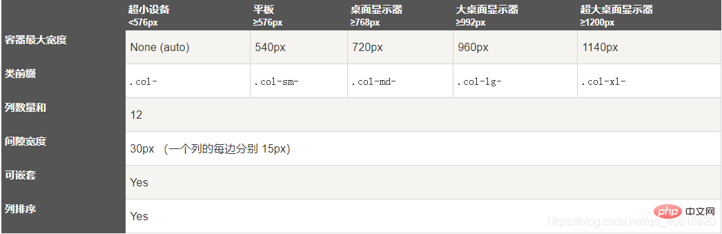
Bootstrap provides a responsive, mobile-first fluid grid system that changes with the screen or viewport As the (viewport) size increases, the system will automatically divide it into up to 12 columns.
Bootstrap 4’s grid system is responsive and columns automatically rearrange based on screen size.
Related recommendations: "bootstrap Tutorial"
Grid Class
Bootstrap 4 Grid The system has the following 5 classes:
.col- for all devices
.col-sm- tablet- screen width equal to or greater than 576px
.col-md- desktop monitor- screen width equal to or Larger than 768px)
.col-lg-Large desktop monitor-Screen width equal to or larger than 992px)
.col-xl-Extra-large desktop monitor-Screen width equal to or larger than 1200px)
Grid system rules
Bootstrap4 grid system rules:
Each row of the grid needs to be placed in a set .container (fixed width) or .container- fluid (full screen width) class container, so that some margins and padding can be automatically set.
Use rows to create horizontal column groups.
Content needs to be placed in columns, and only columns can be direct children of rows.
Predefined classes such as .row and .col-sm-4 can be used to quickly make grid layouts.
Columns create gaps between column contents by padding. This gap is offset by setting the first row and last column via negative margins on the .rows class.
Grid columns are created by spanning the specified 12 columns. For example, to set three equal columns, you need to use three .col-sm-4 to set.
The biggest difference between Bootstrap 3 and Bootstrap 4 is that Bootstrap 4 now uses flexbox (flexible box) instead of float. One of the great things about Flexbox is that grid columns that don't have a specified width are automatically set to equal width and height. If you want to learn more about Flexbox, you can read our CSS Flexbox tutorial.
The following table summarizes how the Bootstrap grid system works on different devices:
The basic structure of the Bootstrap 4 grid
<!-- 第一个例子:控制列的宽度及在不同的设备上如何显示 -->
<div>
  <div></div>
</div>
<div>
  <div></div>
  <div></div>
  <div></div>
</div>

<!-- 第二个例子:或让 Bootstrap 者自动处理布局 -->
<div>
  <div></div>
  <div></div>
  <div></div>
</div>

第一个例子:创建一行(<div>)。
然后, 添加是需要的列( .col-*-* 类中设置)。
第一个星号 (*) 表示响应的设备: sm, md, lg 或 xl,
第二个星号 (*) 表示一个数字, 同一行的数字相加为 12。

第二个例子: 不在每个 col 上添加数字,
让 bootstrap 自动处理布局,同一行的每个列宽度相等:
两个 "col" ,每个就为 50% 的宽度。
三个 "col"每个就为 33.33% 的宽度,
四个 "col"每个就为 25% 的宽度,
以此类推。同样,你可以使用 .col-sm|md|lg|xl 来设置列的响应规则。<p><span style="font-size: 16px;"><strong>Create equal width columns, Bootstrap automatic layout</strong></span></p>
<pre class="brush:php;toolbar:false"><div>
  <div>.col</div>
  <div>.col</div>
  <div>.col</div>
</div>
Equal-width responsive columns
The following example demonstrates how to create equal-width responsive columns on tablets and larger screens. On mobile devices, that is, when the screen width is less than 576px, the four columns will be stacked one above the other:
<div>.col-sm-3</div>
<div>.col-sm-3</div>
<div>.col-sm-3</div>
<div>.col-sm-3</div>
Unequal-width responsive columns
The following example demonstrates creating responsive columns of unequal width on tablets and larger screens. On mobile devices, that is, when the screen width is less than 576px, the two columns will be stacked on top of each other:
<div>
  <div>.col-sm-4</div>
  <div>.col-sm-8</div>
</div>
Tablet and desktop
The following example demonstrates that on a desktop monitor, the width of the two columns each accounts for 50%. If it is on a tablet, the width of the left column is 25% and the width of the right column is 75%. On small devices such as mobile phones, the columns will be stacked.
<div>
  <div>
    <div>
      <p></p>
    </div>
    <div>
      <p></p>
    </div>
  </div>
</div>
Tablet, desktop, large desktop monitor, extra large desktop monitor
##The following examples are used in tablet, desktop, large desktop monitor, extra large desktop monitor The width ratios are: 25%/75%, 50%/50%, 33.33%/66.67%, 16.67/83.33%, which will be displayed stacked on small devices such as mobile phones.<div> <div> <div> <p></p> </div> <div> <p></p> </div> </div> </div>
Offset column
The offset column is set through the offset-- class. The first asterisk (*) can be sm, md, lg, xl, indicating the screen device type, and the second asterisk (*) can be a number from 1 to 11.
To use offsets on large screen displays, use the .offset-md-* classes. These classes increase the left margin of a column by * columns, where * ranges from 1 to 11. For example: .offset-md-4 moves .col-md-4 four columns to the right.<div> <div>.col-md-4</div> <div>.col-md-4 .offset-md-4</div> </div> <div> <div>.col-md-3 .offset-md-3</div> <div>.col-md-3 .offset-md-3</div> </div> <div> <div>.col-md-6 .offset-md-3</div> </div>
Programming Video! !
The above is the detailed content of Let's talk about the grid system in Bootstrap 4. For more information, please follow other related articles on the PHP Chinese website!

Hot AI Tools

Undresser.AI Undress
AI-powered app for creating realistic nude photos

AI Clothes Remover
Online AI tool for removing clothes from photos.

Undress AI Tool
Undress images for free

Clothoff.io
AI clothes remover

Video Face Swap
Swap faces in any video effortlessly with our completely free AI face swap tool!

Hot Article
Hot Tools

Notepad++7.3.1
Easy-to-use and free code editor

SublimeText3 Chinese version
Chinese version, very easy to use

Zend Studio 13.0.1
Powerful PHP integrated development environment

Dreamweaver CS6
Visual web development tools

SublimeText3 Mac version
God-level code editing software (SublimeText3)
Hot Topics


 How to get the bootstrap search bar
Apr 07, 2025 pm 03:33 PM
How to get the bootstrap search bar
Apr 07, 2025 pm 03:33 PM
How to use Bootstrap to get the value of the search bar: Determines the ID or name of the search bar. Use JavaScript to get DOM elements. Gets the value of the element. Perform the required actions.
 Do I need to use flexbox in the center of the Bootstrap picture?
Apr 07, 2025 am 09:06 AM
Do I need to use flexbox in the center of the Bootstrap picture?
Apr 07, 2025 am 09:06 AM
There are many ways to center Bootstrap pictures, and you don’t have to use Flexbox. If you only need to center horizontally, the text-center class is enough; if you need to center vertically or multiple elements, Flexbox or Grid is more suitable. Flexbox is less compatible and may increase complexity, while Grid is more powerful and has a higher learning cost. When choosing a method, you should weigh the pros and cons and choose the most suitable method according to your needs and preferences.
 How to do vertical centering of bootstrap
Apr 07, 2025 pm 03:21 PM
How to do vertical centering of bootstrap
Apr 07, 2025 pm 03:21 PM
Use Bootstrap to implement vertical centering: flexbox method: Use the d-flex, justify-content-center, and align-items-center classes to place elements in the flexbox container. align-items-center class method: For browsers that do not support flexbox, use the align-items-center class, provided that the parent element has a defined height.
 How to set up the framework for bootstrap
Apr 07, 2025 pm 03:27 PM
How to set up the framework for bootstrap
Apr 07, 2025 pm 03:27 PM
To set up the Bootstrap framework, you need to follow these steps: 1. Reference the Bootstrap file via CDN; 2. Download and host the file on your own server; 3. Include the Bootstrap file in HTML; 4. Compile Sass/Less as needed; 5. Import a custom file (optional). Once setup is complete, you can use Bootstrap's grid systems, components, and styles to create responsive websites and applications.
 How to write split lines on bootstrap
Apr 07, 2025 pm 03:12 PM
How to write split lines on bootstrap
Apr 07, 2025 pm 03:12 PM
There are two ways to create a Bootstrap split line: using the tag, which creates a horizontal split line. Use the CSS border property to create custom style split lines.
 Bootstrap Accessibility: Building Inclusive and User-Friendly Websites
Apr 07, 2025 am 12:04 AM
Bootstrap Accessibility: Building Inclusive and User-Friendly Websites
Apr 07, 2025 am 12:04 AM
Building an inclusive and user-friendly website with Bootstrap can be achieved through the following steps: 1. Enhance screen reader support with ARIA tags; 2. Adjust color contrast to comply with WCAG standards; 3. Ensure keyboard navigation is friendly. These measures ensure that the website is friendly and accessible to all users, including those with barriers.
 How to insert pictures on bootstrap
Apr 07, 2025 pm 03:30 PM
How to insert pictures on bootstrap
Apr 07, 2025 pm 03:30 PM
There are several ways to insert images in Bootstrap: insert images directly, using the HTML img tag. With the Bootstrap image component, you can provide responsive images and more styles. Set the image size, use the img-fluid class to make the image adaptable. Set the border, using the img-bordered class. Set the rounded corners and use the img-rounded class. Set the shadow, use the shadow class. Resize and position the image, using CSS style. Using the background image, use the background-image CSS property.
 How to use bootstrap button
Apr 07, 2025 pm 03:09 PM
How to use bootstrap button
Apr 07, 2025 pm 03:09 PM
How to use the Bootstrap button? Introduce Bootstrap CSS to create button elements and add Bootstrap button class to add button text
