A closer look at media objects in Bootstrap
This article will take you through the media objects in Bootstrap. It has certain reference value. Friends in need can refer to it. I hope it will be helpful to everyone.

Related recommendations: "bootstrap tutorial"
In a web page, it is very common for pictures to be on the left and content to be on the right. The effect is a media object. It is an abstract style that can be used to build different types of components. In the bootstrap framework, its corresponding version file is as follows:
LESS: media.less
SASS: _media.scss
Media objects generally appear in groups. A group of media objects generally includes the following parts:
1. Media object container: used to hold media For all contents of the object, the class name .media
must be used on the container. 2. The object of the media object: usually a picture, the class .media-object
3 must be used. 3. The body of the media object: It is the main content of the media object, which can be any element. You need to use the class .media-body
4. The title of the media object: a title used to describe the media object. You need to use the class .media-heading
In addition, the classes .pull-left and .pull-right are often used in the bootstrap framework to control the floating mode of objects in media objects.
The following is their css source code:
.media,
.media-body {
  overflow: hidden;
  zoom: 1;
}
.media,
.media .media {
  margin-top: 15px;
}
.media:first-child {
  margin-top: 0;
}
.media-object {
  display: block;
}
.media-heading {
  margin: 0 0 5px;
}
.media > .pull-left {
  margin-right: 10px;
}
.media > .pull-right {
  margin-left: 10px;
}Media The style is relatively simple, just set the spacing between them;
Let’s take a look at the use of media objects:
<h1 id="默认媒体对象">默认媒体对象</h1>
    <div>
        <a>
            <img  class="media-object lazy" src="/static/imghw/default1.png" data-src="img/1.jpg" alt="A closer look at media objects in Bootstrap" >
        </a>
        <div>
            <h4 id="荷塘月色">荷塘月色</h4>
            <div>这几天心里颇不宁静。今晚在院子里坐着乘凉,忽然想起日日走过的荷塘,在这满月的夜里,总该另有一 番样子吧。月亮渐渐地升高了,墙外马路上孩子们的欢笑……</div>
        </div>
    </div>

Media Nesting of Objects
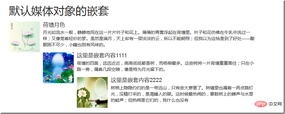
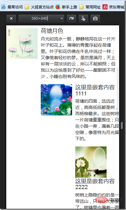
Bootstrap media object nesting, simply place another media object structure in the body of the media object (.media-body). Let’s take a look at the application of media object nesting
<h1 id="默认媒体对象的嵌套">默认媒体对象的嵌套</h1>
    <div>
        <a>
            <img  class="media-object lazy" src="/static/imghw/default1.png" data-src="img/3.jpg" alt="A closer look at media objects in Bootstrap" >
        </a>
        <div>
            <h4 id="荷塘月色">荷塘月色</h4>
            <div>月光如流水一般,静静地泻在这一片片叶子和花上。薄薄的青雾浮起在荷塘里。叶子和花仿佛在牛乳中洗过一样;又像笼着轻纱的梦。虽然是满月,天上却有一层淡淡的云,所以不能朗照;但我以为这恰是到了好处——酣眠固不可少,小睡也别有风味的。</div>
            <div>
                <a>
                    <img  class="media-object lazy" src="/static/imghw/default1.png" data-src="img/4.jpg" alt="A closer look at media objects in Bootstrap" >
                </a>
                <div>
                    <h4 id="这里是嵌套内容">这里是嵌套内容1111</h4>
                    <div>荷塘的四面,远远近近,高高低低都是树,而杨柳最多。这些树将一片荷塘重重围住;只在小路一旁,漏着几段空隙,像是特为月光留下的。</div>
                    <div>
                        <a>
                            <img  class="media-object lazy" src="/static/imghw/default1.png" data-src="img/5.jpg" alt="A closer look at media objects in Bootstrap" >
                        </a>
                        <div>
                            <h4 id="这里是嵌套内容">这里是嵌套内容2222</h4>
                            <div>树梢上隐隐约约的是一带远山,只有些大意罢了。树缝里也漏着一两点路灯光,没精打采的,是渴睡人的眼。这时候最热闹的,要数树上的蝉声与水里的蛙声;但热闹是它们的,我什么也没有</div>
                        </div>
                    </div>
                </div>
            </div>
        </div>
    </div>
The effect is as follows:


##Media object list
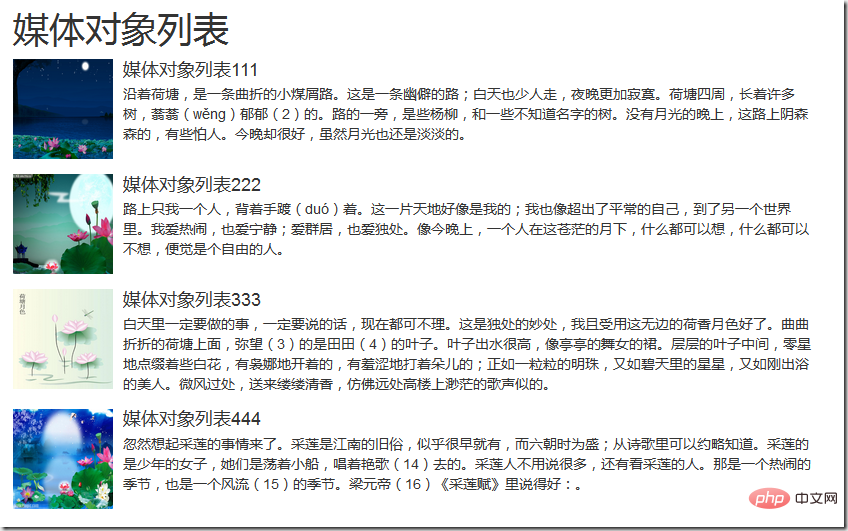
The bootstrap framework provides a media object list display effect. When writing the structure, you can use the tag ul, add the class name .media-list to the tag ul, and use the class name on the tag li .mediaFor example:<h1 id="媒体对象列表">媒体对象列表</h1>
-

媒体对象列表111
沿着荷塘,是一条曲折的小煤屑路。这是一条幽僻的路;白天也少人走,夜晚更加寂寞。荷塘四周,长着许多树,蓊蓊(wěng)郁郁(2)的。路的一旁,是些杨柳,和一些不知道名字的树。没有月光的晚上,这路上阴森森的,有些怕人。今晚却很好,虽然月光也还是淡淡的。 -

媒体对象列表222
路上只我一个人,背着手踱(duó)着。这一片天地好像是我的;我也像超出了平常的自己,到了另一个世界里。我爱热闹,也爱宁静;爱群居,也爱独处。像今晚上,一个人在这苍茫的月下,什么都可以想,什么都可以不想,便觉是个自由的人。 -

媒体对象列表333
白天里一定要做的事,一定要说的话,现在都可不理。这是独处的妙处,我且受用这无边的荷香月色好了。曲曲折折的荷塘上面,弥望(3)的是田田(4)的叶子。叶子出水很高,像亭亭的舞女的裙。层层的叶子中间,零星地点缀着些白花,有袅娜地开着的,有羞涩地打着朵儿的;正如一粒粒的明珠,又如碧天里的星星,又如刚出浴的美人。微风过处,送来缕缕清香,仿佛远处高楼上渺茫的歌声似的。 -

媒体对象列表444
忽然想起采莲的事情来了。采莲是江南的旧俗,似乎很早就有,而六朝时为盛;从诗歌里可以约略知道。采莲的是少年的女子,她们是荡着小船,唱着艳歌(14)去的。采莲人不用说很多,还有看采莲的人。那是一个热闹的季节,也是一个风流(15)的季节。梁元帝(16)《采莲赋》里说得好:。
 ##For more programming-related knowledge, please visit:
The above is the detailed content of A closer look at media objects in Bootstrap. For more information, please follow other related articles on the PHP Chinese website!

Hot AI Tools

Undresser.AI Undress
AI-powered app for creating realistic nude photos

AI Clothes Remover
Online AI tool for removing clothes from photos.

Undress AI Tool
Undress images for free

Clothoff.io
AI clothes remover

Video Face Swap
Swap faces in any video effortlessly with our completely free AI face swap tool!

Hot Article

Hot Tools

Notepad++7.3.1
Easy-to-use and free code editor

SublimeText3 Chinese version
Chinese version, very easy to use

Zend Studio 13.0.1
Powerful PHP integrated development environment

Dreamweaver CS6
Visual web development tools

SublimeText3 Mac version
God-level code editing software (SublimeText3)

Hot Topics
 How to use bootstrap in vue
Apr 07, 2025 pm 11:33 PM
Using Bootstrap in Vue.js is divided into five steps: Install Bootstrap. Import Bootstrap in main.js. Use the Bootstrap component directly in the template. Optional: Custom style. Optional: Use plug-ins.
 How to get the bootstrap search bar
Apr 07, 2025 pm 03:33 PM
How to use Bootstrap to get the value of the search bar: Determines the ID or name of the search bar. Use JavaScript to get DOM elements. Gets the value of the element. Perform the required actions.
 How to do vertical centering of bootstrap
Apr 07, 2025 pm 03:21 PM
Use Bootstrap to implement vertical centering: flexbox method: Use the d-flex, justify-content-center, and align-items-center classes to place elements in the flexbox container. align-items-center class method: For browsers that do not support flexbox, use the align-items-center class, provided that the parent element has a defined height.
 How to set up the framework for bootstrap
Apr 07, 2025 pm 03:27 PM
To set up the Bootstrap framework, you need to follow these steps: 1. Reference the Bootstrap file via CDN; 2. Download and host the file on your own server; 3. Include the Bootstrap file in HTML; 4. Compile Sass/Less as needed; 5. Import a custom file (optional). Once setup is complete, you can use Bootstrap's grid systems, components, and styles to create responsive websites and applications.
 How to write split lines on bootstrap
Apr 07, 2025 pm 03:12 PM
There are two ways to create a Bootstrap split line: using the tag, which creates a horizontal split line. Use the CSS border property to create custom style split lines.
 How to insert pictures on bootstrap
Apr 07, 2025 pm 03:30 PM
There are several ways to insert images in Bootstrap: insert images directly, using the HTML img tag. With the Bootstrap image component, you can provide responsive images and more styles. Set the image size, use the img-fluid class to make the image adaptable. Set the border, using the img-bordered class. Set the rounded corners and use the img-rounded class. Set the shadow, use the shadow class. Resize and position the image, using CSS style. Using the background image, use the background-image CSS property.
 How to use bootstrap button
Apr 07, 2025 pm 03:09 PM
How to use the Bootstrap button? Introduce Bootstrap CSS to create button elements and add Bootstrap button class to add button text
 How to resize bootstrap
Apr 07, 2025 pm 03:18 PM
To adjust the size of elements in Bootstrap, you can use the dimension class, which includes: adjusting width: .col-, .w-, .mw-adjust height: .h-, .min-h-, .max-h-


