What are the three methods of web page layout?
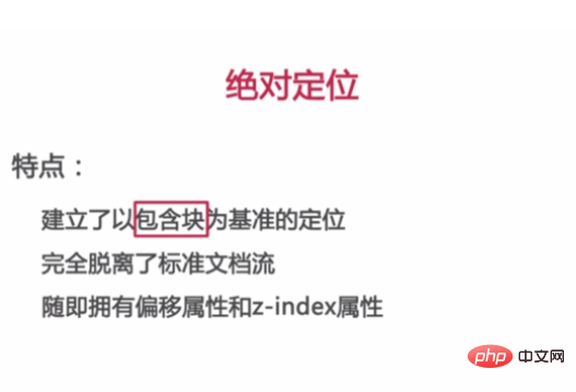
The three methods of web page layout are: 1. Standard document flow; 2. Floating; 3. Absolute positioning. Among them, absolute positioning is completely separated from the standard document flow, establishing positioning based on the containing block, and has offset attributes and z-index attributes.

##Related learning recommendations: Website production video tutorial
Three ways of web page layout:
1: Standard document flow
1. From top to bottom and from left To the right (block-level elements [div, ul, li, dl, dt, p] and row-level elements [hanging plate, img, strong, input]) 2. Box model 1) Box model attributes: border, inner margin padding [(top, right, bottom, left) (top, left, left, bottom) (top, bottom, left)], outer edge Distance margin [(upper, right, lower, left) (upper, left, right, lower) (upper, lower, left and right)]. 3. Box 3D model 1) Box 3D model level 1, border; 2, content padding; 3. background-img; 4. background-color; 5. margin; 4. The size of the box model is equal to the size of the outer margin, inner margin, and middle content of the box.Two: floating float
float: left, right, noneClear float: 1, clear: both; (Generally used to clear floating elements immediately behind) 2. Also set width: 1000% (fixed width) overflow: hidden; Note: (When the parent contains a quick shrink to one , using clear: both methods are invalid; generally use the second method of clearing floats)Three: Absolute positioning
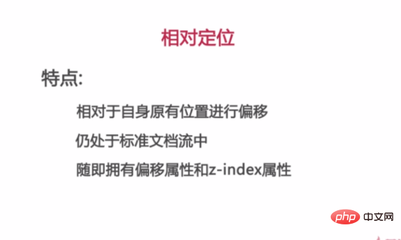
1 Static positioning 2 Relative positioning 3 Absolute positioning

The above is the detailed content of What are the three methods of web page layout?. For more information, please follow other related articles on the PHP Chinese website!

Hot AI Tools

Undresser.AI Undress
AI-powered app for creating realistic nude photos

AI Clothes Remover
Online AI tool for removing clothes from photos.

Undress AI Tool
Undress images for free

Clothoff.io
AI clothes remover

Video Face Swap
Swap faces in any video effortlessly with our completely free AI face swap tool!

Hot Article

Hot Tools

Notepad++7.3.1
Easy-to-use and free code editor

SublimeText3 Chinese version
Chinese version, very easy to use

Zend Studio 13.0.1
Powerful PHP integrated development environment

Dreamweaver CS6
Visual web development tools

SublimeText3 Mac version
God-level code editing software (SublimeText3)

Hot Topics
 How to center pictures in Dreamweaver web design
Apr 08, 2024 pm 08:45 PM
Center an image in Dreamweaver: Select the image you want to center. In the Properties panel, set Horizontal Alignment to Center. (Optional) Set Vertical Alignment to Center or Bottom.
 The definition and use of full-width characters
Mar 25, 2024 pm 03:33 PM
What are full-width characters? In computer encoding systems, double-width characters are a character encoding method that takes up two standard character positions. Correspondingly, the character encoding method that occupies a standard character position is called a half-width character. Full-width characters are usually used for input, display and printing of Chinese, Japanese, Korean and other Asian characters. In Chinese input methods and text editing, the usage scenarios of full-width characters and half-width characters are different. Use of full-width characters Chinese input method: In the Chinese input method, full-width characters are usually used to input Chinese characters, such as Chinese characters, symbols, etc.
 jQuery tips to quickly get screen height
Feb 24, 2024 pm 06:30 PM
jQuery Tips: How to Quickly Obtain Screen Height In web development, you often encounter situations where you need to obtain the screen height, such as implementing responsive layout, dynamically calculating element size, etc. Using jQuery, you can easily achieve the function of obtaining the screen height. Next, we will introduce some implementation methods of using jQuery to quickly obtain the screen height, and attach specific code examples. Method 1: Use jQuery's height() method to obtain the screen height. By using jQuery's height
 What are the commonly used Flex layout properties?
Feb 25, 2024 am 10:42 AM
What are the common properties of flex layout? Specific code examples are required. Flex layout is a powerful tool for designing responsive web page layouts. It makes it easy to control the arrangement and size of elements in a web page by using a flexible set of properties. In this article, I will introduce the common properties of Flex layout and provide specific code examples. display: Set the display mode of the element to Flex. .container{display:flex;}flex-directi
 What does bootstrap consist of?
Apr 05, 2024 am 01:09 AM
The Bootstrap framework consists of the following components: CSS Preprocessors: SASS and LESS Responsive Layout System: Grid System and Responsive Utility Class Components: UI Elements and JavaScript Plug-in Themes and Templates: Pre-made styles and pre-built pages Tools and Utilities: Icon set, jQuery, Grunt
 Detailed explanation of the usage of HTML iframe tag
Feb 21, 2024 am 09:21 AM
Detailed explanation of the usage of iframe tag in HTML The iframe tag in HTML is a method used to embed content such as other web pages or images in a web page. By using the iframe tag, we can display the content of another web page in one web page, achieving flexibility and diversity in web page layout. In this article, the usage of iframe tags will be introduced in detail and specific code examples will be provided. 1. The basic syntax structure of the iframe tag In HTML, using the iframe tag requires the following basic language
 Is there any way to clear floats?
Feb 22, 2024 pm 04:00 PM
Is there any method to clear floats? Specific code examples are required. In web page layout, floats are a common layout method that allows elements to break away from the document flow and be positioned relative to other elements. However, a problem often encountered when using floating layout is that the parent element cannot wrap the floating element correctly, causing the page to have a disordered layout. Therefore, we need to take measures to clear the float so that the parent element can wrap the floated element correctly. There are many ways to clear floats. The following will introduce several commonly used methods and give specific code examples.
 How to use CSS Viewport unit vh to create a web page layout that adapts to mobile screens
Sep 13, 2023 am 11:15 AM
How to use CSSViewport unit vh to create a web page layout adapted to mobile phone screens. The popularity and use of mobile phone devices is becoming more and more widespread, and more and more web pages need to be adapted to mobile phone screens. To solve this problem, CSS3 introduced a new unit - the Viewport unit, which includes vh (viewportheight). In this article, we will explore how to use vh units to create web page layouts that adapt to mobile screens, and provide specific code examples. one


