

DIV+CSS自适应布局 - holiday1123

自适应布局分两类:高度和宽度,方法有很多,我用三列布局举例,我就列几个通俗易懂的例子呗,懂了三列的,两列的原理一样,呵呵哒。
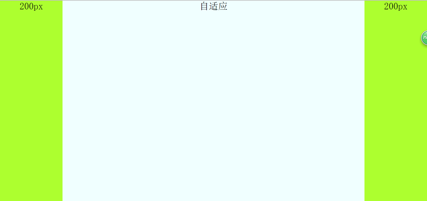
效果图如下:高度自适应——宽度自适应
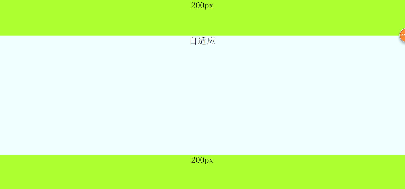
1,高度自适应布局
原理就是把每个模块设置为绝对定位,然后设置中间自适应的模块的top和bottom属性的值分别为头部模块和底部模块的高,然后中间模块的高度就自适应了。代码如下:
html代码:
<span style="color: #0000ff;"><span style="color: #800000;">body</span><span style="color: #0000ff;">></span>
        <span style="color: #0000ff;"><span style="color: #800000;">div </span><span style="color: #ff0000;">class</span><span style="color: #0000ff;">="top"</span><span style="color: #0000ff;">></span><span style="color: #000000;">
            120px
        </span><span style="color: #0000ff;"></span><span style="color: #800000;">div</span><span style="color: #0000ff;">></span>
        <span style="color: #0000ff;"><span style="color: #800000;">div </span><span style="color: #ff0000;">class</span><span style="color: #0000ff;">="main"</span><span style="color: #0000ff;">></span><span style="color: #000000;">
            自适应
        </span><span style="color: #0000ff;"></span><span style="color: #800000;">div</span><span style="color: #0000ff;">></span>
        <span style="color: #0000ff;"><span style="color: #800000;">div </span><span style="color: #ff0000;">class</span><span style="color: #0000ff;">="bottom"</span><span style="color: #0000ff;">></span><span style="color: #000000;">
            120px
        </span><span style="color: #0000ff;"></span><span style="color: #800000;">div</span><span style="color: #0000ff;">></span>
<span style="color: #0000ff;"></span><span style="color: #800000;">body</span><span style="color: #0000ff;">></span></span></span></span></span>
css代码:
<span style="color: #800000;">.top</span>{<span style="color: #ff0000;">
    width</span>:<span style="color: #0000ff;"> 100%</span>;<span style="color: #ff0000;">
    height</span>:<span style="color: #0000ff;"> 120px</span>;<span style="color: #ff0000;">
    position</span>:<span style="color: #0000ff;"> absolute</span>;<span style="color: #ff0000;">
    background-color</span>:<span style="color: #0000ff;"> greenyellow</span>;

}<span style="color: #800000;">
.main</span>{<span style="color: #ff0000;">
    position</span>:<span style="color: #0000ff;"> absolute</span>;<span style="color: #ff0000;">
    width</span>:<span style="color: #0000ff;"> 100%</span>;<span style="color: #ff0000;">
    top</span>:<span style="color: #0000ff;"> 120px</span>;<span style="color: #ff0000;">
    bottom</span>:<span style="color: #0000ff;"> 120px</span>;<span style="color: #ff0000;">
    background-color</span>:<span style="color: #0000ff;"> azure</span>;<span style="color: #ff0000;">
    height</span>:<span style="color: #0000ff;"> auto</span>;
}<span style="color: #800000;">
.bottom</span>{<span style="color: #ff0000;">
    position</span>:<span style="color: #0000ff;"> absolute</span>;<span style="color: #ff0000;">
    bottom</span>:<span style="color: #0000ff;"> 0</span>;//别漏了<span style="color: #ff0000;">
    width</span>:<span style="color: #0000ff;"> 100%</span>;<span style="color: #ff0000;">
    height</span>:<span style="color: #0000ff;"> 120px</span>;<span style="color: #ff0000;">
    background-color</span>:<span style="color: #0000ff;">greenyellow </span>;
}
2,宽度自适应,有三种方法,分别是用绝对定位;利用margin,中间模块先渲染;自身浮动。
a,用绝对定位来设置宽度自适应布局,原理:针对自适应模块使用绝对定位,在把left和right设置为左右两列的宽,其实原理和高度自适应一样,另外左右两列分别左右浮动。
html代码:
<span style="color: #0000ff;"><span style="color: #800000;">body</span><span style="color: #0000ff;">></span>
        <span style="color: #0000ff;"><span style="color: #800000;">div </span><span style="color: #ff0000;">class</span><span style="color: #0000ff;">="left"</span><span style="color: #0000ff;">></span><span style="color: #000000;">
            200px
        </span><span style="color: #0000ff;"></span><span style="color: #800000;">div</span><span style="color: #0000ff;">></span>
        <span style="color: #0000ff;"><span style="color: #800000;">div </span><span style="color: #ff0000;">class</span><span style="color: #0000ff;">="main"</span><span style="color: #0000ff;">></span><span style="color: #000000;">
            自适应
        </span><span style="color: #0000ff;"></span><span style="color: #800000;">div</span><span style="color: #0000ff;">></span>
        <span style="color: #0000ff;"><span style="color: #800000;">div </span><span style="color: #ff0000;">class</span><span style="color: #0000ff;">="right"</span><span style="color: #0000ff;">></span><span style="color: #000000;">
            200px
        </span><span style="color: #0000ff;"></span><span style="color: #800000;">div</span><span style="color: #0000ff;">></span>
<span style="color: #0000ff;"></span><span style="color: #800000;">body</span><span style="color: #0000ff;">></span></span></span></span></span>css代码:
<span style="color: #800000;">html,
body </span>{<span style="color: #ff0000;">
    margin</span>:<span style="color: #0000ff;"> 0</span>;<span style="color: #ff0000;">
    height</span>:<span style="color: #0000ff;"> 100%</span>;<span style="color: #ff0000;">
    padding</span>:<span style="color: #0000ff;"> 0</span>;<span style="color: #ff0000;">
    font-size</span>:<span style="color: #0000ff;"> 30px</span>;<span style="color: #ff0000;">
    font-weight</span>:<span style="color: #0000ff;"> 500</span>;<span style="color: #ff0000;">
    text-align</span>:<span style="color: #0000ff;"> center</span>;
}<span style="color: #800000;">

.left,
.right </span>{<span style="color: #ff0000;">
    width</span>:<span style="color: #0000ff;"> 200px</span>;<span style="color: #ff0000;">
    display</span>:<span style="color: #0000ff;"> inline</span>;<span style="color: #ff0000;">
    height</span>:<span style="color: #0000ff;"> 100%</span>;<span style="color: #ff0000;">
    background-color</span>:<span style="color: #0000ff;"> greenyellow</span>;
}<span style="color: #800000;">

.left </span>{<span style="color: #ff0000;">
    float</span>:<span style="color: #0000ff;"> left</span>;
}<span style="color: #800000;">

.right </span>{<span style="color: #ff0000;">
    float</span>:<span style="color: #0000ff;"> right</span>;
}<span style="color: #800000;">

.main </span>{<span style="color: #ff0000;">
    position</span>:<span style="color: #0000ff;"> absolute</span>;<span style="color: #ff0000;">
    left</span>:<span style="color: #0000ff;"> 200px</span>;<span style="color: #ff0000;">
    right</span>:<span style="color: #0000ff;"> 200px</span>;<span style="color: #ff0000;">
    height</span>:<span style="color: #0000ff;"> 100%</span>;<span style="color: #ff0000;">
    background-color</span>:<span style="color: #0000ff;"> azure</span>;<span style="color: #ff0000;">
    display</span>:<span style="color: #0000ff;"> inline</span>;
}b,中间一列优先渲染的自适应三列布局,优先渲染(加载)的关键:内容在html里面必须放在前面。自适应的div必须放在left和right前面且包含在一个父div里。父div,left和right模块都向左浮动,然后对自适应的div(就是父div里的子div)设置margin:0 200px,然后对left的margin-left的属性值设置为100%的负数,就是margin-left:-100%;对right的margin-left的属性值设置为自身宽度的负数,就是margin-left:-200px。
注意:自适应的div必须放在left和right前面且包含在一个父div里。
html代码:
<span style="color: #0000ff;"><span style="color: #800000;">body</span><span style="color: #0000ff;">></span>
        <span style="color: #0000ff;"><span style="color: #800000;">div </span><span style="color: #ff0000;">class</span><span style="color: #0000ff;">="main"</span><span style="color: #0000ff;">></span> <span style="color: #008000;"><!--</span><span style="color: #008000;">看清楚,这里用一个父div包住</span><span style="color: #008000;">--></span>
            <span style="color: #0000ff;"><span style="color: #800000;">div </span><span style="color: #ff0000;">class</span><span style="color: #0000ff;">="content"</span><span style="color: #0000ff;">></span><span style="color: #000000;">
                自适应
            </span><span style="color: #0000ff;"></span><span style="color: #800000;">div</span><span style="color: #0000ff;">></span>
        <span style="color: #0000ff;"></span><span style="color: #800000;">div</span><span style="color: #0000ff;">></span>
        <span style="color: #0000ff;"><span style="color: #800000;">div </span><span style="color: #ff0000;">class</span><span style="color: #0000ff;">="left"</span><span style="color: #0000ff;">></span><span style="color: #000000;">
            200px
        </span><span style="color: #0000ff;"></span><span style="color: #800000;">div</span><span style="color: #0000ff;">></span>
        <span style="color: #0000ff;"><span style="color: #800000;">div </span><span style="color: #ff0000;">class</span><span style="color: #0000ff;">="right"</span><span style="color: #0000ff;">></span><span style="color: #000000;">
            200px
        </span><span style="color: #0000ff;"></span><span style="color: #800000;">div</span><span style="color: #0000ff;">></span>
<span style="color: #0000ff;"></span><span style="color: #800000;">body</span><span style="color: #0000ff;">></span></span></span></span></span></span>css代码:
<span style="color: #800000;">html,
body </span>{<span style="color: #ff0000;">
    margin</span>:<span style="color: #0000ff;"> 0</span>;<span style="color: #ff0000;">
    height</span>:<span style="color: #0000ff;"> 100%</span>;<span style="color: #ff0000;">
    padding</span>:<span style="color: #0000ff;"> 0</span>;<span style="color: #ff0000;">
    font-size</span>:<span style="color: #0000ff;"> 30px</span>;<span style="color: #ff0000;">
    font-weight</span>:<span style="color: #0000ff;"> 500</span>;<span style="color: #ff0000;">
    text-align</span>:<span style="color: #0000ff;"> center</span>;
}<span style="color: #800000;">

.main </span>{<span style="color: #ff0000;">
    width</span>:<span style="color: #0000ff;"> 100%</span>;<span style="color: #ff0000;">
    height</span>:<span style="color: #0000ff;"> 100%</span>;<span style="color: #ff0000;">
    float</span>:<span style="color: #0000ff;"> left</span>;
}<span style="color: #800000;">

.main .content </span>{<span style="color: #ff0000;">
    margin</span>:<span style="color: #0000ff;"> 0 200px</span>;<span style="color: #ff0000;">
    background-color</span>:<span style="color: #0000ff;"> azure</span>;<span style="color: #ff0000;">
    height</span>:<span style="color: #0000ff;"> 100%</span>;
}<span style="color: #800000;">

.left,
.right </span>{<span style="color: #ff0000;">
    width</span>:<span style="color: #0000ff;"> 200px</span>;<span style="color: #ff0000;">
    height</span>:<span style="color: #0000ff;"> 100%</span>;<span style="color: #ff0000;">
    float</span>:<span style="color: #0000ff;"> left</span>;<span style="color: #ff0000;">
    background-color</span>:<span style="color: #0000ff;"> greenyellow</span>;
}<span style="color: #800000;">

.left </span>{<span style="color: #ff0000;">
    margin-left</span>:<span style="color: #0000ff;"> -100%</span>;<span style="color: #ff0000;"> //important
</span>}<span style="color: #800000;">

.right </span>{<span style="color: #ff0000;">
    margin-left</span>:<span style="color: #0000ff;"> -200px</span>;<span style="color: #ff0000;"> //important
</span>}c,自身浮动,原理:中间列设置margin属性,就是把左右列分别左右浮动。注意:使用这个方法布局自适应的话,必须把自适应的那一列在html中放在left和right后面。
html代码:
<span style="color: #0000ff;"><span style="color: #800000;">body</span><span style="color: #0000ff;">></span>
        <span style="color: #0000ff;"><span style="color: #800000;">div </span><span style="color: #ff0000;">class</span><span style="color: #0000ff;">="left"</span><span style="color: #0000ff;">></span><span style="color: #000000;">
            200px
        </span><span style="color: #0000ff;"></span><span style="color: #800000;">div</span><span style="color: #0000ff;">></span>
        <span style="color: #0000ff;"><span style="color: #800000;">div </span><span style="color: #ff0000;">class</span><span style="color: #0000ff;">="right"</span><span style="color: #0000ff;">></span><span style="color: #000000;">
            200px
        </span><span style="color: #0000ff;"></span><span style="color: #800000;">div</span><span style="color: #0000ff;">></span>
        <span style="color: #0000ff;"><span style="color: #800000;">div </span><span style="color: #ff0000;">class</span><span style="color: #0000ff;">="main"</span><span style="color: #0000ff;">></span><span style="color: #000000;">
            自适应
        </span><span style="color: #0000ff;"></span><span style="color: #800000;">div</span><span style="color: #0000ff;">></span>
<span style="color: #0000ff;"></span><span style="color: #800000;">body</span><span style="color: #0000ff;">></span></span></span></span></span>css代码:
<span style="color: #800000;">html,
body </span>{<span style="color: #ff0000;">
    margin</span>:<span style="color: #0000ff;"> 0</span>;<span style="color: #ff0000;">
    height</span>:<span style="color: #0000ff;"> 100%</span>;<span style="color: #ff0000;">
    padding</span>:<span style="color: #0000ff;"> 0</span>;<span style="color: #ff0000;">
    font-size</span>:<span style="color: #0000ff;"> 30px</span>;<span style="color: #ff0000;">
    font-weight</span>:<span style="color: #0000ff;"> 500</span>;<span style="color: #ff0000;">
    text-align</span>:<span style="color: #0000ff;"> center</span>;
}<span style="color: #800000;">
.main </span>{<span style="color: #ff0000;">
    margin</span>:<span style="color: #0000ff;"> 0 200px</span>;<span style="color: #ff0000;">
    height</span>:<span style="color: #0000ff;"> 100%</span>;<span style="color: #ff0000;">
    background-color</span>:<span style="color: #0000ff;"> azure</span>;
}<span style="color: #800000;">
.left,
.right </span>{<span style="color: #ff0000;">
    width</span>:<span style="color: #0000ff;"> 200px</span>;<span style="color: #ff0000;">
    height</span>:<span style="color: #0000ff;"> 100%</span>;<span style="color: #ff0000;">
    background-color</span>:<span style="color: #0000ff;"> greenyellow</span>;
}<span style="color: #800000;">
.left </span>{<span style="color: #ff0000;">
    float</span>:<span style="color: #0000ff;"> left</span>;
}<span style="color: #800000;">
.right </span>{<span style="color: #ff0000;">
    float</span>:<span style="color: #0000ff;"> right</span>;
}

Hot AI Tools

Undresser.AI Undress
AI-powered app for creating realistic nude photos

AI Clothes Remover
Online AI tool for removing clothes from photos.

Undress AI Tool
Undress images for free

Clothoff.io
AI clothes remover

Video Face Swap
Swap faces in any video effortlessly with our completely free AI face swap tool!

Hot Article
Hot Tools

Notepad++7.3.1
Easy-to-use and free code editor

SublimeText3 Chinese version
Chinese version, very easy to use

Zend Studio 13.0.1
Powerful PHP integrated development environment

Dreamweaver CS6
Visual web development tools

SublimeText3 Mac version
God-level code editing software (SublimeText3)
Hot Topics
 1664
1664
 14
1423
52
1317
25
1268
29
1248
24
14
1423
52
1317
25
1268
29
1248
24

 Understanding HTML, CSS, and JavaScript: A Beginner's Guide
Apr 12, 2025 am 12:02 AM
Understanding HTML, CSS, and JavaScript: A Beginner's Guide
Apr 12, 2025 am 12:02 AM
WebdevelopmentreliesonHTML,CSS,andJavaScript:1)HTMLstructurescontent,2)CSSstylesit,and3)JavaScriptaddsinteractivity,formingthebasisofmodernwebexperiences.
 HTML: The Structure, CSS: The Style, JavaScript: The Behavior
Apr 18, 2025 am 12:09 AM
HTML: The Structure, CSS: The Style, JavaScript: The Behavior
Apr 18, 2025 am 12:09 AM
The roles of HTML, CSS and JavaScript in web development are: 1. HTML defines the web page structure, 2. CSS controls the web page style, and 3. JavaScript adds dynamic behavior. Together, they build the framework, aesthetics and interactivity of modern websites.
 The Future of HTML, CSS, and JavaScript: Web Development Trends
Apr 19, 2025 am 12:02 AM
The Future of HTML, CSS, and JavaScript: Web Development Trends
Apr 19, 2025 am 12:02 AM
The future trends of HTML are semantics and web components, the future trends of CSS are CSS-in-JS and CSSHoudini, and the future trends of JavaScript are WebAssembly and Serverless. 1. HTML semantics improve accessibility and SEO effects, and Web components improve development efficiency, but attention should be paid to browser compatibility. 2. CSS-in-JS enhances style management flexibility but may increase file size. CSSHoudini allows direct operation of CSS rendering. 3.WebAssembly optimizes browser application performance but has a steep learning curve, and Serverless simplifies development but requires optimization of cold start problems.
 The Future of HTML: Evolution and Trends in Web Design
Apr 17, 2025 am 12:12 AM
The Future of HTML: Evolution and Trends in Web Design
Apr 17, 2025 am 12:12 AM
The future of HTML is full of infinite possibilities. 1) New features and standards will include more semantic tags and the popularity of WebComponents. 2) The web design trend will continue to develop towards responsive and accessible design. 3) Performance optimization will improve the user experience through responsive image loading and lazy loading technologies.
 HTML vs. CSS vs. JavaScript: A Comparative Overview
Apr 16, 2025 am 12:04 AM
HTML vs. CSS vs. JavaScript: A Comparative Overview
Apr 16, 2025 am 12:04 AM
The roles of HTML, CSS and JavaScript in web development are: HTML is responsible for content structure, CSS is responsible for style, and JavaScript is responsible for dynamic behavior. 1. HTML defines the web page structure and content through tags to ensure semantics. 2. CSS controls the web page style through selectors and attributes to make it beautiful and easy to read. 3. JavaScript controls web page behavior through scripts to achieve dynamic and interactive functions.
 HTML: Building the Structure of Web Pages
Apr 14, 2025 am 12:14 AM
HTML: Building the Structure of Web Pages
Apr 14, 2025 am 12:14 AM
HTML is the cornerstone of building web page structure. 1. HTML defines the content structure and semantics, and uses, etc. tags. 2. Provide semantic markers, such as, etc., to improve SEO effect. 3. To realize user interaction through tags, pay attention to form verification. 4. Use advanced elements such as, combined with JavaScript to achieve dynamic effects. 5. Common errors include unclosed labels and unquoted attribute values, and verification tools are required. 6. Optimization strategies include reducing HTTP requests, compressing HTML, using semantic tags, etc.
 The Role of HTML: Structuring Web Content
Apr 11, 2025 am 12:12 AM
The Role of HTML: Structuring Web Content
Apr 11, 2025 am 12:12 AM
The role of HTML is to define the structure and content of a web page through tags and attributes. 1. HTML organizes content through tags such as , making it easy to read and understand. 2. Use semantic tags such as, etc. to enhance accessibility and SEO. 3. Optimizing HTML code can improve web page loading speed and user experience.
 HTML: Is It a Programming Language or Something Else?
Apr 15, 2025 am 12:13 AM
HTML: Is It a Programming Language or Something Else?
Apr 15, 2025 am 12:13 AM
HTMLisnotaprogramminglanguage;itisamarkuplanguage.1)HTMLstructuresandformatswebcontentusingtags.2)ItworkswithCSSforstylingandJavaScriptforinteractivity,enhancingwebdevelopment.
