How to use bootstrap's drop-down multiple selection box
When using the bootstrap-select component, first reference the following files
The last file defaults-zh_CN.min. js is not required, it only needs to be referenced when the culture is in the component.
<!-- Latest compiled and minified CSS -->
<link rel="stylesheet" href="https://cdnjs.cloudflare.com/ajax/libs/bootstrap-select/1.10.0/css/bootstrap-select.
min.css">
<!-- Latest compiled and minified JavaScript -->
<script src="https://cdnjs.cloudflare.com/ajax/libs/bootstrap-select/1.10.0/js/bootstrap-select.min.js"></script>
<!-- (Optional) Latest compiled and minified JavaScript translation files -->
<script src="https://cdnjs.cloudflare.com/ajax/libs/bootstrap-select/1.10.0/js/i18n/defaults-zh_CN.min.js"></script>
It is even simpler to use. You don’t need any existing js and can be initialized directly using class.
Select radio option:
If no selected item is set, the first option will be selected by default. If the tilt attribute is set, the content of the title attribute will be displayed and will not be selected by default.
<select class="selectpicker" title="请选择">
    <option value="1">广东省</option>
    <option value="2">广西省</option>
    <option value="3">福建省</option>
    <option value="4">湖南省</option>
    <option value="5">山东省</option>
</select>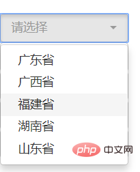
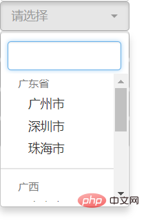
Option grouping
<select class="form-control selectpicker" data-live-search="true" multiple>
        <optgroup label="广东省">
                <option value="1">广州市</option>
                <option value="2">深圳市</option>
                <option value="3">珠海市</option>
         </optgroup>
          <optgroup label="广西">
                  <option value="1">南宁市</option>
                  <option value="2">柳州</option>
                  <option value="3">桂林市</option>
           </optgroup>
           <optgroup label="山东">
                   <option value="1">烟台</option>
                   <option value="2">青岛</option>
                   <option value="3">济南</option>
             </optgroup>
</select>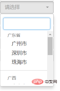
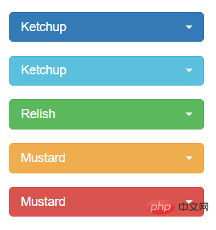
Default style, add Style: data- style="max-width:90%"
<select class="selectpicker" data-style="btn-primary">
  ...
</select>
<select class="selectpicker" data-style="btn-info">
  ...
</select>
<select class="selectpicker" data-style="btn-success">
  ...
</select>
<select class="selectpicker" data-style="btn-warning">
  ...
</select>
<select class="selectpicker" data-style="btn-danger">
  ...
</select>
Related recommendations: "bootstrap Getting Started Tutorial"
Add search: data -live-search="true"
<select class="selectpicker" data-live-search="true">....</select>
Select multiple selection:
Add "multiple" set to multiple selection, and The setting can select up to 2 items data-max-options="2"
<select class="selectpicker form-control" multiple data-max-options="2">...</select>
Effect: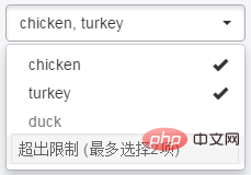
Add search: data-live-search="true"
Set the retrieval placeholder attribute: data-live-search-placeholder="Search"
Add the "select all/inverse selection" function button data-actions-box="true"
<select class="selectpicker" multiple data-live-search="true" data-live-search-placeholder="搜索"
data-actions-box="true">
  <optgroup label="filter1">
    <option>option1</option>
    <option selected>option2</option>
    <option>option3</option>
    <option>option4</option>
  </optgroup>
  <optgroup label="filter2">
    <option>option1</option>
    <option>option2</option>
    <option>option3</option>
    <option>option4</option>
  </optgroup>
  <optgroup label="filter3">
    <option>option1</option>
    <option>option2</option>
    <option>option3</option>
    <option>option4</option>
  </optgroup>
</select>
Effect: 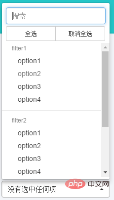
js initialization, set the selected value
$('.selectpicker').selectpicker('val','mustard');
$('.selectpicker').selectpicker('val',['mustard','relish']);
Update UI
$('.selectpicker').selectpicker('refresh');
Selected event
$('.selectpicker').on('changed.bs.select',function(e){
});The above is the detailed content of How to use bootstrap's drop-down multiple selection box. For more information, please follow other related articles on the PHP Chinese website!

Hot AI Tools

Undresser.AI Undress
AI-powered app for creating realistic nude photos

AI Clothes Remover
Online AI tool for removing clothes from photos.

Undress AI Tool
Undress images for free

Clothoff.io
AI clothes remover

Video Face Swap
Swap faces in any video effortlessly with our completely free AI face swap tool!

Hot Article

Hot Tools

Notepad++7.3.1
Easy-to-use and free code editor

SublimeText3 Chinese version
Chinese version, very easy to use

Zend Studio 13.0.1
Powerful PHP integrated development environment

Dreamweaver CS6
Visual web development tools

SublimeText3 Mac version
God-level code editing software (SublimeText3)

Hot Topics
 How to use bootstrap in vue
Apr 07, 2025 pm 11:33 PM
Using Bootstrap in Vue.js is divided into five steps: Install Bootstrap. Import Bootstrap in main.js. Use the Bootstrap component directly in the template. Optional: Custom style. Optional: Use plug-ins.
 How to get the bootstrap search bar
Apr 07, 2025 pm 03:33 PM
How to use Bootstrap to get the value of the search bar: Determines the ID or name of the search bar. Use JavaScript to get DOM elements. Gets the value of the element. Perform the required actions.
 How to do vertical centering of bootstrap
Apr 07, 2025 pm 03:21 PM
Use Bootstrap to implement vertical centering: flexbox method: Use the d-flex, justify-content-center, and align-items-center classes to place elements in the flexbox container. align-items-center class method: For browsers that do not support flexbox, use the align-items-center class, provided that the parent element has a defined height.
 How to set up the framework for bootstrap
Apr 07, 2025 pm 03:27 PM
To set up the Bootstrap framework, you need to follow these steps: 1. Reference the Bootstrap file via CDN; 2. Download and host the file on your own server; 3. Include the Bootstrap file in HTML; 4. Compile Sass/Less as needed; 5. Import a custom file (optional). Once setup is complete, you can use Bootstrap's grid systems, components, and styles to create responsive websites and applications.
 How to write split lines on bootstrap
Apr 07, 2025 pm 03:12 PM
There are two ways to create a Bootstrap split line: using the tag, which creates a horizontal split line. Use the CSS border property to create custom style split lines.
 How to insert pictures on bootstrap
Apr 07, 2025 pm 03:30 PM
There are several ways to insert images in Bootstrap: insert images directly, using the HTML img tag. With the Bootstrap image component, you can provide responsive images and more styles. Set the image size, use the img-fluid class to make the image adaptable. Set the border, using the img-bordered class. Set the rounded corners and use the img-rounded class. Set the shadow, use the shadow class. Resize and position the image, using CSS style. Using the background image, use the background-image CSS property.
 How to use bootstrap button
Apr 07, 2025 pm 03:09 PM
How to use the Bootstrap button? Introduce Bootstrap CSS to create button elements and add Bootstrap button class to add button text
 How to resize bootstrap
Apr 07, 2025 pm 03:18 PM
To adjust the size of elements in Bootstrap, you can use the dimension class, which includes: adjusting width: .col-, .w-, .mw-adjust height: .h-, .min-h-, .max-h-


