How to make bootstrap responsive

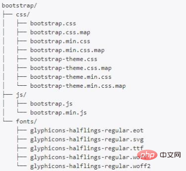
This time I use bootstrap3.4 to make a responsive one. I have explained in detail the selection of bootstrap version in the previous article. The method is relatively simple, with screenshots and instructions. , should all understand. First download the bootstrap source code, unzip it and copy all 3 folders in the dist folder to your project (or the template folder, please note that these 3 folders must be placed together and cannot be separated).

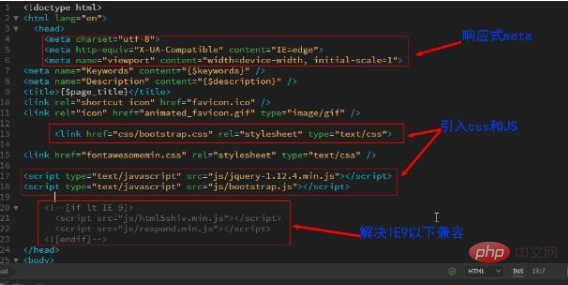
Add responsive meta
The web page needs to be written in HTML5, and put these three meta tags in the head at the beginning After the tags, the following three tags 4 to 6 must be placed at the front and cannot be placed in other positions and must be present to achieve responsiveness.
<!doctype html>
<html>
<head>
<meta charset="utf-8">
<meta http-equiv="X-UA-Compatible" content="IE=edge">
<meta name="viewport" content="width=device-width, initial-scale=1">
<!-- 上面4~6的3个meta标签必须要添加且放在最前面-->
Reference css files
Reference bootstrap css files in html:
<link href="css/bootstrap.css" rel="stylesheet" type="text/css">
Explain separately the css and js provided in the bootstrap folder folder, bootstrap.css and bootstrap.js are uncompressed source files that can be continued to be written and modified. The volume will be slightly larger and suitable for modifications; the js and css files with min are compressed. The final file cannot be modified. When using cdn to load the reference, you usually choose the file with min. It is enough to understand these.

Related recommendations: "bootstrap Getting Started Tutorial"
Quoting js files
Quoting the js file of bootstrap: bootstrap.js, it should be noted that bootstrap relies on the jQuery plug-in, so the jQuery file must be introduced together; the jQuery version supported by bootstrap3.4 cannot exceed the jquery-1.12.4 version, and higher jQuery does not Supports bootstrap3.4. If it is bootstrap4 or above, it can support the latest version of jQuery. You also need to note that the jQuery.js file must be placed in front of the bootstrap.js folder. According to experience, if the position is upside down, sometimes the page loading will be very slow~
<script type="text/javascript" src="js/jquery-1.12.4.min.js">
</script>
<script type="text/javascript" src="js/bootstrap.js">
</script>
Solution to compatibility with browsers below IE9
In order for bootstrap3.4 to display normally on browsers below IE9, you need to add the following code in front of the tag to introduce html5shiv.min.js and respond.min These two js files, .js, are compatible with browsers below IE9 because of the code below, so don’t forget it.
<!--[if lt IE 9]><script src="js/html5shiv.min.js"></script><script src="js/respond.min.js"></script><![endif]-->
The complete code is as follows. Please note that the responsive meta tag must be placed at the front. The bootstrap css file must also be placed in front of other css. The bootstrap js file can be placed within the head tag and loaded in the footer, but the jQuery file must be introduced at the same time. To achieve compatibility with browsers below IE8, you need to add compatible js.

The above is the detailed content of How to make bootstrap responsive. For more information, please follow other related articles on the PHP Chinese website!

Hot AI Tools

Undresser.AI Undress
AI-powered app for creating realistic nude photos

AI Clothes Remover
Online AI tool for removing clothes from photos.

Undress AI Tool
Undress images for free

Clothoff.io
AI clothes remover

Video Face Swap
Swap faces in any video effortlessly with our completely free AI face swap tool!

Hot Article

Hot Tools

Notepad++7.3.1
Easy-to-use and free code editor

SublimeText3 Chinese version
Chinese version, very easy to use

Zend Studio 13.0.1
Powerful PHP integrated development environment

Dreamweaver CS6
Visual web development tools

SublimeText3 Mac version
God-level code editing software (SublimeText3)

Hot Topics
 How to get the bootstrap search bar
Apr 07, 2025 pm 03:33 PM
How to use Bootstrap to get the value of the search bar: Determines the ID or name of the search bar. Use JavaScript to get DOM elements. Gets the value of the element. Perform the required actions.
 How to use bootstrap in vue
Apr 07, 2025 pm 11:33 PM
Using Bootstrap in Vue.js is divided into five steps: Install Bootstrap. Import Bootstrap in main.js. Use the Bootstrap component directly in the template. Optional: Custom style. Optional: Use plug-ins.
 How to do vertical centering of bootstrap
Apr 07, 2025 pm 03:21 PM
Use Bootstrap to implement vertical centering: flexbox method: Use the d-flex, justify-content-center, and align-items-center classes to place elements in the flexbox container. align-items-center class method: For browsers that do not support flexbox, use the align-items-center class, provided that the parent element has a defined height.
 How to write split lines on bootstrap
Apr 07, 2025 pm 03:12 PM
There are two ways to create a Bootstrap split line: using the tag, which creates a horizontal split line. Use the CSS border property to create custom style split lines.
 How to insert pictures on bootstrap
Apr 07, 2025 pm 03:30 PM
There are several ways to insert images in Bootstrap: insert images directly, using the HTML img tag. With the Bootstrap image component, you can provide responsive images and more styles. Set the image size, use the img-fluid class to make the image adaptable. Set the border, using the img-bordered class. Set the rounded corners and use the img-rounded class. Set the shadow, use the shadow class. Resize and position the image, using CSS style. Using the background image, use the background-image CSS property.
 How to use bootstrap button
Apr 07, 2025 pm 03:09 PM
How to use the Bootstrap button? Introduce Bootstrap CSS to create button elements and add Bootstrap button class to add button text
 How to set up the framework for bootstrap
Apr 07, 2025 pm 03:27 PM
To set up the Bootstrap framework, you need to follow these steps: 1. Reference the Bootstrap file via CDN; 2. Download and host the file on your own server; 3. Include the Bootstrap file in HTML; 4. Compile Sass/Less as needed; 5. Import a custom file (optional). Once setup is complete, you can use Bootstrap's grid systems, components, and styles to create responsive websites and applications.
 How to resize bootstrap
Apr 07, 2025 pm 03:18 PM
To adjust the size of elements in Bootstrap, you can use the dimension class, which includes: adjusting width: .col-, .w-, .mw-adjust height: .h-, .min-h-, .max-h-


