How to set the width attribute of the td cell of table tr in html
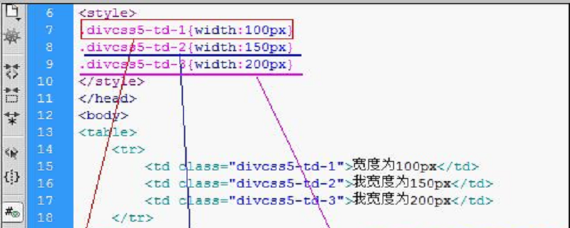
The width of the table is adaptive, and some TDs are of fixed width. In principle, the width of the table should be set to a fixed value, rather than a value that changes according to the screen. Now let's look at how to set the width of table td cells.

Example 1: The width of the Table is 600px, and the sum of all widths of the Table's td is less than 600px. The browser will automatically calculate the width according to the ratio of the width of the td
<table style="width: 600px;border-collapse: collapse;" >
            <tr>
               <td style="width: 200px;">我是200px</td>
               <td style="width: 200px;">我也是200px</td>
            </tr>
</table>
运行结果:两个td都是300px;The width of the Table is 600px. The width of the first two TDs is already 600px, so the width of the third TD is not specified. In this case, the width of the third TD is based on the content, and then the first two are based on the width. Ratio column calculation width.
Example 2: The first two tds are smaller than the table width, then the last td plays a completion role
<table style="width: 600px;border-collapse: collapse;" >
            <tr>
                <td style="width: 300px;">我是200px</td>
                <td style="width: 300px;">我也是200px</td>
                <td >我是根据内容的</td>
            </tr>
</table>Example 3: Within the td in the Table, if the block element is placed more than The width of the td, and the table-layout of the table: fixed; (fixed means that the width of the td is fixed and does not change with the change of the td content). In this way, try not to write overflow: auto; in td because scroll bars will not appear in IE6 and 7. The best way is to wrap a div and set the width to 100%
<table style="width: 600px;border-collapse: collapse;table-layout: fixed;" >
            <tr>
                <td style="width: 200px;"><div style="width: 100%;overflow: auto;"><div style="width: 300px;height: 100px;background-color: red;"></div></div></td>
               <td >我是自由宽度</td>
            </tr>
        </table>
The above is the detailed content of How to set the width attribute of the td cell of table tr in html. For more information, please follow other related articles on the PHP Chinese website!

Hot AI Tools

Undresser.AI Undress
AI-powered app for creating realistic nude photos

AI Clothes Remover
Online AI tool for removing clothes from photos.

Undress AI Tool
Undress images for free

Clothoff.io
AI clothes remover

Video Face Swap
Swap faces in any video effortlessly with our completely free AI face swap tool!

Hot Article

Hot Tools

Notepad++7.3.1
Easy-to-use and free code editor

SublimeText3 Chinese version
Chinese version, very easy to use

Zend Studio 13.0.1
Powerful PHP integrated development environment

Dreamweaver CS6
Visual web development tools

SublimeText3 Mac version
God-level code editing software (SublimeText3)

Hot Topics
 How to use bootstrap in vue
Apr 07, 2025 pm 11:33 PM
Using Bootstrap in Vue.js is divided into five steps: Install Bootstrap. Import Bootstrap in main.js. Use the Bootstrap component directly in the template. Optional: Custom style. Optional: Use plug-ins.
 The Roles of HTML, CSS, and JavaScript: Core Responsibilities
Apr 08, 2025 pm 07:05 PM
HTML defines the web structure, CSS is responsible for style and layout, and JavaScript gives dynamic interaction. The three perform their duties in web development and jointly build a colorful website.
 React's Role in HTML: Enhancing User Experience
Apr 09, 2025 am 12:11 AM
React combines JSX and HTML to improve user experience. 1) JSX embeds HTML to make development more intuitive. 2) The virtual DOM mechanism optimizes performance and reduces DOM operations. 3) Component-based management UI to improve maintainability. 4) State management and event processing enhance interactivity.
 How to write split lines on bootstrap
Apr 07, 2025 pm 03:12 PM
There are two ways to create a Bootstrap split line: using the tag, which creates a horizontal split line. Use the CSS border property to create custom style split lines.
 Understanding HTML, CSS, and JavaScript: A Beginner's Guide
Apr 12, 2025 am 12:02 AM
WebdevelopmentreliesonHTML,CSS,andJavaScript:1)HTMLstructurescontent,2)CSSstylesit,and3)JavaScriptaddsinteractivity,formingthebasisofmodernwebexperiences.
 How to set up the framework for bootstrap
Apr 07, 2025 pm 03:27 PM
To set up the Bootstrap framework, you need to follow these steps: 1. Reference the Bootstrap file via CDN; 2. Download and host the file on your own server; 3. Include the Bootstrap file in HTML; 4. Compile Sass/Less as needed; 5. Import a custom file (optional). Once setup is complete, you can use Bootstrap's grid systems, components, and styles to create responsive websites and applications.
 How to insert pictures on bootstrap
Apr 07, 2025 pm 03:30 PM
There are several ways to insert images in Bootstrap: insert images directly, using the HTML img tag. With the Bootstrap image component, you can provide responsive images and more styles. Set the image size, use the img-fluid class to make the image adaptable. Set the border, using the img-bordered class. Set the rounded corners and use the img-rounded class. Set the shadow, use the shadow class. Resize and position the image, using CSS style. Using the background image, use the background-image CSS property.
 How to use bootstrap button
Apr 07, 2025 pm 03:09 PM
How to use the Bootstrap button? Introduce Bootstrap CSS to create button elements and add Bootstrap button class to add button text


